Bobst Graphic—The light years of typography
Go to Signa Set page
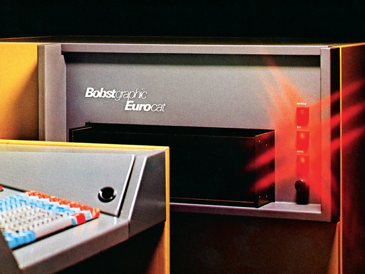
Eurocat phototypesetting system
Bobst Graphic Systems was a pioneer in phototypesetting, automation and typographic design from 1970 – 1980. A decade of projects shown here that allows the reader to browse all the dynamics of a high-level industrial graphic arts company in which engineers and designers at many points conceived and anticipated the technology and design of today’s visual communications. An immersion in a period of expansion and anticipation that had an impact on the whole of the media sphere, its stakeholders, and typographic production itself — an expansion that has continued to grow through to the current day.
Many Bobst Graphic projects anticipated the contemporary vision of a media technology extending beyond the industrial sector and encompassing the whole of society, such as the concepts of individual, automatic, mobile and smart terminals, of their being networked, and also the close integration of design and visual ergonomics into industrial products. It was a vision of technology that allowed the introduction of a great number of new participants from media and information.
In the field of Swiss typographic design, the scale of the Bobst Graphic project was exceptional in every aspect. The project falls within the context of a sequence ranging from industrial typography to dissemination made possible by digital tools. A period of less than twenty years of “destruction- creation” that bears witness to the transition from the century-old production of the historical type foundries, focused on “hardware”, of which Haas in Basel were the illustrious heirs, towards that of “software” production and personal terminals.
This was an upheaval of all aspects, simultaneously: material, technological and economic— but also cultural, aesthetic and social, everything that shapes graphic media and communications.
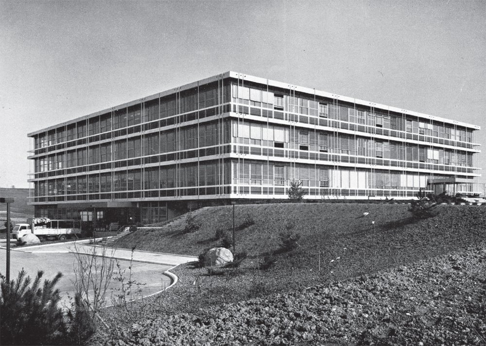
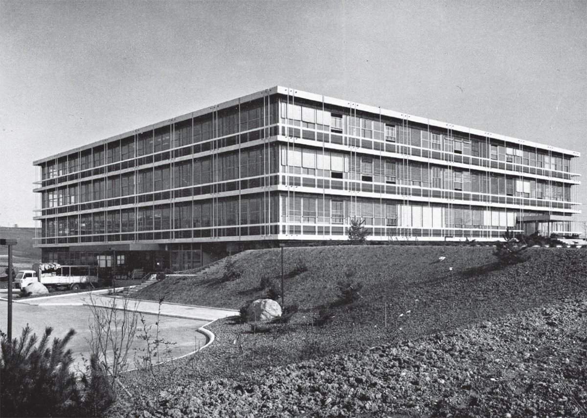
The Bobst building, Mex
Bobst Graphic Systems
Bobst Graphic Systems came into being as part of Bobst SA in 1971. Bobst SA is a company that supplies machinery, products and services to the packaging industry. Founded in 1890 by Joseph Bobst in Lausanne, and becoming Bobst SA in 1978, it acquired an international dimension. Based in Mex, near Lausanne, Bobst Group currently has around 15 production sites across the world and close to 6000 employees in 50 countries. It is one of the leading global companies in its sector.
From the beginning of the 1960s, Bobst diversified from its purely mechanical activities, integrating IT and electronics into all of its products. In the study group set up to bring together high-level scientific collaborators, the idea emerged of extending Bobst’s graphic activities and launching a project of typographic phototypesetting and automation that linked technology and design. This project was the forerunner in Europe. The development of the offset printing process with films superseded traditional printing with hot metal typography. In addition, phototypesetting, which is technically associated (by the generation of films), while at that time almost non-existent in Europe, already accounted for 20 to 40% of typographic typesetting in the United States.
For what was to become Bobst Graphic the firm committed significant scientific and financial means. It surrounded itself with leading advisers including René Higonnet and Louis Moyroud, the inventors of the first modern phototypesetting machine. It developed a network of research and study programmes involving Swiss and foreign institutes and the federal universities and polytechnic schools of Lausanne and Zurich.
In creating Bobst Graphic, the company had linked its goals to a set of strategic considerations recalled by Bruno De Kalbermatten, the Director of Bobst SA from 1950 to 1998: “The intention was for the products to possess mechanics branded with the seal of “Swiss quality”; the phototypesetting should respond to the opportunities offered by advanced computer technology; the quality of the typography should be improved; the favourable position of Switzerland in terms of linguistic proficiency should be exploited to the full.”[]
Bobst Graphic thus proposed participating in the development of contemporary typography in determining the following objectives: “to contribute to the cause of the letter in general; to meet the legitimate demands and aspirations of the press, publishing and advertising; to create a symbiosis between the typographic form and current technologies.”[]
Industrial typography: lead, light, vectors
At the point when Bobst Graphic embarked on the development of phototypesetting in Europe, this sector of the graphics industry was undergoing a radical transformation. It offered an open field of new, complex issues to its stakeholders in technological and commercial terms, as well as exciting opportunities. It should be recalled that in certain milestones the industrial history of typography, simultaneously brief and evolutionary, is punctuated by the implementation of the following “dominant” technologies: mechanical (1884), photomechanical (1955), electronic (1965), digital (1975).
The first stage of genuinely industrial typography began with the– rather overdue– mechanisation of the typesetting of texts by the invention of the Linotype (linecaster machine) in the USA in 1884.[]This was followed by the mechanisation of the engraving of fonts using the pantograph, and by the machine for engraving punches and typographic matrices, invented by Linn Boyd Benton, also in the USA, in 1906.[]
The industrialisation of these two areas cannot be separated from the development of other elements equally crucial in the printing industry, such as that of front-end units, keyboards, integrated into machines or independent, and soon networked. This is also true of the creation of the first large-scale statistical databases linked with industrial automation and its flows of information, likewise just emerging, and of the development of storage devices for information in the form of punched paper tapes and cards, that of communication channels and formats allowing their transmission, telephony and teletypesetting (TTS system). And finally, cannot be separated from the growing development of graphic and editorial applications.
At the same time, the cultural and social implications of these changes should also not be underestimated. The professional profiles and skills of the various stakeholders involved in the graphic arts and media were likewise fundamentally altered. Thus the first industrialisation of typography, mechanisation, was to see both the emergence of the linotypist at his keyboard and the freelance graphic designer (or the typografische Gestalter).[]
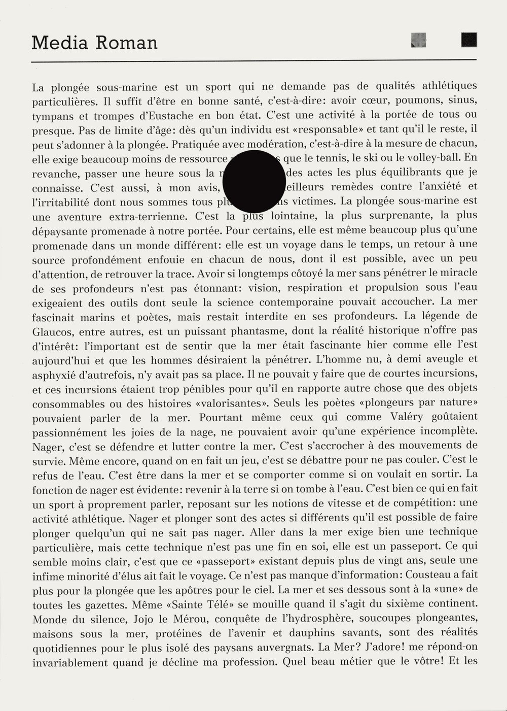
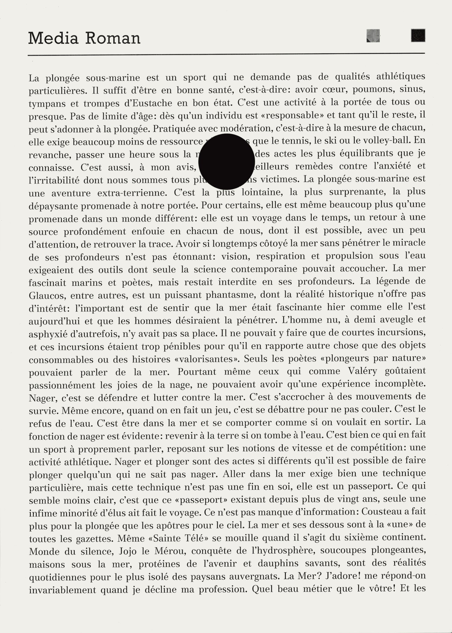
Standard test page of Media font
The typographic typeface and its (re)production
Typeface design is an art based both on specialised graphic tradition and on cognitive and ergonomic invariables, the reading of text and the page. Two aspects that have influenced the relative continuity of typography spanning the various techniques employed for its production. According to historian Bonnie Mak, the page is only slightly influenced by its technical materiality: print or screen— the fourth-century manuscript page still looks similar to that of the latest digital tablets.[]
In order to grasp the effects and impact of technological changes on the art of the letter, engineer and historian of digital typography Richard Southall suggests, relevantly, differentiating between the picture of the character (art) and its technical reproduction.[]In the European foundries, manual punchcutting continued through to the end of the 1950s. The reproduction of an image of the letter–generally determined beforehand– by engraving on a steel block on a scale of 1:1 – was traditionally carried out by specialised technical artists, punchcutters, such as Paul H. Rädisch at Joh. Enschedé en Zonen in Haarlem in the Netherlands, or Edmund Thiele at the Haas Typefoundry Ltd. (Haas’sche Schriftgiesserei) in Basel.[]In this method, “art” and interpretation by engraving are done at the same scale.
Mechanical engraving by pantograph, introduced at the beginning of the 20th century, required large designs (about 12cm height for lower case) for the creation of “pattern drawings”, templates used for engraving matrices with high reduction. This engraving was effected in two stages, down to a typographic scale of just a few millimetres. Here, “art” and engraving are implemented at very different scales, involving a number of adjustments.[9]
The method used for the design and production of typefaces for phototypesetting enabled a shift from graphic-mode to digital binary-mode of “description” of the artistic project. For the first generation of phototypesetting machines, reproduction was carried out in graphic-mode, with analogue drawings, in a method very similar to that of mechanical engraving: large (and beautiful) character drawings were reproduced photographically in negative format then reduced and finally mounted on matrix holders in various forms: grids, discs or drums. For the second generation of phototypesetting machines, reproduction was carried out in digital-mode: the typographic data, “art”, were described and stored in binary-mode, in the form of pixel diagrams or “pre-digitised drawings” (sometimes created by hand). They were subsequently written on the output CRT by cathode ray tubes. Soon afterwards, for the last generation of phototypesetting machines, these typographic data were described and stored in the form of simple vectors (straight-line vectors in the first instance) and then, with the advent of the PostScript format by Adobe in 1984, as complex vectors.
A final phase that was ultimately to lead to the digital description of the whole of the page: texts – whatever their character size – and iconic elements, resulting in a stabilisation of the technological revolutions that had affected typography. A stabilisation that has lasted through to the current day. [10]
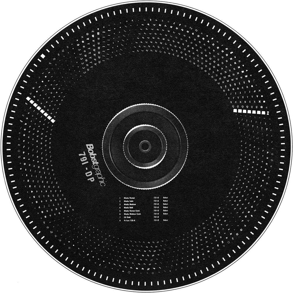
Type disk for Media typeface
Bobst Graphic enters the game
Bobst Graphic entered the field of designing phototypesetters at a point when several technological principles had reached maturity in the USA. This was the case for machines using rotating discs, one of the technical bases of Bobst Graphic’s approach to phototypesetting, the Eurocat series 120, 150, 160. A technology and design methods initially formulated around the pioneering Lumitype project.[11]
The creators of this visionary project were René Higonnet and Louis Moyroud, telecommunications engineers with whom Bobst Graphic went on to collaborate consistently. They conducted their bold experiments in phototypesetting in France at first, and then in the USA, supported by foundations at the Massachusetts Institute of Technology (MIT). They were the first, together with William Jr. “Bill” Garth, to develop industrially a machine producing typefaces that exceeded the constraints of hot metal typesetting: the Lumitype. A machine based on the principle of a rotating disc matrix holder with photographic negatives “flashed” by stroboscopic flash at high speed, by a neon tube with high voltage. The first versions allowed image setting of 28,000 characters per hour, while Bobst Graphic went on to produce typesetting machines that reached 50,000 characters per hour.
Higonnet and Moyroud’s invention triggered a range of technological innovations that influenced many companies as new entrants to the industry of typographic typesetting–Addressograph, Autologic, Information International, Singer Company–as well as companies “dedicated” to typographic typesetting, Mergenthaler Linotype Company, Lanston Monotype Company.
The other technical solution used by Bobst for its phototypesetting machines and that of machines equipped with a rotating drum including negative matrix holder segments (circular quadrants) turning at high speed [12] such as the Eurocat series 200, 1972-75, fitted with more flexible tech- nology, notably developed by the Singer Company for Photomix in the USA. “Bobst Graphic Systems acquired marketing rights to a version of the Photomix 8400 in 1973 and promptly changed the livery, industrial design, and name to Eurocat. Hardware modifications were subsequently engineered to appease Swiss mania for precision and European software came along as well”.[13]
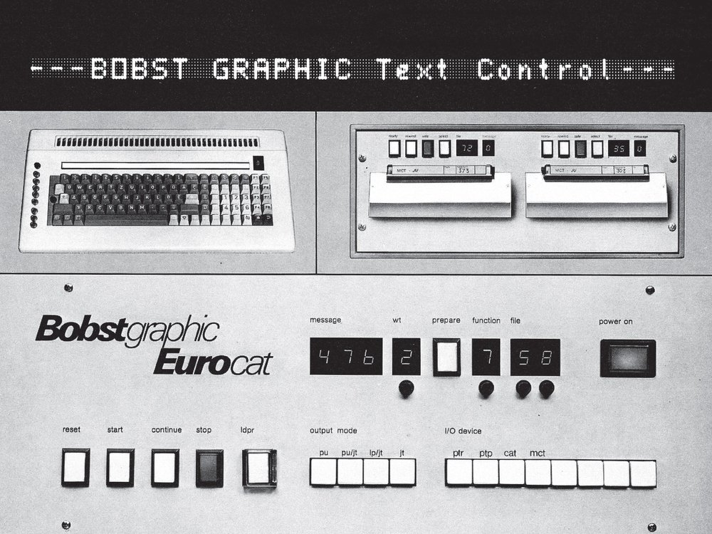
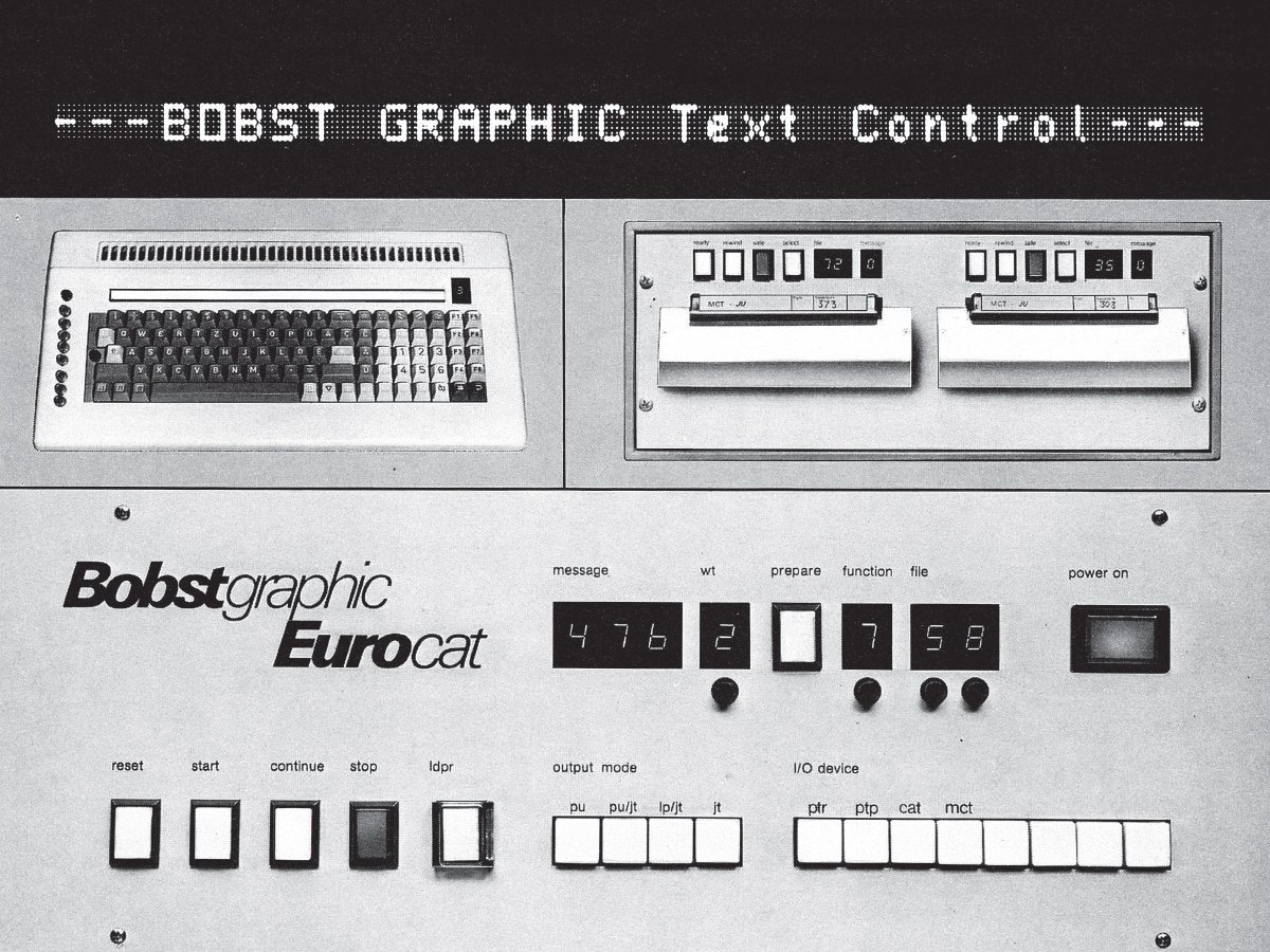
Eurocat phototypesetting system
Typography as hardware/software
“[…] We are working in every sense to automate all of the movements connected with phototypesetting”.[14] The phototypesetting unit was a complex machine combining high-precision mechanics and optics with the electromechanical and also electronic elements of word processing, soon implemented by the first programmable mini-computers.
It incorporated more and more “intelligence”: as a machine processing a great quantity of data specific to typography: spacing, justification, style, hyphenation, editing, correction, and all this sometimes in 15 languages [15]; as a unit inserted into an architecture of complex components: front-end units with keyboards, storage elements, line-ends instructions units, output units, back-end units with output functions.
Interfaces, visualisation and proofing, vital elements of “front-end”, evolved towards the visualisation of typesetting, in the alphanumeric visualisation of texts and on video editing units, subsequently simulating the printed result and soon offering opportunities of growing interaction, and of modification of the typesetting. The screens visualise the text with generic typefaces: serif and sans-serif. First stages of the merging of the computer with the video editing unit.
The “SMArt KeYboard”
The developments in electronics undertaken by Bobst SA for phototypesetting also allowed numerous advances in its other areas: print control in 10 colours, control of cutting, scoring, folding, gluing and their automation; as well as optical character recognition (OCR).
This culture of applied research and development (Ra&D) offered a new generation of engineers the opportunity to imagine the prefiguration of many solutions that have since become the norm today, such as individual input units and word processing: the BeeZy BG-1000 developed by Daniel Borel and Pierluigi Zappacosta from 1978 to 1981 opened up to a wider public, an anticipation of the do-it-yourself editorial; [16] the Scrib a nomadic and “intelligent” terminals, connected by telephonic acoustic couplers based on the “Smaky 5”. “The name Smaky was invented in 1974, and derived from SMArt KeYboard. The objective was to have a computer card the size of a keyboard and placed underneath the keyboard. Thus the size of the first processor card was determined by the size of the keyboards supplied by Digital Equipment: 160 x 280cm. Together with the screen and the power, it had to be possible to transport the whole computer in the briefcase of [its designer] Jean-Daniel Nicoud.” [17]
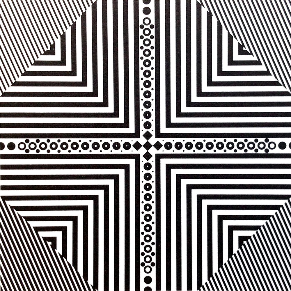
Bobst-Brunner mire
Bobst Graphic, integration of design and technology
Traditionally, and up until the 1980s, the creation of typefaces and the production of machines dedicated to hot metal typesetting [18] was a central skill of the type foundries. The latter represented a highly specialised sector within the printing industry— many of them were heirs to a culture spanning many centuries.
This is true of two foundries with which Bobst Graphic was to develop partner projects: the Haas Typefoundry Ltd., in Basel, Münchenstein, which has a tradition stretching back nearly 400 years with a catalogue including both typefaces produced by its 18th-century matrices and recent creations, such as Helvetica; and the Joh. Enschedé en Zonen Typefoundry, located in Haarlem in the Netherlands since 1703, which has both an important historical typographic library and the contemporary creations of Jan van Krimpen.
In developing its new phototypesetting division, Bobst SA intended to closely associate the development of its phototypesetting machines with that of the typeface design, as highlighted by Bruno De Kalbermatten. It envisaged, from the very outset of the project, closely linking the two approaches, design and technology, in a relationship described as “symbiotic”. The company wished above all to combine a network of high-level graphic designers with a network of engineers and technicians. It should be noted that the development of phototypesetting in the USA had up until then essentially been a project just for engineers. For a long time, the design of original typefaces, respect of copyright regarding their reproduction and the purchase of licences remained secondary.[19]
Bobst Graphic included graphic designers and typographers within its structure. From 1974 on, it established regular contact with freelance graphic designers. This was an artistic direction that integrated internal and external design skills into the company, such as Haas had already developed in Switzerland with designers like Hermann Eidenbenz, Walter Diethelm, then the Team’77 group made up of André Gürtler, Erich Gschwind and Christian Mengelt.
From 1974 on, Bobst Graphic was in contact with the members of the future Team’77, alias “Letterform & Design Team”.
André Gürtler, graphic designer, writer and teacher at the School of Applied Arts in Basel, brought to Bobst Graphic design the experience he had gained during collaboration with Adrian Frutiger on reference projects such as the Concorde or Roissy typefaces (he would soon be as famous as Frutiger and meet with international success).
Christian Mengelt, also a graphic designer and teacher at the School of Applied Arts in Basel, had, for his part, collaborated very early on with Karl Gerstner and Günter Gerhard Lange on the creation of the Gerstner Program, a “grotesque” designed for Berthold’s Diatype phototypesetting machine, in the mid-1960s.
Individually or as a trio, the team benefitted also from the tradition and standards in design resulting from its collaboration with the Haas Typefoundry: “organic” linearity, perfect optical balance, clear graphic expression. It was for this foundry that they developed the Haas Unica, a sans serif typeface, synthesis of modernist Swiss typographic design, at the end of the 1970s.
Crucial for Bobst SA was the knowledge developed by the pioneers of the Lumitype project associated with the Deberny & Peignot Typefoundry. Under the direction of Charles Peignot, and in cooperation with René Higonnet, the Deberny & Peignot Typefoundry had enabled the young Adrian Frutiger to develop the Univers typeface in the 1950s, a large typographic program that allowed him to demonstrate the graphic potential offered by the Lumitype disc phototypesetter (one of the technologies that was to be adopted by Bobst Graphic).[20] The Deberny & Peignot Typefoundry, also heirs to a long typographic culture, had established a partnership with Photon-Lumitype, allowing them to access the new technology of phototypesetting.
Adrian Frutiger had developed a specific method for designing typographic typefaces for the new Lumitype: the standardisation of the proportions of the letter (same uppercase height, lengths of ascenders and descenders, stems height, x-height) for all cuts of the same family; the use of a grid of 36 units of width for designing all of the alphabet (double the 18 units in current usage); the realisation of large original high-finish drawings[21] based on an em quad of 18 cm, named phototypes, ready for camera reproduction.
The fonts of Bobst Graphic typefaces incorporated this principle. Starting with the original drawing, a reproduction was created on film, positioned, and located on a grid of 36 units, reducing the initial body of 500 Didot points (about 188 millimetres) to the body of 125. This intermediate negative is called a “lettercard”. The lettercards were then reduced 34 times on a glass plate coated in high-resolution emulsion. At this stage the body of the letter was 3.65 points. This glass plate is the “master” of the font and allows contact reproduction of the fonts on the photo-matrix discs of the phototypesetting machine, which can contain up to 8 fonts of typefaces. “During the exposure, the rotation speed of the disc of the Eurocat makes 70 revolutions per second and allows phototypesetting at a speed of 33 characters per second with a perfect sharpness.”[22]
Bobst Graphic began producing phototypesetting machines in which the data were “written” in the form of pixel diagrams, run-lengths or squares, then generated and written on the output CRT. These machines made it possible to generate two million entirely digital fonts an hour. But it did not produce them. For the range of BG 1000 units, “BeeZy”, the typefaces were already described and stored in the form of spline vectors using the Ikarus software.[23]
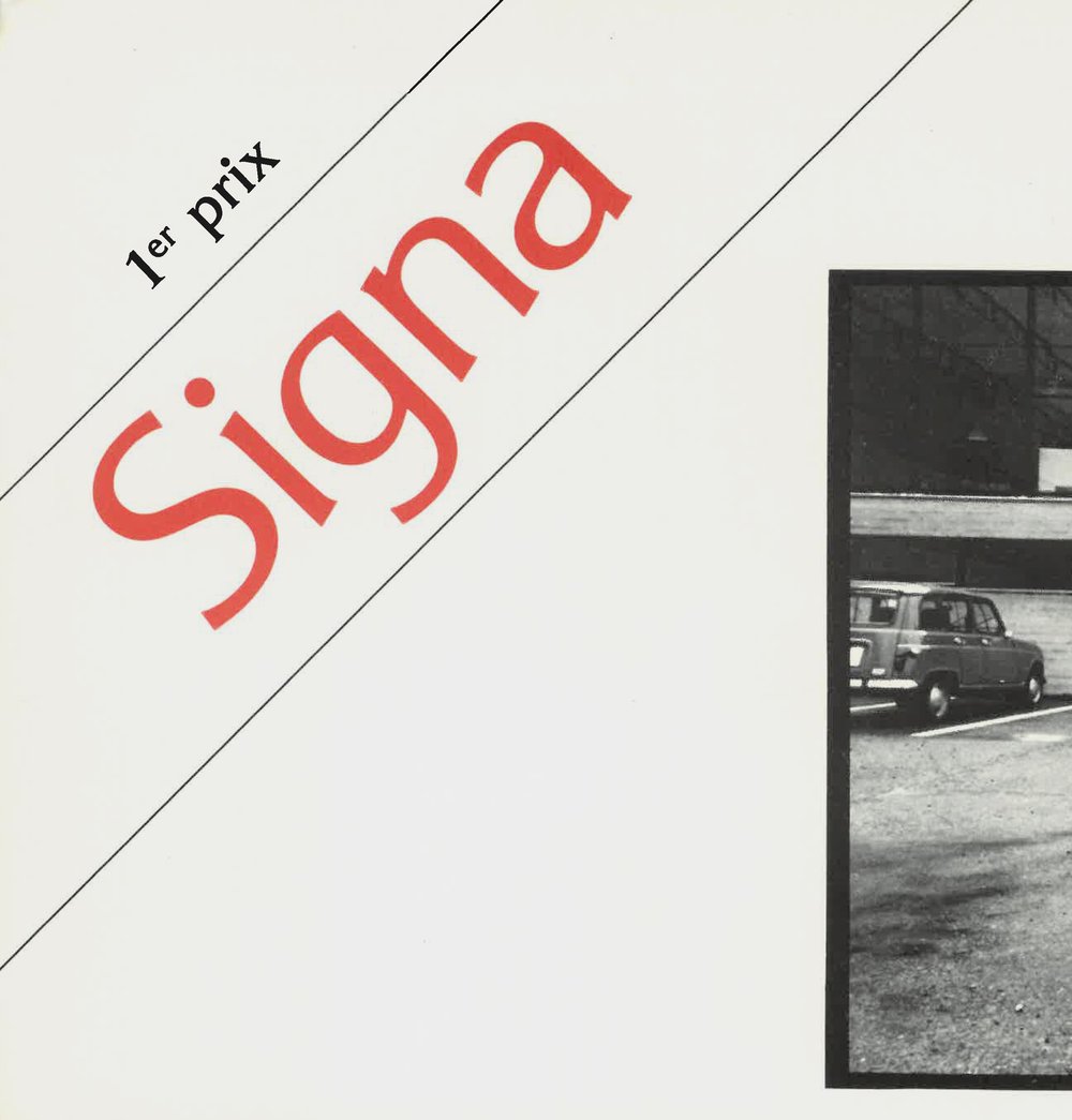
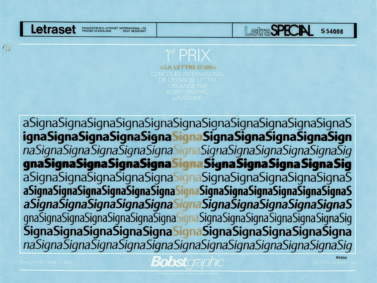
Signa, winner of the first prize in the 1978 Lettre d’Or competition competition
The 1978 Lettre d’Or competition
Bobst Graphic adopted an innovative approach to marketing and communications within a typically traditional sector, making “open” design a point of encounter with a broader public in the graphic arts. At the annual conference of ATypI in Lausanne in 1977, it announced that it would hold an in- ternational competition for the creation of typefaces, which took place in 1978, the Lettre d’Or.[24] “In 1978, thanks to the Association Typographique Internationale ATypI, the Lettre d’Or competition was announced on an international level. At that time such competitions in the field of designing typefaces were quite rare.”[25]
17 typographers from six countries (Germany, Canada, Denmark, France, the Netherlands and Switzerland) responded to the call. The jury selected three projects: Signa by Team’77, Fontenay by Robert Flach and Meteora by Walter Sutter.[26] Louis Moyroud himself awarded the prizes to the winners in October 1978. Winner of the first prize in the competition, Signa was developed for phototypesetting machines fitted with photomatrix discs. Regarded as an evolution in the modernist typography of the 1970s, light serifed, it incorporates an “organic” inflection in its strokes, a ductus discreetly reminiscent of calligraphy in its curves and stroke endings.
A new kind of relationship between typefoundry and designer and between producing company and graphic designer, emerged in the iconography gathered by the competition. We see the graphic designers independent in their studio, home-based, drawing their compositions and proofing in large format, in ink or on inactinic film. The archives kept by Robert Flach suggest numerous repeated visual tests (in his own garden), at variable distances, making it possible to assess the optical balance of the compositions at the different scales required by the text typefaces.[27] An approach and position that foreshadowed the contemporary situation of designers in the digital age.

Letraset sheet of Signa font produced on the occasion of the Lettre d’Or competition
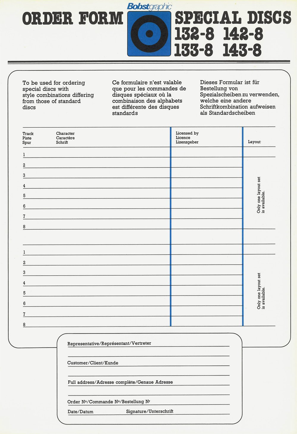
Order form, Bobst Graphic
The Bobst Graphic typographic library
The Bobst Graphic catalogue of typefaces in part comprises designs acquired by licence from “legacy” typefoundries and developed by Bobst for phototypesetting – American Type Founders (ATF), Berthold, Haas, Monotype, Nebiolo, Olive – as well as a major collection of fonts designed by International Typeface Corporation (ITC), one of the top typefoundries resulting from the dematerialisation of typographic production.
Robert Flach, whose prize-winning project Fontenay is a fluid humanistic slab serif, ensured the development and adaptation of fonts acquired by licence.
The catalogue also includes Bobst’s own creations. As well as Signa, Team’77 developed a serif typeface for the press, Media. In 1980, in collaboration with Haas, Bobst Graphic also issued the new creation by Team’77, the Haas Unica font: “Our collaboration continued and around 1980 Bobst Graphic acquired a licence from the Haas foundry for Haas Unica. Once again we made specific technical adjustments and the first version of Haas Unica was in their possession.”[28]
As well as Latin fonts, the catalogue offered Cyrillic and Arabic fonts.
In 1978, Bobst Graphic planned to integrate the Romanée typeface by Jan van Krimpen into its catalogue and to adapt it for phototypesetting. On this basis, in collaboration with Joh. Enschedé en Zonen, the Dutch graphic designer Bram de Does developed the Trinité series. A completely new design that took advantage of both the opportunities offered by phototypesetting machines (a greater number of fonts) and their constraints (photographic reproduction mode, offset printing and inking mode). “During a first discussion with Bobst Graphic, […] in February ’79, we learned that the fitting proofs had to be made on a photosetter with a normal disc of eight fonts. We were to use only two fonts, so I supposed that varying lengths of ascenders and descenders, widths and weights might be tried at the same time.”[29]
The addition of one of the most elegant creations to emerge from the Dutch typographic tradition to its catalogue of typefaces, accompanied by an international selection, and the latest advances in Swiss modernism, demonstrate the ambition and commitment of the artistic direction at Bobst Graphic in its design choices.
A new architecture for the working space
The sleek iconography of Bobst Graphic communications visualises and emphasizes a new innovative working space. During the 1970s two specific working spaces, that of industry and services, merged: the printer composing room and the office. Typesetting machines and the casting machines for hot-metal typography (with their molten lead fumes!) were replaced by ergonomic terminals with an elaborate design. A new typology of microarchitecture, of furnishings, and of a range of colours appeared. The heavy metal formes became instead films, both for texts and images. Soon, with PostScript technology, they were to become files and intangible data.
The elements of the printing industry, of pre-press could be configured in various networks: front-end units independent of text and images (keyboards, cameras, scanners); front-end units coupled with image setters, in several different possible configurations. The data were stored on floppy disks. Some terminals were already nomadic. “Image setters could be piloted by different systems, […] the Bobst Graphic Mopas system for large companies (newspapers, publishing houses). Such systems could be found at the Journal de Genève, at ESIG [École suisse d’ingénieurs des industries graphiques]. In this way we responded to demand from all of the printers, from the small ones to the larger ones. […] Bobst Graphic commercialised the first portable editing computer [the Smaky]. This was followed by the BG-1000 [BeeZy], aimed at non-professionals”.[30]
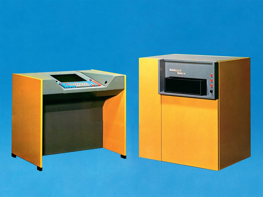
Eurocat phototypesetting system
Hard & soft power
“Keystroke by anybody […] Electronic technology has deskilled the traditional processes and invites do-it-yourself participation”, stated Lawrence W. Wallis at the beginning of the 1980s.[31] Intelligent, ergonomic keyboard, interactive screen, a major part of the routines of typographic composition were taken over by the computer programming of Bobst Graphic machines: hyphenation, justification, style variations, weights, widths, interactive corrections.
The visualisation of the typesetting was not yet in WYSIWYG mode, it required stages of preliminary coding. But the flexibility of data flow processing offered the possibility of “adding line-end instructions”, of processing them anywhere and at any time. From the studio to the office, a transfer of skills was initiated. Typography passed from the exclusive circle of typographers, and of linotypists, into the hands of writers, editors, typists. This was an invitation to reorganise the industrial and editorial process.
The studio/office division of the mechanical organisation of the first industrial age of the printers and early information industry overlapped with gender division, with the figures of the male typographer and the female typist.[32] To the chronology of technological changes corresponds a chronology of the involvement of women in graphic art. Regarding French-speaking Switzerland, Roger Chatelain, a historian of typography and a typographer, emphasises: “Concerning the presence of women in the printing industry, here are a few landmark dates. 1923: the union gain assurances from the printing company owners that no women will be employed (nota bene Saint-Paul Printing House, Fribourg was an exception, since nuns worked in the composing rooms). 1960: the daughters of printing company owners and typesetters are permitted to undertake an apprenticeship in typographic typesetting. 1968: in Lausanne, Anne-Marie Roy, a typographer’s daughter, gains the CFC compositor-typographer qualification (Certificat fédéral de capacité, Federal Diploma of Vocational Education and Training). 1975: the nuns of Saint-Paul are officially permitted to undertake an apprenticeship in typography. 1984: At ERAG, Nicole Messelier gains the CFC typo-offset press(wo)man qualification (the first woman in Switzerland to do so)”.[33]
Men at the keyboard / women at the input. Typographical enrichment / data entry “by the mile”. This gender gap was for a while one of the possible configurations of the organization of typesetting. After 1974, however, Bobst was interested in the automatic processing of keyboarded data for phototypesetting with the Text Reader scanner. And soon the text input, their formatting and editing went upstream in the editorial project, towards the copy originators themselves.
Bobst Graphic, vision, dissemination
In retrospect, the Bobst Graphic projects appear visionary, ahead of their time, setting a number of milestones for our modern world. If the Bobst SA company is focused today on its core competency, the production of machinery and services for industrial packaging, the dynamics initiated by the Bobst Graphic project benefitted the whole of its production.
Its culture of design and its industrial integration are evident. The framework of applied research and development established around Bobst Graphic facilitated the development of a technological culture of innovation with a strong component of design, disseminated in a number of start-ups initiated at a later stage, during the 1980s. Its principal typographic creations have a presence today in the form of intangible typography software.[34] Bobst Graphic was the last truly industrial framework of typographic production and creation in Switzerland.
Originally published in: Giliane Cachin (ed.), Bobst Graphic 1972–1981, Zurich: Triest Verlag, 2019. Thanks to Giliane Cachin.
https://www.triest-verlag.ch/produkte/buch-26/typografie-141/bobst-graphic-e-2907
1 Bruno De Kalbermatten in conversation with Giliane Cachin, Jouxtens-Mézery, 14th May 2015, 22nd June 2017, see below, p. 53.
2 Ibid., p. 50.
3 See, for cinema lovers, Park Row (USA 1952, black and white, 83’, directed by Samuel Fuller). New (mechanical) technology et freedom of the press. With Gene Evans and Bela Kovacs in the role of Ottmar Mergenthaler.
4 See Patricia A. Cost, The Bentons: How an American Father and Son Changed the Printing Industry, RIT Graphic Arts Press, Rochester (NY) 2011.
5 See, among others, Eric Gill, An Essay on Typography, Sheed & Ward, London 1931; Bruce Kenneth, W.A. Dwiggins: A Life in Design, Letterform Archive, San Francisco (CA) 2017; Jan Tschichold, “Jan Tschichold: praeceptor typographiae”, in Typographische Monatsblätter, Schweizer Grafische Mitteilungen, Revue Suisse de l’imprimerie, no. 4, April 1972, pp. 288-319.
6 Bonnie Mak, How the Page Matters, University of Toronto Press, Toronto/ Buffalo/London 2011.
7 Richard Southall, Printer’s Type in the Twentieth Century: Manufacturing and Design Methods, The British Library, Oak Knoll Press, London/Newcastle (DE) 2005.
8 See Carl Dair, Epistles to the Torontonians, Coach House Press with Sheridan College, Oak Knoll Press, Toronto/New Castle (DE) 2015; Edmund Thiele, “ein der letzten schöpferisch tätigen Stempelschneider”, in Die Drucktype. The Printing Type. Le Caractère, published by la Fonderie de Caractères Haas SA, on its 400th anniversary, Basel 1980.
9 See William Addison Dwiggins, WAD to RR. A Letter About Designing Type, Harvard College Library, Cambridge (MA) 1940.
10 Richard Southall, Printer’s Type, cit., p. 165.
11 See, on the whole of the Lumitype venture, Alan Marshall, Du plomb à la lumière. La Lumitype-Photon et la naissance des industries graphiques modernes, Edition de la Maison des sciences de l’homme, Paris 2003.
12 See, on the whole of the technical evolution, Lawrence W. Wallis, Electronic Typesetting. A Quarter Century of Technological Upheaval, The Paradigm Press, Gateshead 1984.
13 Lawrence W. Wallis, Electronic Typesetting cit., p. 21.
14 Roland Jan in conversation with Giliane Cachin, Lausanne, 17th April 2017, see below, p. 169.
15 “At Bobst Graphic we developed software not only for Latin languages, but also for Cyrillic, Arabic, the various languages of India.” Jean-Luc Monnard, email interview with Giliane Cachin, Lausanne, 10th February 2019, see below, p. 102.
16 See “BeeZy” BG-1000, on Wikidata, https://m.wikidata.org/wiki/Q30015097 (accessed 14th January 2019).
17 Jean-Daniel Nicoud, La famille des Smakys, in Une histoire de l’informatique en Suisse, http://www.smaky.ch/chapitre. php?id=lami_4 (accessed 23rd March 2019).
18 Hot-metal typography, by typefounding, versus cold metal typography, photographic or digital.
19 See Alan Marshall, Du plomb à la lumière cit., p. 246: letter from Vannevar Bush to Bill Garth on compliance with patents concerning the ownership of the designs of typographic typefaces.
20 See Adrian Frutiger. Caractères. L’Œuvre complète, edited by Heidrun Osterer and Philipp Stamm, Birkhäuser Verlag, Basel/ Boston/Berlin 2009.
21 “These drawings, like those for other direct-photography composing systems but unlike those for pantographic punchcutting, were real pictures of letters: solid shapes on a contrasting ground” (Richard Southall, Printer’s Type cit. p. 100).
22 Jean-Daniel Nicoud in conversation with Giliane Cachin Lausanne, 20th July 2017, see below, p. 61.
23 Ikarus was a vectorial design software developed by Peter Karow for the URW++ foundry, presented for the first time in 1975 at the ATypI conference in Warsaw. “It got its name from the frequency with which it crashed in the early days of its development”. See Ikarus (typography) on Wikipedia: wiki/Ikarus_(typography_software) (accessed 23rd March 2019).
24 According to the extract from the rules of the competition, participants were invited to design: “1: [An] alphabet adapted to the advertising needs of Bobst SA and for industrial products […]”, see below, p. 140.
25 Christian Mengelt, email interview with Giliane Cachin, Lausanne, 27th August 2017, see below, p. 145.
26 See Roger Chatelain, La Typographie suisse du Bauhaus à Paris, Presses polytechniques et universitaires romandes, Lausanne 2008. The author was a member of the jury for La Lettre d’Or competition.
27 See below, p. 152.
28 Christian Mengelt, email interview with Giliane Cachin, Lausanne, 27th August 2017, see below, p. 145.
29 See, Bram de Does, “Trinité 1, 2, 3,”, in AsA types, no. 2, June 1982, p. 5.
30 Jean-Luc Monnard, email interview with Giliane Cachin, Lausanne, 10th February 2019, see below, p. 102.
31 Lawrence W. Wallis, Electronic Typesetting cit., p. 110.
32 See Kate Boyer, “Miss Remington” Goes to Work: Gender Space, and Technology at the Dawn of the Information Age, in The Professional Geographer, vol. 50, no. 2, May 2004, pp. 201-212.
33 Roger Chatelain (former dean of ERAG/ERACOM) in conversation with the author, Lausanne, January 2019.
34 The Media typeface was reissued by Team’77 at the digital foundry Optimo (www.Optimo.ch). The sans serif typeface Unica was reissued by the same team at the Lineto foundry (www.Lineto.com). The members of Team’77 are currently (2019) developing the vectorial version of the Signa typeface. Trinité is released by The Enschedé Font Foundry (https://www.teff.nl).
- 1
Bruno De Kalbermatten in conversation with Giliane Cachin, Jouxtens-Mézery, 14th May 2015, 22nd June 2017, see below, p. 53.
- 2
Ibid., p. 50.
- 3
See, for cinema lovers, Park Row (USA 1952, black and white, 83’, directed by Samuel Fuller). New (mechanical) technology et freedom of the press. With Gene Evans and Bela Kovacs in the role of Ottmar Mergenthaler.
- 4
See Patricia A. Cost, The Bentons: How an American Father and Son Changed the Printing Industry, RIT Graphic Arts Press, Rochester (NY) 2011.
- 5
See, among others, Eric Gill, An Essay on Typography, Sheed & Ward, London 1931; Bruce Kenneth, W.A. Dwiggins: A Life in Design, Letterform Archive, San Francisco (CA) 2017; Jan Tschichold, “Jan Tschichold: praeceptor typographiae”, in Typographische Monatsblätter, Schweizer Grafische Mitteilungen, Revue Suisse de l’imprimerie, no. 4, April 1972, pp. 288-319.
- 6
Bonnie Mak, How the Page Matters, University of Toronto Press, Toronto/ Buffalo/London 2011.
- 7
Richard Southall, Printer’s Type in the Twentieth Century: Manufacturing and Design Methods, The British Library, Oak Knoll Press, London/Newcastle (DE) 2005.
- 8
See Carl Dair, Epistles to the Torontonians, Coach House Press with Sheridan College, Oak Knoll Press, Toronto/New Castle (DE) 2015; Edmund Thiele, “ein der letzten schöpferisch tätigen Stempelschneider”, in Die Drucktype. The Printing Type. Le Caractère, published by la Fonderie de Caractères Haas SA, on its 400th anniversary, Basel 1980.
