Creating Tools—Using Tools
Go to Programme pageProcess
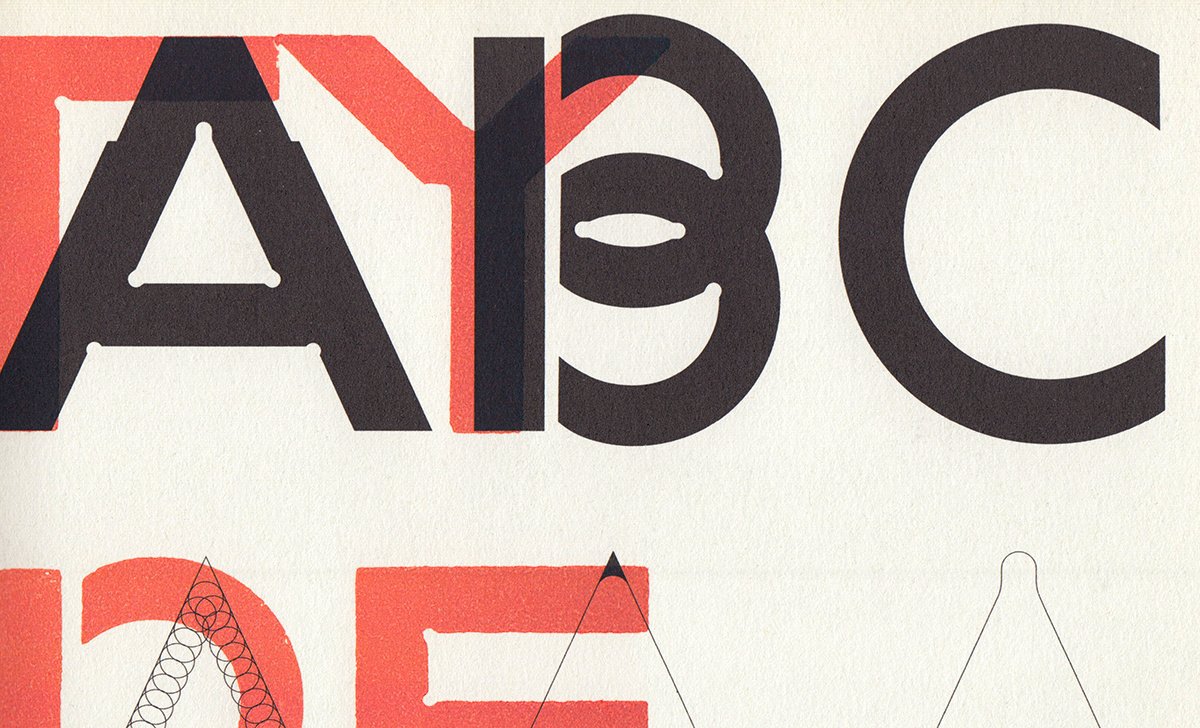
Our student project was a series of posters for music events. To design these posters we decided to develop our own tools. First step: we programmed a script that could automatically generate typographic character sets based on a group of specified variables (A). Then, using a digital font created with this program, we made woodtypes (B) and an automatic layout tool (C). By combining these three tools, we typeset and printed the series of posters (D).
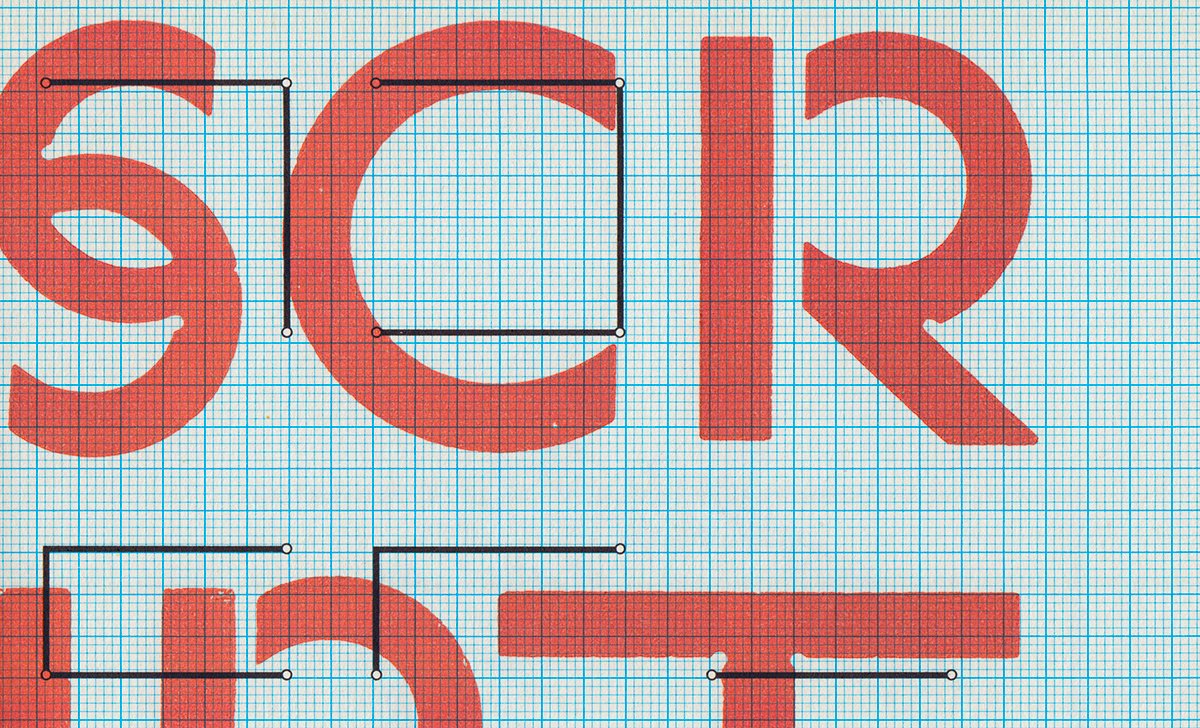
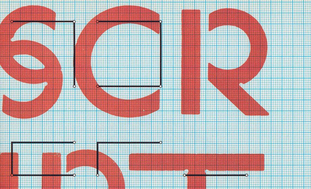
The typographic tool enables rapid, easy sketching of type sets. Its basic concept is a group of modular components and its specifications are taken from the order in which lines are drawn in calligraphy. These base components are then used by the program to generate all the letters of the alphabet. We also took into account the formal incoherencies, which nonetheless obeyed a common logic produced by the software. This gives the alphabet a trademark—a common style for each glyph—and suggests new formal solutions.
Using one of the fonts generated by our program to make woodtypes, our intention was to contrast different graphic languages. Wooden display type and letterpress printing have a significant aesthetic that we wanted to confront with that of a font derived from a programming language. The result displays traces of the digital and the analogue, the programmed and the random.
Associating manual and automatic actions is a recurring theme in our project: it can be found in the type design, the layout, and the printing. Interaction between these heterogeneous techniques produces a graphic identity, impossible to obtain with either traditional- or digital-only methods.
Script
This tool for creating typographic characters was initiated during an ECAL workshop by Frederik Berlaen in 2007 and subsequently developed and completed in 2008. As it stands, the tool was designed for experimental purposes and as such has almost no interface. It was written in the Python programming language.
For greater fleibility, and because programming was not the aim, it was combined with FontLab and RoboFab. The script was based on a modular system that follows the order of calligraphic strokes. It began from the naive idea that a font’s “DNA” was entirely contained in the letters “o” and “n,” and that from these two glyphs, a program could build the full Latin alphabet, since a typeface is actually made out of a limited set of shapes that are repeated in all of its characters.
The program first creates an entirely configurable template font. The letters’ width, weight, and contrast are specified digitally.
This font is then augmented and assembled using five base modules—two stems, two curved, one slanted—and four auxiliary modules. Once assembled, each module can be edited. Changes take place simultaneously throughout the entire alphabet: this enables a live preview of the effects of curve, serif, or stem changes on the overall font, in turn allowing for a more intuitive creation of typographic characters. The number of modules and their combinations can be changed at any time.

Typeface
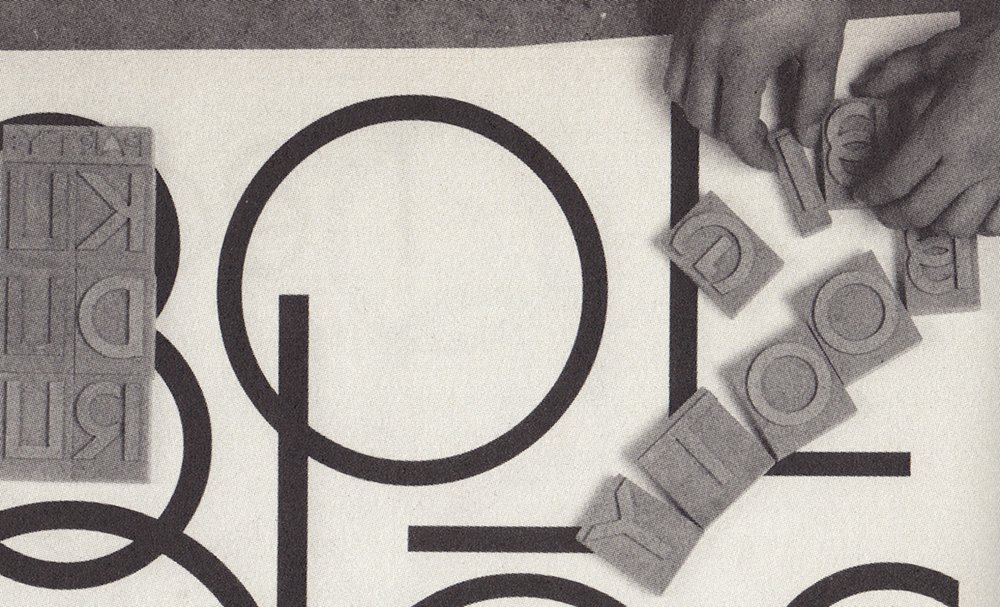
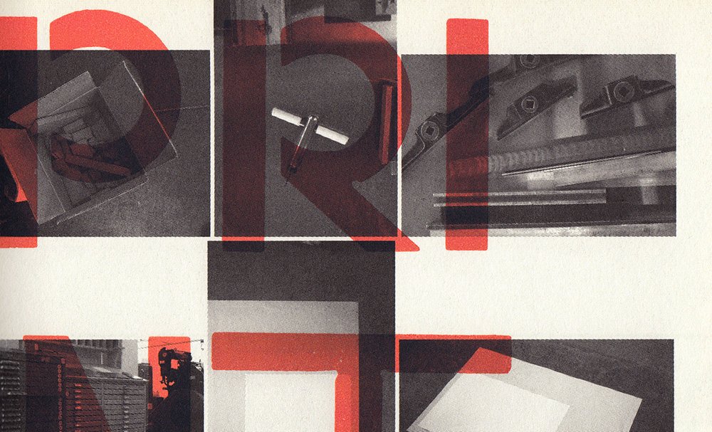
During the initial woodtype testing, we found that a 2mm drill bit was not fine enough to cut the inner angles. To avoid the letters becoming too black, we peformed some optical corrections. A new form emerged from these woodtype constraints. The letters were then cut with a CNC (Computer Numerical Controlled) machine out of 2mm plywood, hand finished, and sanded. Each letter was mounted on a block corresponding to the overall type height, and each block was then justified for correct type spacing. The leading of the setting was rather tight so letters could be assembled in a simpler, more straightforward way. Of course the leading and spacing could be increased using regular typographic spaces.
Layout
An automatic layout tool was developed using the Java language, in collaboration with Clément Gallet. Specifically designed for poster layouts, it too used sets of digital specifications. To ensure coherence between layout and type, the posters were based on the width, weight, and contrast parameters used earlier for the typeface tool.
Having a set of automatic layouts of the texts was beneficial: we could view them side by side with handset layouts of the woodtypes and compare the two methods, one digital and virtual, the other material and restrictive.
Print
The posters were printed in a studio with a proof press, a chase, and metal quoins.
Originally published in: ECAL/University of Art and Design Lausanne. With texts from Peter Bilak, Dimitri Bruni, Pierre Keller, David Keshavjee & Julien Tavelli, Jürg Lehni, François Rappo, Erik Spiekermann. Typeface as Program. JRP|Ringier, 2009.