Programme
Go to Programme page
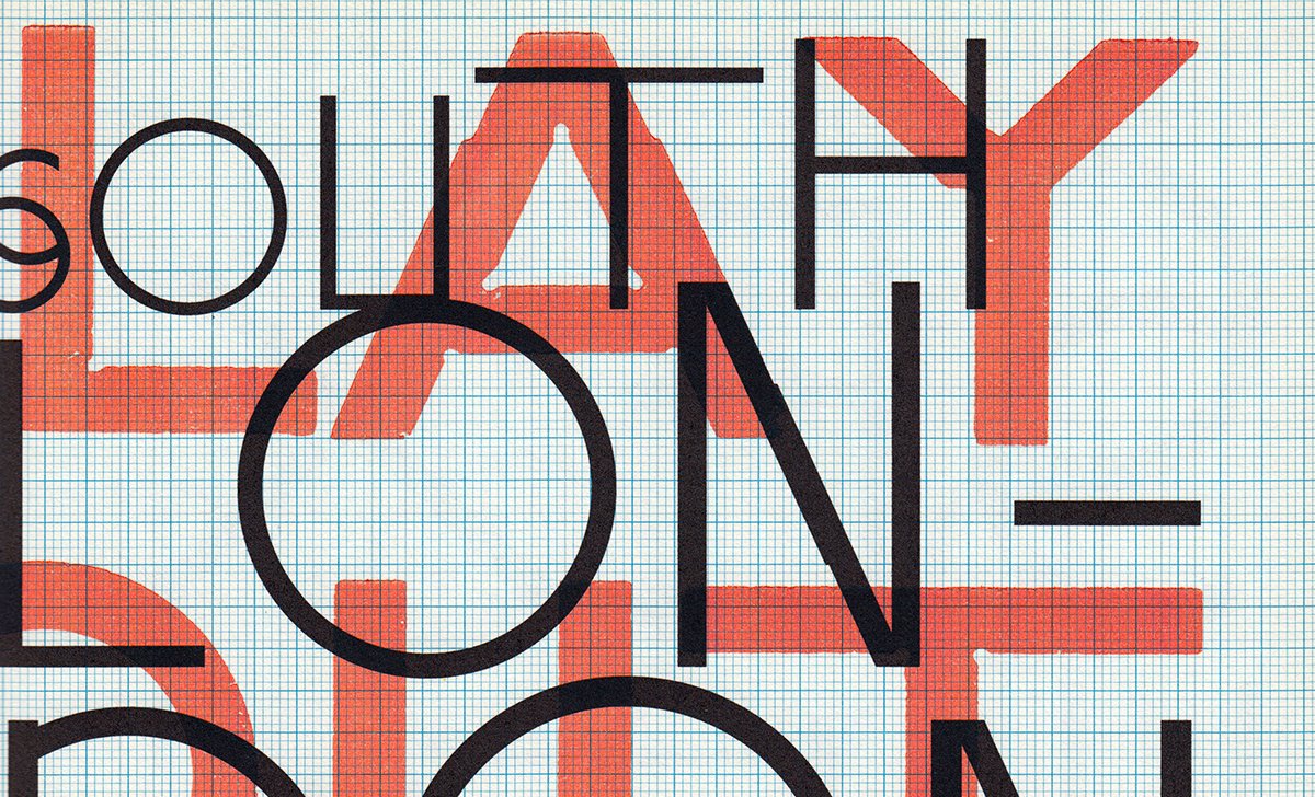
Programme, a seven-style suite of types from Berlin-based designers Julien Tavelli and David Keshavjee (sold by Optimo, and credited to Maximage Société Suisse) is a gorgeous series of forms giving a designer a full range of voices, from the staid tones of Swiss typography to some relatively bananas gestural forms reminiscent of Renner’s initial design for Futura.
Programme’s an odd bird in its creation: early versions were generated automatically by programmatic means—a script running on top of FontLab. The forms were then chosen and curated, honed into the Primitiv version, and, from there, further refined into the rest of the weights. There’s no rationale explicitly spelled out for the rotated versions, but there are clear visual connections explaining the concept nicely: the angle of the rotation is the first step in generating a look at the italics.
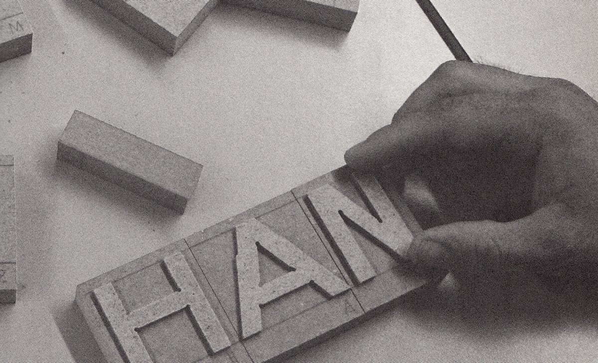
The family is lovely in that it slyly shows the influence of various lettermaking implements on the letter’s form. Primitiv is the family’s lightest version, a series of gestural letterforms—almost sketches—which show the basic geometries leading into other weights, and provides a look at the family’s skeletal structure. In that version, and in the family’s large collection of alternate forms, it is possible to see marks that would be made by chisel, by brush, by pen, and, of course, by computer.
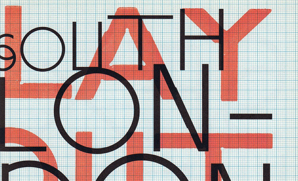
It’s interesting that a family of faces generated by such machine-driven, automatic processes would end up looking so… old. Some of the forms are pretty clearly calligraphic, some alternates come out of the process looking like remnants of archaic majuscule alphabets, and some are reminiscent of German Blackletter in the abrupt transition from curve to corner.
Programme, while begun via automatic means, is not an automatically-built typeface. Heaven knows every Junior Type Designer goes through an automatic phase, but this is not that. The basic ideas are wisely curated and sculpted into some truly beautiful and versatile forms. That makes this family of faces not an end result of a process, but a souvenir of a process—a fond reminder of where the family has been.
For more about the pair and their works, read Boris Meister’s interview with Tavelli and Keshavjee for Walker Art Center.
Originally published on Typographica.
