Stanley Stencil

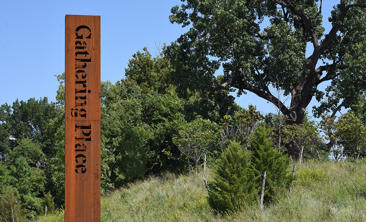
Stanley Stencil letters cut-out from weathered steel pylons.
In collaboration with the studio Project Projects (now Wkshps and IN-FO.CO), Optimo developed a custom stencil typeface intended for outdoor signage, specifically for use in the Gathering Place park in Tulsa, Oklahoma. The resulting typeface, Stanley Stencil, is based on Ludovic Balland’s Stanley.
Though sometimes referred to as the “Oil Capital of the World,” a lesser known aspect of Tulsa is that the city has significant acreage dedicated to park space. One of the city’s most impressive civic projects to have been implemented in recent years is Gathering Place, a 100-acre park located along Tulsa’s scenic Arkansas River waterfront. Principally funded by the George Kaiser Family Foundation with contributions from more than eighty corporate and philanthropic organizations, the park was designed by the renowned landscape architect firm Michael Van Valkenburgh Associates with input from the local community.
With the aim of improving the existing infrastructure and diversifying the ecology of this waterfront site, the new park design transformed a flat, windblown, and sun-baked terrain into a playful topography with subtle changes in elevation, refreshing water ponds, and a broad range of native ecologies.[]As the topography subdivides this massive site into a series of smaller spaces, it was important to implement a signage and a wayfinding system to navigate the park and its featured attractions. Project Projects was contacted by their long-time collaborator, Michael Van Valkenburgh Associates, from the very outset of the Gathering Place project, for which they collaborated on a competition entry—an entry which would eventually award their design team the commission.[]From their six-year involvement on the project, Project Projects recalls the main challenge: “The scale—it’s a massive park! Even trying to understand how signage would fit into this landscape was hard to envision at first. Also its location in Tulsa, Oklahoma. We had never been there before the project. Tulsa is a unique city in the United States with its specific landscape and telling history.”
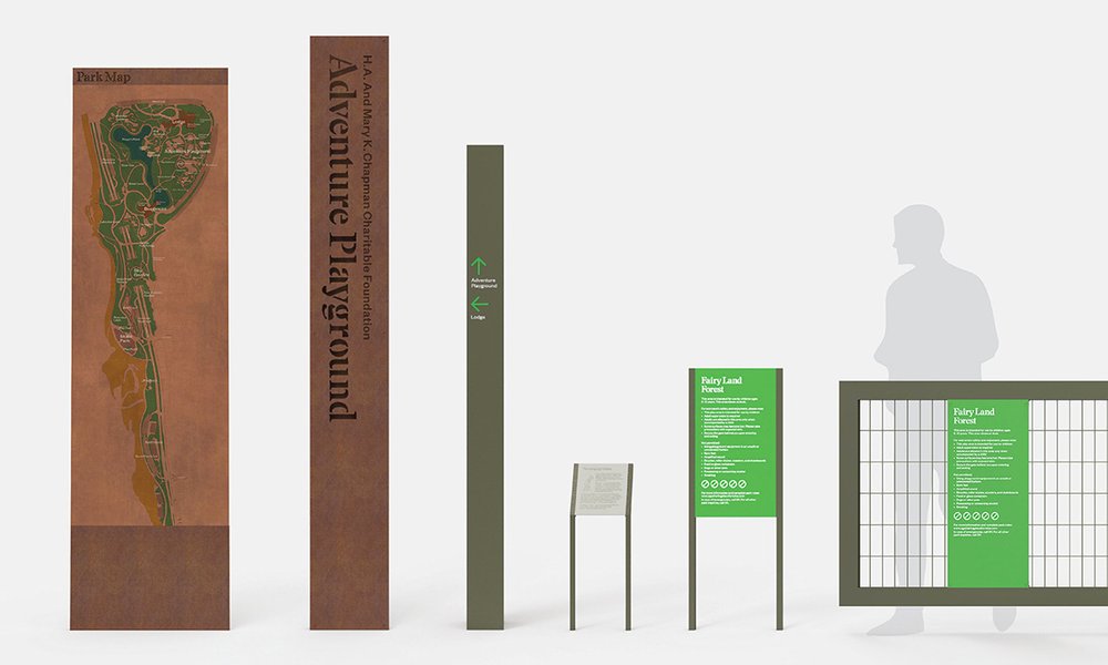
Mockup from Project Projects presenting the wayfinding system. Encoded with material, color, and size the signs provide information for orientation, park rules, and activities.
Project Projects’s process focuses on understanding the project within the broader civic and social fabrics. For the Gathering Place, they studied the landscape design to understand how wayfinding and signage could complement the design and provide visitors with a meaningful experience of the space. Their design translates these contextual and project-related cues into a typographic and compositional approach that feels embedded within the context. Encoded with material, color, and size the signs provide information for orientation, park rules, and activities. The palette of the signage, which includes rust, olive, and bright green, complements the natural sandstone found in the Oklahoma region—one of the largest rock quarries in the state is located near the Gathering Place and it was from there that 20,000 tons of sandstone were sourced for the park. They also wanted to use large-scale steel as the primary signage material—a material that would evoke Tulsa’s industrial history (the oil industry is a mainstay of its economy) while also providing a permanent marker in the landscape.
“The idea to have a contemporary and ‘sharp’ serif typeface to form the core of the typographic system arose in the very early stages of our design process,” Project Projects notes. The studio contacted Optimo in November 2016 with the intention of using the Stanley typeface in the Gathering Place’s wayfinding system, as they thought the typeface would “create an immediate differentiation from other park signage, where modern sans-serif typefaces are widely used.” Inspired by Times New Roman, one of the most important and enduring typefaces of the twentieth century, Ludovic Balland designed Stanley. The typeface presents sharp, angular shapes that give a contemporary edge to the project while preserving the essential qualities of its inspiration source. The typeface’s drawing is characterized by wide and honed counter-forms, as well as short ascenders and descenders. In addition, the graphic shape of the serifs provides a distinctive feature.

All sharp endings and acute angles were avoided by substituting them with squared or obtuse shapes for safety considerations (i.e. protecting the fingers of curious park visitors).
The idea to develop a stencil font came up during Project Project's design process. The studio considers the stencil to be “a nod to Tulsa’s industrial history,” and thinks it “establishes a look of process: raw and easily applied.” Since one of the primary types of signs was designed to have letters cut out from weathered steel pylons, such that the hollow interior would be visible through the perforations, the creation of a stencil version of Stanley became a necessity. Project Projects then inquired about customization. Navigating through several technical requirements that would ensure structural integrity of the letters as well respect safety regulations and maintain the spirit of the original drawing, Ludovic Balland involved himself in the process of customization. He explored an extensive number of letterforms and considered a wide range of sizes for the stencil version. Finally, a weight (bold) and a type size (a cap height of 4 inches) were decided upon and served to define the appropriate size of the bridge (1/4 inch)—the stencil letters had to be able to support themselves when cut into metal panels. Balland also managed to avoid all sharp endings and acute angles by substituting them with squared or obtuse shapes for safety considerations (i.e. protecting the fingers of curious park visitors). The customized typeface includes uppercase and lowercase letters as well as standard English and Spanish punctuation marks. The customized typeface was also used on other types of signs throughout Gathering Place, creating a nice coherence throughout the wayfinding system.

The customized typeface includes uppercase and lowercase letters.
The USA Today Readers’ Choice Awards named Gathering Place the Best New Attraction in the United States in 2018, and the park earned a spot on both Time Magazine’s list of The World’s 100 Greatest Places in 2019 and National Geographic’s list of 12 Mind-Bending Playgrounds Around the World.[]Since its opening Gathering Place has been widely acclaimed and Optimo is glad to have had the opportunity to contribute to the park’s success.
- 1
“Gathering Place,” Projects, Michael Van Valkenburgh Associates Inc.
- 2
The Project Projects’s team working on Gathering Place included: Prem Krishnamurthy, Chris Wu, Shannon Harvey, Yoon-Young Chai, Corey Di Stasio, Won Choi, Lauren Gideonse, and Katie Okamoto.
- 3
“Gathering Place Awards,” Award Winning Park, Gathering Place: Tulsa’s Riverfront Park.
Stanley Stencil letters cut-out from weathered steel pylons.

Mockup from Project Projects presenting the wayfinding system. Encoded with material, color, and size the signs provide information for orientation, park rules, and activities.
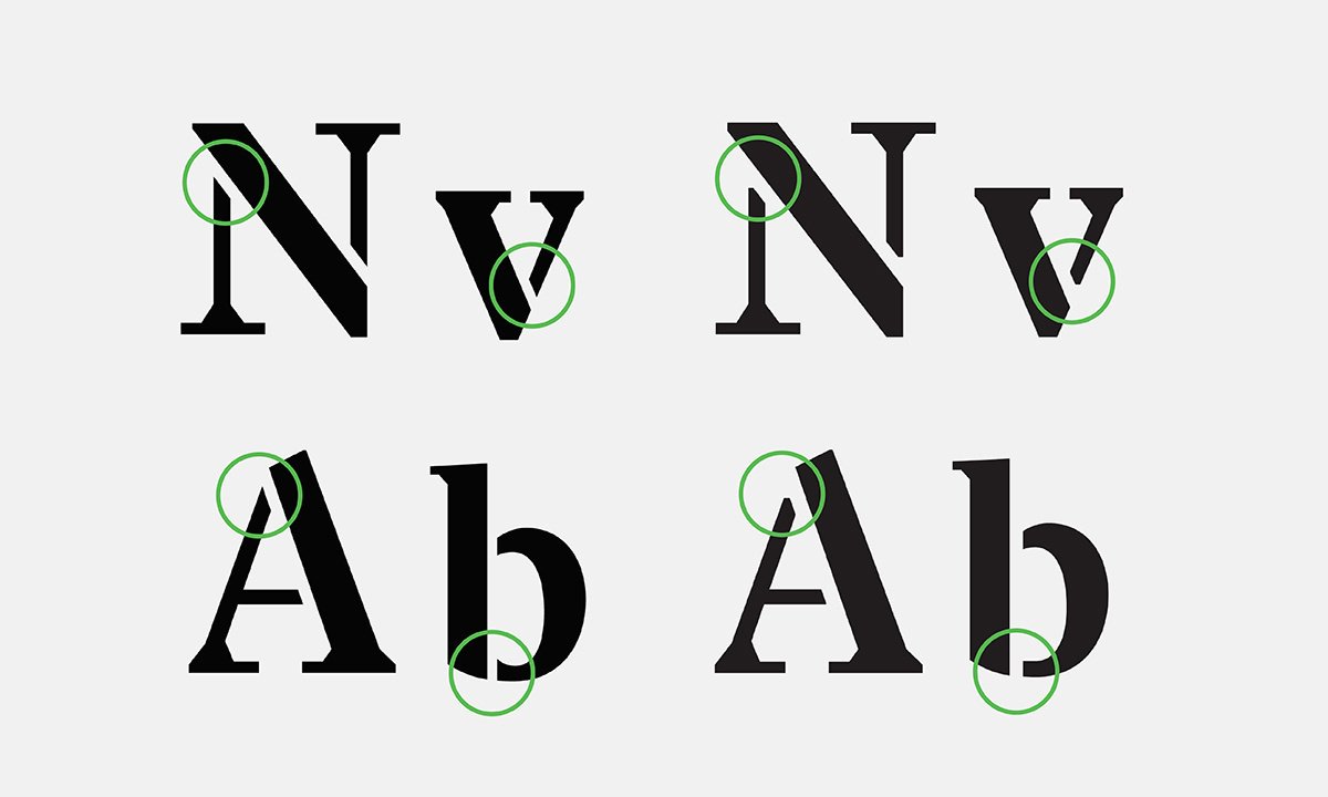
All sharp endings and acute angles were avoided by substituting them with squared or obtuse shapes for safety considerations (i.e. protecting the fingers of curious park visitors).
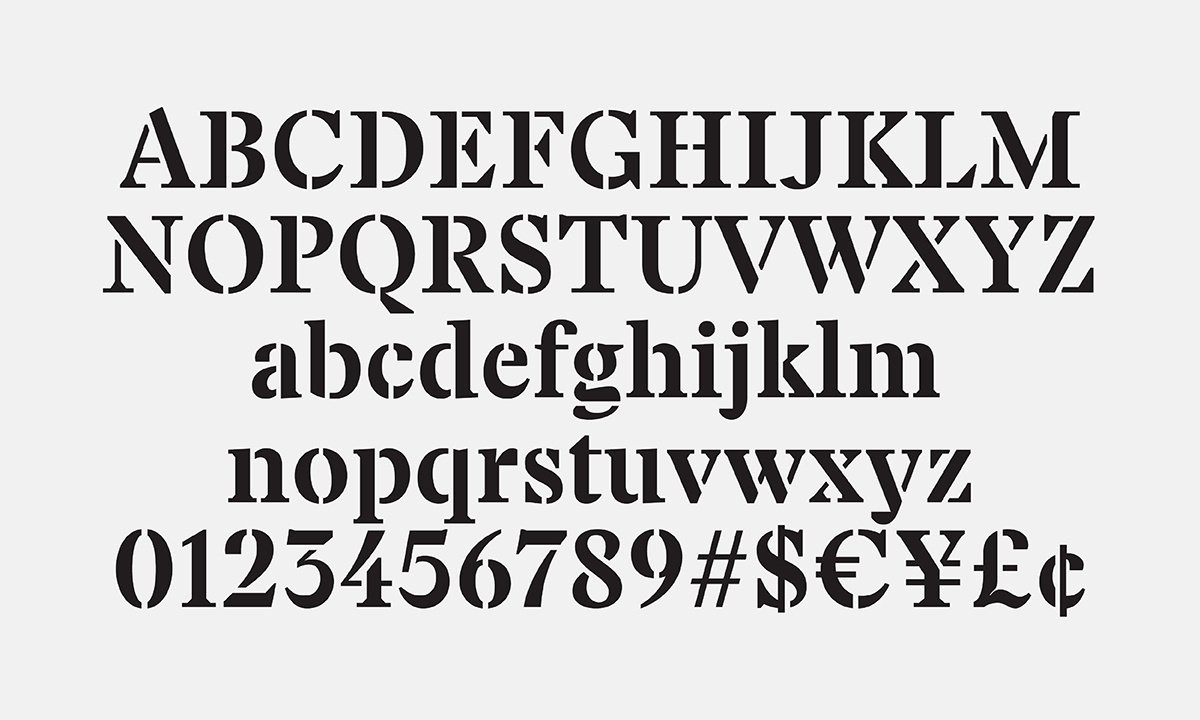
The customized typeface includes uppercase and lowercase letters.
