Team’77
Go to Signa Set pageTeam’77: a name which has left a lasting impression on Swiss and international typographic design. Team’77 demonstrates remarkable originality in the field of design: the originality of a creative collective that brought together three leading designers—Erich Gschwind, André Gürtler and Christian Mengelt; the originality of a broad field of activity which includes the creation of typefaces, graphic design and design education—to which should also be added a long and important series of publications on lettering, the media, pedagogy and graphic experimentation.
The three designers have been active in the field of typography and graphics for more than four decades.
Erich Gschwind, André Gürtler and Christian Mengelt studied at the Schule für Gestaltung (SfG) Basel under Armin Hofmann, Emil Ruder and Theo Ballmer. Christian Mengelt had earlier also been a student of Walter Käch.
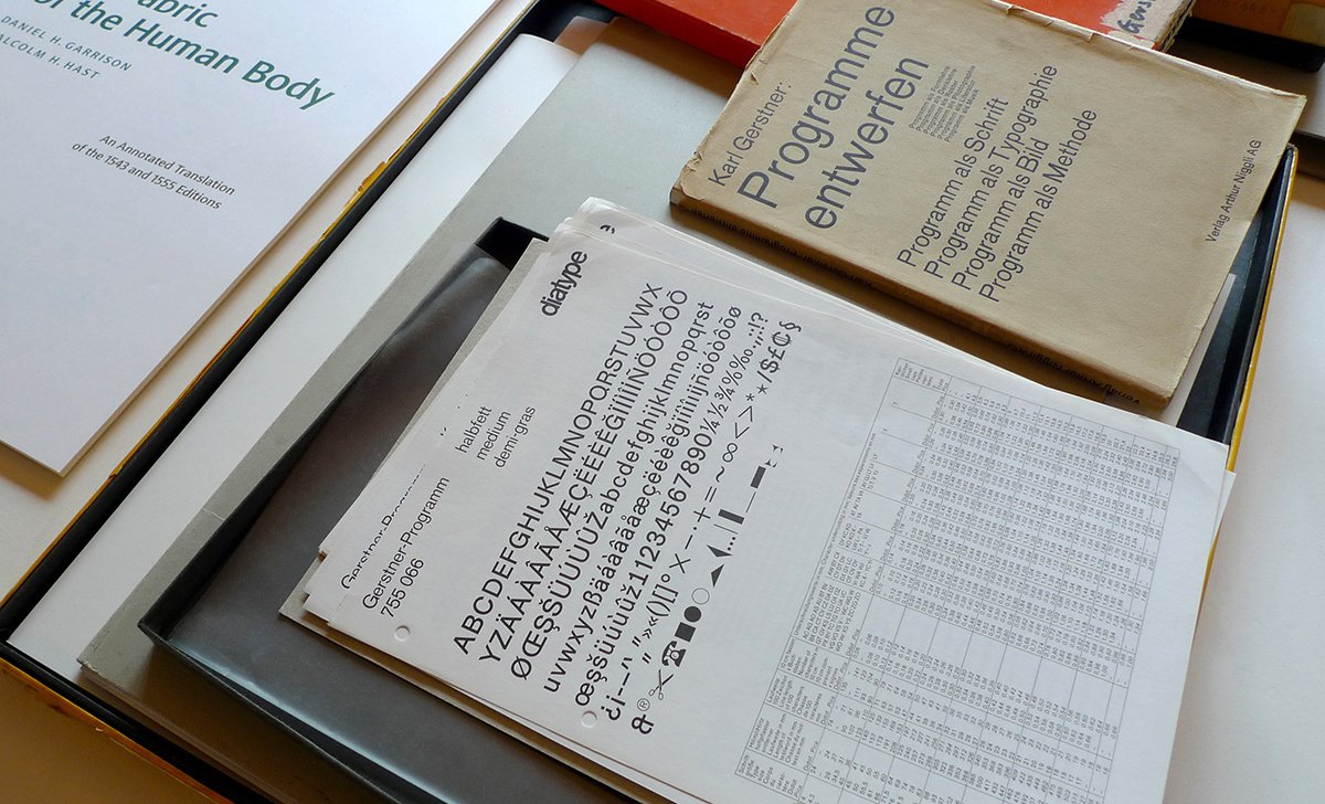
In 1974, André Gürtler and Christian Mengelt founded the Letterform Research & Design Team, combining their experience in the field of typographic design. They had already collaborated closely on some of the projects now considered among the key milestones of contemporary typography. One such project is the Gerstner Programm typeface, a very graphic sans serif that Christian Mengelt developed with Karl Gerstner and Günter Gerhard Lange in the mid-1960s. Exploring the potential of the new possibilities offered by photocomposition opened up new avenues, such as typographic creations like Concorde (after 1961) or Roissy (in 1970), which André Gürtler conceived with Adrian Frutiger in Paris, or the project for Egyptian 505 that André Gürtler developed with a class of students at the SfG Basel in 1966.
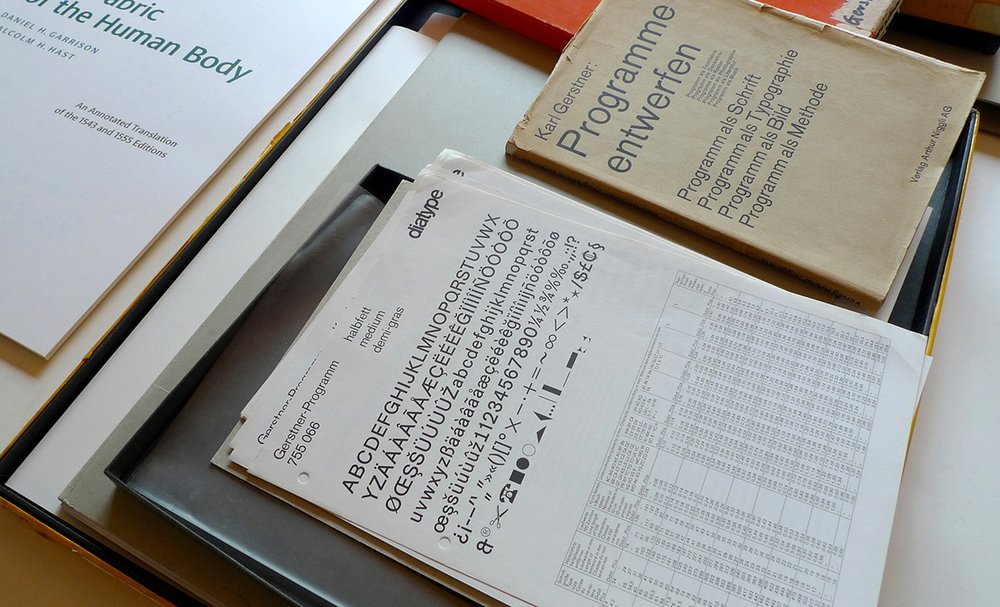
Detail of the “Gerstner Programm” typeface project from Christian Mengelt’s personal archive. Photo: Louise Paradis.
In 1977, Erich Gschwind joined the Letterform Research & Design Team; prior to this he had gained considerable experience as a graphic designer in the field of scientific publishing and corporate identity design.
From that time onwards, Team’77’s typographic creations were to be characterized by their modernist approach and by their quest for formal innovations: a design comprised of clarity, of objectivity, and of the organic unity of the illustrations and graphic compositions—which the team would raise to a new level of optical quality. It was an innovative approach that drew inspiration from the most contemporary aesthetic values: dynamism and rhythm, and the desire to update the humanist tradition of the printed word. Another factor which is equally characteristic of the approach of Team’77 is their constant integration of technological innovations into their graphic projects. At first the integration of photocomposition, then of digital illustration, from the first idea through to the creation of the typefaces.
These are the features which constitute the typical “signature” of the projects of Team’77, allowing them establish a new standard in the field of contemporary typography.
Both André Gürtler and Christian Mengelt have always associated their design work with their teaching—considering them to be mutually beneficial activities. They taught at the SfG Basel, in the ATypI (Association Typographique Internationale) and then in numerous seminars, conferences and workshops in Europe, the United States and Mexico.
It was in their capacity as a collective of independent designers that Team’77 carried out a first series of industrial contracts for Compugraphic Corporation in the United States beginning in 1974: the Cyrilic Gothic project and a display typeface, Alpin Gothic.

Detail from the article Media, A New Typeface for Photo-typesetting published in the Typografische Monatsblätter, nr. 8/9, 1977.
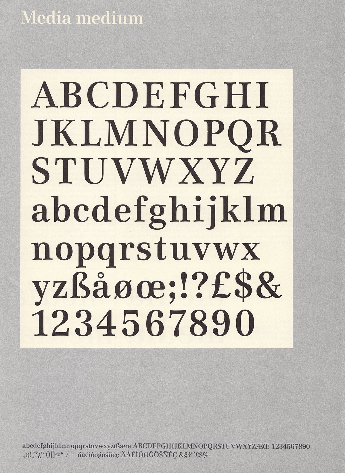
The team then began working with Bobst Graphic in Lausanne (associated with Autologic in the US), a company whose area of expertise is specialized printing machines. Bobst Graphic was keen to branch out into a new sector of activity and to begin producing typefaces in addition to its work on technological innovations. Team’77 adapted a number of fonts and in 1976 thought up Media, a typeface specifically for the press which incorporates a new optical quality for all of its different styles, both Roman and italic type. Then, in 1978, the Signa font, the starting point for an innovative linear typeface: a modern humanist sans serif. Christian Mengelt was then to continue working on this typographic aesthetic when he developed the Sinova typeface, released in 2010.
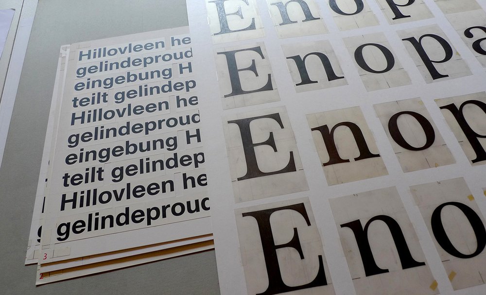
Detail of “Unica” and “Media” typeface projects from Christian Mengelt’s personal archive. Photo: Louise Paradis.
The team’s creative work has often had an international dimension; for example, in 1977 it designed the Avant Garde Oblique set for Aaron Burns and Herb Lubalin’s International Typeface Corporation.
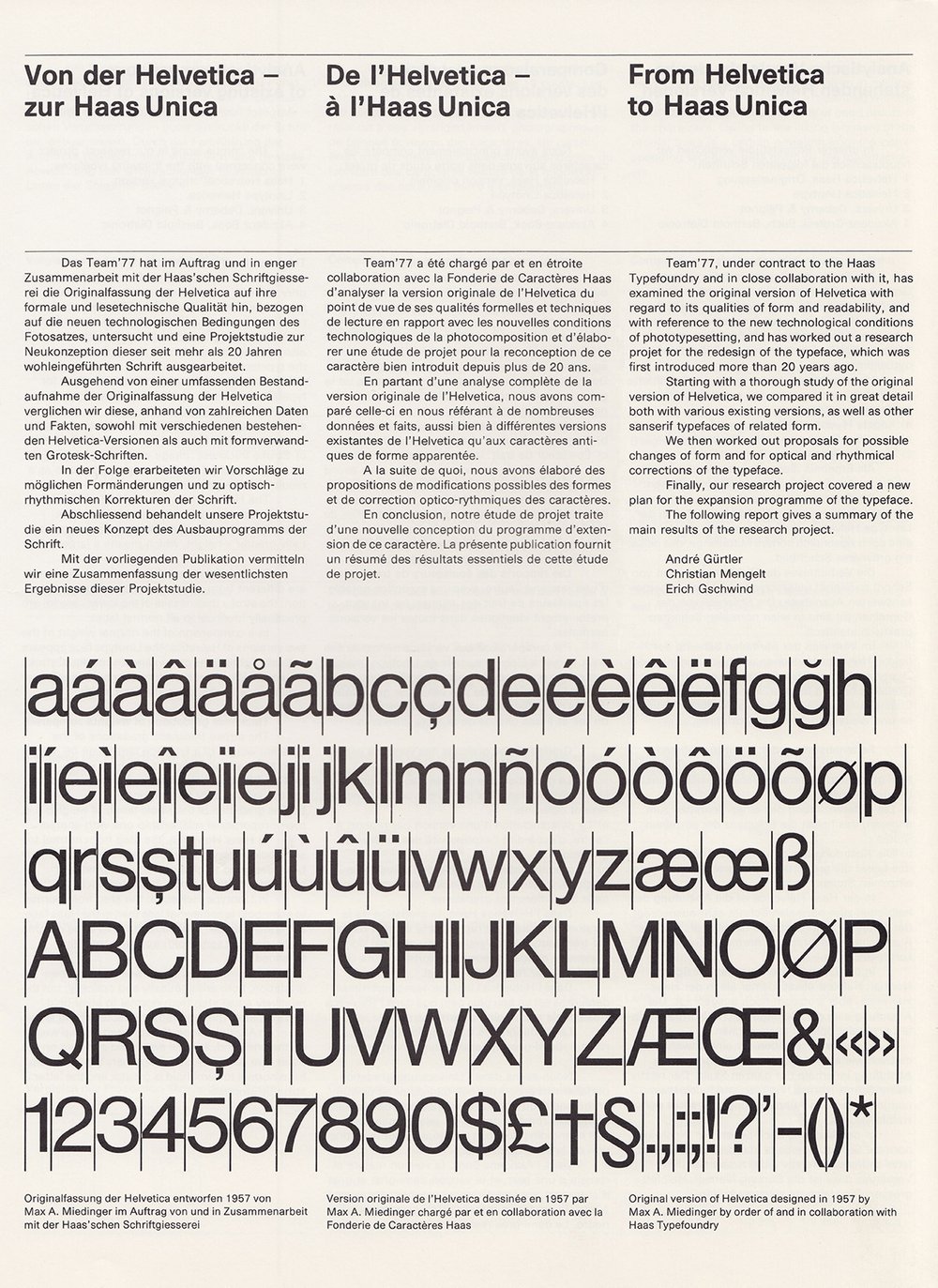
Detail from the article From Helvetica to Haas Unica published in the Typografische Monatsblätter, nr. 4, 1980.
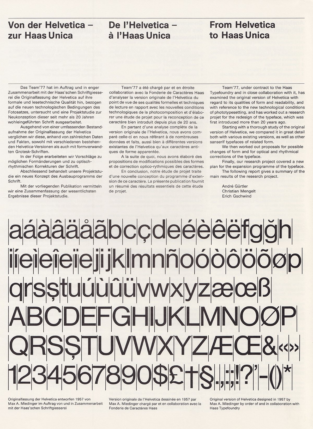
The Haas foundry in Basel, which has been active in the typographic industry for almost four centuries, first collaborated with André Gürtler on a project to design a contemporary Didone, Basilia (1978). It then commissioned from Team’77 a study for a new sans serif adapted to photocomposition. The three designers developed a sans serif which suited the possibilities offered by the new technology. They enhanced the graphic qualities which were already to be found in the fonts created by the Haas foundry during the “hot type” period, such as the famous Helvetica. When the new sans-serif Unica appeared in 1980, it appeared to be the final improvement, the ultimate finishing touch brought to several innovations begun in the 1950s in the field of the “new sans serifs”. It was a typographic style understood throughout the world as integral to the International Style, or Swiss Style. In the context of the 1980s, a period which from our contemporary point of view now seems to be the era of a fundamental transformation of the strictly industrial production of typography, Unica immediately enjoyed broad recognition, most notably from avant-garde graphic designers such as the Octavo group in the UK. In recent years the typeface has gained adepts among young designers of the digital era. And even more recently, in early 2015, the “post-industrial” foundries, now online and digital, have offered to publish the typeface—certainly a cause for pride. Media has also aroused similar interest, and will also soon be available in a digital version.
From 2011 to 2014, Erich Gschwind and Christian Mengelt were engaged in a complex project: a new scientific edition in English of the anatomical treatise by Andreas Vesalius (1514–1564), The Fabric of the Human Body, for Karger Publishers in Basel. Christian Mengelt designed, this time entirely digitally, modern typefaces for both Greek and Latin alphabets inspired by historical types: Basel Antiqua. Erich Gschwind was responsible for the complex typographic design of the work, which logically combines the two creations of Christian Mengelt: the new Basel Antiqua and Sinova typefaces.
The typographic œuvre of the three designers of Team’77 represents an integral part in a pivotal moment for visual creation in Switzerland. A period full of challenges both aesthetic and technical in which we still find ourselves today: the challenge of the ongoing development in communications and its importance in our global society; the challenge of the new technologies associated with it; the challenge faced by designers who need to envisage graphic solutions which can respond to, or can even anticipate, the visual needs of our time.
Team’77 is creatively involved in these new developments, and as a collective of independent designers they have translated these new impulses into memorable typographic solutions; it is for this reason that their creations are so captivating. Their typography work is now admired by several generations of graphic designers. It is this creative production which has today earned them the award granted by the Federal Office for Culture.
Originally published in: Swiss Grand Award for Design 2015.
Detail of the “Gerstner Programm” typeface project from Christian Mengelt’s personal archive. Photo: Louise Paradis.

Detail of “Unica” and “Media” typeface projects from Christian Mengelt’s personal archive. Photo: Louise Paradis.