Twentieth-Century Type Design in Switzerland: A Full Rhythmical Experience
Detail from the book 100 Years of Swiss Graphic Design, edited by Museum für Gestaltung Zürich and published by Lars Müller Publishers, 2013.
In the regularity of our heart and pulse beats, in our breathing. []
Twentieth-century Swiss typography has assumed iconic status in the history of graphic design, at times even developing into a generic, universal model, as is the case of Helvetica or Univers, which have become veritable hallmarks of modernism. This publication aims to position this production within a longer time frame as it appreciates the diversity of those aesthetic approaches that have defined the “visible language” of international communication. This text focuses on the creation of body types that are meant to transmit dense information and suitable for both continuous reading text and serial production. This is distinguished from display types, intended for graphic expression, sometimes produced as a one-off design for a poster, a book cover, or a specific architectural project.[]
The situation facing typography at the start of the twentieth century resembles the final pages of a chapter that could be added to Sigfried Giedion’s book on the long history of the mechanization of writing, Mechanization Takes Command:[]mechanization of typesetting, mechanization of letter engraving, previously manual; mechanization, as well, of more individual writing practices, thanks to the typewriter. Having become industrial and mechanized, typography nonetheless remained a complex cultural creation, only partially determined by the technical conditions of its (re)production. Furthermore, at the turn of the century, industrial type foundries immediately succeeded in integrating the aesthetics of a return to experimental artisanship, spearheaded by the private press and the Arts and Crafts movement.[]
International Flair: The Werkbündler
Writing, drawing, engraving, in calligraphy, in typography, “around 1900”—an art and a profession. Or on the cusp of becoming both art and profession. From 1912 to 1916 and following, sections concentrating on very specific disciplines were set up in Swiss art schools, dedicated to teaching “applied art,” widely promoted by the regional sections of the Werkbund (SWB, OEV). The Werkbund fostered a network of contacts in northern Europe, linking experimentation and innovations in architecture and the applied arts. It was also a key player in “transferring” these models into art schools and markets. A number of the central projects for typographical renewal that emerged at this time were directly linked to major Werkbund artists.[]
Invigorated by this dynamism, Alfred Altherr, who was appointed director of the Gewerbeschule Zürich in 1912, launched an exceptional pedagogical program. The teaching staff included, inter alia, figures such as Ernst Keller or Sophie Taeuber. Altherr disseminated publications by Morris & Co., and proposed that these works be purchased for the school’s collections.[]Immediately after the end of the war, making ample use of the Werkbund network, he invited Fritz Helmut Ehmcke, a visiting professor at several Kunstgewerbeschulen, applied arts schools, in the German-speaking world, to teach for a year. Altherr also proposed that the specialized course in letter drawing include classes by Rudolf von Larisch, who taught calligraphy in Vienna, and by Anna Simons, a former student of Edward Johnston in London.[]Simons was an ambassador for the efficient didactic model embodied in Johnston’s calligraphy, which was simple, practiced with a broad nib pen, and focused on working with large formats; she taught in a large number of applied art schools, notably in Weimar at the invitation of Henry van de Velde. This packed teaching schedule and the brevity of the individual sessions may appear surprising. However it seems reasonable to conclude that these classes were among the main forces that drove the calligraphic renaissance, and that the students who attended them proved particularly receptive. That was the case for Walter Käch, who joined F. H. Ehmcke as an assistant in Munich before teaching in the arts and crafts department of the Kunstgewerbeschule Zürich from 1925 on. Alfred Willimann also began to teach at the Kunstgewerbeschule in 1929.[]Instruction in lettering thus took on particular importance in Zurich, assuming a much greater role than was generally the case in applied arts schools in Switzerland.
Detail from the book 100 Years of Swiss Graphic Design, edited by Museum für Gestaltung Zürich and published by Lars Müller Publishers, 2013.
The Typography Foundry
In the twentieth century, the Haas’sche Schriftgiesserei AG (Haas Typefoundry Ltd.) in Münchenstein, Basel was heir to an unbroken tradition reaching back almost four hundred years. Its corporate culture makes it emblematic of the history of typography in Basel and in Switzerland.[]In the twenties and thirties, impetus for its new creations stemmed from Edmund Thiele, “one of the last creative type cutters.”[]Thiele designed a Bodoni (1924) that completed the range of modern Neoclassical typefaces offered by the foundry. He also modernized part of the historical legacy, with the remarkable Haas Caslon, derived from historical matrices, and Nürnberger Schwabacher, based on matrices that the young Johann Wilhelm Haas brought to Nurnberg in 1718 to what at that time was still known as the Genatsche Offizin (Genath). This historicizing program should be seen in the context of other historicizing movements focused on typography in book design, such as work by Emil Ruder, a student in Zurich in 1940.[]Thiele developed modern display faces, narrow and elegantly modeled: Superba and its Egyptian version, Commercial Grotesk.
Private presses had been a typographic testing ground in the United Kingdom, the United States, and in Germany,[]but they did not possess the same importance in Switzerland. Giovanni Mardersteig was, of course, active in Montagnola until 1927; his circle of collaborators included Stanley Morison in London and Charles Malin in Paris. The private press developed by Hans Vollenweider in 1919 should also be mentioned here: he had a highly humanist rotunda designed for it by Walter Schneider, cut and cast by the Haas foundry for his publications, conceived in the spirit of William Morris.[]
Calligraphic Renewal and Modernism
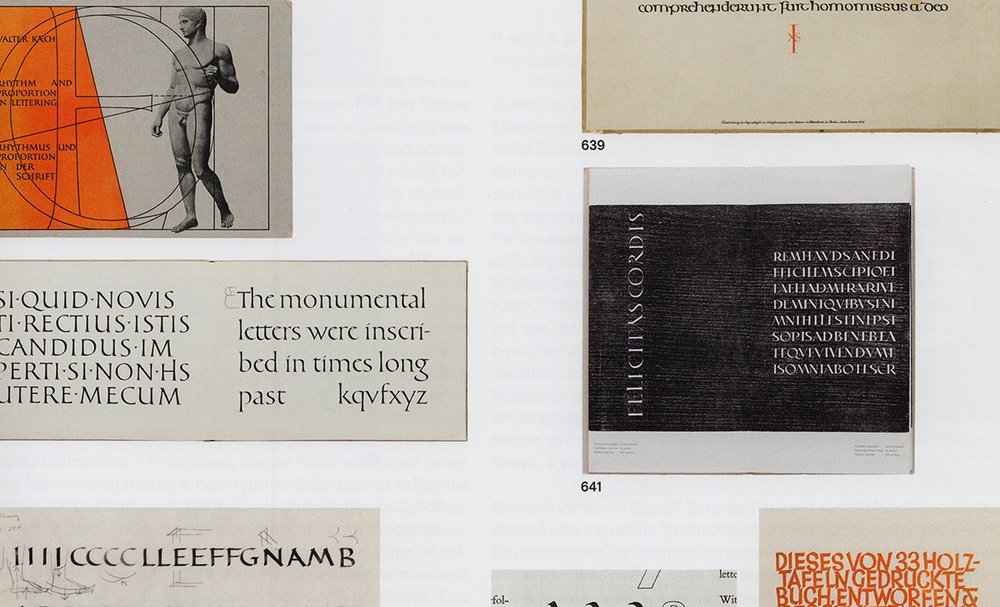
The hallmark of the Swiss graphic design world of the thirties and forties, which formed the backdrop to reception of the “neue Schriftbewegung,” the new type movement, was originality: it was receptive to modernism, to new visual, Constructivist, and photographic languages, imbuing letter-drawing, found in all media formats, with distinctive characteristics and impetus. This stylistic evolution can be traced from a highly elaborate “Johnston-style” uncial to the sans serif for posters by Walter Käch, and to the astonishing montage that Willimann designed for the cover of Verner von Heidenstam’s Als die Kastanien blühten. It was a synthesis of gestural expression and optical construction.
Parallel to this creative work, Käch’s teaching afforded him an opportunity to put these experiments on a formal footing and to look back on the history of writing through this prism, enabling several generations of students to acquire a solid grasp of graphic and calligraphic tradition and developments. General awareness of Alfred Willimann’s teaching activity has only developed in the wake of recent publications.[]In contrast, Walter Käch published on an ongoing basis, inaugurating a new type of didactic and reflective literature in Switzerland: veritable treatises on the letter. In Schriften, Lettering, Ecritures,[]he proposes a bold link between the construction and proportions of hand-drawn letters and the rhythm of calligraphy; between the shape of serif letters formed with a broad nib pen and the modular strokes of lineale (sans-serif) typefaces. This organic and rational “image” of the letter, this liaison between the positive space of the letterforms and the negative space of counters, was to become the hallmark of typographic modernism. This was developed further by Walter Käch’s numerous students. Significantly, a specialized two-year “Schriftgrafiker” course[]for type designers was set up at the Kunstgewerbeschule Zürich.
Evolving Production at the Haas Typefoundry—A New Typographic Style
The postwar period saw an exceptional blossoming in the artistic development of the Haas foundry, headed by Eduard Hoffmann. Commissions to in-house and external typeface designers fundamentally transformed the foundry’s artistic culture, which was intimately linked to the most innovative tendencies and markets in typography for information systems and communication design.[]From 1948 to 1951 the foundry worked on development of a book face: Diethelm Antiqua (1948–51). Its designer, Walter J. Diethelm, talks of seeking to create a typeface for truly contemporary text, without historical references; the letterform drawings had been fine-tuned for cutting by 1942.[]The Diethelm typeface, one of the few types in this style produced by the foundry, and one of its rare modern book faces, comprises lowercase letters with a high x-height and very specific graphic solutions: pronounced curves, at times interrupted by spurs, which seem to anticipate the solutions deployed in today’s digital fonts.
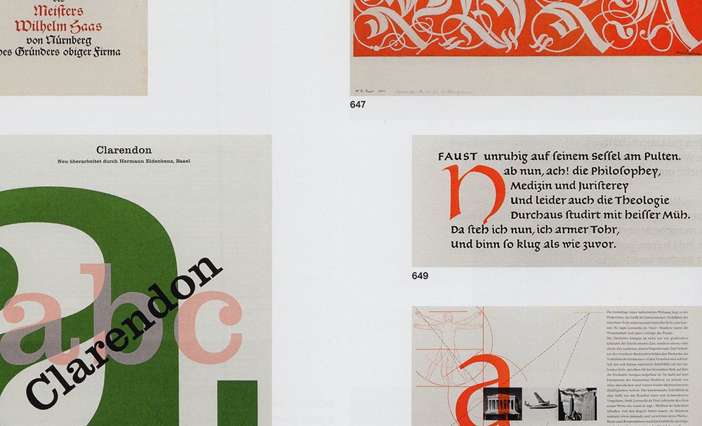
In 1952 this was followed by the publication of a reworked version of Clarendon, drawn by Hermann Eidenbenz, a talented type designer and a student of Ernst Keller and Walter Käch. In 1980, in the jubilee publication celebrating the four-hundredth anniversary of the Haas Typefoundry,[]Eidenbenz described the specifications for the redesign of this nineteenth-century type:
The type was to be redesigned from scratch:
The letters were to be given clearer forms,
Their widths were to be harmonized,
Overhangs caused by shading were to be avoided,
Uppercases should be made lighter and lowercases more solid;
Numbers and the &-sign should be made less massive,
Missing punctuation marks, ligatures and figures were to be created,
The new cut was to be more of an emphatic display type than the existing Egyptian (slab serif) and should therefore have a more forceful rhythm,
And, finally, in all this it was important to ensure that the characteristic features of a Clarendon were preserved.
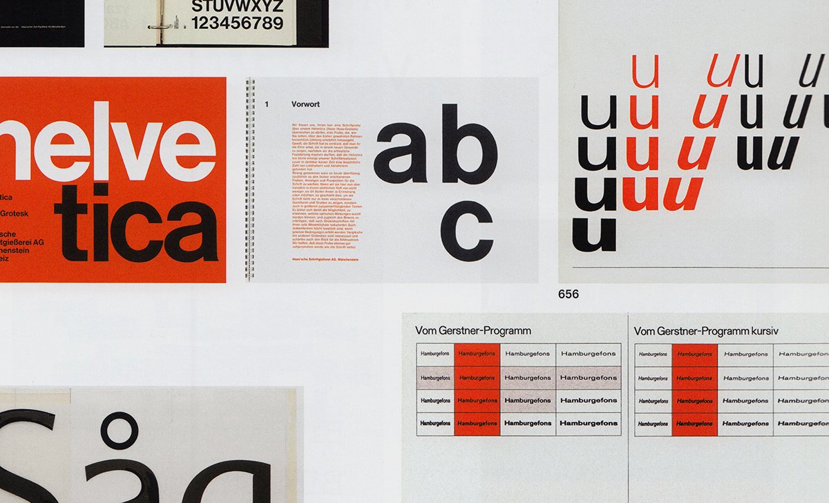
It was a program that led to the design of new typefaces with unprecedented overall optical balance: a new typographic style. These specifications are undoubtedly very similar to those drawn up in 1956 when Eduard Hoffmann commissioned Max A. Miedinger to design the Neue Haas Grotesk, renamed Helvetica in 1960. Rather than simply adapting Normal Grotesk to the changed demands of the era, Miedinger chose to expand the project to encompass a much broader scope. The original typeface would have the same hallmarks of optical balance, and a light, compact look for the ascenders and descenders. Its entire design, the definition of its organic curves (those of the original lowercase a, for example) is based on solutions comparable to those already proposed by Käch.[]Helvetica was exceptionally well received, combining as it did the ability to produce text surfaces of a particularly uniform typographic “color” at small point sizes, and high-quality letterform detailing, enabling logotype production. It helped define the profession of graphic designer, and has become a paradigm of modernist typography.[]The foundry’s output in the immediate postwar period also included display faces by Eugen and Max Lenz, and Bravo, a virtuoso script font by E. A. Neukomm.
Grotesk versus Antiqua? Sans serif versus serif? Haas’s production slotted into a specific “niche,” that of New Typography: sans-serif, Egyptian types for information systems and communication design. In the postwar period, until the development of phototypesetting in the sixties, most typography used in the world of book publishing in Switzerland was taken from the Monotype catalogue: preference was given to the Bembo, Baskerville, Van Dijck, Times series.[]There was some overlap between type design for publishing and for information systems, yet each had their own particular design brief. The famous polemical debate that pitted Max Bill against Jan Tschichold in 1946 can also be seen as a difference of opinion between two realms of typography: on the one hand, typography for information systems, the field of “graphic designers,” championed by Bill; and, on the other, typography as practiced by “Buchgestalter,” book designers, spearheaded by Tschichold.[]
In 1955, Max Caflisch, one of the leading figures in the art of book design, created a display face, Columna, a graphic and vigorously contemporary interpretation of Roman inscription capitals. The calligraphic, constructed, stencil-drawn, or illustrative alphabets that Imre and Hedwig Reiner published with Zollikofer in St. Gallen also stem from the universe of lettering and book design, as do the cover capitals that Walter Käch devised for the Walter Verlag publishing house.

Detail from the book 100 Years of Swiss Graphic Design, edited by Museum für Gestaltung Zürich and published by Lars Müller Publishers, 2013.
International Influence
Influenced perhaps by factors similar to those that shaped Haas’s creations, or indeed by the shared educational background of the type designers involved, another famous new sans serif also came into being during this period: Univers by Adrian Frutiger. The specific context of its development , however, was entirely different: the location, the Parisian foundry Deberny & Peignot, as well as the advanced technology of phototypesetting—everything about Univers sets it apart from the Haas foundry’s creations. Univers was conceived right from the outset as a typeface family with twenty-one weights for hot-metal type and phototypesetting, comprising an unprecedented range of weights and widths. The project’s pioneering originality is comparable to that of previous programs (such as ATF Cheltenham, also linked to a technological innovation, Linn Boyd Benton’s pantographic engraving machine).[]However, Univers defined an entirely new conception of typography thanks to the consistency and breadth of its optical variations, which would make it a key point of reference in type design. The typeface’s functional and aesthetic potential, as revealed in experiments by Emil Ruder[]or Hans-Rudolf Lutz,[]would become the paradigm for a new aesthetic emphasizing graphic appearance figs. 153, 184. Adrian Frutiger subsequently embarked on work to create an exceptional series of typefaces, including Méridien, a modern book type and a particularly elegant synthesis of Swiss modernism and Parisian inscription letters.
Paradigmatic Programs
The tenor of a manifesto—and a further milestone in typographic literature: Programme entwerfen (Designing Programmes) by Karl Gerstner.[]This “pro-programmatic” declaration, written in Ascona in 1963, established cross-references between typography and music, Concrete Art and literature. Composed in Monogrotesk 215 for the text and in Akzidenz Grotesk for the titles, this work explores the liaison embodied in historic Akzidenz Grotesk, championing its choices and technical innovations.[]It is in a sense a treatise on lettering, as well as a reflection on the era of optical systems, phototypesetting, and advertising agencies. Gerstner announced production of a typeface that would draw on the wide range of possibilities for type design opened up by the optical system used in the Diatype phototypesetting machine: Gerstner Programm, first developed by Christian Mengelt and Günter Gerhard Lange in two weights with the corresponding italics. Gerstner’s most remarkable work, published in 1972, is the Kompendium für Alphabeten (Compendium for Literates), a witty, technophile essay with a new semiotic emphasis, halfway between typography and Concrete poetry.[]
During this period in the early sixties, the accelerating pace of technological change stabilized (momentarily) as a result of the total dematerialization of typographic production, which had now become digital. Phototypesetting made it necessary to adapt catalogues, translating types “from lead to light.”[]This translation process had both advantages and drawbacks: Helvetica, adapted by the Stempel foundry (Schriftgiesserei D. Stempel AG), gained a broader spectrum of styles but lost much of its initial graphic identity. Initially, a new cut of the font was produced, Helvetica Plakat, and subsequently, in early 1980, its entire design was reworked, creating Helvetica Neue, inspired by the optical gradation of Univers and now used just as widely, while the characteristics of the famous Medium have disappeared. Linotype Corp. has very recently begun to offer a digital interpretation similar to the original version. This technological boom was echoed in the boom experienced by the mass media, with their expanding new audiences. The sixties gradually became steeped in new visual styles, characterized by a taste for even more organic and more dynamic typographies, or by a renewed interest in humanist letterforms.
Hans-Eduard Meier, who was also trained at the Kunstgewerbeschule Zürich, proposed a pioneering solution in Swiss typography, Syntax, melding sans-serif and Renaissance serif type. This sans-serif typeface was given a new haptic dimension by introducing a slight slope and distinctive curved forms. Walter Diethelm designed fonts in the style of stone inscription alphabets, Seta and Arrow. Jan Tschichold also created a typeface with an original blend of influences, Sabon. Moving beyond the Renaissance model, this type displays a whole host of dynamic, optical, and rational hallmarks of the sixties. The stringent specifications it fulfills (compatibility with all production systems, compatible width of the Roman and italic styles) also underscore the modernity of this body type.[]
Pop Culture, Corporate Design, and Phototypesetting
New players emerged within the carefully guarded preserve of typographic production: foundries that were phototypesetting “natives” without a historical typographic tradition, along with independent phototypesetting studios, which drew and published their own display types. Manual lettering thus also became a “readymade” available to graphic designers. Pop, illustration, eclecticism, retro style: easy-to-use new technologies provided an opportunity to publish context-specific, eclectic display types. Particularly worthy of note among this varied spectrum are the typefaces created by Walter Haettenschweiler;[]by Siegfried Odermatt, Antiqua Classica and Marabu; by Rosmarie Tissi, Sinaloa, Sonora, and Mindanao,[]produced by Englersatz AG; and Bernard Bavaud’s work, produced by Zipatone. These were often a direct extension of a logo or letterform design project.
The type Hans-Jürg Hunziker developed for the Centre Georges Pompidou is more complex: as an integral component in the visual identity designed by Jean Widmer / Ernst + Ursula Hiestand (VDA), it was conceived to respond to all the graphic needs of the fledgling institution—in signage, stationery, or publications. In a democratic and pop vein, this half-monospaced font draws its inspiration from the linearity of typewriter scripts. Hunziker also worked with Adrian Frutiger in Paris. The font displays slightly varying letter widths and has an organic, modernist twist. Corporate design gradually began to incorporate typography; nowadays this process has come to fruition with the spread of digital technology.
In the seventies, the Lausanne company Bobst, specialized in packaging machinery technology and manufacture and a new player in the field of typography, set up a phototypesetter manufacturing department. This was tied into an ambitious program producing original typefaces. Bobst Graphic involved international designers, launching its Lettre d’Or competition in 1978. Its catalogue would include Trinité by Bram De Does from the Netherlands, and two typefaces by designers André Gürtler, Erich Gschwind, and Christian Mengelt, who formed Team’77. André Gürtler, trained in Basel, also worked with Adrian Frutiger in Paris on projects such as Concorde and, later, Roissy, which would become Frutiger. Through these projects he contributed significantly to the development of a new type of humanist sans serif.[]
The typefaces designed by Team’77 share a high degree of optical balance, modernist fluidity, and formal innovation, as can be seen in a newspaper typeface, Media, or in a lightly serifed sans serif, Signa. Team’77 also produced oblique versions of Avant Garde Gothic for Aaron Burns and Herb Lubalin. This new graphic frame of reference developed by Team’77 is also reflected in one of the last industrial typographic projects in Switzerland: a new sans-serif typeface for phototypesetting, Unica, commissioned by the Haas foundry. This project combined the foundry’s tradition of grotesque typefaces and the new thinking on the visual appearance of printscript developed by Team’77.[]The Haas Unica combined these two elements, making the type, available in three weights and the corresponding italics (originally a broader range was planned), one of the most successful renditions of a modern grotesque.[]It was initially distributed to phototypesetting and digital markets, but the demise of the Haas foundry, subsequently taken over by Linotype, led to confusion about utilization rights for Unica. It is not currently included in digital catalogues but designers still opt to work with Unica today for large-scale communication campaigns and visual identity projects. During the same period, André Gürtler also devised Basilia for Haas, a classical Didone that nevertheless reflected the zeitgeist and displayed several of the typical traits of Team’77 fonts. This renewal of its catalogue and the launch of new collaborations, in particular with Aldo Novarese, constituted the last major projects of this centuries-old foundry.[]
Detail from the book 100 Years of Swiss Graphic Design, edited by Museum für Gestaltung Zürich and published by Lars Müller Publishers, 2013.
The Postindustrial Era
The period from 1980 to 1990 could be dubbed a watershed. It marked the end of the long industrial era of typographic production and the “transfer” of this production to designers, who established digital infrastructure on a smaller scale, producing their own fonts and distributing these directly to users. The Swiss graphic arts world, accustomed to high standards, with phototypesetting playing a vital role, began to make this transition only very gradually.
The École polytechnique fédérale de Lausanne (EPFL) was, however, the hub for the European research program Didot,[]led by Jacques André and Roger D. Hersch. Bringing together a range of universities, schools, and designers, the program focused on devising algorithms for digital typography. Gürtler began teaching at the Schule für Gestaltung Basel (formerly Allgemeine Gewerbeschule Basel, AGS) in 1960, and was joined in 1970 by Christian Mengelt, presenting courses on “production-oriented” type design and typography. The school incorporated computer-based design and typesetting into its syllabus in 1984.[]Some of the first designers of the digital generation emerged from these courses: Felix Arnold, Sibylle Hagmann, Ludovic Balland, and Bruno Maag, who specialized in corporate typefaces, with his clients including BMW, Toyota, and a number of Swiss firms.
In Paris, the Atelier national de création typographique was directed in the nineties by Peter Keller from Basel; Hans-Jürg Hunziker also taught there, as Jean Widmer had done previously—and this was the setting within which André Baldinger designed an experimental type, Newut.[]His working method was still rooted in the phototypesetting era, and he fine-tuned his design in large-format drawings, but the font production was digitalized.
An entire generation of type designers, in some cases trained in lettering, in other instances without this background, discovered the new playground offered by digital tools. Access to powerful, inexpensive typographic software opened up the formerly exclusive realm of typography, making it accessible for all forms of visual communication. Cause or effect, “postmodernist” aesthetics nourished and legitimated an incredibly varied range of graphic improvisation.[]A generation of outsiders and newcomers shook up a traditionally prescriptive domain. For a while, typography seemed to be split between old-school and modern approaches, while at the same time gaining a new audience. Readymades, improvisation, vernacular style, techno-parody, and neo-Constructivism are just some of the topics running through this work: Moonbase Alpha and Magda by Cornel Windlin, Normetica by Dimitri Bruni and Manuel Krebs from the Norm studio, Tatami by Büro Destruct, Container by Stephan Müller,[]Detroit and Autologic by Gilles Gavillet and David Rust,[]to cite just a few. Digital lettering (although the body/display distinction was consciously suspended for a time) became a branding hallmark, a signature.[]Perhaps the most fitting economic model to describe this emergent typography could be borrowed from the world of pop music: the first digital online “foundries” saw the light of day in Switzerland around this new form of typographic culture and its audience. Examples include Lineto in Zurich and Optimo in Geneva. The three steps of creation, production, and distribution formed part of one single design project in these new enterprises.
Navigating between a digital potlatch and initial commercial strategies, the emerging type-design scene gradually came back to issues that had concerned previous generations. In the first decade of the new millennium, in a kind of second-wave development, young designers proposed more complex fonts, often directly in the Swiss modernist tradition, such as Akkurat by Laurenz Brunner, a neo-grotesque with a pinch of digital construction, published by Lineto. Optimo extended its catalogue range, adding Executive, Didot Elder, Cargo, Theinhardt, and Plain Grotesque. Some kind of convergence between the old-school and modern camps emerged, after the “deconstructivist” nineties. Today, typography most often exists as an individual piece of creative work, at times not directly commissioned by a client, yet this does not preclude complex design specifications. This type of brief can be found in numerous contemporary projects, along with references to typographic tradition and the challenges involved in modernizing it. Examples include Norm’s most recent work, Replica, widely used in public space throughout Switzerland, or Sinova and Basel Antiqua by Christian Mengelt.[]Allegra also deserves a mention here; this humanist sans serif by Jost Hochuli was the first to be published under the aegis of a project initiated in the eighties, pioneering the notion of a typeface conceived as a “superfamily.”[]
Over the last few years, the Swiss typographic scene has expanded and undergone a fresh phase of professionalization. A number of factors are involved: competitive font production, consolidation of markets—now global—through licensing agreements, corporate typeface design, and new formats produced for web fonts. In parallel, new programs to teach lettering have been developed in design schools. The discipline has found a niche once again in training courses for visual designers.[]The three phases of creation, production, and distribution were centralized in the long tradition of industrial typography, whereas typography in the digital age is complex, networked, and versatile. Are these two eras in the process of converging, through the growing market of font “consumers,” and as a consequence of demand for increasingly complex fonts (fonts are typographic programs)? And does that mean that increasing supply-side professionalization is becoming essential too? The creative output from these two realms tends to be comparable nowadays, and the same applies to their distribution and turnover figures.
Originally published in: Museum für Gestaltung Zürich. Christian Brändle, Karin Gimmi, Barbara Junod, Christina Reble, Bettina Richter. 100 Years of Swiss Graphic Design. Lars Müller Publishers, 2013. Translation (French-English) Helen Ferguson
https://eshop.museum-gestaltung.ch/webshop?op=product&id=7325
https://www.lars-mueller-publishers.com/100-years-swiss-graphic-design
- 1
Käch 1956, p. 11.
- 2
The importance and influence of the development of the art of monumental inscriptions for typography in Great Britain is also well known, with artists such as Eric Gill.
- 3
Giedion 1948.
- 4
It is not appropriate to refer too much here to “historicism,” calquing the problems related to typography directly on those arising in architecture or in other fields within the decorative arts. Lettering, and body type in particular, has its own intrinsic historicity.
- 5
In London, William Lethaby, who suggested a calligraphy teaching role to Edward Johnston in 1901, was in close contact with Hermann Muthesius. Lethaby played a major part in the commissioning of Johnston’s London Underground Railway type. See Holliday 2007.
- 6
As Barbara Junod explains, he hosted a “branch of Morris & Co.” These works are now part of the Graphic Collection of the Museum für Gestaltung Zürich, for example The Works of Geoffrey Chaucer, Hammersmith 1896.
- 7
“The new calligraphic movement in Switzerland came from England.... At that point Zurich was a magnet for intellectual figures from abroad, amongst whom I would also number, in the light of her artistic achievements, Miss Anna Simons.... In her capacity as the head of a lettering course, at that time she brought together a whole host of gifted young graphic artists, who subsequently ... played a leading role.” Altherr 1934.
- 8
See Koenig / Gasser 2006, p. 265.
- 9
The last comprehensive study on the Haas foundry is still Bruckner 1943.
- 10
Haas 1980, p. 29
- 11
Gejko 2011.
- 12
Private presses, such as William Morris’s Kelmscott Press, launched in 1881, were based on the principle of a return to craftsmanship and the quest to find a new link between design (in this case typographic and graphic) and production, in the context of the Industrial Revolution. Such presses made it possible to realize prototype graphic projects, experimenting with new techniques in printing, inks, letter engraving, and binding. Further examples include: in Germany, Bremer Presse, Cranach Presse; in Great Britain, Doves Press, Vale Press, among many others.
- 13
Hochuli 1993, p. 65. Note also Offizin Parnassia in Vättis, which cut and cast a Morris-inspired Troy type in 2009 for its own use; see www.parnassia.org.
- 14
Kaeser 2009 (this publication also contains extensive information on Walter Käch’s classes). See also Bignens 2006.
- 15
Käch 1949.
- 16
In 1942; see Osterer/Stamm 2009, p. 14.
- 17
At the first screening of Gary Hustwit’s film about Helvetica in Zurich, in 2007, Alfred E. Hoffmann recalled: “We had been the first to cast faces with tight metrics. My father was often in contact with various graphic designers, printers. For example, one client asked us to ‘shave up’ the metrics of Helvetica Bold Extended, and ... the result was superb!”
- 18
Diethelm 1980, p. 32.
- 19
Eidenbenz 1980, p. 37.
- 20
Käch 1949.
- 21
Gary Hustwit, dir., Helvetica, documentary, 80 min., London 2007. Malsy / Müller 2008; Müller 2004.
- 22
Fischer et al., 2004.
- 23
Bill 1946; Tschichold 1946.
- 24
Cost 2011.
- 25
See Ruder 1967; see also the ten covers of the Typografische Monatsblätter of 1961 at http://www.tm-research-archive.ch; see also Ruder 1961.
- 26
Lutz 1987.
- 27
Gerstner (1963) 2007.
- 28
“The quality of sans-serif which is sometimes criticized as ‘restless’ seems to us to be its chief virtue: its vitality, its (literally) original freshness.” in Gerstner 1963, p. 22. The origin of Akzidenz Grotesk is debated today. It is doubtless a combination of various classicizing Grotesken from several German foundries, including that of Ferdinand Theinhardt in Berlin. See Lange 2003.
- 29
Gerstner (1972) 1974.
- 30
Marshall 2003; Southall 2005.
- 31
As used by Hans-Rudolf Lutz, for example. Sabon has recently been reinterpreted, diluting the modernity of Tschichold’s design.
- 32
Walter Haettenschweiler’s production has recently been addressed in a very comprehensive article by Rudolf Barmettler, Barmettler 2012.
- 33
See the Swisstypedesign site: http://www.swisstypedesign.ch.
- 34
Osterer / Stamm 2009.
- 35
See Haas’sche 1980, p. 61.
- 36
The group of British designers comprising Michael Burke, Simon Johnston, Mark Holt, and Hamish Muir made good use of the graphic potential of Unica in their experimental publication Octavo.
- 37
In the eighties Aldo Novarese designed the following types for Haas (not produced): Basilar (an innovative Elzevir-Egyptian), Expert, Evidens, Floreal, Sport.
- 38
Hersch 1993.
- 39
“Wolfgang Weingart was the first to bring a Mac into the school, thanks to an American student.” Interview with Christian Mengelt, January 2013.
- 40
Acronym for “new universal type,” according to its designer. This “monocameral” type offered greater freedom to alter a word’s appearance by means of the interplay between its optically harmonized uppercase and lowercase letters.
- 41
However the tradition of publications reflecting on the field seemed to have been interrupted; the new aesthetic eluded formal analyses. The Norm studio’s publications were an exception to this general rule; see Introduction (1999) and The Things (2002).
- 42
See http://lineto.com/The+Fonts/Lineto+Legacy.
- 43
Blackwell et al. 1998.
- 44
The topics were structured around the issue of emerging technologies, via critical or ironic parody, such as this return to typewriter typefaces. Values rooted in cultural or emerging issues, such as “genre,” were, relatively underrepresented during this period.
- 45
Mengelt 2013.
- 46
Superfamily: a family of faces that adopts a unified approach for the main typographic styles—serifs, sans serifs, etc. Interview with Jost Hochuli, January 2013.
- 47
Ecole cantonale d’art de Lausanne (ECAL), BA

Detail from the book 100 Years of Swiss Graphic Design, edited by Museum für Gestaltung Zürich and published by Lars Müller Publishers, 2013.

Detail from the book 100 Years of Swiss Graphic Design, edited by Museum für Gestaltung Zürich and published by Lars Müller Publishers, 2013.
Detail from the book 100 Years of Swiss Graphic Design, edited by Museum für Gestaltung Zürich and published by Lars Müller Publishers, 2013.

Detail from the book 100 Years of Swiss Graphic Design, edited by Museum für Gestaltung Zürich and published by Lars Müller Publishers, 2013.
