Clarkson for Squarespace
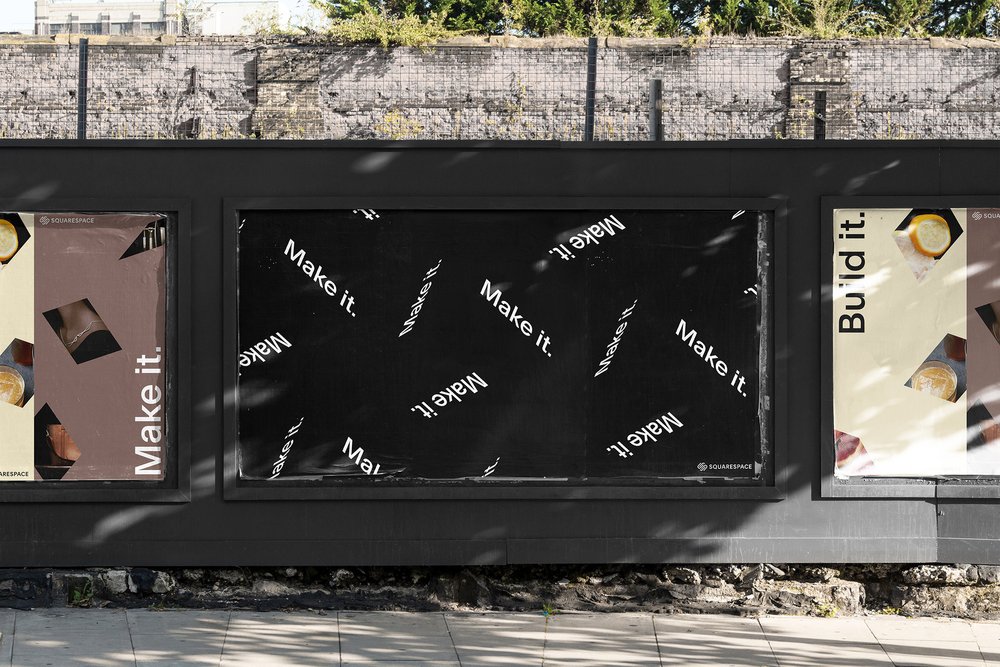
Squarespace, a leading American technology company headquartered in New York City, specializes in website creation, offering users a range of pre-built templates and intuitive drag-and-drop elements for effortless webpage customization. Their user-friendly platform and DIY approach empower users to craft a broad range of websites, from basic web presences to fully functional e-commerce websites, with thoughtfully designed tools.
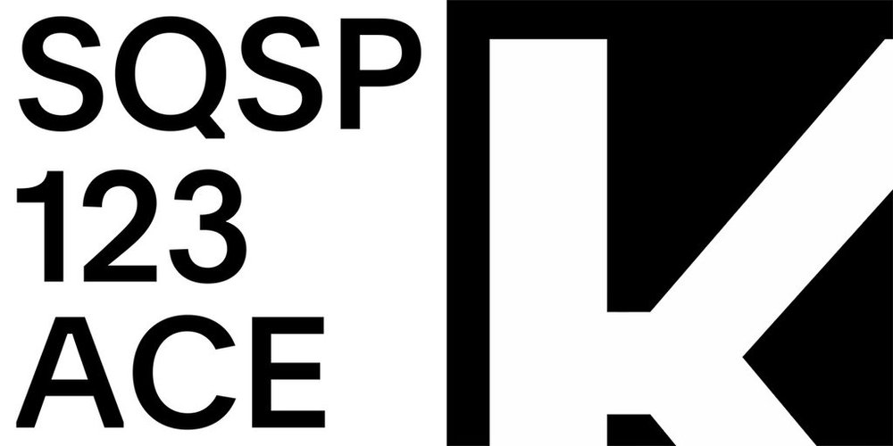
“I imagined for the font design the best balance of key values: objectivity, visual clarity—with a playful touch and signature.” —François Rappo
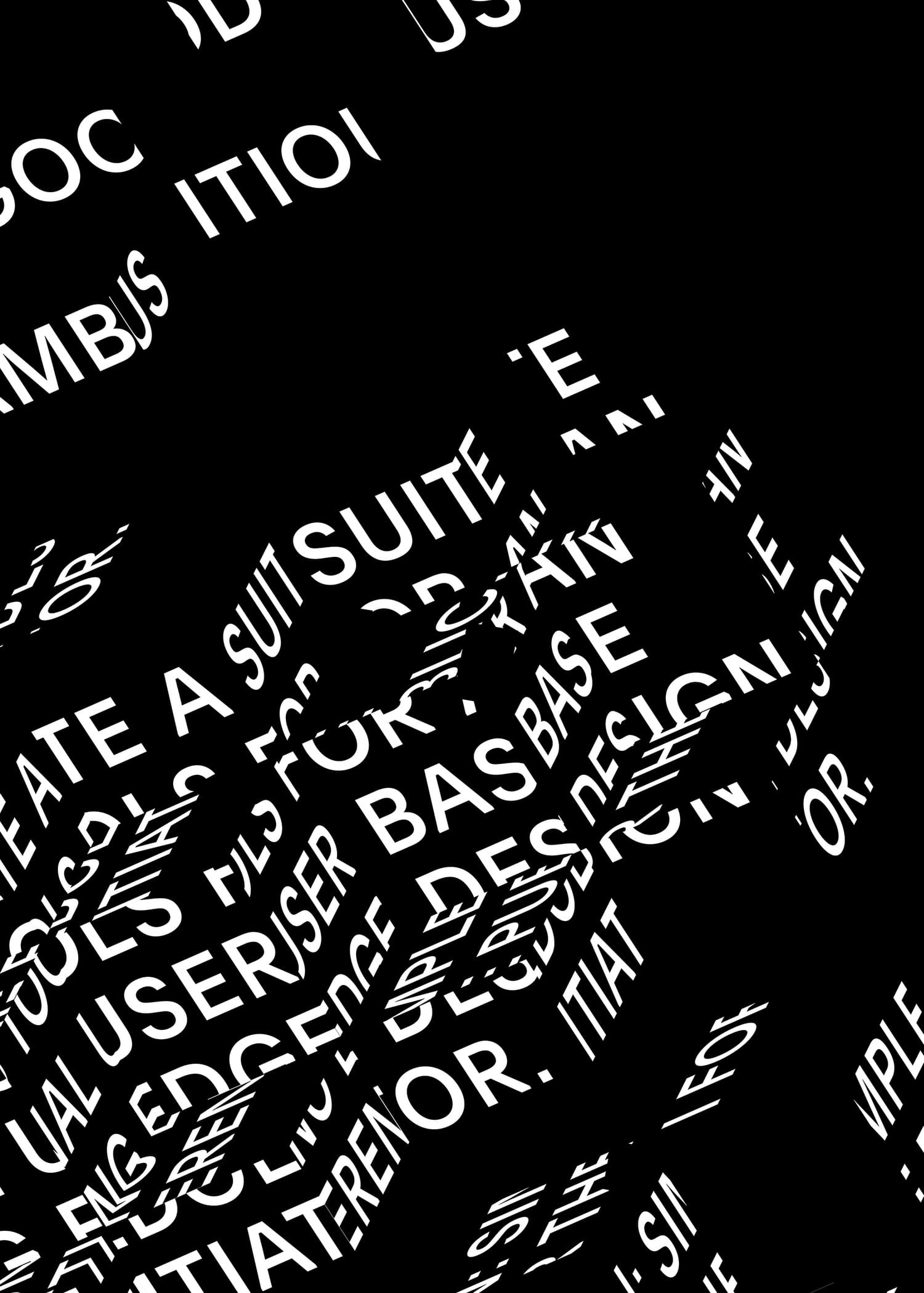
On the occasion of their 10th anniversary, Squarespace collaborated with design agency DIA Studio to refine their brand identity to pay homage to New York City’s influence on their company culture. DIA Studio developed a kinetic identity system anchored in a strict typographic foundation that reflects the city’s vibrancy. This is the backstory of Clarkson, an entirely new brand typeface drawn by François Rappo.

“New York has always been in the DNA of Squarespace.” —David Lee, Squarespace

“This system allows designers to improvise and create infinite variations while always maintaining a consistent visual thread.” —Mitch Paone, DIA
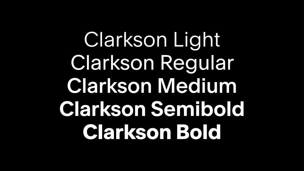
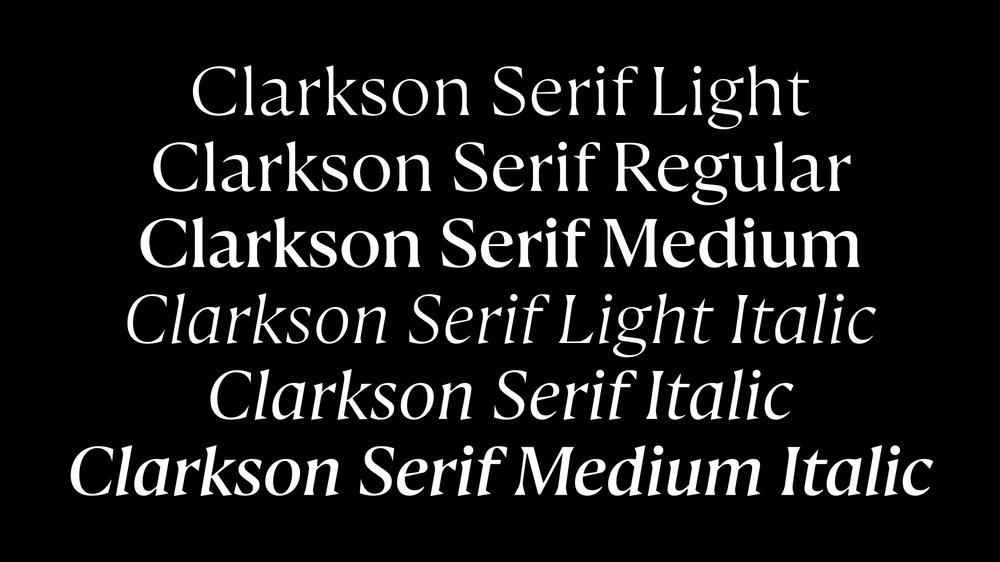
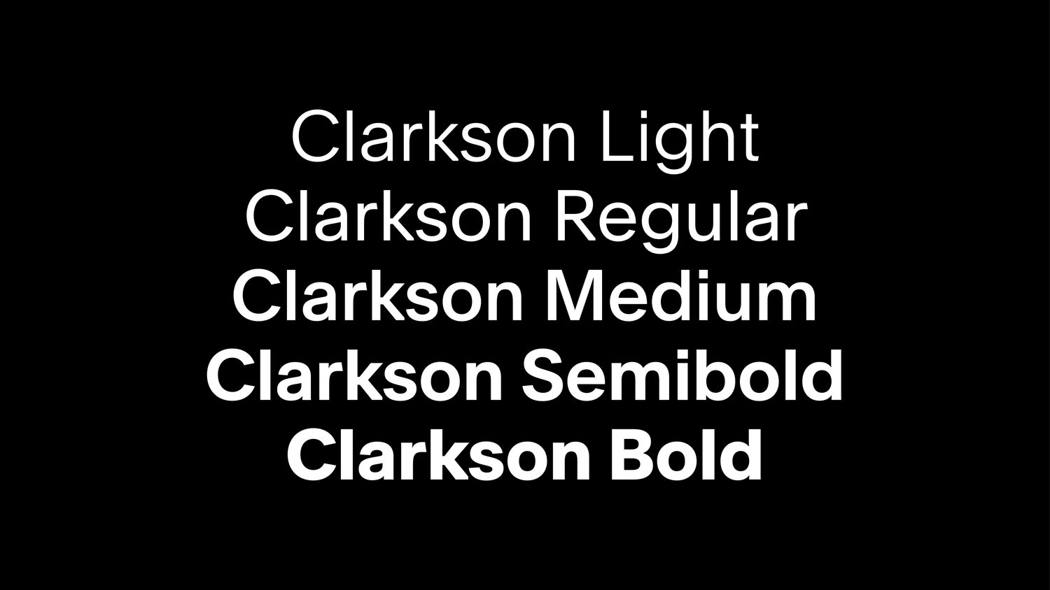
Taking its name from Squarespace’s headquarters, which is located at 8 Clarkson Street, the neo-grotesque typeface strikes a balance between clarity and sophistication, with an edge achieved by a thoughtful cutting of the letterforms. This intentional idiosyncrasy, reflected in the angles of the letter’s terminals, underscores the irreverent personality of the city and the company, while also adding a playful touch. After the release of the first two cuts, the family was expanded to five styles to complement the brand’s development.
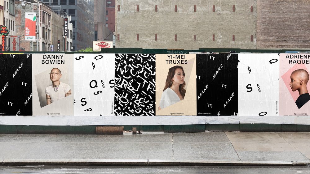
Clarkson plays a significant role in personifying the brand’s identity, which was built on a conceptual behavioral system that utilizes typography as its primary signature component. This distinct and sophisticated approach to brand identity clearly sets Squarespace apart from the typical tech company. Optimo developed a versatile typeface designed to seamlessly adapt to a variety of applications, ranging from motion graphics to web assets and printed billboards.
