FLW Reply for Frank Lloyd Wright Building Conservancy
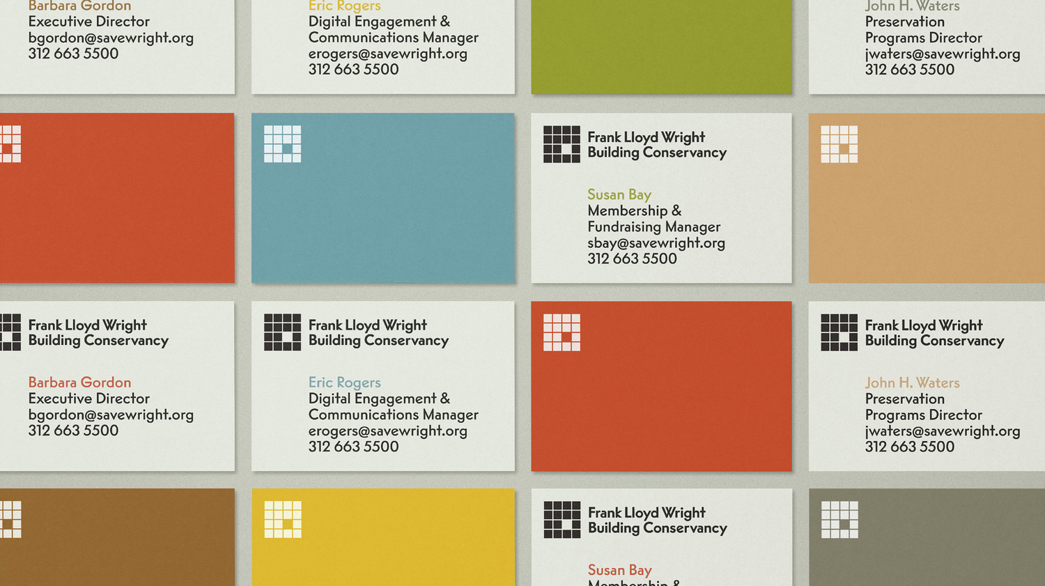
Frank Lloyd Wright Building Conservancy new logo in FLW Reply

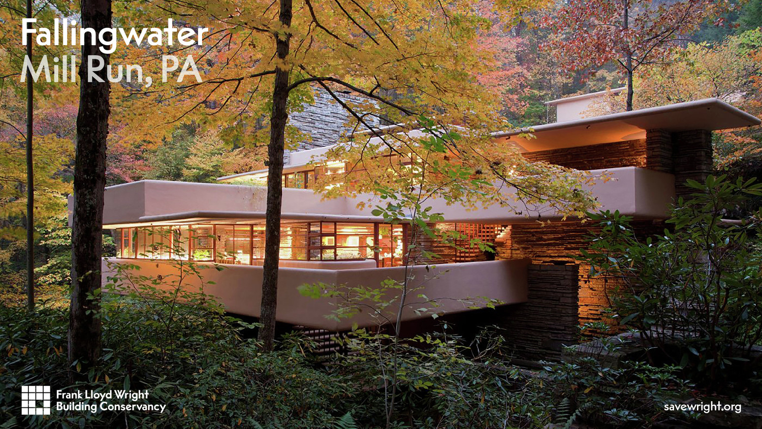
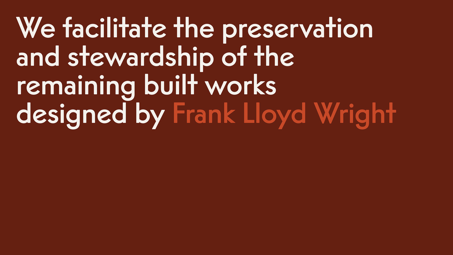
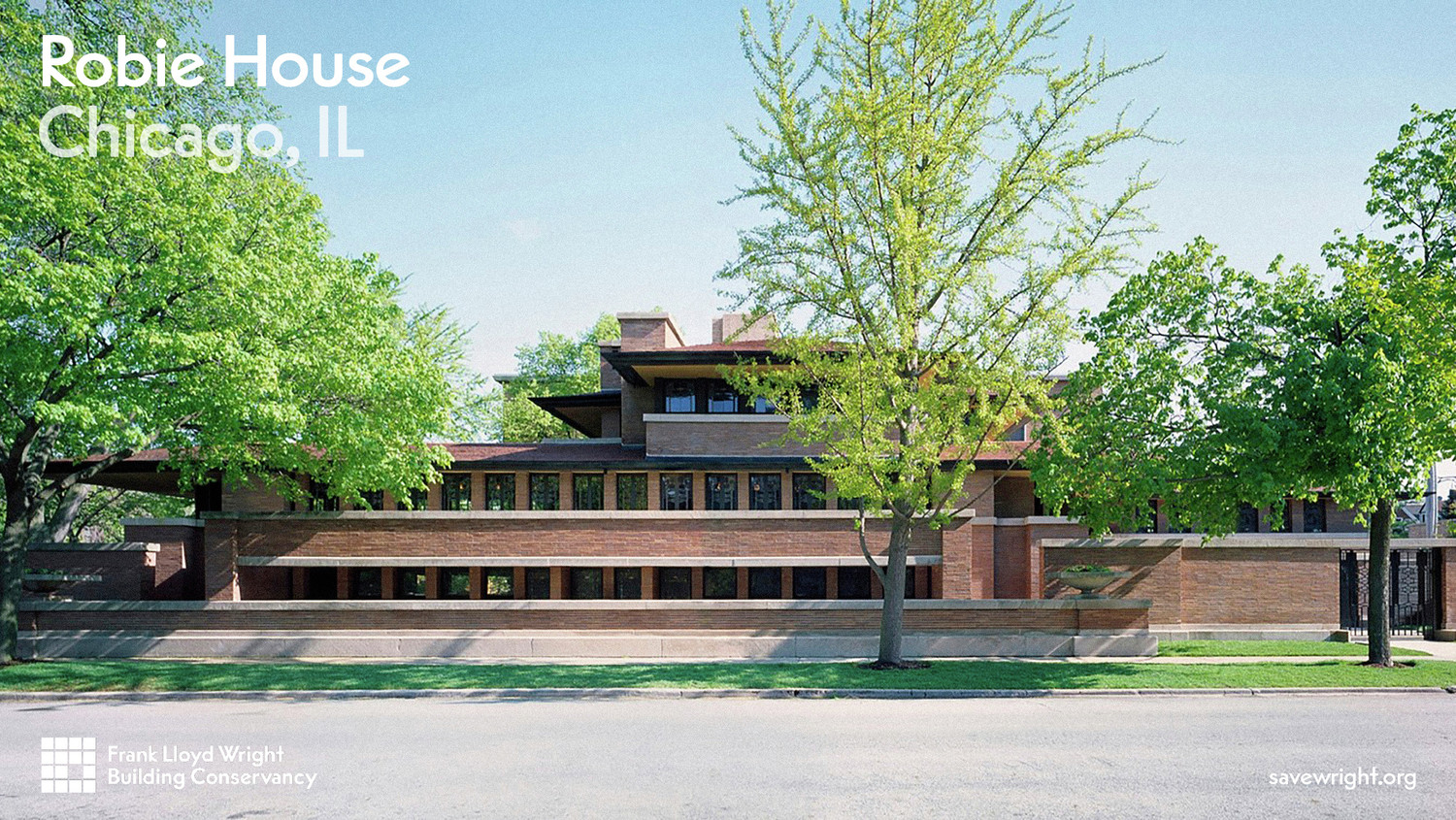
FLW Reply in use

FLW Reply in use

FLW Reply in use

By combining geometric forms and proportional drawing, Rappo created a typeface with a distinctive personality—rooted in American modernism yet unmistakably contemporary.
Considered one of the greatest American architects, Frank Lloyd Wright (1867–1959) played a pivotal role in the architectural movements of the twentieth century and had a profound impact on the trajectory of modern architecture. Dedicated to the preservation and stewardship of Wright’s buildings and interiors, the Frank Lloyd Wright Building Conservancy was founded in 1989 by a diverse group, ranging from devoted admirers to scholars. The organization advances its mission through advocacy, education, and technical programs.
FLW Reply in use on print

FLW Reply in use on print

FLW Reply in use on print
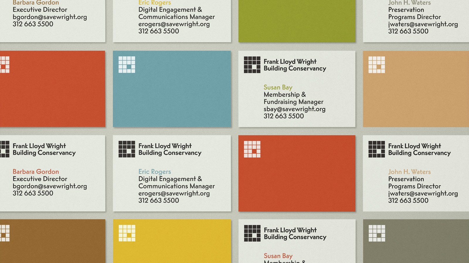
The Frank Lloyd Wright Building Conservancy commissioned Order, a design office based in Brooklyn, New York, to develop a new visual identity. Order took Wright’s iconic red square as its point of departure and inspiration, and expanded the motif into a comprehensive system that reflects not only the architect’s enduring legacy but also the Conservancy’s community and the urgency of its preservation work.
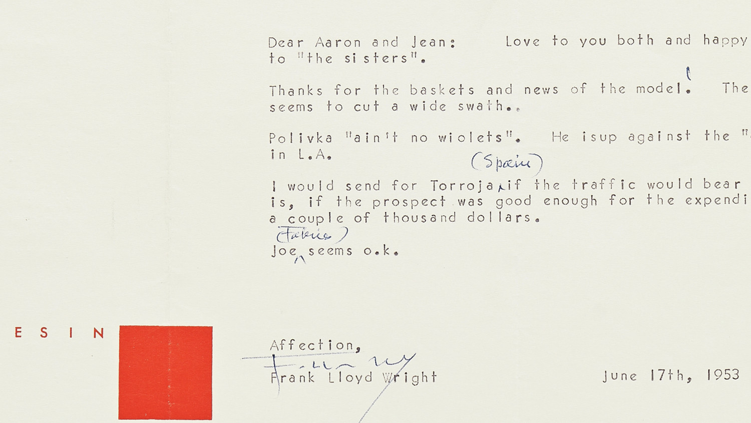
Vogue Intertype in use by Frank Lloyd Wright in his correspondence
Vogue Intertype in use by Frank Lloyd Wright in his correspondence

Vogue Intertype in use by Frank Lloyd Wright in his correspondence
Vogue Intertype in use by Frank Lloyd Wright in his correspondence
Vogue Intertype in use by Frank Lloyd Wright in his correspondence
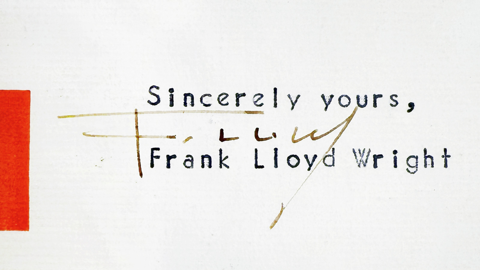
Vogue Intertype in use by Frank Lloyd Wright in his correspondence

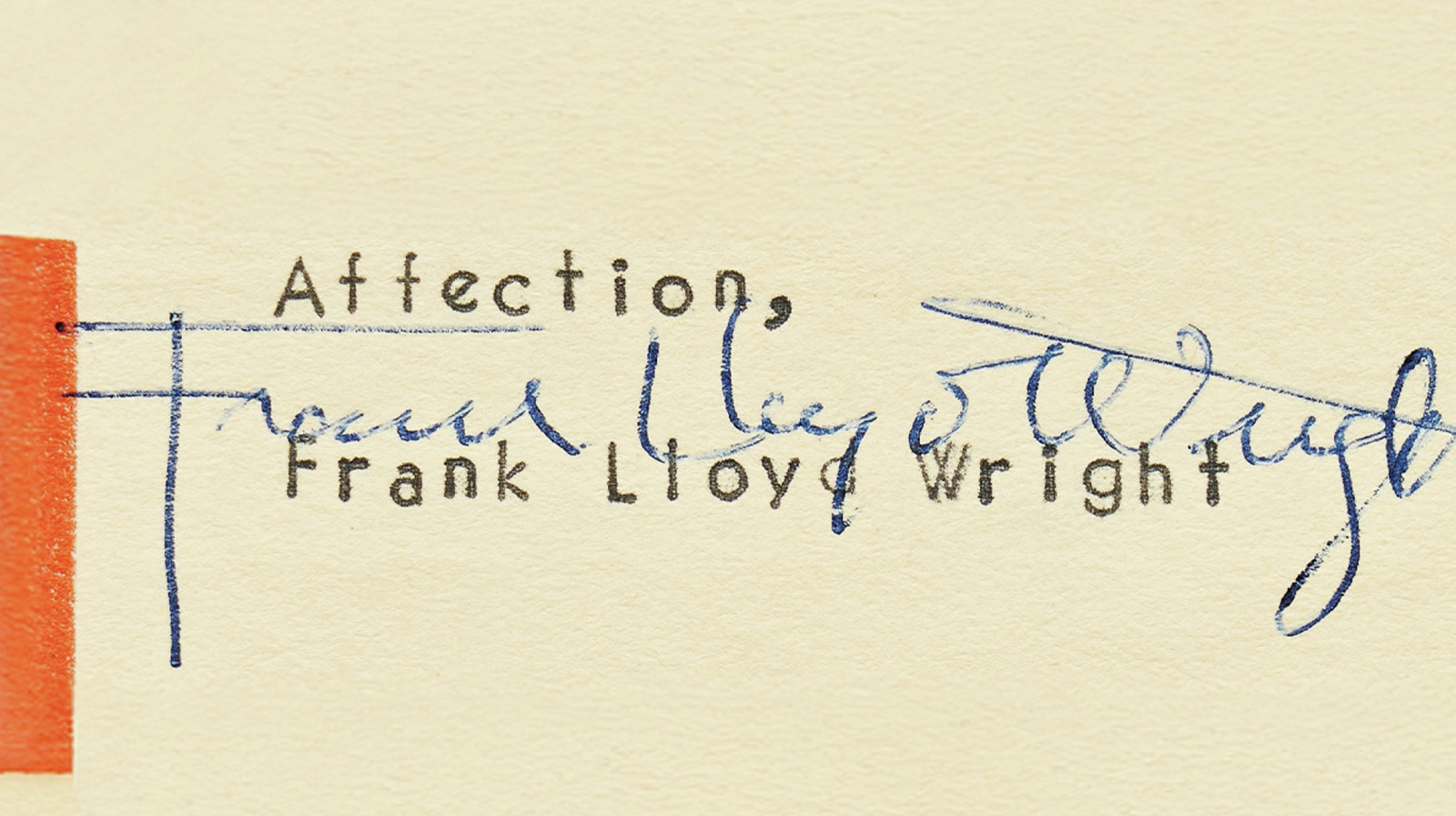
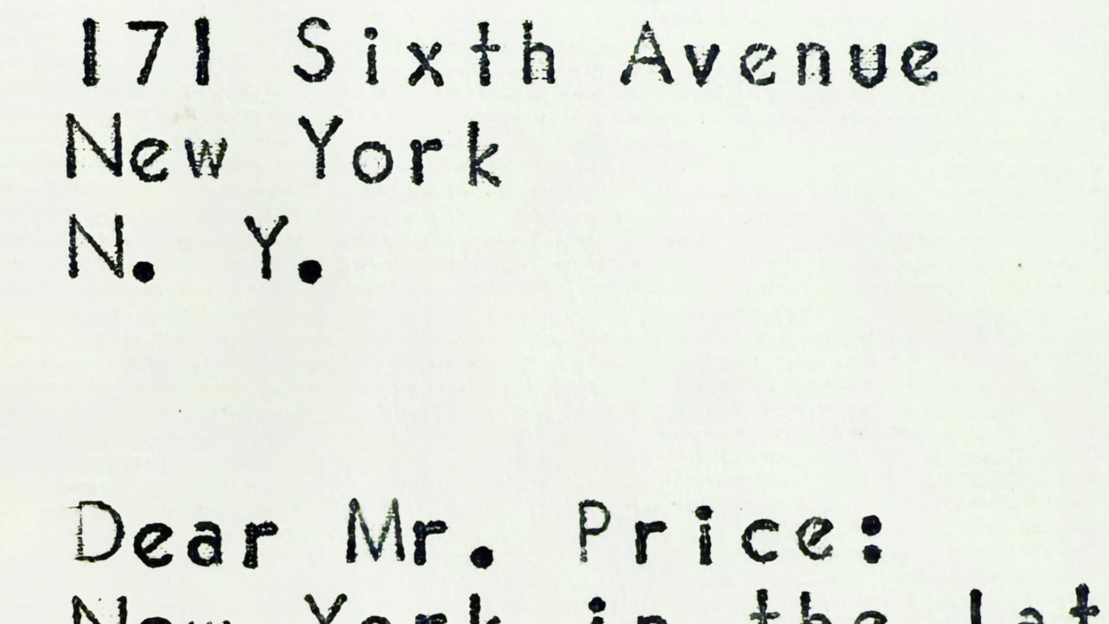
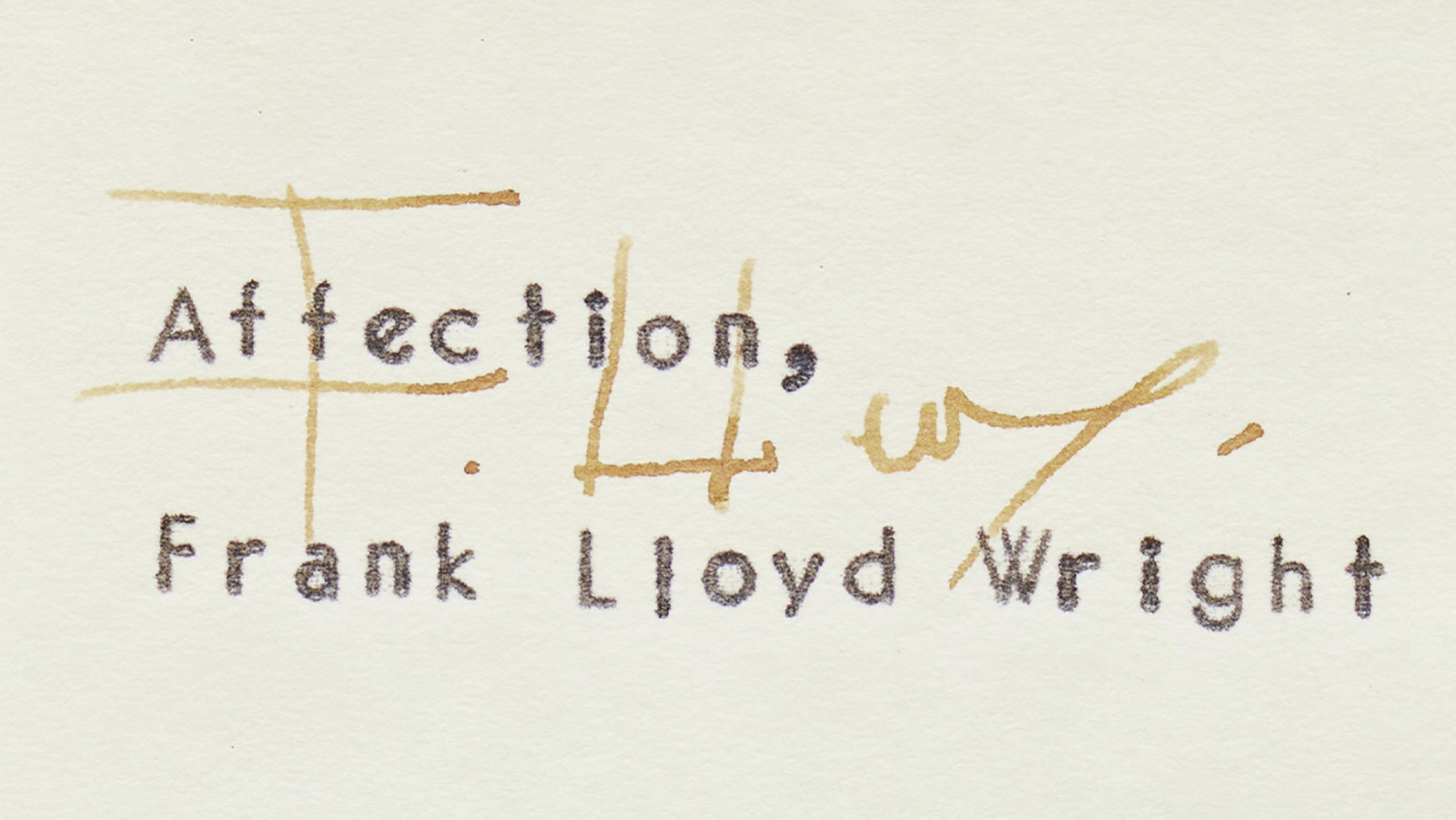
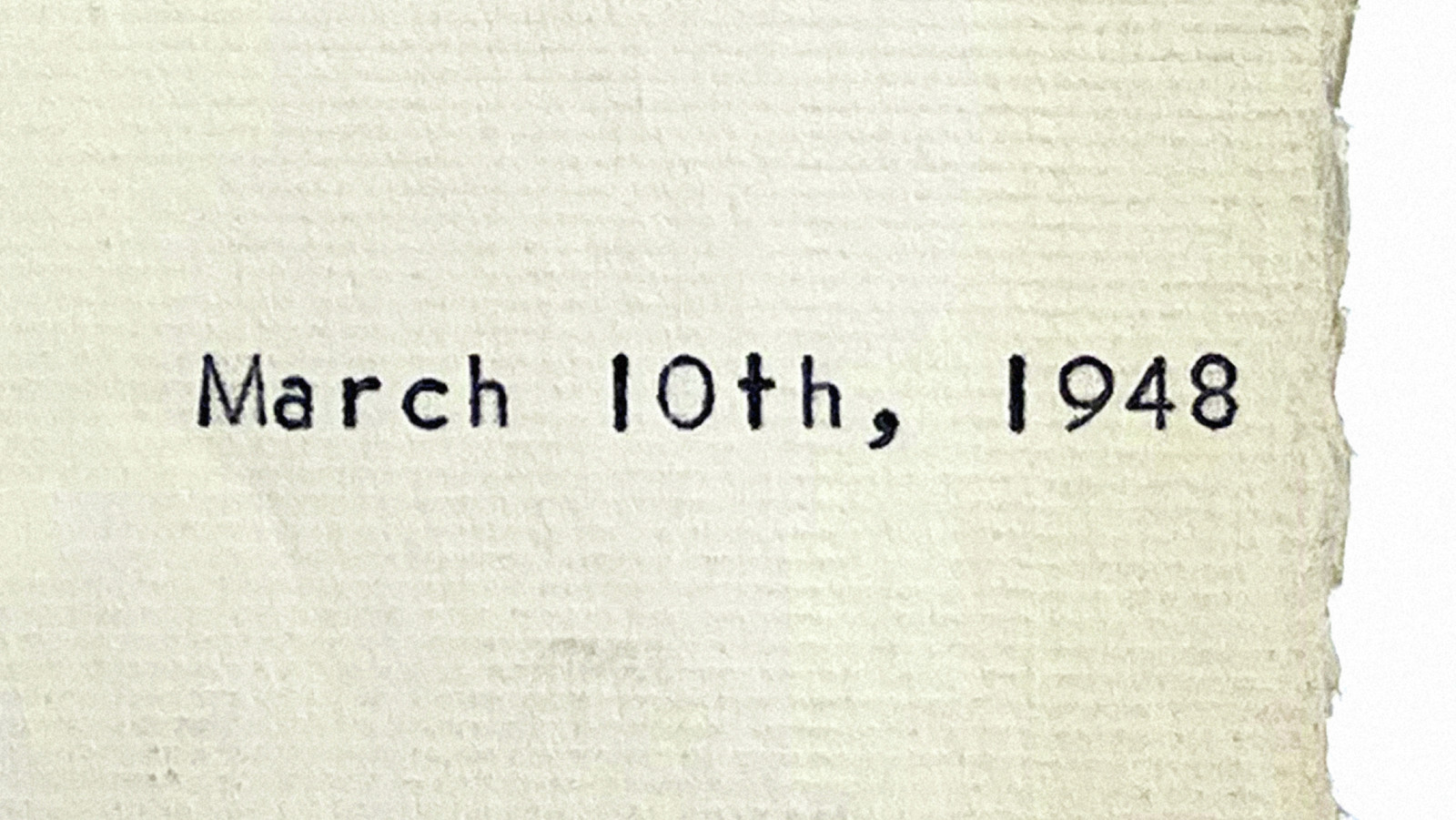
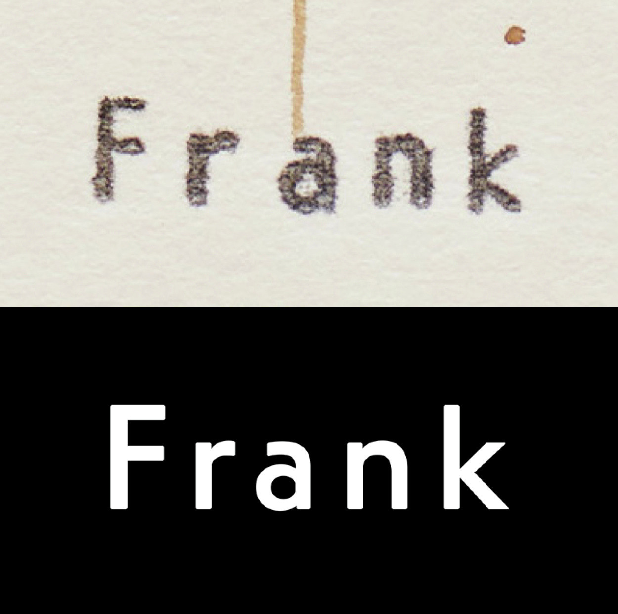
The typeface draws direct inspiration from the refined texture of some of Frank Lloyd Wright’s correspondence, produced using a typewriter version of Vogue Intertype.
Order selected Optimo’s Reply typeface, designed by François Rappo, to serve as the primary voice of the identity. The typeface draws direct inspiration from the refined texture of some of Frank Lloyd Wright’s correspondences, produced using a typewriter version of Vogue Intertype, which Rappo discovered through his research into American ephemera from the 1950s.
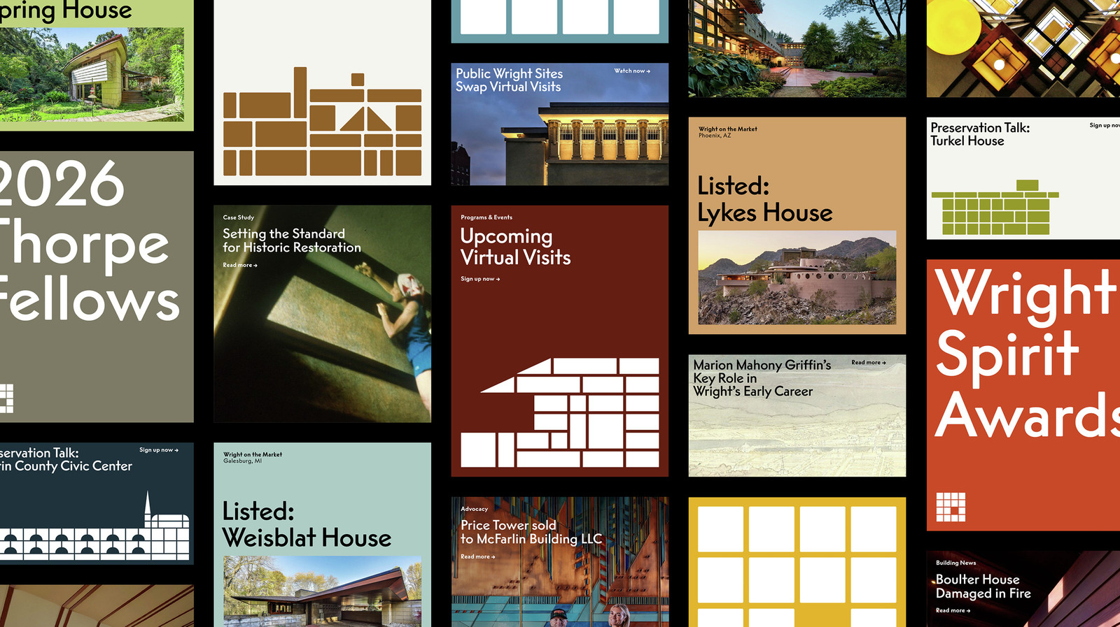
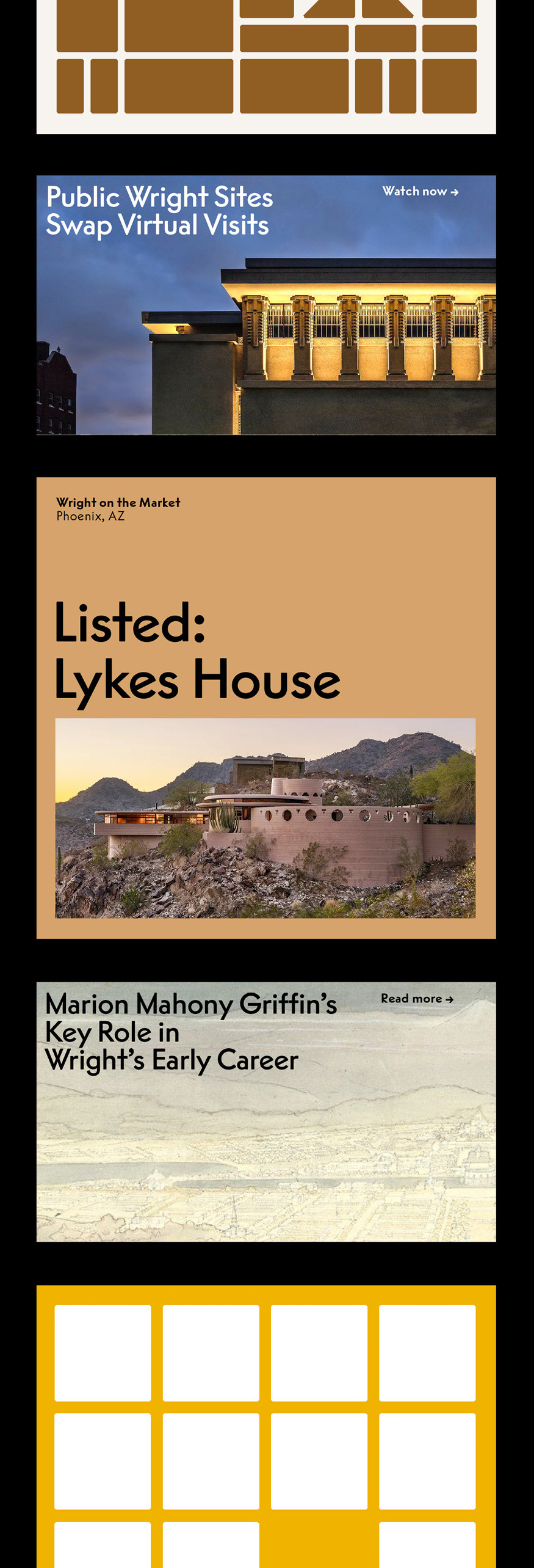
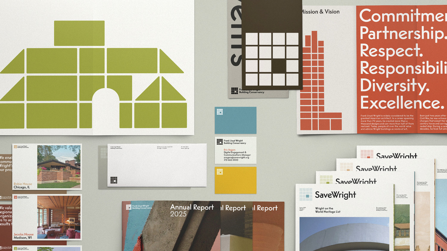
FLW Reply in use on screen
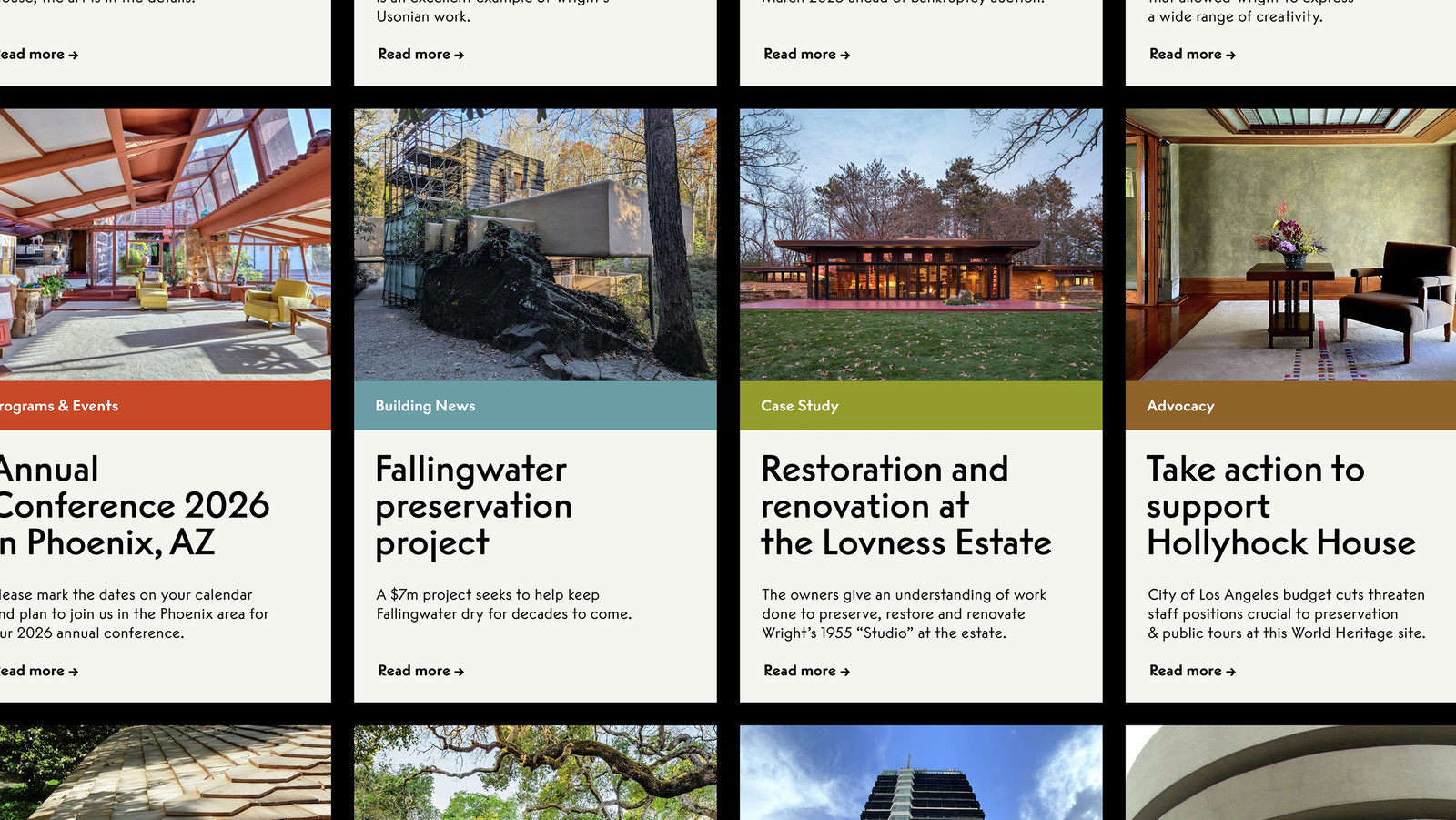
FLW Reply in use on screen
By combining geometric forms and proportional drawing, Rappo created a typeface with a distinctive personality—rooted in American modernism yet unmistakably contemporary. Its angular, geometric forms extend and reinforce the graphic language established by Order. Optimo reworked Reply with custom alternate characters and renamed it FLW Reply, bringing the typeface full circle: back home to the work and the words of Frank Lloyd Wright that once inspired it.

Reply’s angular, geometric forms extend and reinforce the graphic language established by Order.

Reply’s angular, geometric forms extend and reinforce the graphic language established by Order.
All images are courtesy of Order, Brooklyn, New York.
Frank Lloyd Wright Building Conservancy new logo in FLW Reply
FLW Reply in use
FLW Reply in use
FLW Reply in use
FLW Reply in use on print
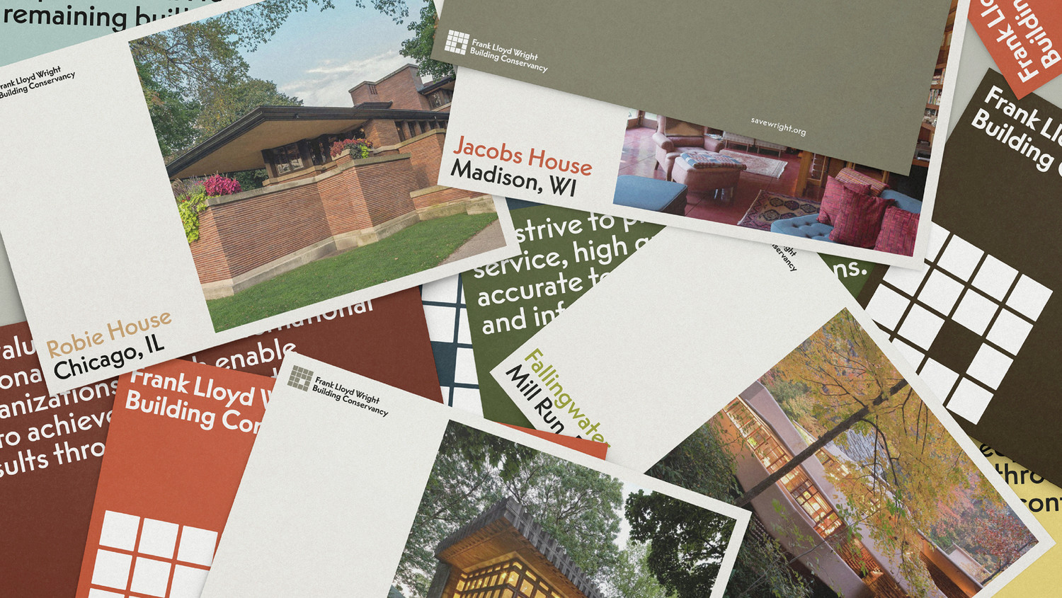
FLW Reply in use on print
FLW Reply in use on print

Vogue Intertype in use by Frank Lloyd Wright in his correspondence
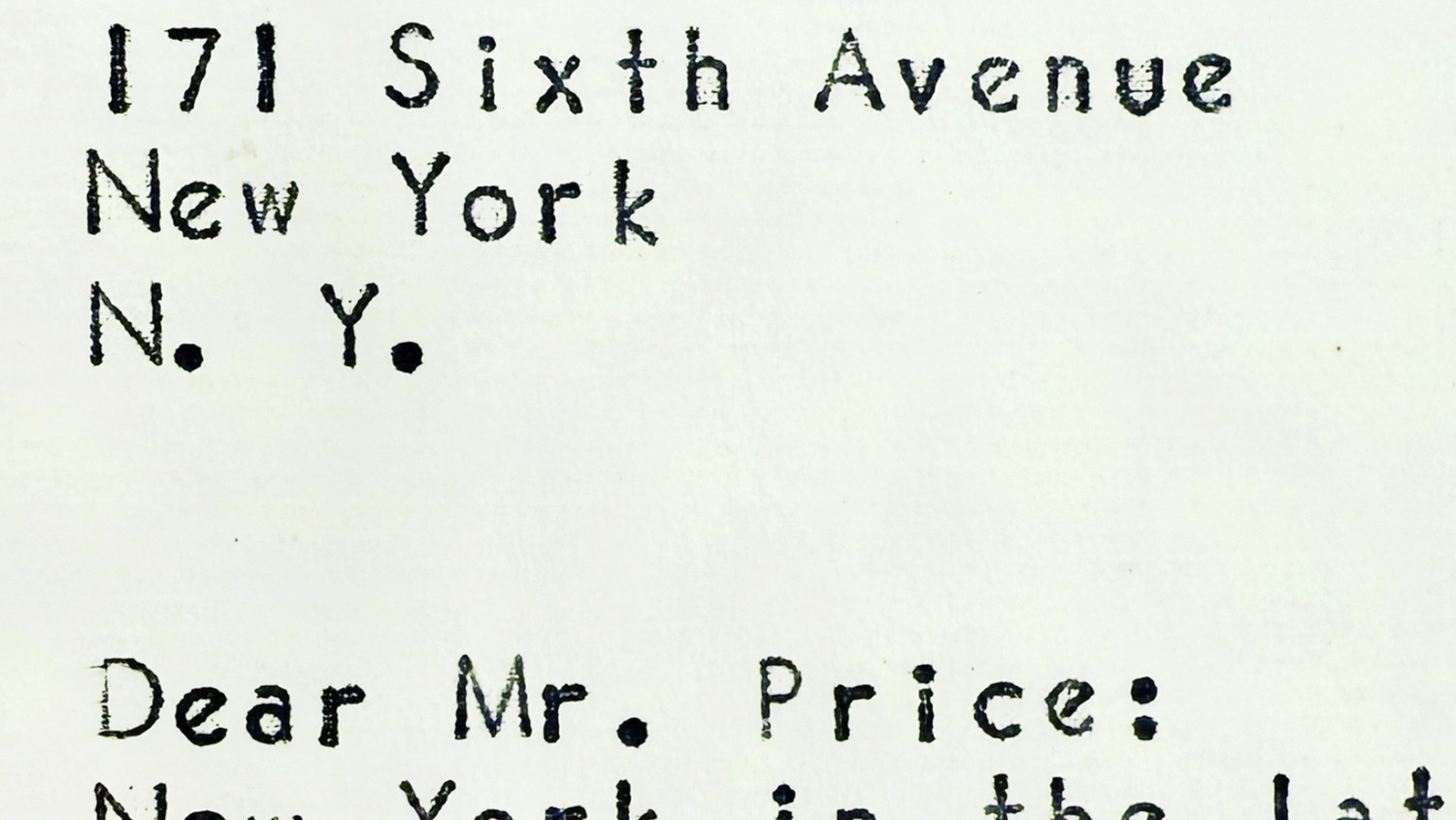
Vogue Intertype in use by Frank Lloyd Wright in his correspondence
Vogue Intertype in use by Frank Lloyd Wright in his correspondence

Vogue Intertype in use by Frank Lloyd Wright in his correspondence
Vogue Intertype in use by Frank Lloyd Wright in his correspondence

Vogue Intertype in use by Frank Lloyd Wright in his correspondence

FLW Reply in use on screen

FLW Reply in use on screen

Reply’s angular, geometric forms extend and reinforce the graphic language established by Order.

Reply’s angular, geometric forms extend and reinforce the graphic language established by Order.
