Aoki for Steve Aoki
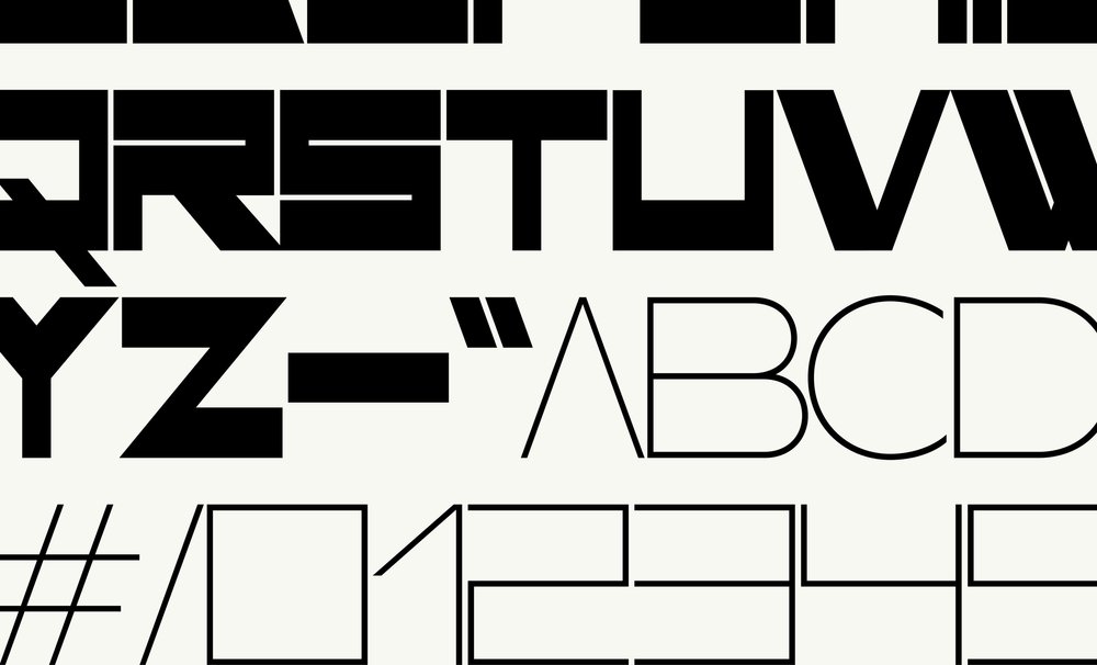
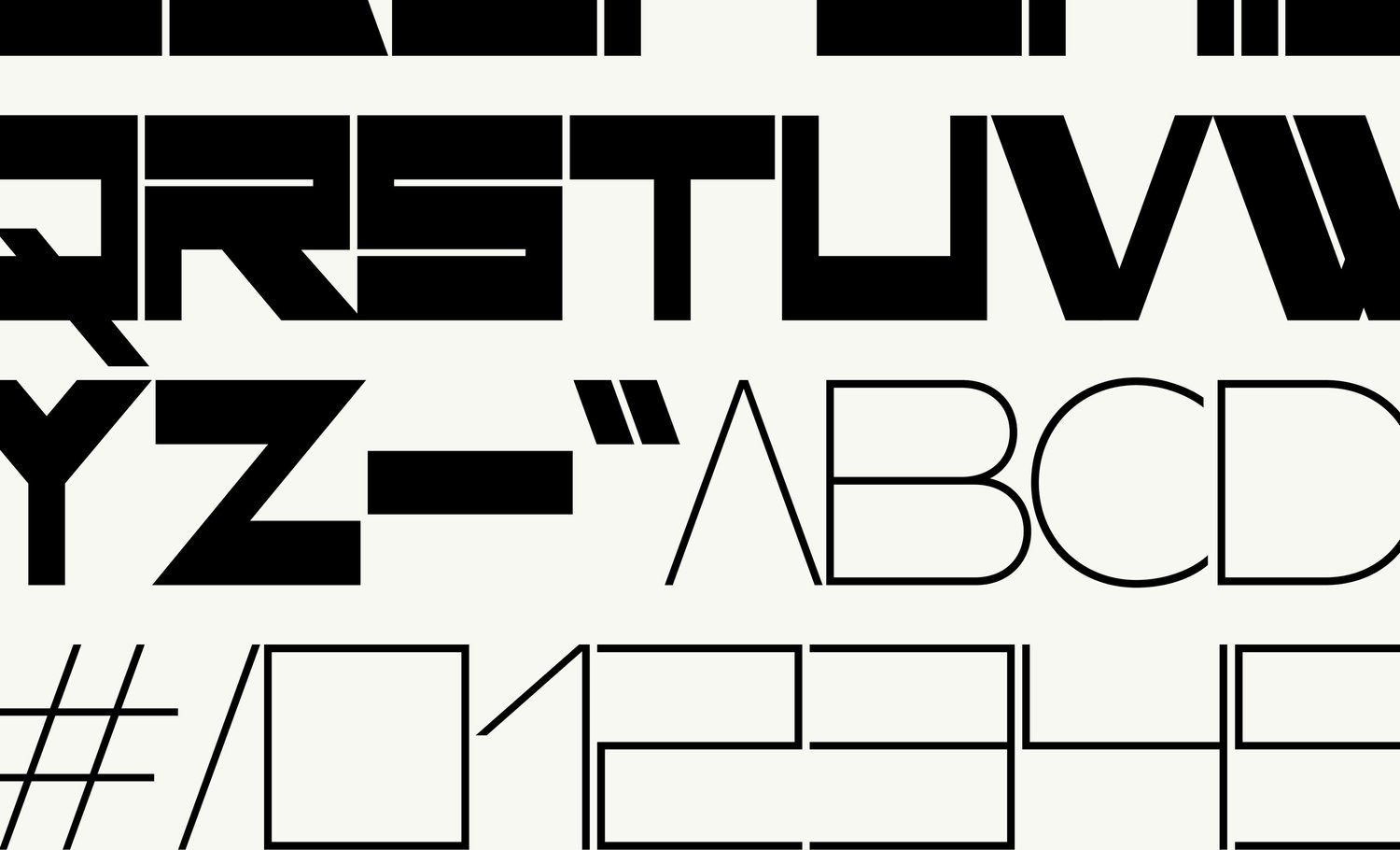
Aoki typeface was conceived with two weights within the same character set creating a distinct and playful contrast.
In collaboration with LA-based graphic designer Brian Roettinger, Optimo developed a custom display typeface with a powerful graphic identity. Intended for the musician Steve Aoki’s Neon Future album campaign, the typeface draws inspiration from an iconic Swiss graphic design artwork.
Roettinger and Steve Aoki had actually crossed paths long before the Neon Future album project brought them together. During college, they both played in the hardcore band This Machine Kills, and Roettinger lent Aoki records when Aoki was beginning his, now prolific, career as a DJ.[1,2]
Roettinger and Aoki would meet again years later, on the occasion of Aoki’s second studio album Neon Future. Aoki commissioned Roettinger for the album artwork and the entire campaign. The general brief for the project, envisioned by Aoki, was to create something that seemed as though it was meant to exist in the future. In response to the brief, Roettinger’s typographic ambition was to avoid all of the design clichés associated with ideas of the “future,” a “digital world,” as well as anything that had a post-apocalyptic feeling. He expressed: “One could argue that the future is a condensed rounded serif, but, I think, in this case, the hope is for it to be more expressive and iconic. Anything that looks too futuristic is either ironic or retro—the hope is to avoid that as well.”

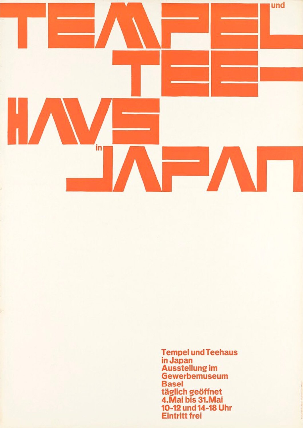
The iconic poster “Temple und Tee-haus in Japan” designed by graphic designer master Armin Hofmann in 1955.
Following Roettinger’s project, Optimo thought of a project of their own that had been on the back burner at the time; a type design project, which as a primary point of reference had the iconic poster “Temple und Tee-haus in Japan,” designed by graphic designer master, Armin Hofmann. A leading protagonist of the Swiss style, Hofmann designed said poster in 1955 to promote an exhibition about Japanese architecture. Hofmann’s approach to typography is holistic. For him, typography is clearly a fundamental component of an overall design and is not solely for the communication of written information.[3] This approach can be seen in the lettering on the poster, which emulates the modular simplicity and bold contrast of Japanese architecture and, at the same time, carries the title of the exhibition. Set entirely in uppercase, the letters showcase strong rectangular forms with reverse contrast (i.e. the weight is distributed more along the horizontals than the verticals), and it was precisely these daring and blockish forms that caught Roettinger’s interest. Additionally, it is potentially modular and has a strong graphic personality, all of which made it a perfect fit for the project.
Optimo type designer Chi-Long Trieu started to complete the alphabet loosely based on Hoffman’s hand-drawn letterforms. Following Roettinger’s request, a lighter weight with a mono-linear structure was also developed to complement and contrast the heaviness of the first cut. Since the typeface for Aoki is composed exclusively of uppercase characters, Trieu had the idea to include the two weights within the set, allowing the heavier weight to serve as uppercase characters and the lighter as lowercase characters. Furthermore, several alternate glyphs with variable widths and shapes were added to exploit the modular and dynamic potential that had initially appealed to Roettinger. This project demonstrates Optimo’s interest in revisiting typographic models from different eras with a contemporary perspective.
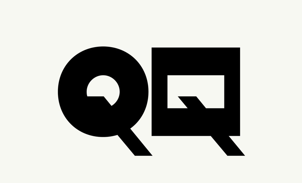
Detail of two alternate glyphs for “Q” presenting a round-shaped and square-shaped option.
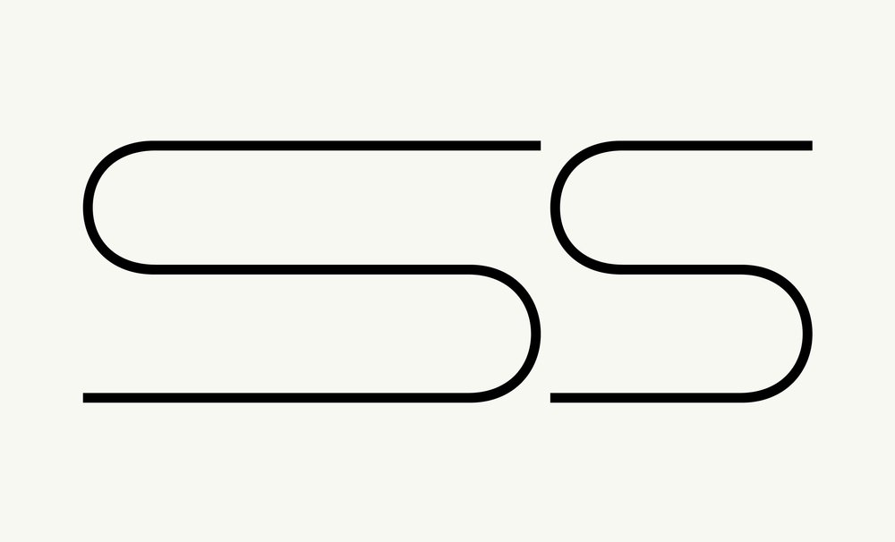
Detail of two alternate glyphs for “S” with variable widths.
1 Roettinger, Brian (2008, January-February). “LA Story: Brian Roettinger Takes It to the Core”. The Fader.
2 Buerger, Megan (2014,September 12). “Style’s Name to Know: Album Designer Brian Roettinger”. Billboard.
3 Museum für Gestaltung Zürich. With an essay by Steven Heller. Poster Collection 07: Armin Hofmann. Museum Fur Gestaltung Zurich l Lars Muller Publishers, 2003.
Aoki typeface was conceived with two weights within the same character set creating a distinct and playful contrast.
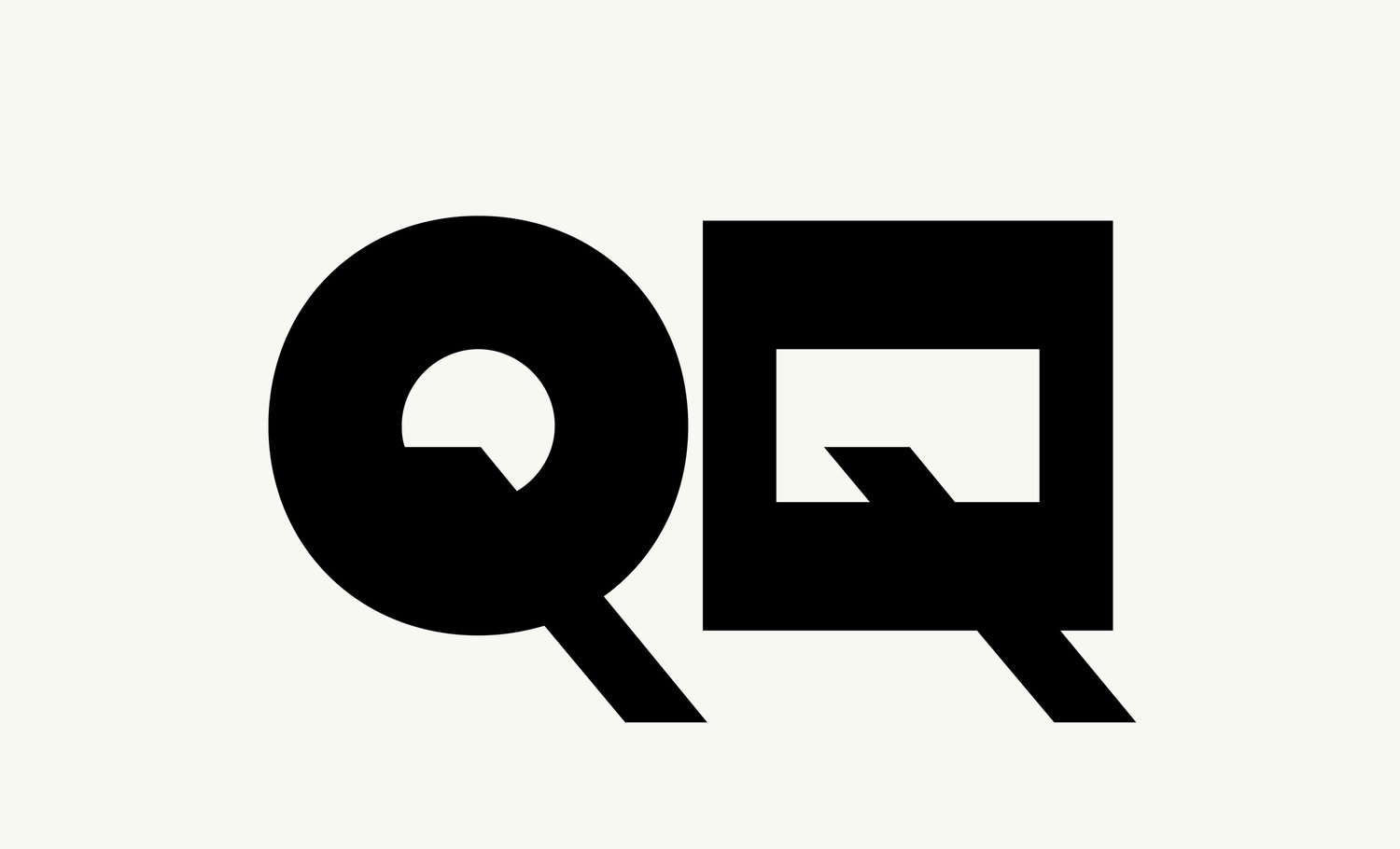
Detail of two alternate glyphs for “Q” presenting a round-shaped and square-shaped option.
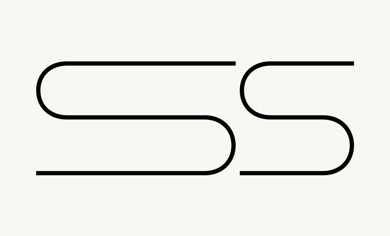
Detail of two alternate glyphs for “S” with variable widths.
