Flodesk Sans and Serif for Flodesk
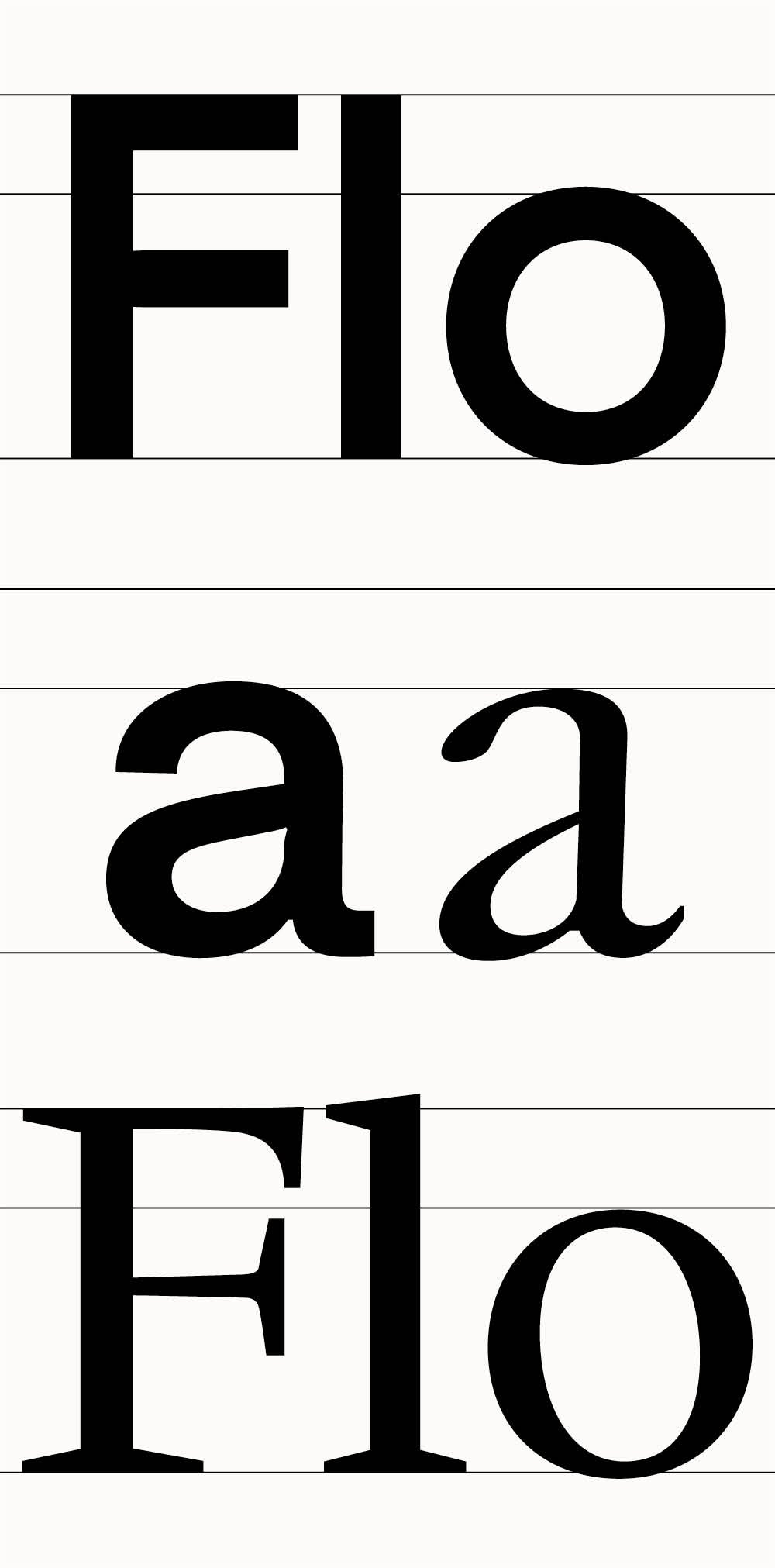
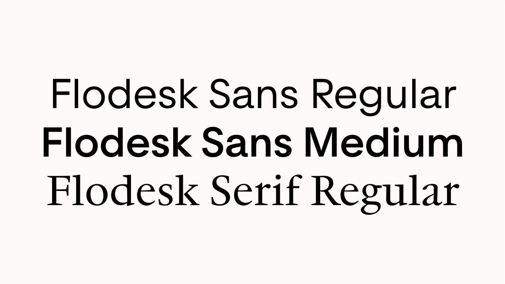
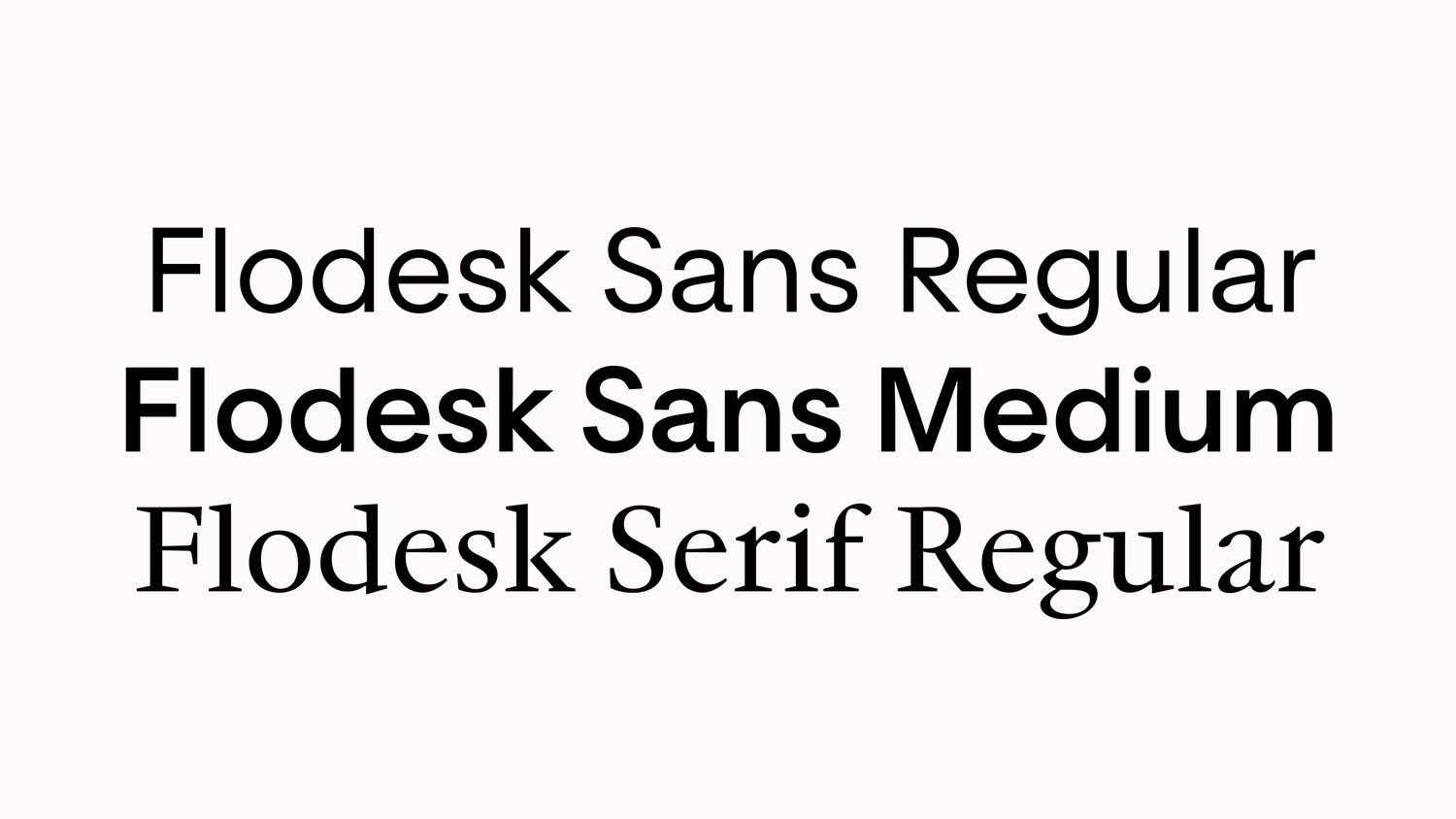
Drawing inspiration from late nineteenth-century grotesque styles and geometric forms reminiscent of Richard Neutra’s architectural approach, Flodesk Sans exhibits a strong sense of balance. Flodesk Serif is a modified version of the seventeenth-century French type revival JJannon. Though they have a different set of references, Flodesk Serif’s adjusted x-height seamlessly complements Flodesk Sans.
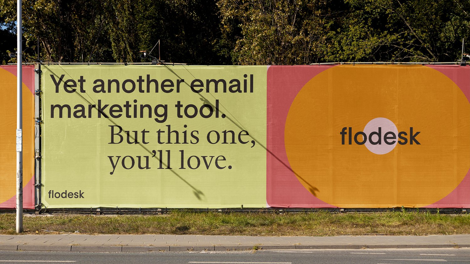
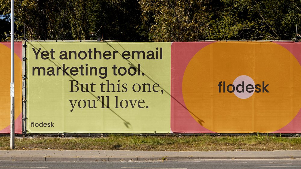
Flodesk is an email marketing platform that allows users to create beautiful and engaging emails. A tool that is loved by small businesses, Flodesk adeptly blends community warmth with practical functionality. Conceived of as a “marketing powerhouse at your fingertips,” Flodesk offers a user-friendly interface for the effortless generation and deployment of on-brand marketing communications, complemented by a number of features to help foster business growth.
“Conceptually, each of our typefaces reflect a key brand attribute. Flodesk Sans reflects our company’s design rigor. Flodesk Serif reflects our community’s voice. Our logo animation illustrates the flow and inherent connection between the two.” —Flodesk
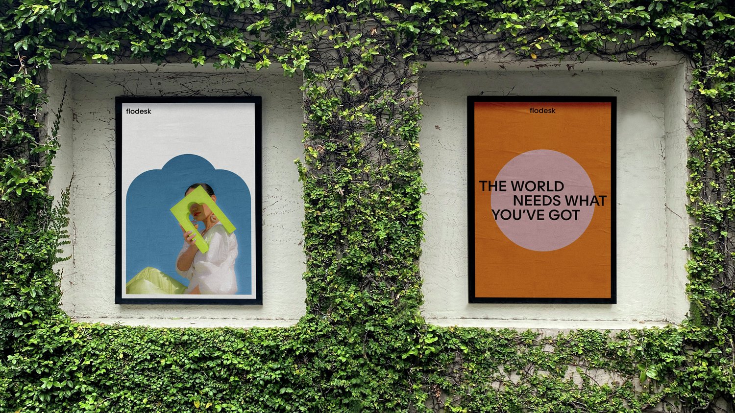
Based out of the American West Coast tech hub, this female-founded enterprise seeks to embody both the community spirit and the efficiency of its intuitive platform. Partnering with DIA Studio, a design firm specializing in kinetic identities and typographic systems, Flodesk fashioned an identity for itself that represents the creativity and purposefulness of the technology.

The design strategy incorporates a comprehensive motion system, product art direction and integration, and a custom typeface comprising sans-serif and serif variants, each reflecting distinct brand attributes. The new signature typeface emerged through a collaborative effort between DIA Studio and François Rappo at Optimo. Flodesk Sans balances friendliness and functionality, while Flodesk Serif resonates with a community-based tone of voice. The logo animation combines both variants brilliantly and demonstrates their inherent connection.
“I selected a few keywords to guide my design of the Flodesk typeface: inviting, touch of rationalism, and a strong user-friendly ergonomics.” —François Rappo, Optimo
Drawing inspiration from late nineteenth-century grotesque styles and geometric forms reminiscent of Richard Neutra’s architectural approach, Flodesk Sans exhibits a strong sense of balance. Flodesk Serif is a modified version of the seventeenth-century French type revival JJannon. Though they have a different set of references, Flodesk Serif’s adjusted x-height seamlessly complements Flodesk Sans. The result is something that feels contemporary while evoking historical roots. Both variants maintain their aesthetic excellence across various contexts, from tiny product user interface to large-scale branded collateral. Flodesk typefaces exude approachability, rationality, and user-friendly design, and contribute significantly to the overall brand identity of Flodesk.
“We wanted the brand to embody the warmth of our community and the rigor of our intuitive platform in an uncluttered and confident way.” —Flodesk