


Dada Grotesk
OpenType Features
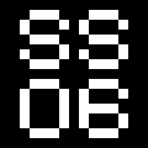
Case Sensitive Forms


All Caps [cpsp]

Case Sensitive Forms [case]
This function formats the text in uppercase and adjusts spacing between all capital letters. It also applies the ‘Case Sensitive Forms’ feature which replaces certain characters with alternates that are better suited for all capital text, especially related to punctuation.
«Optimo»
@|¦()[]{}¿¡‹›«»-–—·
«OPTIMO»
@|¦()[]{}¿¡‹›«»-–—·
Contextual Alternates
 Contextual Alternates [calt]
This feature adapts the position of a glyph after its surrounding context. For instance, a dash placed between two uppercase letters or numbers will be replaced by an uppercase version of the dash, slightly higher. This feature is usually active by default in Adobe applications.
Tabular Lining Figures
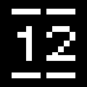
Tabular Lining Figures [tnum–lnum]
Based on the proportions of the capitals, lining figures have an invariable height. With the combination of the tabular spacing format, the width of each numeral is uniformized. This feature is useful when numerals need to all lined up. It facilitates the reading of numbers set within columns or tables. As some applications don’t have access to this feature, proportional figures are set as the default choice.
0123456789
0123456789
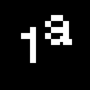
Fractions
 Fractions [frac]
With this feature, any numbers separated by a slash will automatically turn into a fraction. To fit in fraction configuration, numerals have been designed smaller and their weights have been adjusted to suit the typeface.
3/4 3/8 5/8 7/8
3/4 3/8 5/8 7/8
Lowercase math symbols
 Stylistic Set 6 [ss06]
This feature activates alternate lowercase positioning of mathematical symbols.
up+down
+±×÷−=≈≠¬∞
up+down
+±×÷−=≈≠¬∞
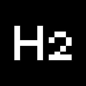
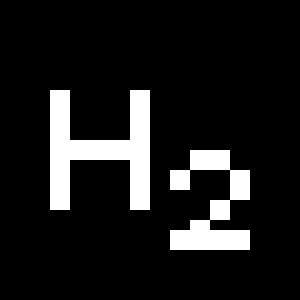
Ordinals
 Ordinals [ordn]
This feature replaces any letter following a numeral with its matching superior letters. French language uses the ordinal indicators such as ‘er’ for 1er premier, while Spanish, Portuguese and Italian require the feminine and masculine ordinals ‘a,’ ‘o’ for 1º, 1ª. Ordinals are designed to match the weight of the typeface.
Slashed Zero
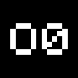 Slashed Zero [zero]
Originally created to avoid the confusion between the ‘0’ and the ‘O’, this feature substitutes all zeros in a selected text by a slashed form of the zero.
Multiply sign
 Stylistic Set 20 [ss20]
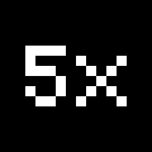
This feature substitutes the letter “x” into the multiplication sign.
Numerators
 Numerators [numr]
This feature substitutes glyphs with their matching smaller alternates. The numerators are the same glyphs that are used to create fractions, their vertical position remains within the capital letters height. These glyphs are reduced in size and designed slightly heavier to keep them consistent with the rest of the font.
Habcdefghijklmn
Hopqrstuvwxyz()[].,
Habcdefghijklmn
Hopqrstuvwxyz()[].,
Denominators
 Denominators [dnom]
This feature substitutes glyphs with their matching smaller alternates and low position glyphs. The denominators are the same glyphs that are used to create fractions, their vertical position remains within the base line. These glyphs are reduced in size and designed slightly heavier to keep them consistent with the rest of the font.
Habcdefghijklmn
Hopqrstuvwxyz()[].,
Habcdefghijklmn
Hopqrstuvwxyz()[].,
Superscript/Superiors
 Superscript / Superiors [sups]
This feature substitutes glyphs with their matching smaller alternates which are set slightly above the height of the capital letters. These glyphs are reduced in size and designed slightly heavier to keep them consistent with the rest of the font.
Habcdefghijklmn
Hopqrstuvwxyz()[].,
Habcdefghijklmn
Hopqrstuvwxyz()[].,
Subscript/Inferiors
 Subscript / Inferiors [subs]
This feature substitutes glyphs with their matching smaller alternates which are set slightly below the baseline. These glyphs are reduced in size and designed slightly heavier to keep them consistent with the rest of the font.
Habcdefghijklmno
Hpqrstuvwxyz()[].,
Habcdefghijklmno
Hpqrstuvwxyz()[].,
Character Map
Uppercases
Lowercases
Accented Uppercases
Accented Lowercases
Punctuation
Lining Figures
Slashed Zero
Numerators
Denominators
Superscripts/Superiors
Subscripts/Inferiors
Prebuilt Fractions
Symbols
Mathematical Symbols
Currencies
Arrows
Ordinals
About
Dada Grotesk is a typeface designed by deValence for the fabulous exhibition, Dada, which took place in 2005 at the Centre Pompidou in Paris. Its design was based on a typeface called Aurora Grotesk, which was used on third and fourth issues of Dada journal.
Aurora Grotesk’s origins can be traced to Wagner & Schmidt, a company specialized in punch-cutting and engraving in Leipzig. The company sold matrices to many European foundries in the early twentieth century, which resulted in the same typeface appearing under multiple names and being distributed by different foundries, such as Edel Grotesk from Ludwig Wagner foundry or Cairoli from Nebiolo foundry. Aurora Grotesk was eventually used by Dada artists in some of their avant-garde publications.
While maintaining the idiosyncrasies of the original drawing, deValence developed a contemporary typeface, which is available as a complete family. With its modulated stroke curves—resembling hooks—and terminals finishing at varying angles, this sans-serif typeface presents an interesting warmth and dynamism.