Hermes Variable
Hermes Narrow
Hermes
Hermes Wide
OpenType Features
«Optimo»
@|¦()[]{}¿¡‹›«»-–—·
«OPTIMO»
@|¦()[]{}¿¡‹›«»-–—·
IJWijlmw
ÌÌÍÍÎÎÏĮĨĪĬĴẂẀẄ
ììííîîïįĩīĭĵĺļľŀłwẃẁẅ
IJWijlmw
ÌÌÍÍÎÎÏĮĨĪĬĴẂẀẄ
ììííîîïįĩīĭĵĺļľŀłwẃẁẅ
a
àáâãäåǻāăą
a
àáâãäåǻāăą
g
ĝğġģ
g
ĝğġģ
l
ĺļľŀlł
l
ĺļľŀlł
M
M
®
®
0123456789
0123456789
3/4 3/8 5/8 7/8
3/4 3/8 5/8 7/8
up+down
+±×÷−=≈≠¬∞
up+down
+±×÷−=≈≠¬∞
Habcdefghijklmn
Hopqrstuvwxyz()[].,
Habcdefghijklmn
Hopqrstuvwxyz()[].,
Habcdefghijklmn
Hopqrstuvwxyz()[].,
Habcdefghijklmn
Hopqrstuvwxyz()[].,
Habcdefghijklmn
Hopqrstuvwxyz()[].,
Habcdefghijklmn
Hopqrstuvwxyz()[].,
Habcdefghijklmno
Hpqrstuvwxyz()[].,
Habcdefghijklmno
Hpqrstuvwxyz()[].,
-> <-
-> <-
abcdefghijklmn
opqrstuvwxyz
abcdefghijklmn
opqrstuvwxyz
ABCDEFGHIJK
LMNOPQRSTU
VWXYZ
()[]{}¡!¿?&
ABCDEFGHIJK
LMNOPQRSTU
VWXYZ
()[]{}¡!¿?&
ABCDEFGHIJKLMN
OPQRSTUVWXYZ
0123456789
ABCDEFGHIJKLMN
OPQRSTUVWXYZ
0123456789
Character Map
Uppercases
Lowercases
Small Caps
Accented Uppercases
Accented Lowercases
Accented Small Caps
Standard Ligatures
Stylistic Alternates
Punctuation
Lining Figures
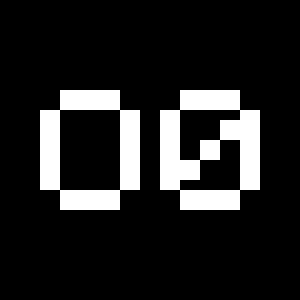
Slashed Zero
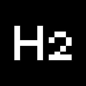
Numerators
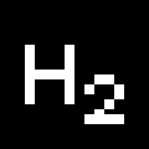
Denominators
Superscripts/Superiors
Subscripts/Inferiors
Prebuilt Fractions
Symbols
Mathematical Symbols
Currencies
Arrows
Ordinals
About
With its soft curves, balanced geometry, and subtle retro charm, Hermes is a typeface that blends warmth, precision, and contemporary appeal.
Its design is a reinterpretation of a typeface sample named Epoca produced by a Hermes 3000 typewriter. Through its simple geometrical shapes and low-contrast strokes, Epoca embodied fresh modernist ideas, particularly in comparison to its contemporaries, in the age of mechanical writing machines. Notably the last typewriter Jack Kerouac owned and easily recognizable by its seafoam color, the Hermes 3000 is a lightweight portable typewriter that was manufactured in Western Switzerland from 1958 until the 1980s.
As monospaced fonts were customary on typewriters, Hermes undoubtedly keeps certain features from this original parameter. Although, Hermes has been adapted proportionally for improved texture and legibility. Its rounded ends bring a friendly touch, while its reminiscent fixed-width and geometrical aspect simultaneously give it a more rational edge.
Originally designed by Gavillet & Rust in 2001, Hermes was redrawn and extended by Amélie Gallay in 2024. Reformulated as a collection, Hermes now offers variable fonts, additional styles and a new width bridging the gaps between its already existing Narrow and Wide families. The result is a reliable, flexible and resourceful typeface and allows for extensive modern usage.
More about the collection >


