


Plain Pan
OpenType Features
Case Sensitive Forms


All Caps [cpsp]

Case Sensitive Forms [case]
This function formats the text in uppercase and adjusts spacing between all capital letters. It also applies the ‘Case Sensitive Forms’ feature which replaces certain characters with alternates that are better suited for all capital text, especially related to punctuation.
«Optimo»
@|¦()[]{}¿¡‹›«»-–—·
«OPTIMO»
@|¦()[]{}¿¡‹›«»-–—·
Contextual Alternates
 Contextual Alternates [calt]
This feature adapts the position of a glyph after its surrounding context. For instance, a dash placed between two uppercase letters or numbers will be replaced by an uppercase version of the dash, slightly higher. This feature is usually active by default in Adobe applications.
Bulgarian alternates
 Stylistic Set 3 [ss03]
This feature activates alternative letters used in Bulgarian language.
български
ДЛФвгджзий
ѝклптцшщю
български
ДЛФвгджзий
ѝклптцшщю
Macedonian and Serbian alternates
 Stylistic Set 4 [ss04]
This feature activates the alternative “be” letter used in Serbian language.
б
Добро јутро
б
Добро јутро
Serbian alternates [italics only]
 Stylistic Set 5 [ss05]
This feature activates alternative italic letters used in Serbian language.
погледајте
бгдптш
погледајте
бгдптш
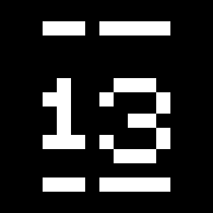
Tabular Lining Figures
Tabular Lining Figures [tnum–lnum]
Based on the proportions of the capitals, lining figures have an invariable height. With the combination of the tabular spacing format, the width of each numeral is uniformized. This feature is useful when numerals need to all lined up. It facilitates the reading of numbers set within columns or tables. As some applications don’t have access to this feature, proportional figures are set as the default choice.
0123456789
0123456789
Proportional Oldstyle Figures
 Proportional Oldstyle Figures [pnum–onum]
Based on the design of the lowercase, oldstyle figures have varying ascenders and descenders. Like most of the letters, each number has an appropriate width based on its shape. The combination of oldstyle figures with proportional setting generate numerals perfectly adapted for text.
Tabular Oldstyle Figures
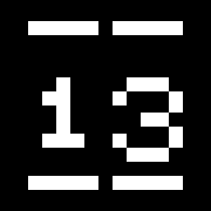 Tabular Oldstyle Figures [tnum–onum]
Based on the design of the lowercase, oldstyle figures have varying ascenders and descenders. With the combination of the tabular spacing format, the width of each numeral is uniformized. This feature is useful when numerals need to all lined up. It facilitates the reading of numbers set within columns or tables.
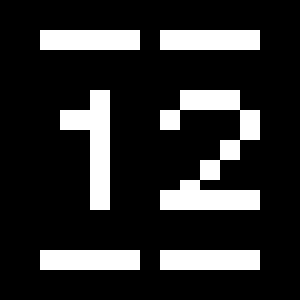
Fractions
 Fractions [frac]
With this feature, any numbers separated by a slash will automatically turn into a fraction. To fit in fraction configuration, numerals have been designed smaller and their weights have been adjusted to suit the typeface.
3/4 3/8 5/8 7/8
3/4 3/8 5/8 7/8
Lowercase math symbols
 Stylistic Set 6 [ss06]
This feature activates alternate lowercase positioning of mathematical symbols.
up+down
+±×÷−=≈≠¬∞
up+down
+±×÷−=≈≠¬∞
Ordinals
 Ordinals [ordn]
This feature replaces any letter following a numeral with its matching superior letters. French language uses the ordinal indicators such as ‘er’ for 1er premier, while Spanish, Portuguese and Italian require the feminine and masculine ordinals ‘a,’ ‘o’ for 1º, 1ª. Ordinals are designed to match the weight of the typeface.
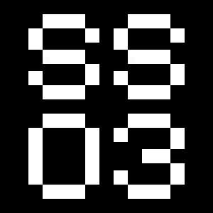
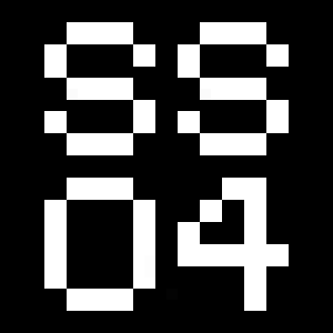
Slashed Zero
 Slashed Zero [zero]
Originally created to avoid the confusion between the ‘0’ and the ‘O’, this feature substitutes all zeros in a selected text by a slashed form of the zero.
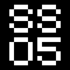
Slashed Zero Oldstyle
Slashed Zero [zero]
Originally created to avoid the confusion between the ‘0’ and the ‘O’, this feature substitutes all zeros in a selected text by a slashed form of the zero.
Proportional Oldstyle Figures [onum]
Tabular figures are all of equal width. They are only needed when the figures must all line up from one line to the next, as in a table. Proportional figures have varying widths, just like most letters; each number has a width appropriate to its design. Lining figures are all the same height, usually similar to that of capital letters. They are needed for use with all-capital settings.
Multiply sign
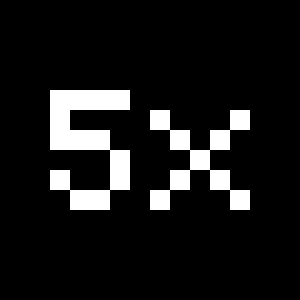 Stylistic Set 20 [ss20]
This feature substitutes the letter “x” into the multiplication sign.
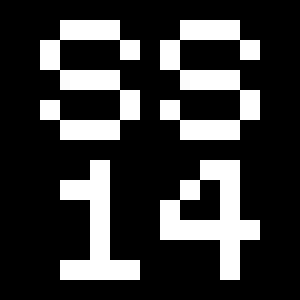
Numerators
 Numerators [numr]
This feature substitutes glyphs with their matching smaller alternates. The numerators are the same glyphs that are used to create fractions, their vertical position remains within the capital letters height. These glyphs are reduced in size and designed slightly heavier to keep them consistent with the rest of the font.
Habcdefghijklmn
Hopqrstuvwxyz()[].,
Habcdefghijklmn
Hopqrstuvwxyz()[].,
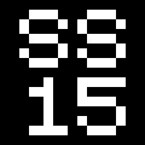
Denominators
 Denominators [dnom]
This feature substitutes glyphs with their matching smaller alternates and low position glyphs. The denominators are the same glyphs that are used to create fractions, their vertical position remains within the base line. These glyphs are reduced in size and designed slightly heavier to keep them consistent with the rest of the font.
Habcdefghijklmn
Hopqrstuvwxyz()[].,
Habcdefghijklmn
Hopqrstuvwxyz()[].,
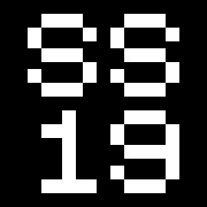
Superscript/Superiors
 Superscript / Superiors [sups]
This feature substitutes glyphs with their matching smaller alternates which are set slightly above the height of the capital letters. These glyphs are reduced in size and designed slightly heavier to keep them consistent with the rest of the font.
Habcdefghijklmn
Hopqrstuvwxyz()[].,
Habcdefghijklmn
Hopqrstuvwxyz()[].,
Subscript/Inferiors
 Subscript / Inferiors [subs]
This feature substitutes glyphs with their matching smaller alternates which are set slightly below the baseline. These glyphs are reduced in size and designed slightly heavier to keep them consistent with the rest of the font.
Habcdefghijklmno
Hpqrstuvwxyz()[].,
Habcdefghijklmno
Hpqrstuvwxyz()[].,
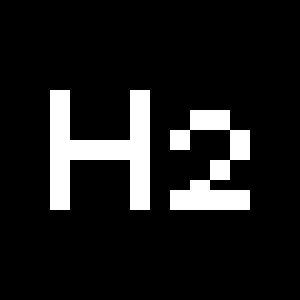
Circled Figures
Stylistic Set 14 [ss14]
This feature replaces glyph(s) with stylistic alternate(s).
0123456789
0123456789
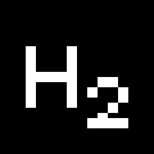
Black Circled Figures
Stylistic Set 15 [ss15]
This feature replaces glyph(s) with stylistic alternate(s).
0123456789
0123456789
Pictograms
Stylistic Set 19 [ss19]
This feature activates a set of pictograms.
abcdefgh
ijklmnop
qrstu
vwxyz
ABCDEF
GHIJKLM
NOPQR
STUVWXYZ
012345678
!"#$%&'()
+,-./:;<=
>?@[\]^_
`{|}*9
abcdefgh
ijklmnop
qrstu
vwxyz
ABCDEF
GHIJKLM
NOPQR
STUVWXYZ
012345678
!"#$%&'()
+,-./:;<=
>?@[\]^_
`{|}*9
Character Map
Uppercases
Lowercases
Uppercases Cyrillic
Lowercases Cyrillic
Uppercases Greek
Lowercases Greek
Accented Uppercases
Accented Lowercases
Additional Uppercases Cyrillic
Additional Lowercases Cyrillic
Bulgarian Alternates
Serbian Alternate
Standard Ligatures
Punctuation
Greek Punctuation
Lining Figures
Numerators
Denominators
Superscripts/Superiors
Subscripts/Inferiors
Circled Numbers
Black Circled Numbers
Prebuilt Fractions
Symbols
Mathematical Symbols
Currencies
Arrows
Ordinals
Pictograms
About
Plain Pan offers an extended character set, which supports languages that use Cyrillic and Greek alphabets, in addition to those which use the Latin alphabet. It provides accurate and genuine letterforms created for international communication.
Every word could be a logotype. Text composes effortlessly balanced lines. Plain works from footnote to poster sizes. The graphic aesthetic is unique yet universal.
Plain investigates the rational simplicity of modernism and brings it to a new level of achievement. Few typefaces achieve this state of visual alchemy, which is epitomized by the classic Helvetica from times in which photo lettering was ubiquitous. Plain is incredibly fluid thanks to a drawing that is neither constrained by a geometrical approach nor structured according to the idiosyncrasy of the stroke. Glyphs are designed optically as plain surfaces and, beneath an apparent modern simplicity, their dynamic interactions create a distinct identity.
Plain is the accomplishment of years of research by François Rappo, whose Theinhardt family had set a milestone in revivalist Grotesque typeface design. Plain comes in an exceptionally large range of weights offering to graphic designers a multi-sided tool, ready to prove its utility.