Programme Pan offers an extended character set, which supports languages that use Cyrillic and Greek alphabets, in addition to those which use the Latin alphabet. It provides accurate and genuine letterforms created for international communication.
Developed by the Swiss design studio Maximage, Programme is an innovative typeface which is based both on calligraphy and computer programming. The typeface was developed with the help of scripting technology.
The project started from the rather raw idea that a font’s DNA is entirely contained in the calligraphic letters “o” and “n.” From these two glyphs, it was thought that a computer program could build the full Latin alphabet, since a typeface is actually made out of a limited set of shapes that are repeated in all of its characters. The typeface was eventually optimized for both text and display uses. In some cases, the imperfections of the program have not been retouched to preserve the type’s original essence. This is why Programme exists in a rougher style as well as in a more refined one
The first version of Programme was featured in JRP Ringier’ 2009 book Typeface as Program. The book provides an overview of a series of projects related to programming and type design, which took place at the École cantonale d’art de Lausanne (ECAL).
Programme Pan 10 styles
Contextual Alternates
This feature adapts the position of a glyph after its surrounding context. For instance, a dash placed between two uppercase letters or numbers will be replaced by an uppercase version of the dash, slightly higher. This feature is usually active by default in Adobe applications.
Classic Alternate letters and symbols
This feature replaces glyph(s) with stylistic alternate(s).
JQUefgj&@
ĴIJÚÙÛÜŨŪŬŮŰŲ
èéêëēĕėęěĝğġģĵij
JQUefgj&@
ĴIJÚÙÛÜŨŪŬŮŰŲ
èéêëēĕėęěĝğġģĵij
Geometric alternate letters and symbols
This feature replaces glyph(s) with stylistic alternate(s).
GKRShmnru¿?π∫ƒ$
ĜĞĠĢĶŔŖŘŠŚŜŞȘ
ĥħñńņňʼnŋŕŗř
ùúûüũūŭůűų
GKRShmnru¿?π∫ƒ$
ĜĞĠĢĶŔŖŘŠŚŜŞȘ
ĥħñńņňʼnŋŕŗř
ùúûüũūŭůűų
Bulgarian alternates
This feature activates alternative letters used in Bulgarian language.
български
ДЛФвгджзий
ѝклптцшщю
български
ДЛФвгджзий
ѝклптцшщю
Macedonian and Serbian alternates
This feature activates the alternative “be” letter used in Serbian language.
б
Добро јутро
б
Добро јутро
Serbian alternates [italics only]
This feature activates alternative italic letters used in Serbian language.
погледајте
бгдптш
погледајте
бгдптш
Alternate a
This feature replaces glyph(s) with stylistic alternate(s).m
a
àáâãäāăåǻą
a
àáâãäāăåǻą
Alternate e
This feature replaces glyph(s) with stylistic alternate(s).
e
èéêëēĕėęě
e
èéêëēĕėęě
Alternate f g j t J
This feature replaces glyph(s) with stylistic alternate(s).
fgjtJ
ĝğġģijĵťŧțIJĴ
fgjtJ
ĝğġģijĵťŧțIJĴ
Alternate h m n r u
This feature replaces glyph(s) with stylistic alternate(s).
hmnru
ĥħñńņňʼnŋŕŗř
ùúûüũūŭůűų
hmnru
ĥħñńņňʼnŋŕŗř
ùúûüũūŭůűų
Alternate r
This feature replaces glyph(s) with stylistic alternate(s).
r ŕŗř
r ŕŗř
Alternate G
This feature replaces glyph(s) with stylistic alternate(s).
G ĜĞĠĢ
G ĜĞĠĢ
Alternate K
This feature replaces glyph(s) with stylistic alternate(s).
K Ķ
K Ķ
Alternate Q
This feature replaces glyph(s) with stylistic alternate(s).
Q
Q
Alternate R
This feature replaces glyph(s) with stylistic alternate(s).
R ŔŖŘ
R ŔŖŘ
Alternate S
This feature replaces glyph(s) with stylistic alternate(s).
S ŠŚŜŞȘ
S ŠŚŜŞȘ
Alternate U
This feature replaces glyph(s) with stylistic alternate(s).
U
ÚÙÛÜŨŪŬŮŰŲ
U
ÚÙÛÜŨŪŬŮŰŲ
Tabular Lining Figures
Tabular Lining Figures [tnum–lnum]
Based on the proportions of the capitals, lining figures have an invariable height. With the combination of the tabular spacing format, the width of each numeral is uniformized. This feature is useful when numerals need to all lined up. It facilitates the reading of numbers set within columns or tables. As some applications don’t have access to this feature, proportional figures are set as the default choice.
0123456789
0123456789
Proportional Oldstyle Figures
Based on the design of the lowercase, oldstyle figures have varying ascenders and descenders. Like most of the letters, each number has an appropriate width based on its shape. The combination of oldstyle figures with proportional setting generate numerals perfectly adapted for text.
Fractions
With this feature, any numbers separated by a slash will automatically turn into a fraction. To fit in fraction configuration, numerals have been designed smaller and their weights have been adjusted to suit the typeface.
3/4 3/8 5/8 7/8
3/4 3/8 5/8 7/8
Ordinals
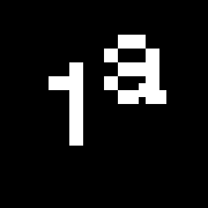
This feature replaces any letter following a numeral with its matching superior letters. French language uses the ordinal indicators such as ‘er’ for 1er premier, while Spanish, Portuguese and Italian require the feminine and masculine ordinals ‘a,’ ‘o’ for 1º, 1ª. Ordinals are designed to match the weight of the typeface.
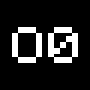
Slashed Zero
Originally created to avoid the confusion between the ‘0’ and the ‘O’, this feature substitutes all zeros in a selected text by a slashed form of the zero.
Discretionary Ligatures
This feature activates discretionary ligatures which are specific to the typeface. It applies all other designed ligatures that are not classified as standard ligatures.
Lowercase math symbols
This feature activates alternate lowercase positioning of mathematical symbols.
up+down
+±×÷−=≈≠¬∞
up+down
+±×÷−=≈≠¬∞
Alternate symbols and figures
This feature replaces glyph(s) with stylistic alternate(s).
¿?ßπ∫ƒ$
012345689
¿?ßπ∫ƒ$
012345689
Alternate registered
This feature replaces glyph(s) with stylistic alternate(s).
®
®
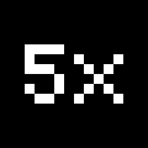
Multiply sign
This feature substitutes the letter “x” into the multiplication sign.