Rand
Rand Mono
OpenType Features
«Optimo»
@|¦()[]{}¿¡‹›«»-–—·
«OPTIMO»
@|¦()[]{}¿¡‹›«»-–—·
0123456789
0123456789
3/4 3/8 5/8 7/8
3/4 3/8 5/8 7/8
up+down
+±×÷−=≈≠¬∞
up+down
+±×÷−=≈≠¬∞
H0123456789()[]
Habcdefghijklmn
Hopqrstuvwxyz
H0123456789()[]
Habcdefghijklmn
Hopqrstuvwxyz
H0123456789()[]
Habcdefghijklmn
Hopqrstuvwxyz
H0123456789()[]
Habcdefghijklmn
Hopqrstuvwxyz
Habcdefghijklmn
Hopqrstuvwxyz()[]
Habcdefghijklmn
Hopqrstuvwxyz()[]
Habcdefghijklmno
Hpqrstuvwxyz()[]
Habcdefghijklmno
Hpqrstuvwxyz()[]
fi ffi fl ffl ff
fi ffi fl ffl ff
-> <-
-> <-
Character Map
Uppercases
Lowercases
Accented Uppercases
Accented Lowercases
Standard Ligatures
Punctuation
Lining Figures
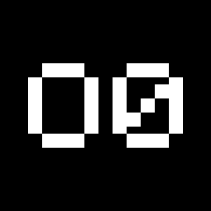
Slashed Zero
Numerators
Denominators
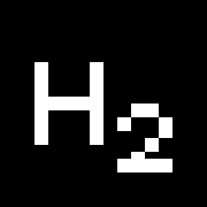
Superscripts/Superiors
Subscripts/Inferiors
Prebuilt Fractions
Symbols
Mathematical Symbols
Currencies
Arrows
Ordinals
About
Following the releases of Plain in 2014 and Apax in 2016, we launched Rand in 2019 to conclude this trilogy dedicated to François Rappo’s research on the grotesque genre. As Plain investigates the rational simplicity of modernism and Apax re-evaluates the visual grammar of constructivism; Rand explores the shapes that brought a certain spirit and warmth to the rigidity of modern design—emerging notably from The New York School. While some glyphs, like the “a”, inherit the elemental clarity of Swiss Rationalism, other glyphs borrow from design icons such as the “t” from the Westinghouse logo by Paul Rand.
Rand was born out of a constantly and evolving practice rather than from an initial concept. Combining specific design references and his researches in legibility, Rappo achieved a true visual alchemy. Its organic texture and balanced rhythm will enhance any editorial work. A monospace program is also offered. With its shortened capitals and well-studied proportions, Rand Mono perfectly completes this new font family by extending its range of competencies.


