


Recital Variable
Recital
OpenType Features
Case Sensitive Forms


All Caps [cpsp]

Case Sensitive Forms [case]
This function formats the text in uppercase and adjusts spacing between all capital letters. It also applies the ‘Case Sensitive Forms’ feature which replaces certain characters with alternates that are better suited for all capital text, especially related to punctuation.
«Optimo»
@|¦()[]{}¿¡‹›«»-–—·
«OPTIMO»
@|¦()[]{}¿¡‹›«»-–—·
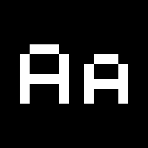
Contextual Alternates
 Contextual Alternates [calt]
This feature adapts the position of a glyph after its surrounding context. For instance, a dash placed between two uppercase letters or numbers will be replaced by an uppercase version of the dash, slightly higher. This feature is usually active by default in Adobe applications.
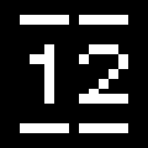
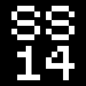
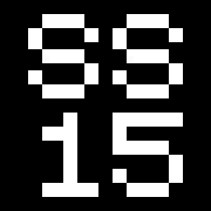
Alternate oldstyle zero

Stylistics Set 1 [ss01]
This feature replaces glyph(s) with stylistic alternate(s).
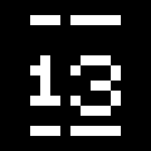
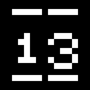
2023
2023
Alternate k [italics only]
Stylistics Set 2 [ss02]
This feature replaces glyph(s) with stylistic alternate(s).
Skyline
Skyline
Alternate v w [italics only]
Stylistics Set 3 [ss03]
This feature replaces glyph(s) with stylistic alternate(s).
Everywhere
Everywhere
Alternate ampersand [italics only]
Stylistics Set 4 [ss04]
This feature replaces glyph(s) with stylistic alternate(s).
You & Me
You & Me
Alternate ampersand [italics only]
Stylistics Set 5 [ss05]
This feature replaces glyph(s) with stylistic alternate(s).
You & Me
You & Me
Tabular Lining Figures
Tabular Lining Figures [tnum–lnum]
Based on the proportions of the capitals, lining figures have an invariable height. With the combination of the tabular spacing format, the width of each numeral is uniformized. This feature is useful when numerals need to all lined up. It facilitates the reading of numbers set within columns or tables. As some applications don’t have access to this feature, proportional figures are set as the default choice.
0123456789
0123456789
Proportional Oldstyle Figures
 Proportional Oldstyle Figures [pnum–onum]
Based on the design of the lowercase, oldstyle figures have varying ascenders and descenders. Like most of the letters, each number has an appropriate width based on its shape. The combination of oldstyle figures with proportional setting generate numerals perfectly adapted for text.
Tabular Oldstyle Figures
 Tabular Oldstyle Figures [tnum–onum]
Based on the design of the lowercase, oldstyle figures have varying ascenders and descenders. With the combination of the tabular spacing format, the width of each numeral is uniformized. This feature is useful when numerals need to all lined up. It facilitates the reading of numbers set within columns or tables.
Fractions
 Fractions [frac]
With this feature, any numbers separated by a slash will automatically turn into a fraction. To fit in fraction configuration, numerals have been designed smaller and their weights have been adjusted to suit the typeface.
3/4 3/8 5/8 7/8
3/4 3/8 5/8 7/8
Lowercase math symbols
 Stylistic Set 6 [ss06]
This feature activates alternate lowercase positioning of mathematical symbols.
up+down
+±×÷−=≈≠¬∞
up+down
+±×÷−=≈≠¬∞
Ordinals
 Ordinals [ordn]
This feature replaces any letter following a numeral with its matching superior letters. French language uses the ordinal indicators such as ‘er’ for 1er premier, while Spanish, Portuguese and Italian require the feminine and masculine ordinals ‘a,’ ‘o’ for 1º, 1ª. Ordinals are designed to match the weight of the typeface.
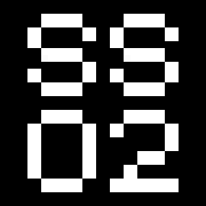
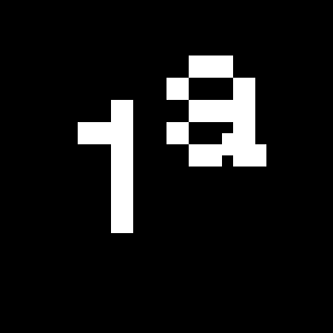
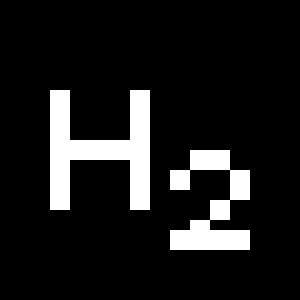
Slashed Zero
 Slashed Zero [zero]
Originally created to avoid the confusion between the ‘0’ and the ‘O’, this feature substitutes all zeros in a selected text by a slashed form of the zero.
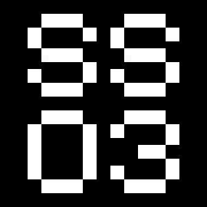
Slashed Zero Oldstyle
Slashed Zero [zero]
Originally created to avoid the confusion between the ‘0’ and the ‘O’, this feature substitutes all zeros in a selected text by a slashed form of the zero.
Proportional Oldstyle Figures [onum]
Tabular figures are all of equal width. They are only needed when the figures must all line up from one line to the next, as in a table. Proportional figures have varying widths, just like most letters; each number has a width appropriate to its design. Lining figures are all the same height, usually similar to that of capital letters. They are needed for use with all-capital settings.
Multiply sign
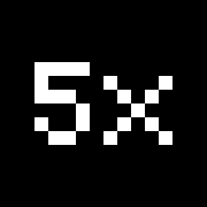 Stylistic Set 20 [ss20]
This feature substitutes the letter “x” into the multiplication sign.
Numerators
 Numerators [numr]
This feature substitutes glyphs with their matching smaller alternates. The numerators are the same glyphs that are used to create fractions, their vertical position remains within the capital letters height. These glyphs are reduced in size and designed slightly heavier to keep them consistent with the rest of the font.
Habcdefghijklmn
Hopqrstuvwxyz()[].,
Habcdefghijklmn
Hopqrstuvwxyz()[].,
Denominators
 Denominators [dnom]
This feature substitutes glyphs with their matching smaller alternates and low position glyphs. The denominators are the same glyphs that are used to create fractions, their vertical position remains within the base line. These glyphs are reduced in size and designed slightly heavier to keep them consistent with the rest of the font.
Habcdefghijklmn
Hopqrstuvwxyz()[].,
Habcdefghijklmn
Hopqrstuvwxyz()[].,
Superscript/Superiors
 Superscript / Superiors [sups]
This feature substitutes glyphs with their matching smaller alternates which are set slightly above the height of the capital letters. These glyphs are reduced in size and designed slightly heavier to keep them consistent with the rest of the font.
Habcdefghijklmn
Hopqrstuvwxyz()[].,
Habcdefghijklmn
Hopqrstuvwxyz()[].,
Subscript/Inferiors
 Subscript / Inferiors [subs]
This feature substitutes glyphs with their matching smaller alternates which are set slightly below the baseline. These glyphs are reduced in size and designed slightly heavier to keep them consistent with the rest of the font.
Habcdefghijklmno
Hpqrstuvwxyz()[].,
Habcdefghijklmno
Hpqrstuvwxyz()[].,
Standard Ligatures

Standard Ligatures [liga]
Standard ligatures replaces a sequence of characters with a single ligature glyph, they are designed to improve kerning and readability of certain letter pairs.
fi ffi fl ffl ff
fi ffi fl ffl ff
Discretionary Ligatures
Discretionary Ligatures [dlig]
This feature activates discretionary ligatures which are specific to the typeface. It applies all other designed ligatures that are not classified as standard ligatures.
-> <-
The
-> <-
The
Small Caps
 Small Caps [smcp]
This feature formats the text from lowercase or uppercase to small caps. Depending on the software used, lowercase may be affected only when a word starts with a capital.
abcdefghijklmn
opqrstuvwxyz&
0123456789-–—
()[]{}¡!¿?‘’“”‚„'"/\|¦
abcdefghijklmn
opqrstuvwxyz&
0123456789-–—
()[]{}¡!¿?‘’“”‚„'"/\|¦
All Small Caps
 All Small Caps [c2sc]
This feature formats the text from lowercase or uppercase to small caps. It uses alternate characters for punctuation which are lowered and adjusted to small caps. Depending on the software used, lowercase may be affected only when a word starts with a capital.
ABCDEFGHIJKLMN
OPQRSTUVWXYZ&
0123456789-–—
()[]{}¡!¿?‘’“”‚„'"/\|¦
ABCDEFGHIJKLMN
OPQRSTUVWXYZ&
0123456789-–—
()[]{}¡!¿?‘’“”‚„'"/\|¦
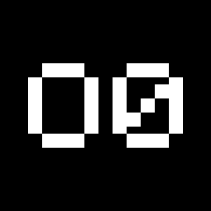
Circled Figures
Stylistic Set 14 [ss14]
This feature replaces glyph(s) with stylistic alternate(s).
0123456789
0123456789
Black Circled Figures
Stylistic Set 15 [ss15]
This feature replaces glyph(s) with stylistic alternate(s).
0123456789
0123456789
Character Map
Uppercases
Lowercases
Small Caps
Accented Uppercases
Accented Lowercases
Accented Small Caps
Standard Ligatures
Discretionary Ligatures
Stylistic Alternates [italics only]
Stylistic Alternates
Punctuation
Lining Figures
Oldstyle Figures
Slashed Zero
Numerators
Denominators
Superscripts/Superiors
Subscripts/Inferiors
Circled Numbers
Black Circled Numbers
Prebuilt Fractions
Symbols
Mathematical Symbols
Currencies
Arrows
Ordinals
About
While the journey to a recital may be arduous, it is a moment that has been honed to perfection over time. It is a performance that is tirelessly practiced, right up until it is ready to be shared with the world. With Recital, Malte Bentzen shares a carefully orchestrated achievement—an exceptional fusion of references, emotions, and unwavering dedication.
Recital, a contemporary serif typeface, reveals a refreshingly warm personality, skillfully and harmoniously weaving historical influences and shapes together. The evolution of typefaces often takes the form of revivals nested within revivals. Straddling the line between Old-Style and Transitional typefaces, Recital defies traditional classifications and explores the rich and nuanced tapestry of moods embedded within typographic materials produced during the 19th and 20th centuries.
Meticulously crafted, Recital’s compelling posture derives from its delving into the heavier end of the weight spectrum. Its substantial serifs and robust stems impart a strong and resolute presence to the text, allowing the ink to satisfyingly saturate the printed page. The typeface maintains slender lowercase proportions, while affording more generous spacing in uppercase characters. The italics are elegantly designed to offer a striking contrast to the upright forms.
Comprised of five weights and accompanying italics, this concise font family proves to be extremely versatile and suitable for various text applications. Honoring the legacy of traditional print media, the typeface seamlessly adapts to the demands of the digital world. While distinctly contemporary, Recital’s design is bolstered by a commitment to enduring the test of time.