Hermes, different Epocas
Go to Hermes page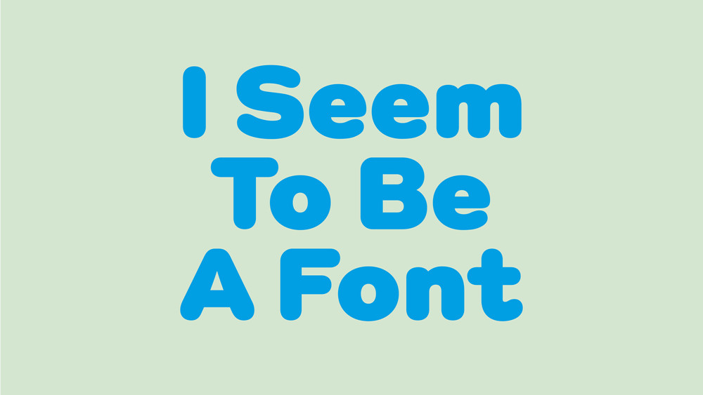
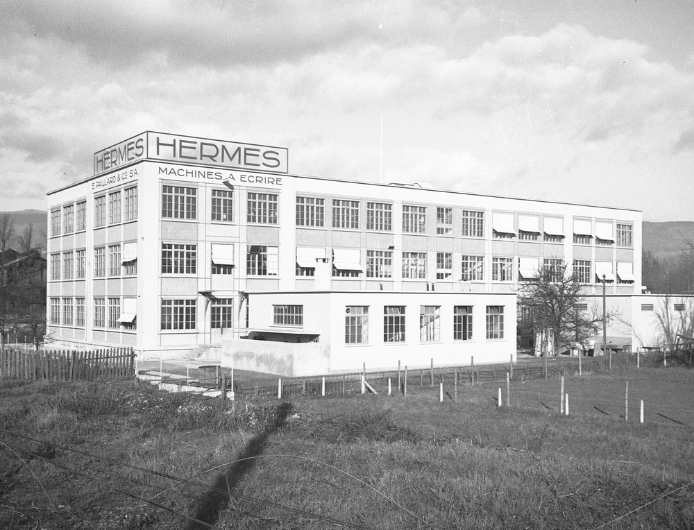
Usine Paillard S.A. in Sainte-Croix, Switzerland, 1938, Musée d’Yverdon et Région (MYR), notrehistoire.ch
A reinterpretation of a typeface used on the iconic Hermes 3000 typewriter—one of the most celebrated Swiss-made machines—Optimo’s Hermes has gradually been refined and expanded over the past twenty years into a complete, versatile type family.
Switzerland has a fascinating history of typewriter production, which has its roots in Romandy’s impressive yet largely unknown industrial legacy. Between the 1940s and 1990s, three Swiss companies, Caractères SA, Setag, and Novatype, produced type components for some of the world’s largest typewriter manufacturers, including IBM, Remington, Olivetti, Paillard, and Triumph-Adler.1 Sophie Wietlisbach’s research, presented in the book Impact Type: Manufacturing Type for Typewriters in Switzerland, 1941–1997 sheds light on these companies located in Romandy and the distinctive typewriter fonts they developed within a specific historical and technological context. Swiss companies were not, however, merely suppliers of component parts for typewriters, some also manufactured complete typewriters. Of these, Paillard, the company behind the iconic Hermes 3000 model, is the most notable.
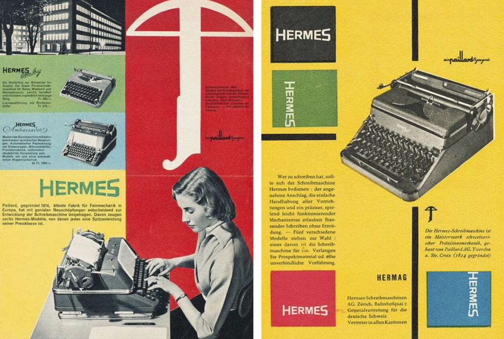
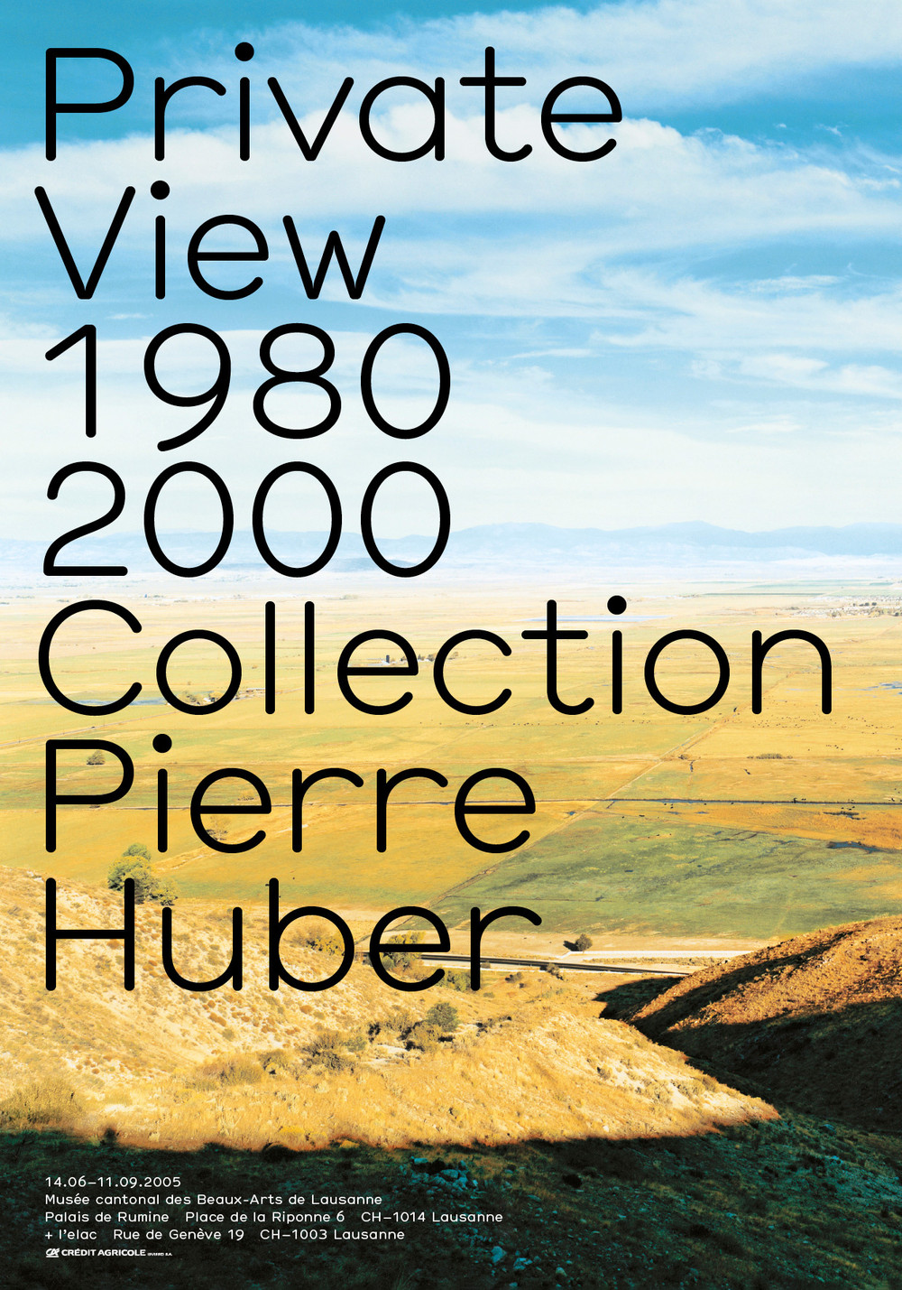
Hermes posters by Josef Müller-Brockmann for Paillard, Switzerland, 1947–1950
Usine Paillard S.A. in Sainte-Croix, Switzerland, 1956, Musée d’Yverdon et Région (MYR), notrehistoire.ch
Paillard was a precision engineering company, which was renowned for its diverse range of mechanical products, while it was in operation between 1814 and 1989. Originally founded as a watchmaking workshop in Sainte-Croix, Paillard continuously diversified to remain competitive.2 The company expanded its products from watches to include phonographs, film cameras (notably the Bolex 8mm), and—most famously—typewriters. The company’s move into typewriter manufacturing was driven by patriotic motives: at the time, Switzerland was reducing its dependence on French and German imports and aimed to create a self-sufficient typewriter industry in the country. Paillard brought its first Hermès typewriter to full production readiness and launched it in 1923. Several models followed the first, and in 1935, the company released the Hermès Baby—one of the first truly portable typewriters—which became an international bestseller. Roughly a decade after World War II, Paillard introduced its flagship model, the Hermès 3000, in 1958. It quickly became one of the most iconic typewriters of all time. Most of them were produced in the signature light green color—often described as “mint” or “seafoam.” The Hermès 3000 left its mark not only in offices but also in popular culture: Jack Kerouac typed his final novel, Vanity of Duluoz (1966), on a Hermès 3000 and Sylvia Plath used one to write her only novel, The Bell Jar (1963).
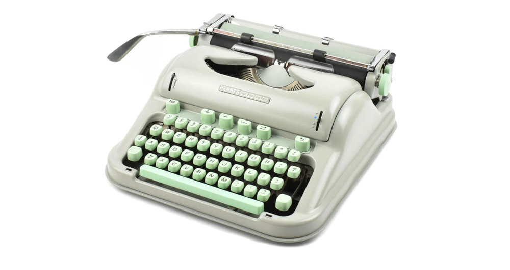
The Hermes 3000 model and its signature light green color—often described as “mint” or “seafoam.”
To create the typefaces used on Hermes typewriters, in the 1940s, Paillard began a collaboration with the Swiss company Setag SA for the production of the majority of its type matrices.[]This partnership likely explains why models such as the Hermes Baby and Hermes 3000 featured exceptionally well-designed typefaces. This history of this Swiss collaboration reveals a technical and aesthetic synergy, culminating in a rich intersection of industrial design, typography, and innovation—epitomized in Hermes typewriters.

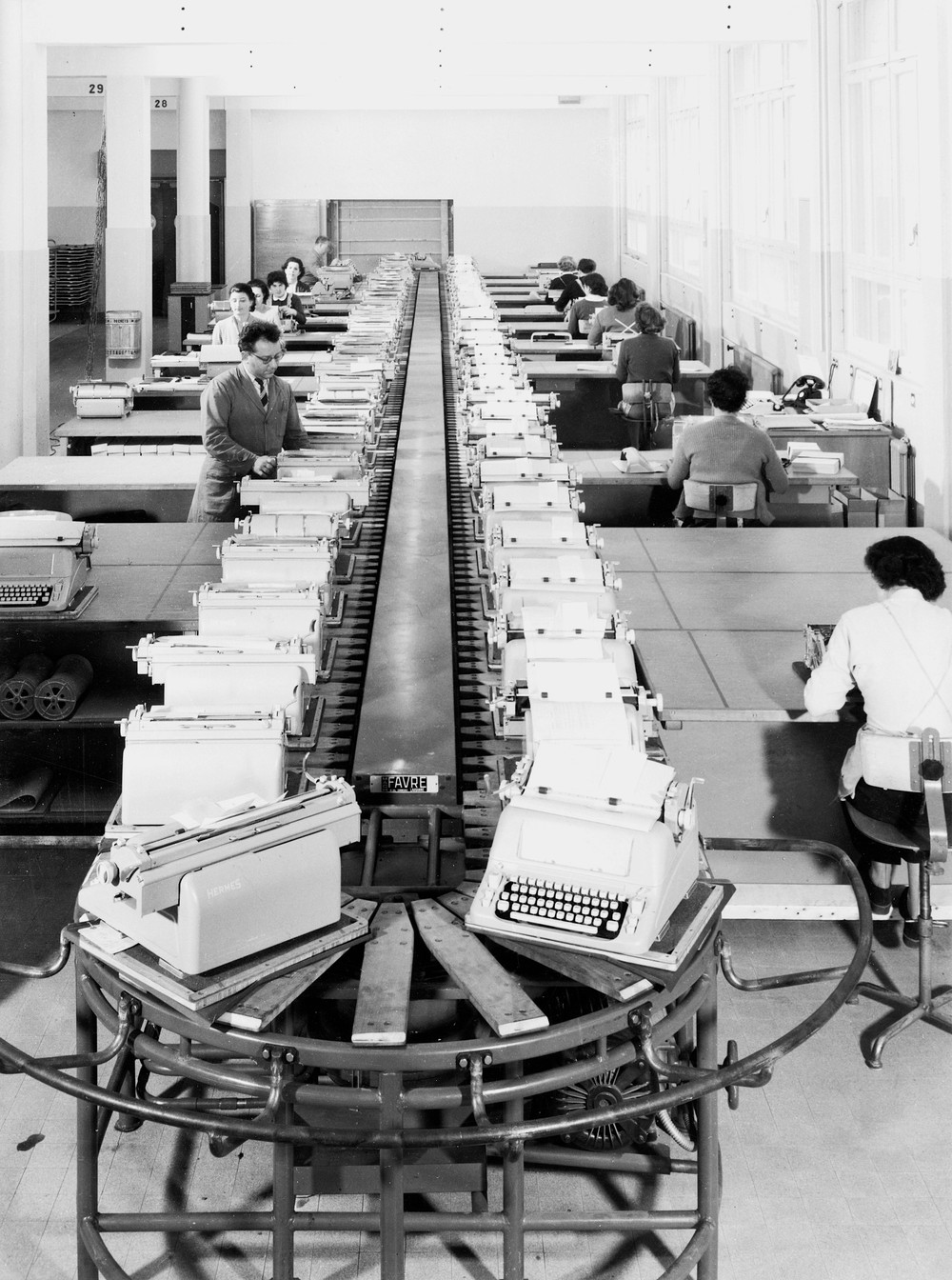
“Organised in assembly lines, in production chains, the machines and the bodies associated with them (most frequently bodies of the female sex), mimetically reproduced modernist factories and the principals of divided labour, of Taylorist productivity and reification.” This dynamic is represented in the tv show Mad Men (2007–2015) set in the 60s.
With the rise of personal computers in the 1980s, typewriters gradually fell into obsolescence and came to be thought of as an outdated writing technology of the past. In 2001, Gilles Gavillet and David Rust came across a typewriter museum in Lausanne that resembled more of a storage warehouse than a curated collection. Founded by Charles Perrier, a retired typewriter technician, the collection was born out of his deep fascination with these ingenious machines and offered a complete survey of mechanical writing in the 20th century. Gavillet & Rust documented the typeface samples and photographed the machines in a series that was later published in Super: Welcome to Graphic Wonderland, a book published by Die Gestalten Verlag.[8] For the occasion, curator and writer Lionel Bovier contributed an essay titled “The Perrier Museum of Jurassic Writing Technology,” in which he reflected on a museum devoted to a disappearing medium and examining our relationship with machines and technology.[9] He writes,
“Organised in assembly lines, in production chains, the machines and the bodies associated with them (most frequently bodies of the female sex), mimetically reproduced modernist factories and the principals of divided labour, of Taylorist productivity and reification. Standardising the act of typing by attempting to universalise the keyboard configuration, working on the ergonomics of the object in relation to the wrist and size of fingers, adding different corrective functions and basic formatting tools, were less technical advancements than a reduction of the body to a part of a mechanical process inscribed in the machine-destiny of Man (or in this case of Woman). At the same time, the position of machines in the office space, their role as status and socio-professional symbols duplicated other dominant/dominated relations that these technologies which is precisely what these technologies rigidified.”[10]

The Epoca typeface offered a fresh and rational aesthetic.
Among the 800 pieces on display at the small museum was a comprehensive history of the Swiss manufacturer Hermes.[11] One machine in particular caught Gavillet & Rust’s attention: a Hermes 3000 typewriter equipped with the Epoca typeface. Epoca has a modern, low-contrast design characterized by clean geometric forms that echoes the emergent principles of modernist typography. Compared to many of its contemporaries, Epoca offered a fresh and rational aesthetic that was aligned with the mechanical spirit of the period. Designed as a monospaced typeface using a 10-pitch system, Epoca struck a balance between technical precision and visual clarity.[12]
Rigorously tested through Gavillet & Rust graphic practice, Hermes underwent further refinements to enhance both its texture and legibility.
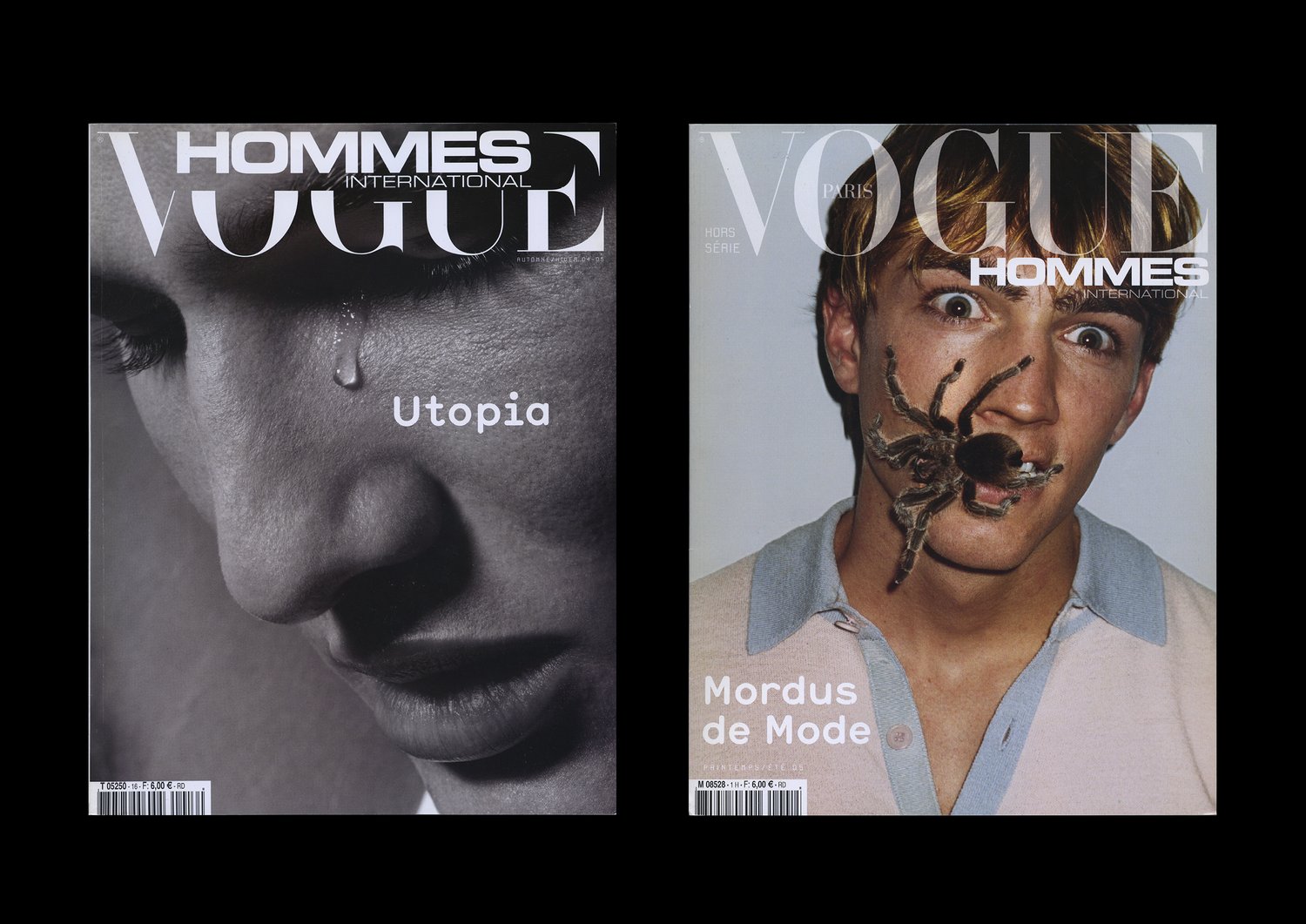
Inspired by its geometrical simplicity and its modern drawing, which represented a break in the genre, Gavillet & Rust began redrawing the typeface—a process that eventually led to the creation of a new digital font: Hermes. Rigorously tested through their graphic practice, Hermes underwent further refinements to enhance both its texture and legibility: the serifs were removed and the typeface was gradually developed to have a more proportional design, while still retaining traces of its original monospaced structure in its texture. In 2003, Hermes was finally published on Optimo’s website. It was featured in the 2004 exhibition Fresh Types at the Design Museum in Zürich, an exhibition that showcased a new wave of typeface design in Switzerland. Shortly after that, it became the headline type of Vogue Hommes International, under the artistic direction of Michel Mallard—an unexpected application for a typeface that had been initially shaped more by mechanical constraints than by pure artistry.
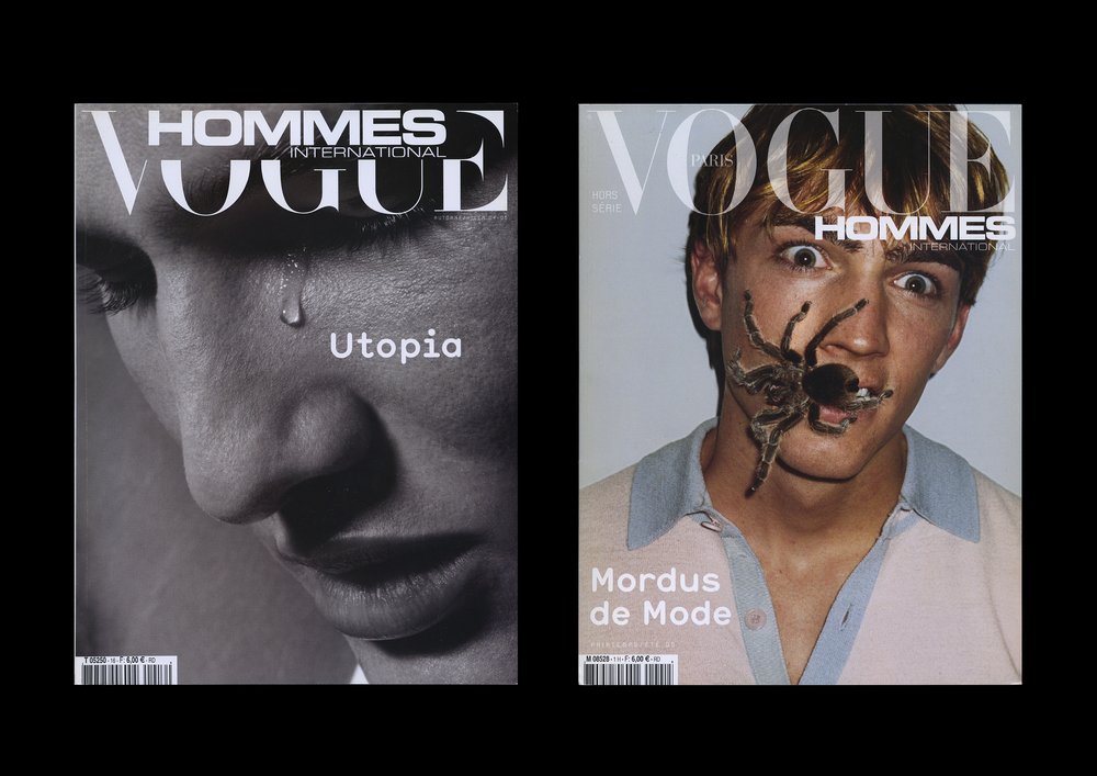
Hermes became the headline type of Vogue Hommes International, under the artistic direction of Michel Mallard—an unexpected application for a typeface that had been initially shaped more by mechanical constraints than by pure artistry.
Two decades later, Amélie Gallay began redrawing Hermes from its existing digital outlines, infusing it with a fresh, contemporary flair all while preserving the spirit of the original Epoca. Key features were retained and refined, including rounded terminals, proportional spacing with echoes of fixed-width characters, and a sans-serif foundation. Gallay defined and designed a space across weight and width axes, drawing key master styles at the extremes. Most notably, an intermediate width was added to the family, connecting Hermes Condensed with Hermes Wide (the original “Epoca” cut). The result is a versatile typeface family that transitions fluidly from light to black, narrow to wide, and includes matching italics—ideal for both dynamic and static layouts.
From a mid-20th-century, rigid, mechanical typeface, Hermes evolved into an established and complete digital product, including everything expected of a typeface for the first quarter of the 21th century, such as variability, versatility of styles, and personality. Hermes evokes the analogical and digital fate of Western and modernist ideologies, projecting the smooth visual identity of the computer back to the future. In this sense Hermes recalls the way that the design of machines, from writing machines to playing machines and talking machines, dissimulate their true functions as “way-of-life” machines.

Hermes in use by Khloé Kardashian for Khloud Foods, 2025
1 Sophie Wietlisbach, Roland Früh, and Davide Fornari. Caractères : la fabrication des caractères pour machines à écrire en Suisse, 1941–1997. Zürich: Triest, 2025.
2 Alain Beltran. “Tissot Laurent , E.Paillard & Cie SA. Une entreprise vaudoise de petite mécanique (1920-1945). Entreprise familiale, diversification industrielle et innovation technologique,” Vingtième Siècle. Revue d’histoire., 1989, 146-147.
3 “Paillard-Hermes-Precisa,” Davel.
4 “History of the Hermes Typewriter.” Classic Typewriter.
5 James Cockington, “Staying True to Type,” The Sydney Morning Herald, March 30, 2011.
6 John Dugdale, “Is Sylvia Plath’s Driver’s License Worth More than a Letter from Dickens?,” The Guardian, March 22, 2018.
7 Sophie Wietlisbach, Roland Früh, and Davide Fornari. Caractères : la fabrication des caractères pour machines à écrire en Suisse, 1941–1997. Zürich: Triest, 2025. 61, 73–74.
8 “Michel Fries, Grafik.”
9 Thomas Bruggisser et al. Super, Welcome to Graphic Wonderland. Berlin: Die Gestalten, 2003.
10 Thomas Bruggisser et al. Super, Welcome to Graphic Wonderland. Berlin: Die Gestalten, 2003.
11 “Musée de la machine à écrire. Lausanne Tourisme.”
12 “1964 NOMDA Blue Book: Hermes Font Styles.”


Hermes posters by Josef Müller-Brockmann for Paillard, Switzerland, 1947–1950


The Hermes 3000 model and its signature light green color—often described as “mint” or “seafoam.”

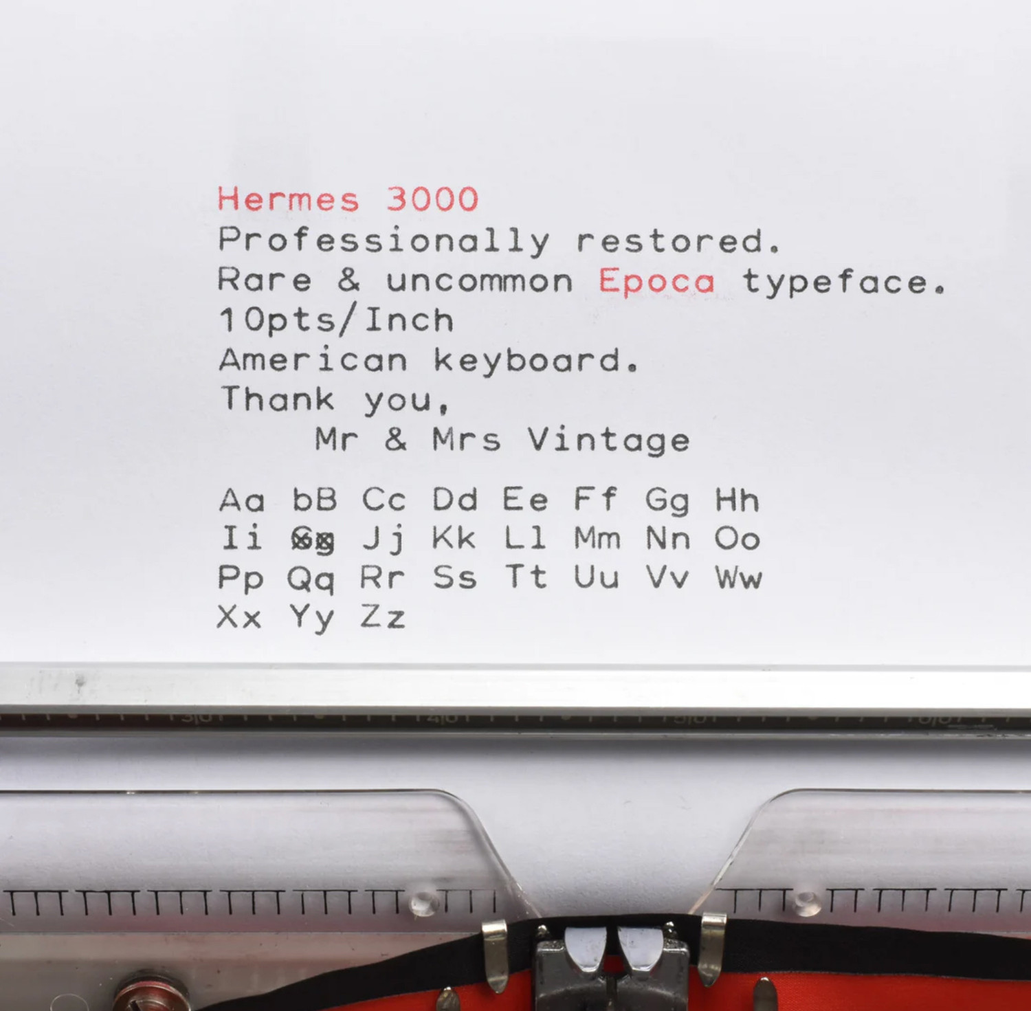
The Epoca typeface offered a fresh and rational aesthetic.

Hermes became the headline type of Vogue Hommes International, under the artistic direction of Michel Mallard—an unexpected application for a typeface that had been initially shaped more by mechanical constraints than by pure artistry.

Hermes in use by Khloé Kardashian for Khloud Foods, 2025
