Antique Legacy
Go to Antique Legacy page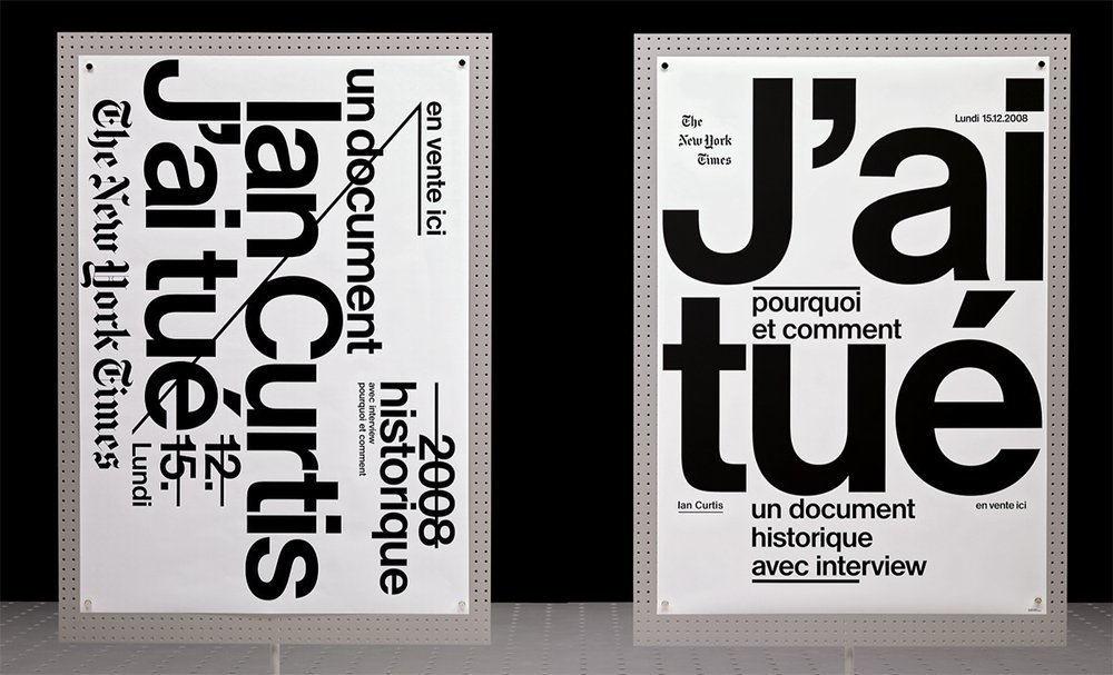
© ECAL Graphic Design/Workshop with Ludovic Balland, 2008
Evolving through its use in editorial projects over the course of ten years, Antique Legacy has been one of the Swiss design community’s best-kept secrets. In its beta version, the typeface has been used by many designers drawn by its sophisticated formal qualities, and many of the projects in which it has been used have received design awards, notably, from The Most Beautiful Swiss Books.
In 2008, François Rappo was investigating how the emblematic image of the letter was defined in Swiss neo-grotesque typefaces. From the synthesis of letterform designs proposed by Walter Käch in the late 1940s and the optically balanced Helvetica, which was drawn by Max Miedinger in the mid-1950s a distinct sensorial liaison between positive and the negative spaces in the letterforms and counterforms has emerged. The examination of how technical variants—from lead typography to photocomposition and their first digitizations—fundamentally impacted this paradigm allowed Rappo to develop a comprehensive understanding of the precedents.
Rappo was simultaneously analyzing the typographic compositions by some renowned modernist graphic designers, in particular the ways in which they achieved balance in text surfaces, such as those designed by Ernst and Ursula Hiestand for the now defunct Swiss retail store Au Bon Marché (ABM) or brochures edited by École romande des arts graphiques (ÉRAG), which were designed by one of Rappo’s teachers, Roger-Virgile Geiser.

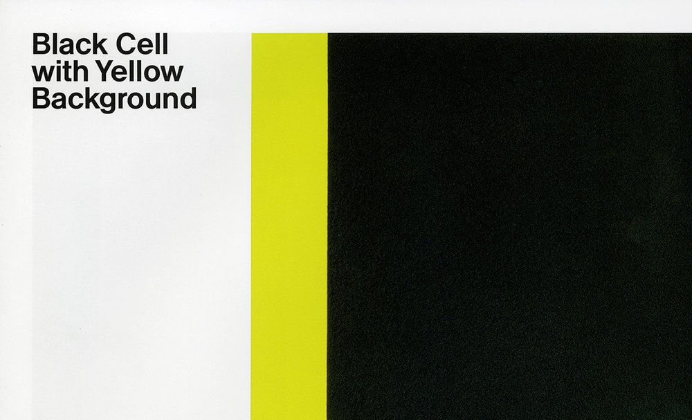
Detail from the book Francis Baudevin, Miscellaneous Abstract designed by Gavillet & Rust.
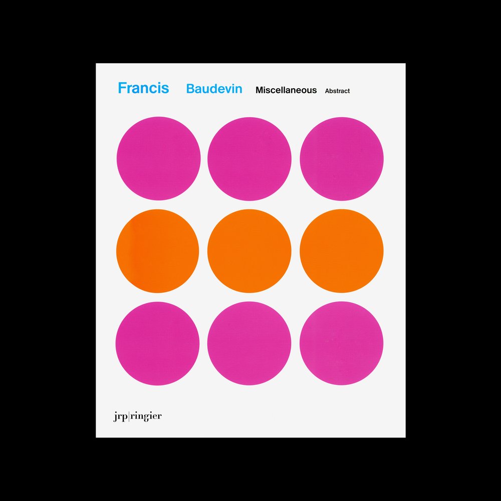
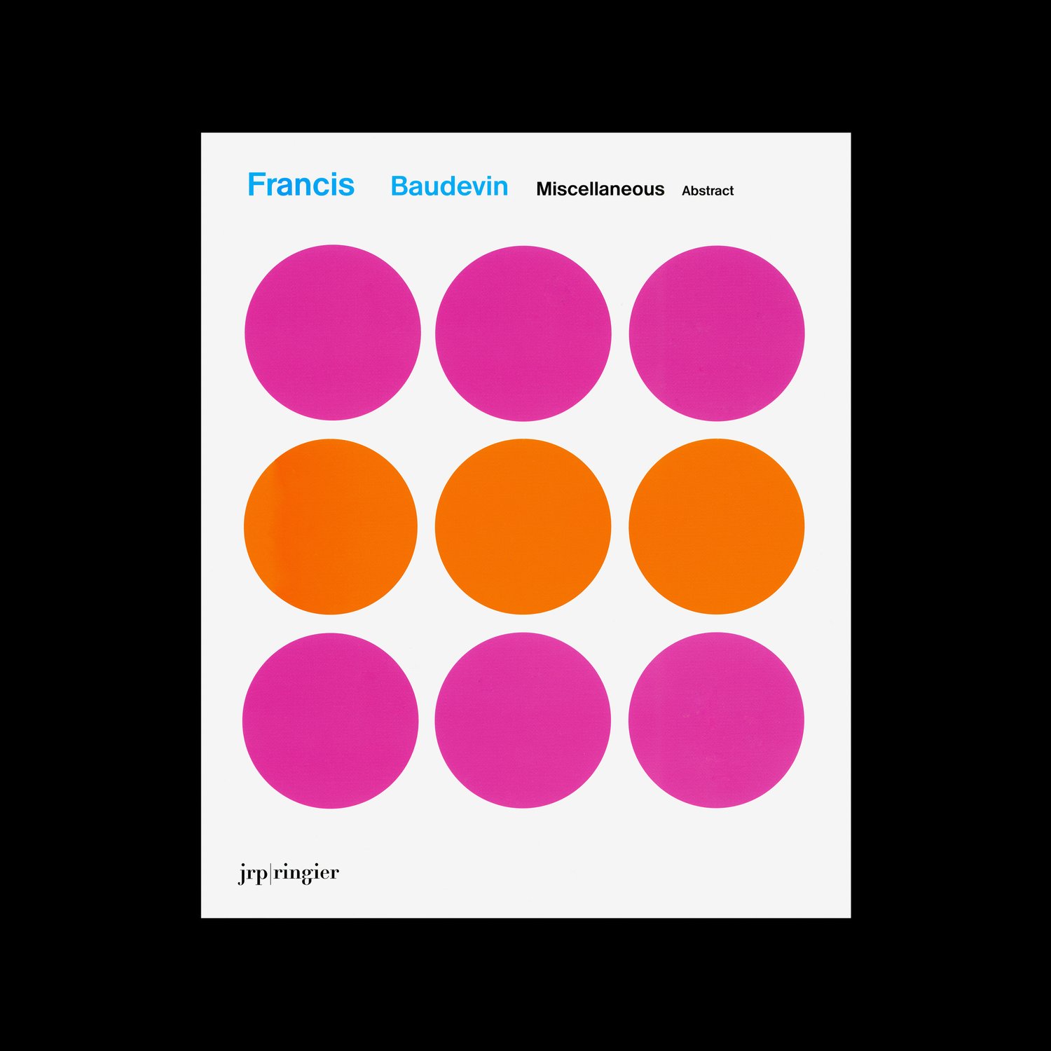
Book cover of Francis Baudevin, Miscellaneous Abstract designed by Gavillet & Rust in 2009.
Based on his studies, Rappo drew the medium weight of Antique Legacy, in a single session. He shared the resulting drawing with Gilles Gavillet, who immediately wanted to use the typeface for a book project he had been working on at the time. Gavillet thought Antique Legacy was in a way the perfect complement to the subject of the monograph: the Swiss artist Francis Baudevin. Informed by the history of graphic design and of geometric abstraction—especially Swiss graphic design—Baudevin bases his paintings on found graphic design artworks that were created for various products (mainly pharmaceuticals). “In the appropriation, Baudevin’s main act is that of removal: he takes away the type, leaving only the graphics, and so no products are identified or advertised. He never varies the colors from those of the original, and his only real departure is scale, with the original enlarged to the canvas or the wall by ten times or more.”[1] By choosing Antique Legacy as the typeface of the publication and by creating an intricate typographic layout, Gavillet was able to not only include a reference to Swiss typography but also reinforce Baudevin’s interest playing with scale in his works. The publication received an award in The Most Beautiful Swiss Books competition in 2009. Pleased by the result, Rappo told Gavillet that he was interested in limiting the use of the typeface to this publication and deeming it a one-off project. Gavillet, however, couldn’t help but continue to use the typeface, which proved its versatility in his next book, a publication presenting the work of Ari Marcopoulos, a self-taught photographer best known for his work showcasing artists, skateboarders, snowboarders, musicians, and other figures belonging to contemporary subcultures. The publication Ari Marcopoulos: Within Arm’s Reach also received an award in The Most Beautiful Swiss Books competition in 2009. And soon thereafter, the font became viral among Rappo’s students at École cantonale d’art de Lausanne (ECAL).
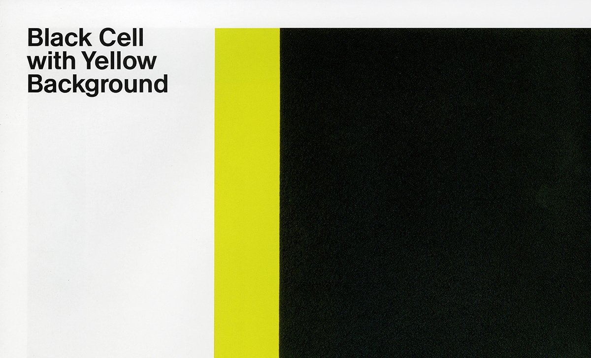
Detail from the book Peter Halley: Paintings of the 1980s, The Catalogue Raisonné designed by Nicolas Eigenheer and Nicolas Leuba.
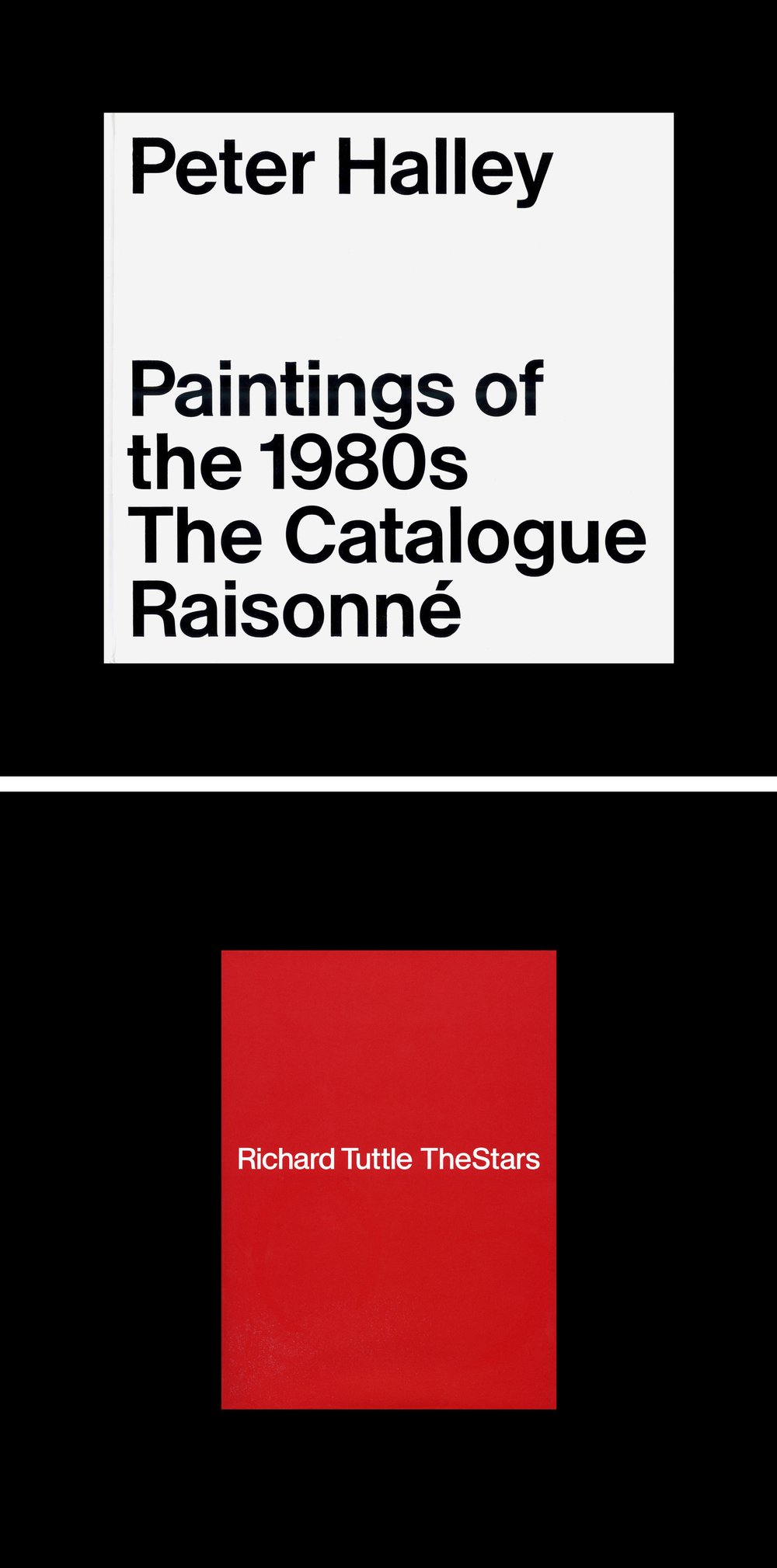
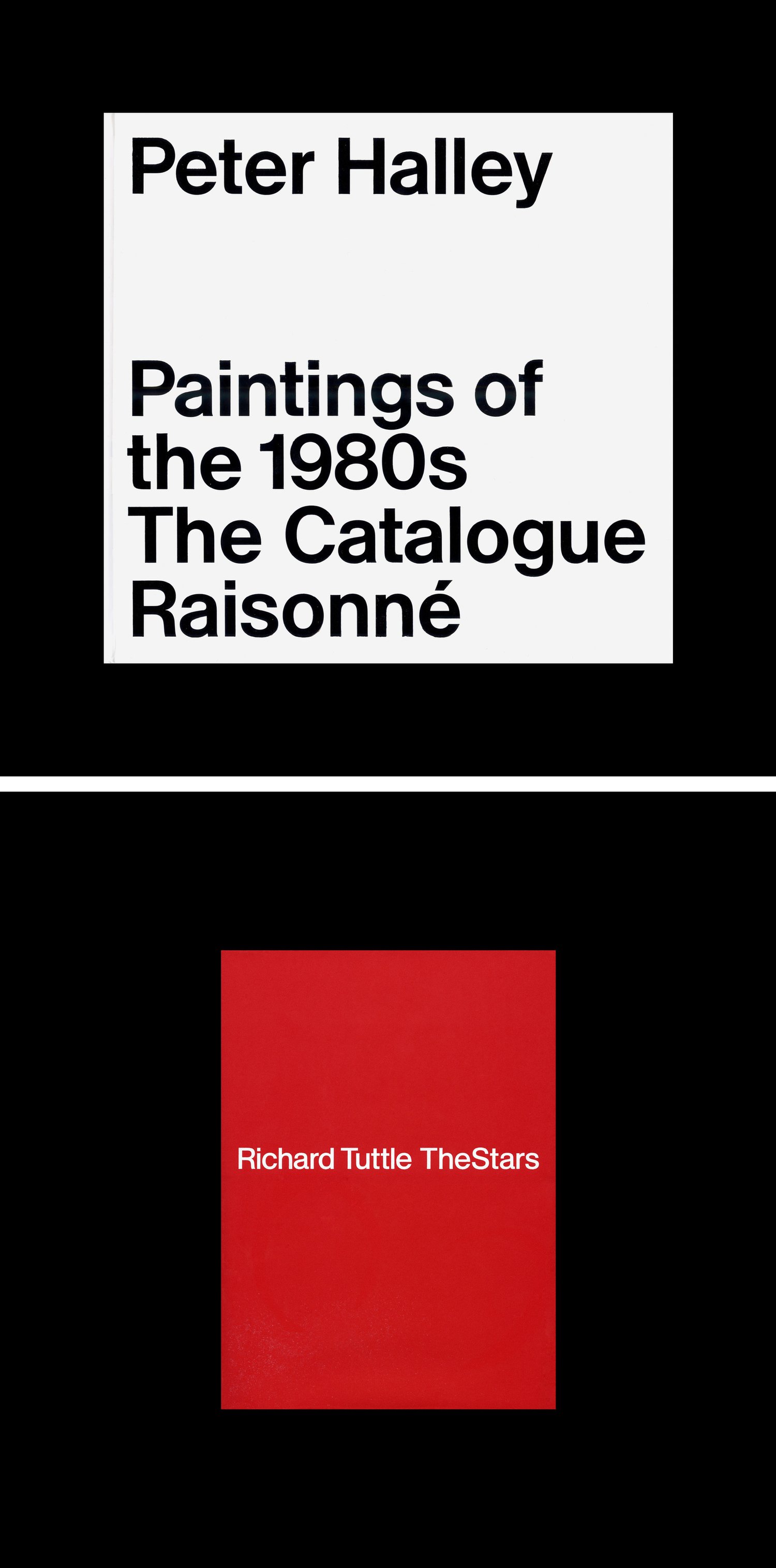
Book covers of Peter Halley: Paintings of the 1980s, The Catalogue Raisonné designed by Nicolas Eigenheer and Nicolas Leuba in 2018 (on top) and Richard Tuttle: TheStars designed by Mathias Clottu in 2020 (below).
More recently, and again used to present contemporary art, specifically geometric abstraction and minimalism, Antique Legacy appeared in both Peter Halley: Paintings of the 1980s, The Catalogue Raisonné and Richard Tuttle: TheStars. The former publication presents the work of the American artist Peter Halley, who was a central figure in the neo-conceptualism movement. The publication was designed by Nicolas Eigenheer and Nicolas Leuba and received an award in The Most Beautiful Swiss Books competition in 2018. Eigenheer explained that he used Antique Legacy to reference Peter Halley’s conceptual and formal language as well as a means to respond to Halley’s interest in modernist forms and urban infrastructure, particularly public transportation systems. It was in relation to his latter interest that Eigenheer found a connection between Halley’s work and Antique Legacy: “In Switzerland, we have the Chemins de fer fédéraux suisses (CFF) and in New York City, where Peter Halley is from, you have the New York City Subway (NYCS).” Antique Legacy functions as signage, as a sort of “corporate font,” throughout The Catalogue Raisonné. In 2020, Mathias Clottu designed a publication on the American postminimalism artist Richard Tuttle who is best known for his thoughtfully subtle works. Clottu explained that the design of the book needed a straightforward typeface, one with the qualities of a default typeface but with a bit more weight. The last weight that Antique Legacy was drawn in—between typical regular and medium weights—was the right match for the project, as it retains the classicism of shapes found in neo-grotesque typefaces.
Detail from the book Richard Tuttle: TheStars designed by Mathias Clottu.
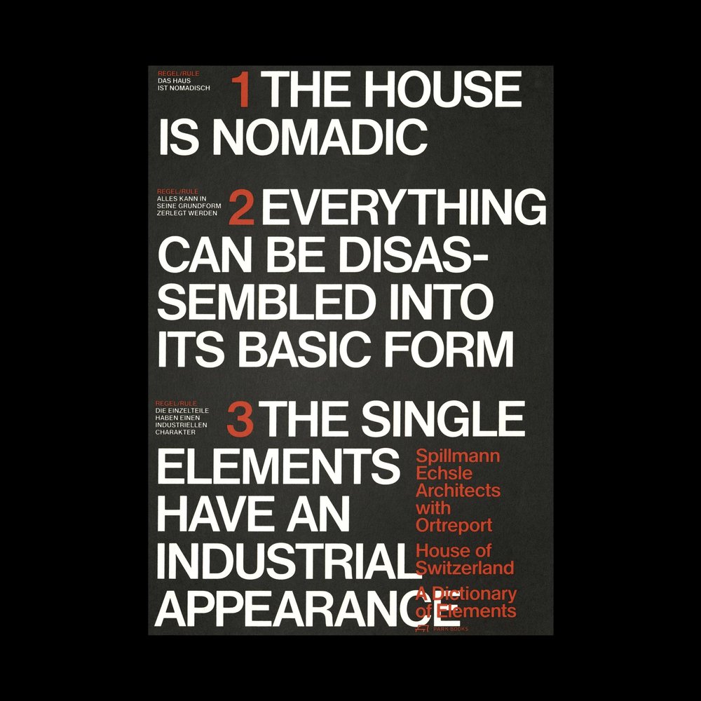
Book cover of House of Switzerland: A Dictionary of Elements designed by Ludovic Balland in 2016.
House of Switzerland: A Dictionary of Elements takes a close look at the architectural and design challenges presented by The House of Switzerland, the mobile pavilion that serves as the official visitors’ center for Switzerland at major international events. Balland explained that when Spillmann Echsle Architekten were commissioned to design The House of Switzerland, they were given a very tight timeline for completing the project. In response to the accelerated pace of the project, the architects developed a manifesto to guide the project’s development and construction from the very onset of their work. Spillmann Echsle Architekten felt that setting the manifesto was necessary in order to complete the project by the given deadline. Balland noted that, ultimately, the majority of the eight principles in the manifesto—the house must be nomadic; everything must be possible disassemble into its composing parts; each element must have an industrial quality; the style and color of the house must be defined by its raw materials; all of its elements must be visible in final form and contribute to the appearance of the project; any additional elements must be easily removable from the structure; colors may be used for furnishings; and the Swiss character is at the very core of the project[2]—were easily applied to the design of the publication. Based on the principles of the manifesto, Antique Legacy seemed to be a natural fit for this project.

Detail from the book House of Switzerland: A Dictionary of Elements designed by Ludovic Balland.
These are but a few select examples of the projects where Antique Legacy left its distinctive mark: an unparalleled graphic identity that produces exceptionally uniform text surfaces and that performs optimally in headlines and titles. The typeface evolved through them, as did its weight range, which now gives the possibility of precisely defining several typographic colors in compositions. Having circulated privately among a network of Swiss designers over the last ten years, Antique Legacy’s relevance grew especially following the release of countless variants and clones. It has finally been made available to all designers, marking the unveiling of what was once a tightly guarded secret, and reinvigorates the unmistakeable identity of Swiss typographic modernism.
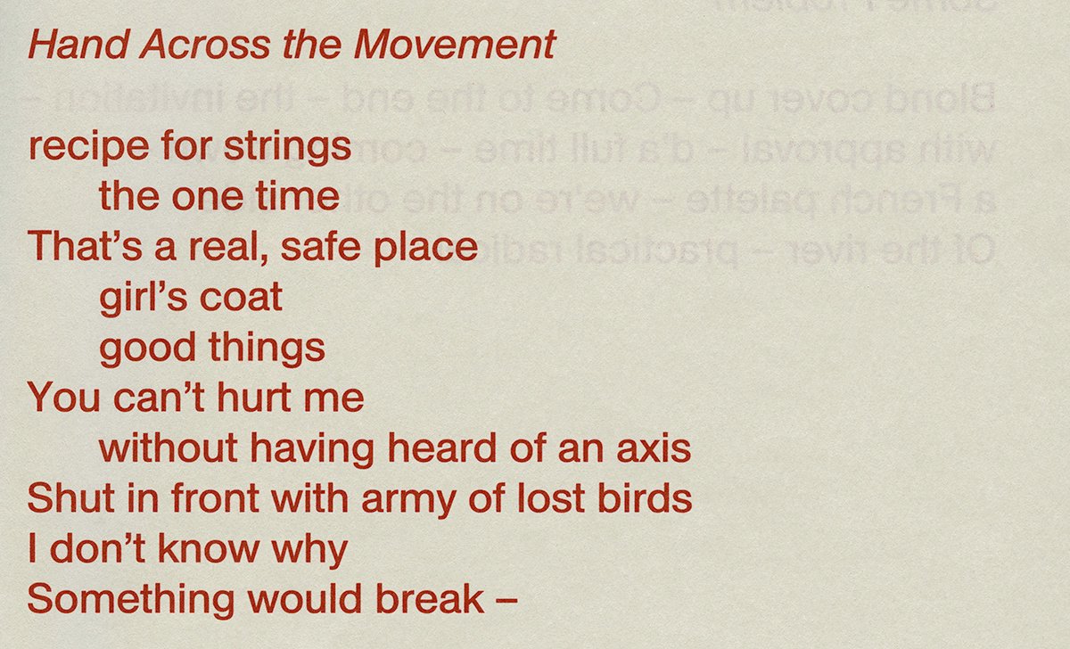
Antique Legacy poster, DIA Studio
1 “Francis Baudevin, Miscellaneous Abstract,” Les presses du réel.
2 Christoph Wieser. House of Switzerland: a Dictionary of Elements (Zürich: Park Books, 2016).
© ECAL Graphic Design/Workshop with Ludovic Balland, 2008
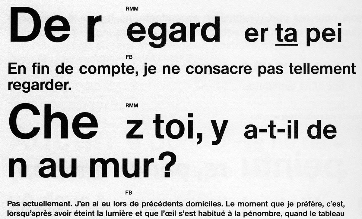
Detail from the book Francis Baudevin, Miscellaneous Abstract designed by Gavillet & Rust.
Detail from the book Peter Halley: Paintings of the 1980s, The Catalogue Raisonné designed by Nicolas Eigenheer and Nicolas Leuba.
Detail from the book Richard Tuttle: TheStars designed by Mathias Clottu.

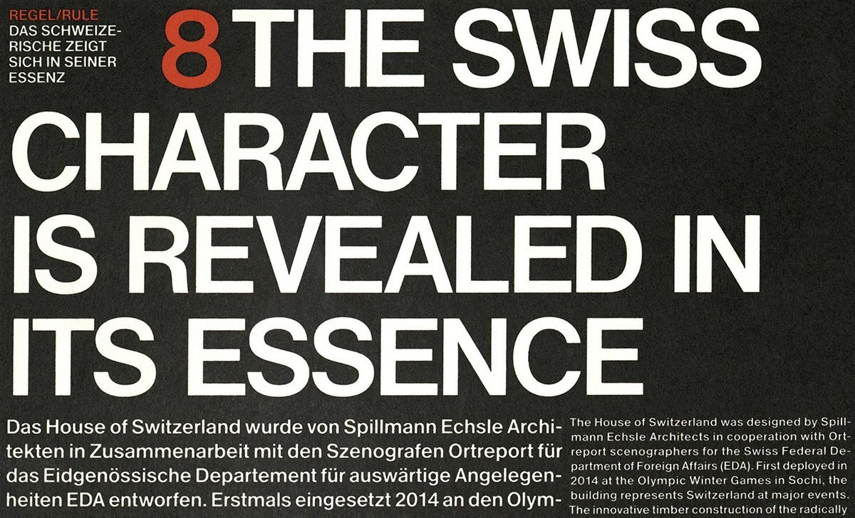
Detail from the book House of Switzerland: A Dictionary of Elements designed by Ludovic Balland.

Antique Legacy poster, DIA Studio
