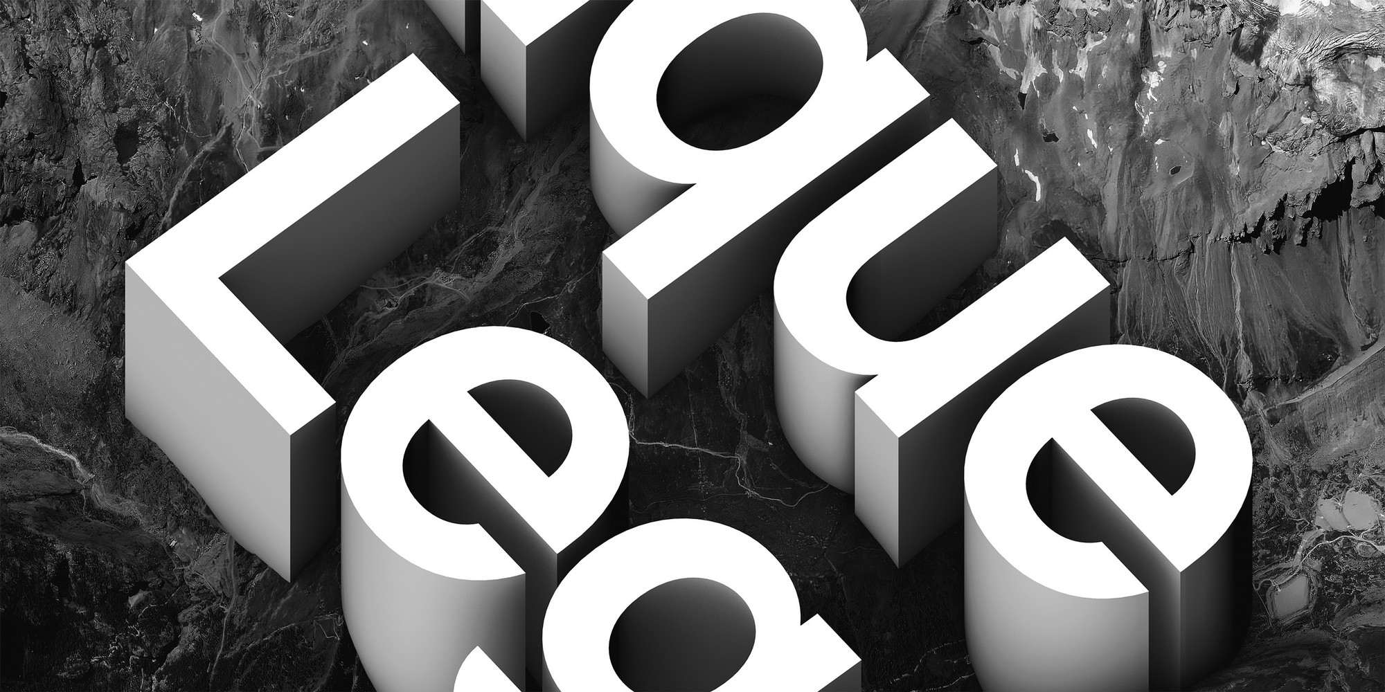
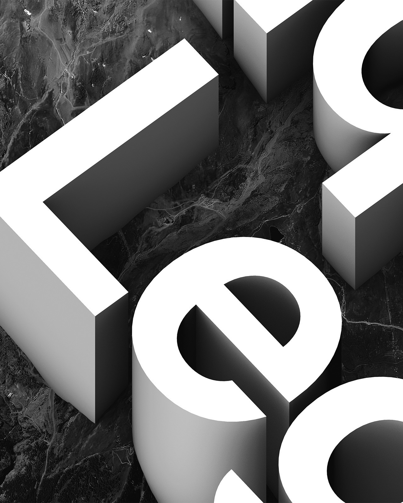
Antique Legacy
OpenType Features
«Optimo»
@|¦()[]{}¿¡‹›«»-–—·
«OPTIMO»
@|¦()[]{}¿¡‹›«»-–—·
3/4 3/8 5/8 7/8
3/4 3/8 5/8 7/8
up+down
+±×÷−=≈≠¬∞
up+down
+±×÷−=≈≠¬∞
H0123456789()[]
Habcdefghijklmn
Hopqrstuvwxyz
H0123456789()[]
Habcdefghijklmn
Hopqrstuvwxyz
H0123456789()[]
Habcdefghijklmn
Hopqrstuvwxyz
H0123456789()[]
Habcdefghijklmn
Hopqrstuvwxyz
Habcdefghijklmn
Hopqrstuvwxyz()[]
Habcdefghijklmn
Hopqrstuvwxyz()[]
Habcdefghijklmno
Hpqrstuvwxyz()[]
Habcdefghijklmno
Hpqrstuvwxyz()[]
fi ffi fl ffl ff fb ffb fh ffh fk ffk ft ff fj
fi ffi fl ffl ff fb ffb fh ffh fk ffk ft ff fj
-> <-
-> <-
Character Map
Uppercases
Lowercases
Accented Uppercases
Accented Lowercases
Standard Ligatures
Punctuation
Lining Figures
Slashed Zero
Numerators
Denominators
Superscripts/Superiors
Subscripts/Inferiors
Prebuilt Fractions
Symbols
Mathematical Symbols
Currencies
Arrows
Ordinals
About
It’s all a matter of perception and, perhaps, a matter of time and place as well. From the synthesis of letterform designs proposed by Walter Käch in the late 1940s to the optical balance achieved by Helvetica, which was drawn by Max Miedinger in the mid-1950s, an organic and rational image was defined for the letter. With a distinct sensorial liaison between the positive and the negative spaces of its letterforms and counterforms, this paradigm of modernist typography eventually became the backbone of Swiss graphic design, which, in turn, inspired an international model in the latter half of the twentieth century.
More than sixty years after the peak of Swiss style and following the release of countless variants, François Rappo reclaims this typographic heritage with Antique Legacy. Rappo, once again, proves his mastery of the grotesque genre with this tremendous project. With its unprecedented ability to produce exceptionally uniform text surfaces and high-quality letterforms, Antique Legacy ultimately reinvigorates the distinctive identity of Swiss typographic modernism and serves as a tool that will make your retina tingle with delight.
More about the collection >
