Basel x Uniqlo
Go to Basel page
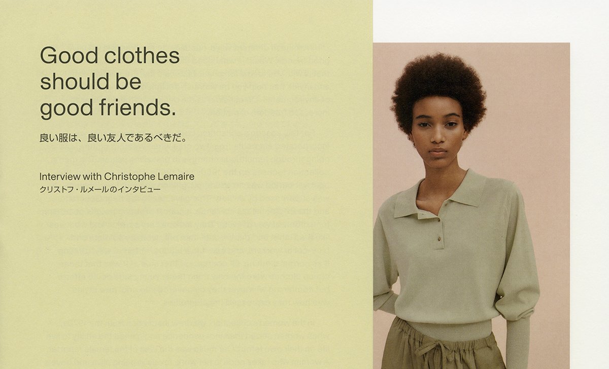
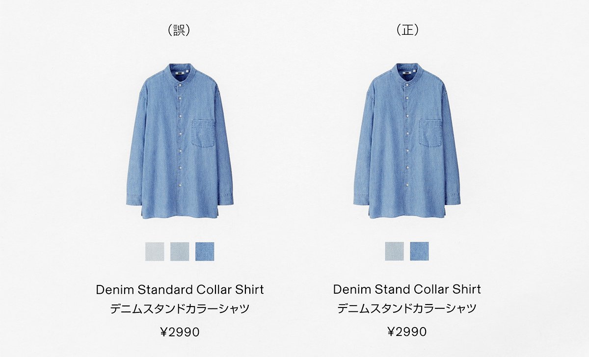
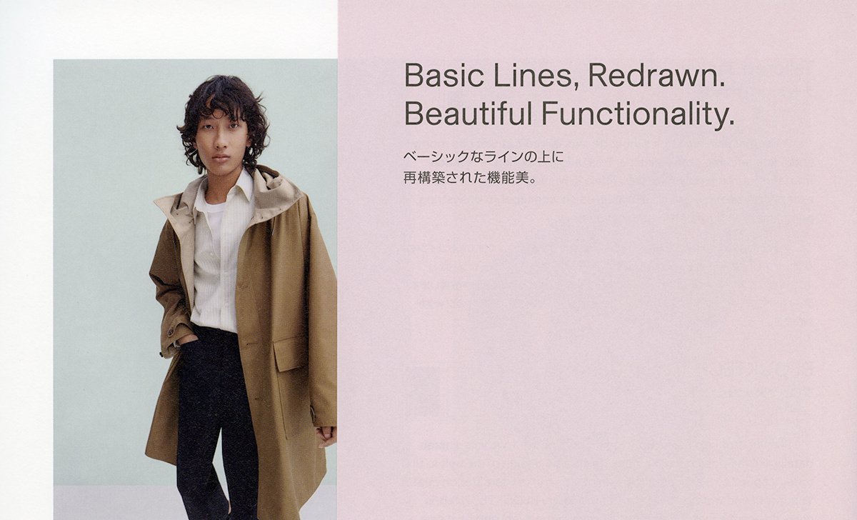
Detail from a Uniqlo U printed catalog using Basel typeface.
Before it was publicly released, Basel Grotesk was first assessed by the brand identity for Christophe Lemaire’s Uniqlo U, which was conceived of for its namesake Japanese clothing company. A key element of the collection’s identity, Basel’s ability to serve as a tool for designers simultaneously working with Latin and non-Latin characters was successfully put to the test.
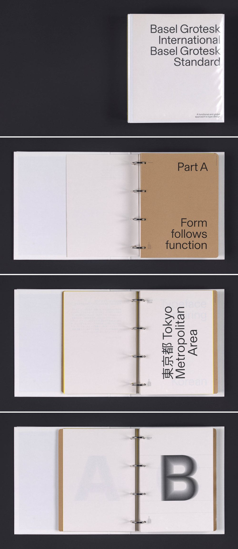
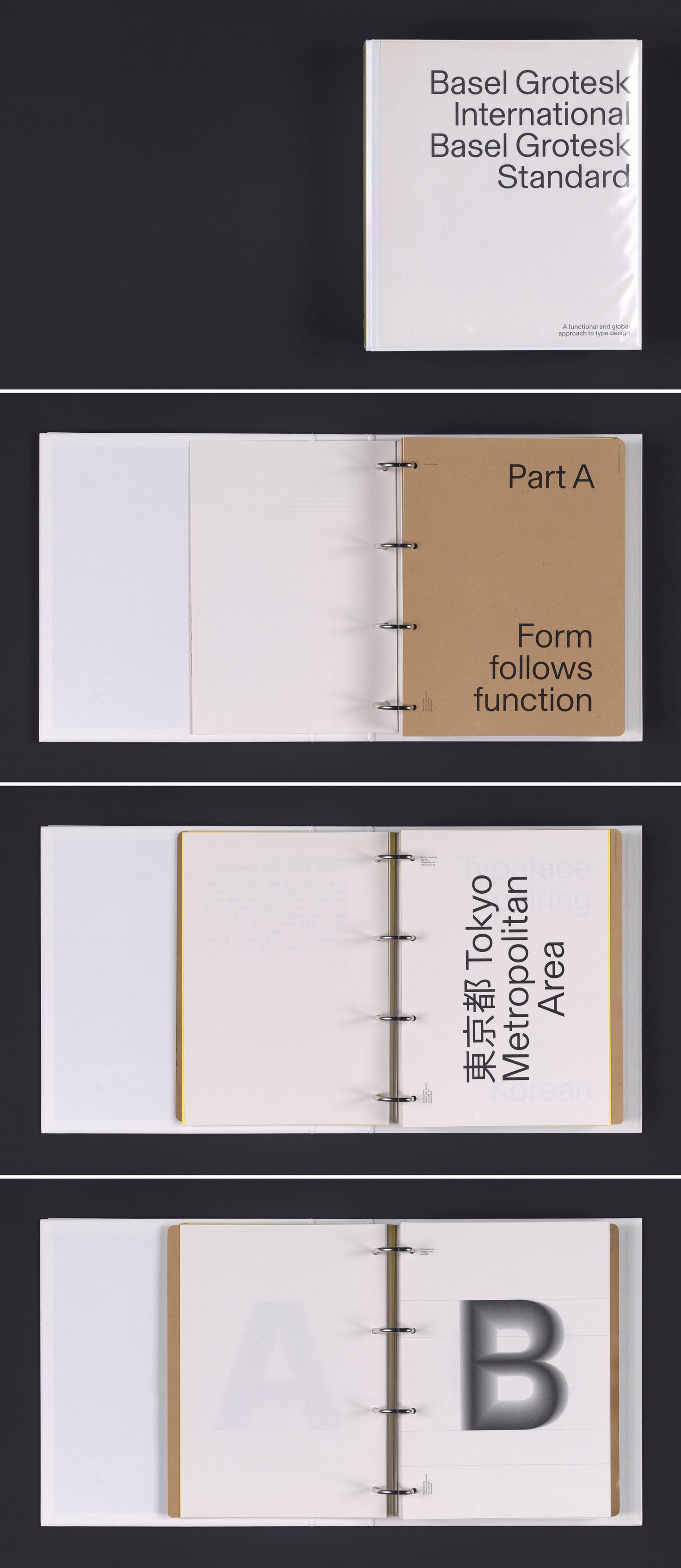
Detail of Basel’s presentation document from Chi-Long Trieu.
Designed by Chi-Long Trieu, Basel Grotesk is a sans-serif typeface that was primarily developed between 2013 and 2016, before being officially released in 2020. Following a certain Swiss typographic tradition and with an aspiration for objectivity, the typeface’s design stems from a combination of several Swiss modernist ideas. Basel Grotesk reinterprets key elements of this aesthetic with a new dynamism.
Because font weights are not standardized across different typefaces, it is nearly impossible for designers to find Latin typefaces that perfectly match the weights of non-Latin typefaces. Basel was initially developed to respond to this very specific need, by offering fifty weights to maximize the possibilities and flexibility of pairing fonts. It was specifically this feature of Basel Grotesk that was being assessed through the pre-release collaboration with Uniqlo.
Uniqlo is a Japanese clothing company and one of the world’s largest clothing retailers. The brand opened its first store in 1984 and today has over 2,000 retail locations across the globe.[1] The company offers clothing basics with a contemporary flair—their clothing is designed with current trends in art, design, and fashion in mind. Guided by its brand philosophy, “Made for All,” Uniqlo positions its clothing as essential yet universal and as transcending age, gender, ethnicity, and culture, allowing consumers to integrate the pieces into their wardrobes and personal styles.
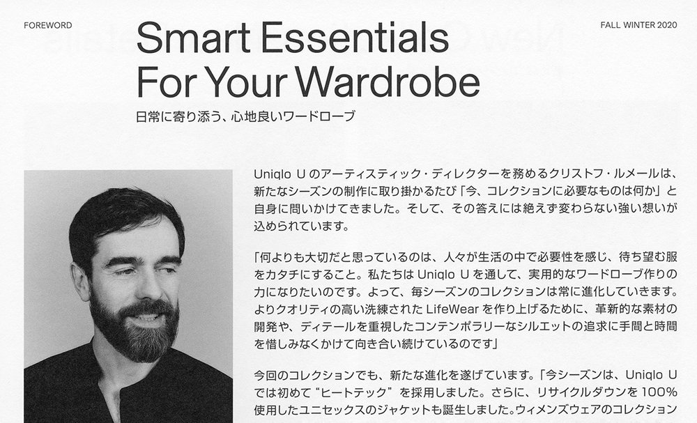
Since 2015, Christophe Lemaire and his team have been designing unique, versatile, comfortable, and sophisticated utilitarian pieces for Uniqlo U.
Since 2009, Uniqlo has been developing capsule collections in collaboration with internationally renowned designers, including Jil Sander, Alexander Wang, Inès de La Fressange, JW Anderson, and Hana Tajima to name just a few. These collaborations have attracted customers beyond those in Asia, particularly American and European ones. Amongst Uniqlo’s numerous successful partnerships is that with Paris-based designer Christophe Lemaire, who began working with the clothing retailer first as a collaborator, after which he joined Uniqlo again for a second season. After these first collaborations, Uniqlo, realizing Lemaire shared the approach and design philosophy of the brand, gave him carte blanche for their next collaboration, which led to the creation of Uniqlo’s Paris R&D Center and Uniqlo U in 2015. Since then, Lemaire and his team have been designing unique, versatile, comfortable, and sophisticated utilitarian pieces for Uniqlo U.
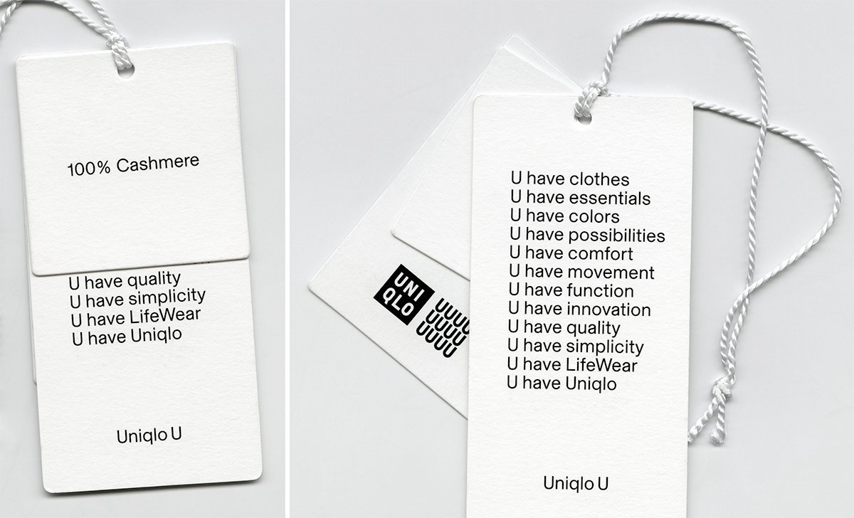
To reflect the ethos and concept of the clothing line, Lemaire’s team developed a graphic identity using the letter “U” as a central element (the line was actually named Uniqlo U for the graphic quality of the letter “U”). Not only is “U” the first letter of “Uniqlo” but the letter’s phonetic association with the word “you” compellingly echoes the brand’s philosophy: “U represents the very essence of Uniqlo.”[2] Uniqlo explains the presence of the twelve U’s in the line’s logo as follows: “Twelve is a ubiquitous number of everyday life: twelve months, twelve hours, and twelve years in the Chinese zodiac. Each of the twelve constituent statements with starts with ‘U have’ to emphasize that the collection is the fruit of the UNIQLO Paris R&D Center’s teamwork and cohesion.”[3] After six seasons, the logo eventually evolved to include a single central “U”.
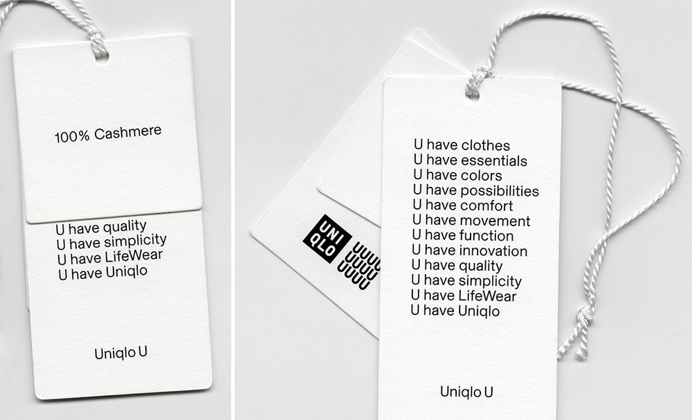
“U represents the very essence of Uniqlo.” Detail of a hangtag presenting the graphic identity of Uniqlo U developed by Uniqlo’s Paris R&D Center. After six seasons, the logo eventually evolved to include a single central “U”.
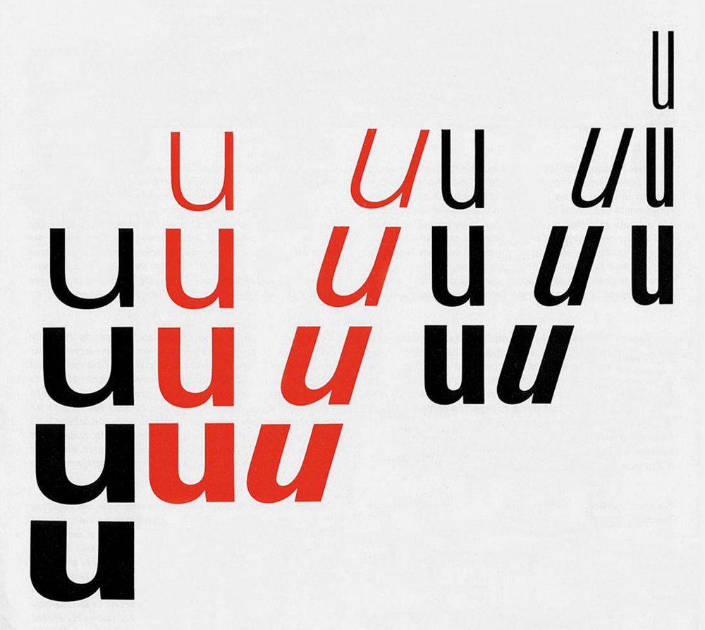
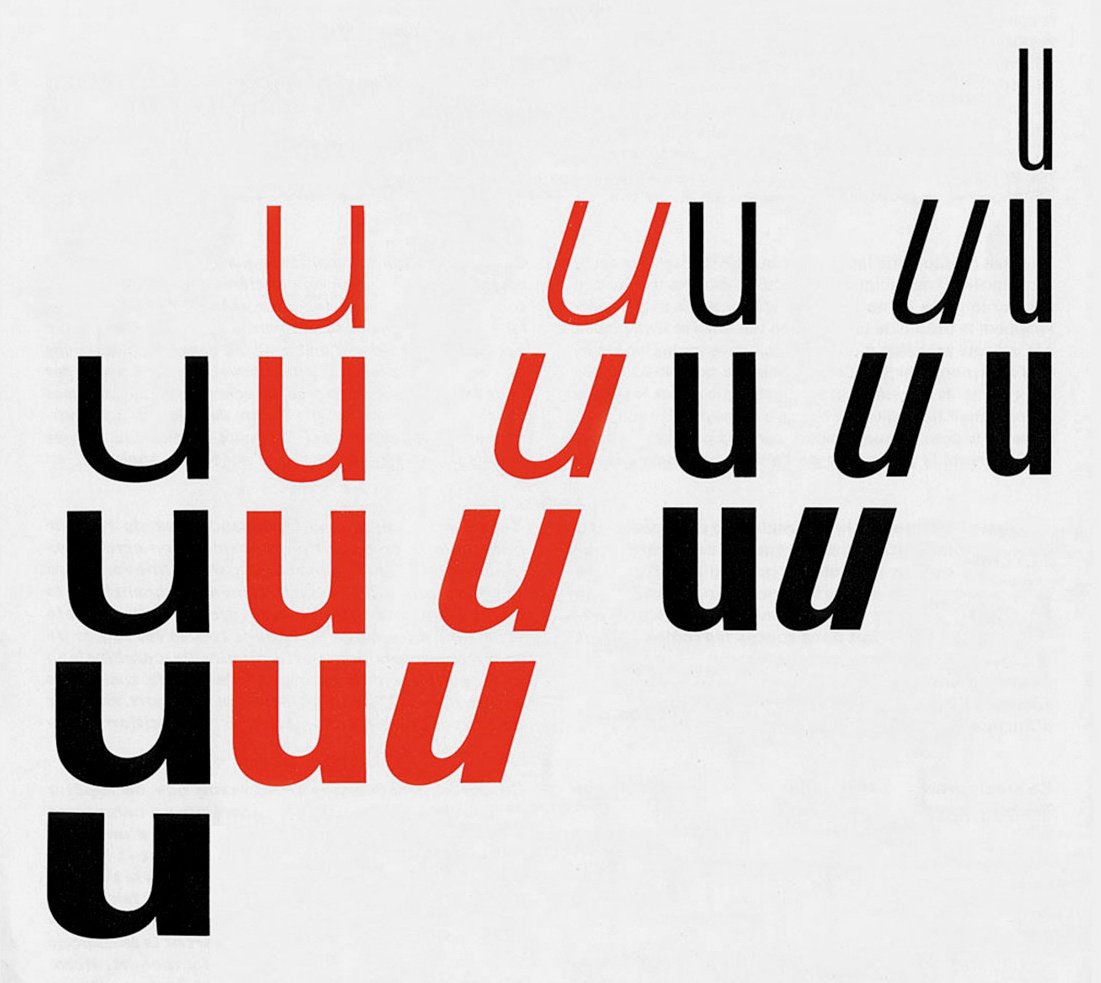
One important precedent for the team was Adrian Frutiger’s Univers typeface, in particular the graphic Frutiger designed to present the comprehensive range of weights and widths of the typeface.
For the brand typography, Lemaire’s team was looking for something precise, simple, and quite neutral. One important precedent for the team was Adrian Frutiger’s Univers typeface, in particular the graphic Frutiger designed to present the comprehensive range of weights and widths of the typeface. As a graphic-design consultant for Uniqlo U, Larissa Kasper of Kasper-Florio proposed using Basel Grotesk as the typeface for the brand’s identity. She describes the process for coming to this selection as follows: “Uniqlo U stands for a quality of universality, that speaks to diverse audiences all around the world. The challenge was in finding a typeface that would help translate this democratic approach toward clothing and design and that would walk the fine line between expectation and direction. Steadiness, solidity, elegance, and timelessness are attributes that equally reflected in Lemaire’s collections and in Chi-Long’s Basel Grotesk. Both are based on unobtrusive forms that search for the obvious and the special at the same time. Lastly, as the fabrics used for Uniqlo U are lovely without being too precious, they’re of the same robust and warm quality that we found Basel Grotesk to be.” Additionally, Kasper expressed that “the identity of Uniqlo U would necessarily be applied in a wide range of instances—it would need to be able to function on everything from stitched labels to printed billboards and at extremely small and large type sizes. The finely balanced weights of Basel Grotesk allows for a consistent gray value and an even tone throughout the entire campaign collateral.”
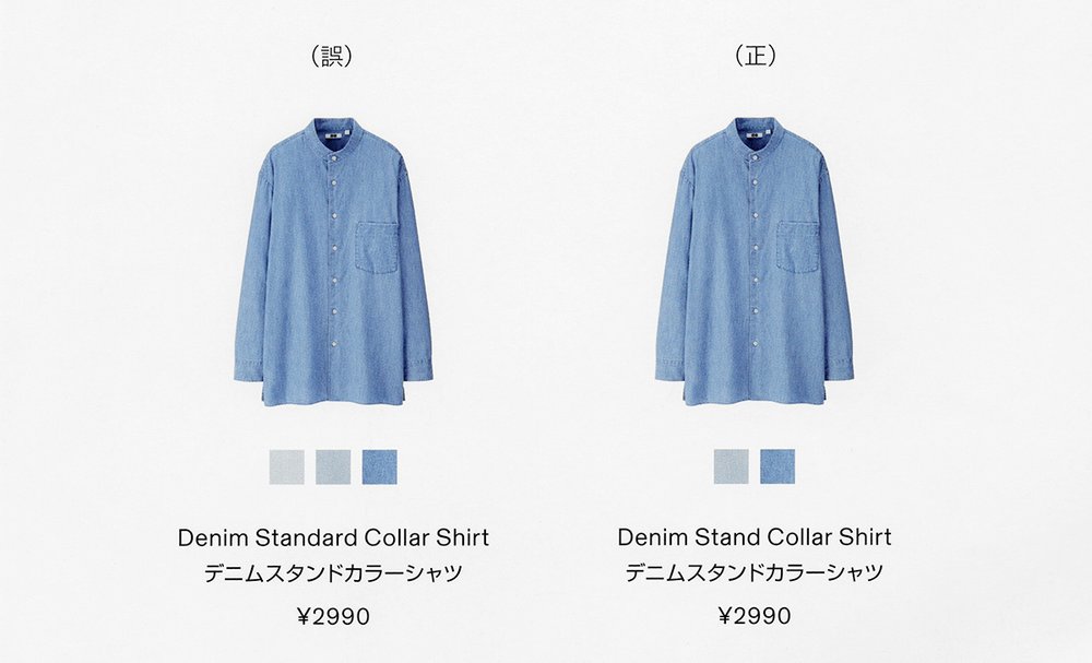
Larissa Kasper expressed that “the identity of Uniqlo U would necessarily be applied in a wide range of instances—it would need to be able to function on everything from stitched labels to printed billboards and at extremely small and large type sizes.
An interesting historical precedent for this suggestion can be found in the lineage of Emil Ruder’s work. Reaching its apogee between the 50s and 60s, Swiss typography is defined by its foundational principles of functionality, objectivity, universality, and simplicity—a direct inspiration for Basel Grotesk. One of the movement’s greatest protagonists, Emil Ruder, had a broad range of interests including Eastern design, and upon discovering The Book of Tea found a design reference that he would eventually integrate into his own typographic work. Ruder favored asymmetrical arrangements, flush-left alignments, negative space as a compositional element, and sans-serif typefaces, as he believed that they had more natural, neutral, and universal qualities. Following Ruder’s work, a harmonious symbiosis between Swiss typography and Japanese design naturally developed and numerous graphic products attest to this alliance. The similarities in intentions and core values between Basel Grotesk and Uniqlo U makes their coming together reminiscent of the relationship Swiss typography has with Japanese design.[4] Importantly, Basel Grotesk was also employed by Uniqlo U for its ability to precisely match the weights of the Japanese’s typeface characters and other non-Latin typeface characters being used for brand communications.
After five years of usage, it is clear that Basel Grotesk delivered the precise, simple, and neutral qualities to Uniqlo U that Lemaire and his team were looking for. Basel Grotesk also allowed for consistency across the brand identity as the typeface could be and is used for everything from line sheets to labels to communication materials, which creates a beautiful unity. The typeface’s variety of weights allowed the design team to precisely select the perfect weight for each of the different applications, including labels and hang tags.
Following this collaboration with Uniqlo U and being shortlisted for a Swiss Design Award in 2017, Trieu continued to work on Basel and went on to develop a second variant. In 2018, he began to develop Basel Classic, which presents characters with decisively contrasting stroke modulations. With the same skeleton and weight gradation, Basel (Classic and Grotesk) is now comprised of nine weights. Combining formal and contextual approaches, Basel was achieved through years of research on font engineering and Swiss modernist type design. Both worldly and refined, Basel offers spirited and contemporary characters with its foundational versatility adapted to meet modern needs.
1 “Our Story,” Uniqlo, and “Group Outlets,” Fast Retailing.
2–3 “UNIQLO announces launch date of the first Uniqlo U collection!” Uniqlo Web News, Uniqlo, September 13, 2016.
4 Nobue Domae, CEO of Uniqlo USA, has explained that Uniqlo embraces the quality of kino-bi, which he explains “means function and beauty, joined together.” Domae goes on to say that Uniqlo’s clothing is “presented in an organized, rational manner, and that very organization and rationality creates an artistic pattern and rhythm. All these qualities reflect the defining characteristics of modern Japanese culture, modern ‘Japaneseness.’” Nobue Domae, “Uniqlo: From Tokyo to New York to Global Brand,” Japan Society, April 26, 2017.

Detail from a Uniqlo U printed catalog using Basel typeface.
