Ceremony
Go to Ceremony pageDesigners have shown an increased interest in information design and graphics over the last ten years or so, but type design has not quite reflected that interest.
This might be due in part to the fact that it took type designers some time to fully explore the potential of OpenType in practical designs. It may also have taken a while to imagine what information, exactly, designers needed from type other than legibility, a useful range of weights, styles, and adjustments for size, and proper hinting for the screen.
That’s not to say that there weren’t plenty of pi / symbol / label fonts released during this time period, many of them quite useful or interesting, or at least providing important updates to the forms found in Wingdings or Zapf Dingbats. Think of Tobias Frere-Jones’s Whitney, and Martin Friedl’s Poppi (both released in 2004), or Johannes Erler’s (and later, his and Henning Skibbe’s) FF Dingbats (1993/2009). But it wasn’t until the arrival of Travis Kochel’s Chartwell in 2011 (subsequently acquired by the FontFont library and expanded as FF Chartwell in 2012) that a font really took advantage of OpenType to provide designers with a powerful and flexible tool—in this case, not for labels or icons, but for generating the graphics themselves.
Chartwell relies on OpenType’s stylistic sets feature to combine numbers into, well, charts. The advantage to doing this with live type is that a designer can create graphics that can be edited without having to be redrawn from scratch. And on the web, of course, the more type you can keep live, the more searchable and accessible your site is. Aegir Hallmundur was right to say that Chartwell inaugurated a new category of such fonts. Symbolset’s releases, for example, are webfonts that rely on ligature features to convert words in live text into icons for navigation, actions, and web and social media links.
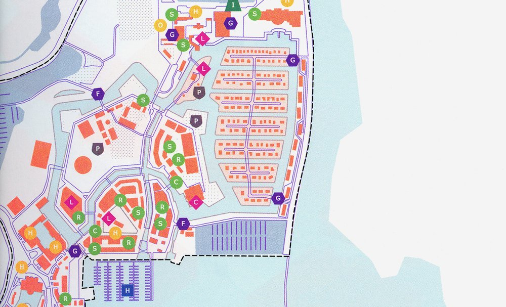
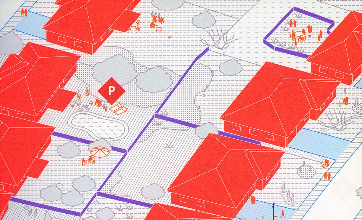
Ceremony is essentially a label and icon font family that also uses ligatures, and contextual alternates, to generate its glyphs. It’s technologically less clever than Chartwell, perhaps, but more exciting in other ways.
The font was designed by Joost Grootens, the well-known book and information designer based in Amsterdam. His studio has been using and refining Ceremony in-house since around 2008 (according to the their website) to use in their award-winning and internationally recognized atlases, as well as maps and diagrams included in their other books.

In response to the many multiple layers of information the studio’s designers have included in their graphic work, SJG (as the studio calls itself) has been expanding the range of shapes included in Ceremony’s repertoire. Not content with the square, circle, and diamond shapes typically included in such fonts, SJG includes no fewer than fourteen container options, adding shields, pentagrams, hexagrams, open books (or bow ties?), crosses, columns, book covers, arrows, ribbons, trapezoids, and sun shapes to the mix—all easily distinguishable, all in both filled and outline forms, and many of the simpler shapes in a partial-outline form as well: in all, seventy-seven different containing shapes. What’s more, these shapes can contain not only alphanumeric glyphs (all of them in each shape variation, by the way) but also numbers in combination to one hundred, punctuation, math symbols, icons, and even a set of geometric textures. (The family also includes a sans and mono sans font with all the outlines included, to allow designers to improvise where they still need to.)
That the result is effective, and pleasant to look at as well, is undeniable—one needs only to review the work the studio has produced with Ceremony to gauge its success. Its overall impression is one of cleanliness without sterility, attention to detail without fussiness. The pi/icon set is, to be sure, an interesting reflection of the studio’s preoccupation with geography and architecture, but SJG also included icons that reflect a sensitivity to gender stereotypes and same-sex relationships, as well as a wheelchair-user icon that, like Otl Aicher’s version in the icon set he designed for the Frankfurt airport in 1971, positions the user properly: in an active position directly above the axle of the large wheels, and not passively behind it, as so many other versions do.
Ceremony’s public release was a long time coming—the first video promising it was on the way appeared on Vimeo in January of 2013, but it wasn’t released until last fall. It was worth the wait. Ceremony represents the same challenge to designers as does the excellent work of the studio that created it: to embrace old forms of information design—maps and diagrams—but to think more expansively about what we can do with them, what categories and levels of information they can include while still remaining functional and inviting.
For this reason, Ceremony is in my view the most significant typographic development in information design since Chartwell’s release—conceptually, perhaps even more significant than Chartwell. I hope it finds its way into many designers’ toolboxes, and I hope that Optimo and the Grootens studio continue to expand and refine it.

Originally published on Typographica

