Herbert Matter’s Designs Inspired the Guggenheim’s Giacometti Catalogue
Go to Modern Matter page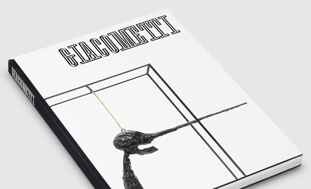
This article originally appeared on guggenheim.org/blogs and is used with permission.
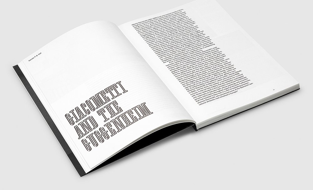
Alberto Giacometti and the Guggenheim have a long history together. The artist’s first museum show was presented in 1955 at a Fifth Avenue space temporarily occupied by the Guggenheim before it relocated to its new, Frank Lloyd Wright-designed home; later, in 1974, the Guggenheim presented a posthumous retrospective of his work. Now, for the museum’s current Giacometti show—the first major survey of the artist’s work in the United States in more than 15 years—the museum’s publications team wanted to create a catalogue that would showcase the depth and breadth of Giacometti’s oeuvre and also pay subtle homage to the long-standing ties between the institution and the artist.
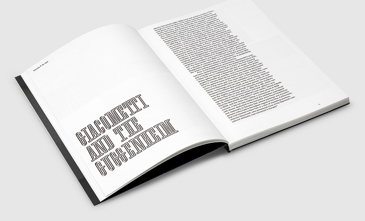
To create the catalogue, the Guggenheim’s publications department collaborated with Swiss designer Gilles Gavillet and his team at Gavillet & Cie. Gavillet had previously worked with the Guggenheim on their 2017 book for Visionaries: Creating a Modern Guggenheim. This time, he began the project by looking at some of the catalogues and collateral created for the museum’s previous Giacometti exhibitions and was particularly drawn to the work of graphic designer Herbert Matter. In his role as design consultant to the Guggenheim in the 1950s and ’60s, Matter shaped invitations, catalogues, and posters. He created the ephemera for the 1955 show in which Giacometti’s work was included; later, his photograph appeared on the poster for the 1974 Giacometti exhibition.

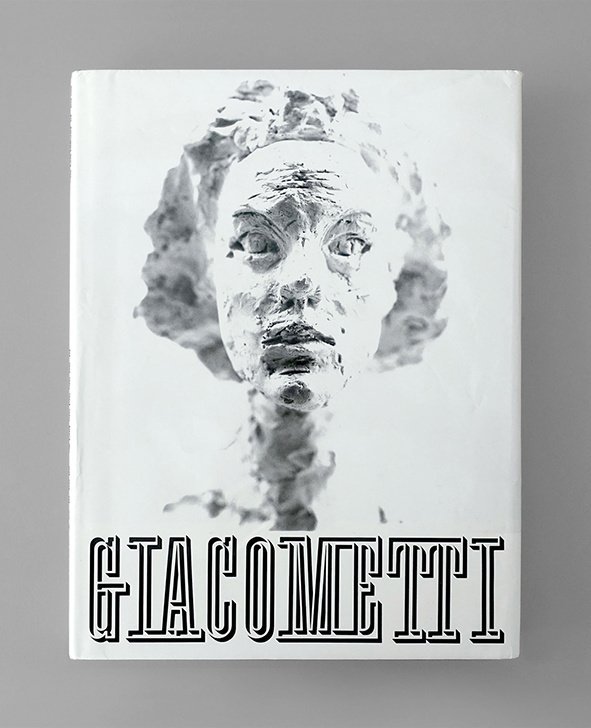
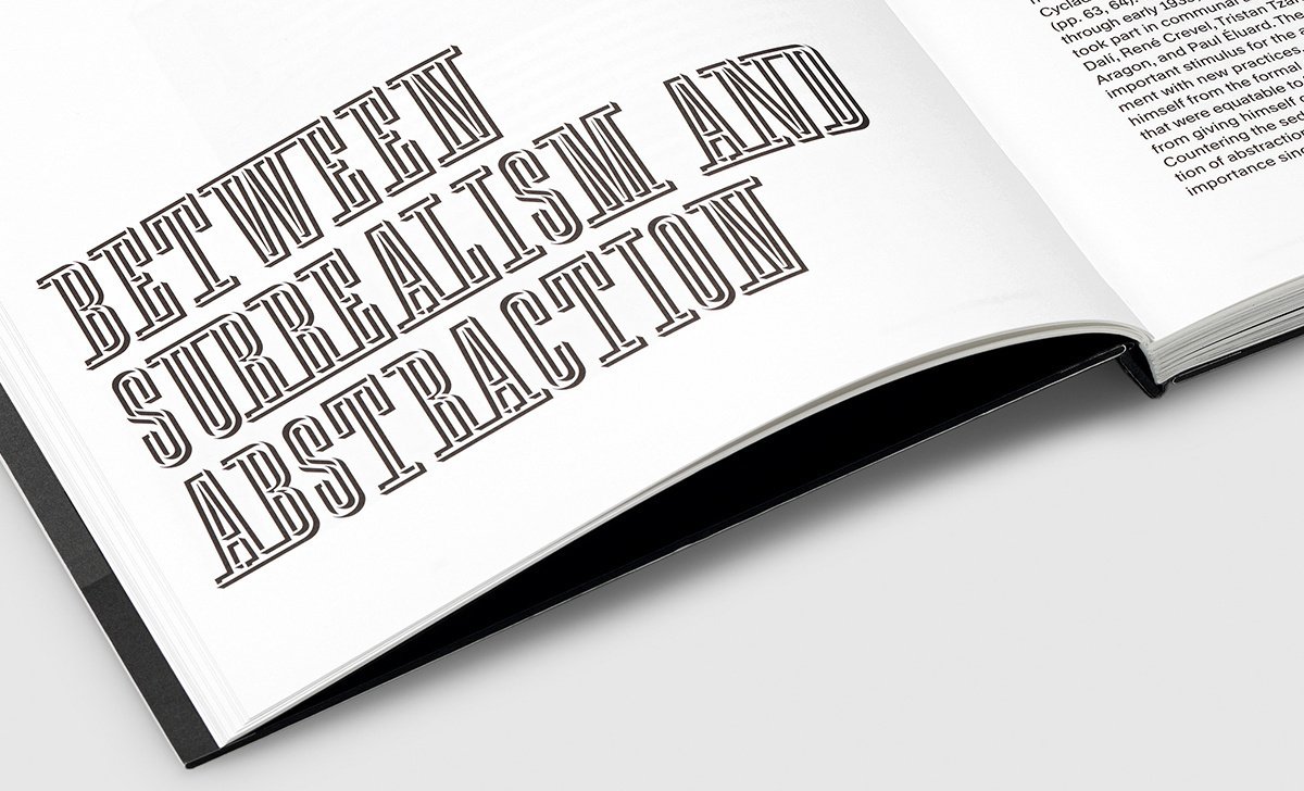
Matter, who was also a close friend of the artist’s, made his own book about him, Giacometti (Abrams, 1987). The publication comprises a collection of photographs Matter took of the artist and his work. In the preliminary stages of thinking about the catalogue design, Gavillet showed Minjee Cho, the Guggenheim’s Senior Production Manager, a sketch that type designer François Rappo had previously made of Matter’s title treatment for the 1987 book. Gavillet received a positive response from the Guggenheim’s team, who liked the typeface’s historical background, and Matter’s work became an inspiration for the 2018 catalogue. Rappo developed a full font based on the title treatment, which is used throughout the current book and was also adapted for use in the exhibition’s wall texts.
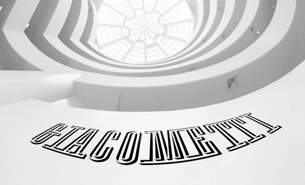
If you look carefully at the two titles—the earlier one by Matter and the new one by Rappo—you can observe slight differences. The serifs are more angular in the new version, while Matter’s included some slight curves, such as in the arch under the top of the T cross-stroke. Rappo’s version also eliminates the serifs on the tops of G and the C.
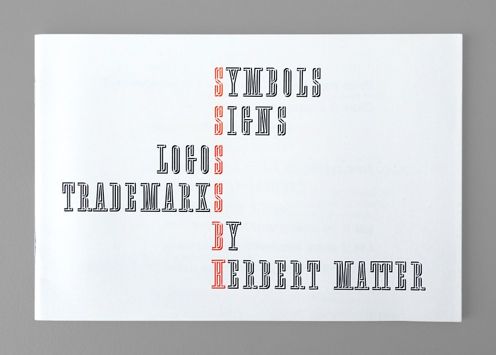
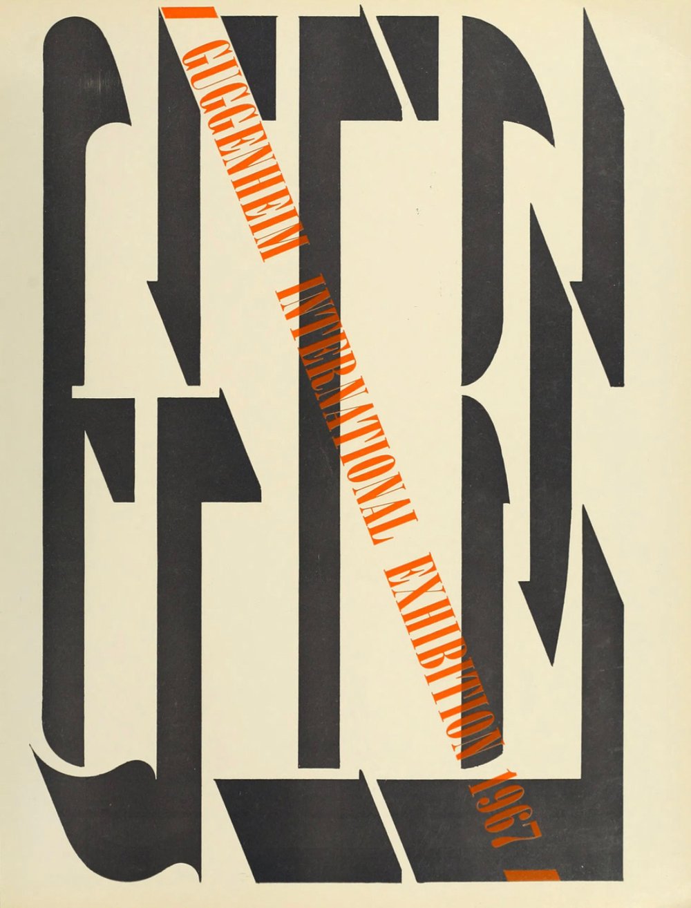
Originally, Gavillet believed that the Giacometti book was the only use of this lettering by Matter. However, while working on the catalogue, Cho happened to come across a small pamphlet, Symbols Signs Logos Trademarks by Herbert Matter. The publication (ca. 1977), which showcases some of the designer’s most famous logos for the likes of Knoll Associates and the New Haven Railroad, uses the same cover lettering as Giacometti. Gavillet also points to Matter’s title for the 1967 Guggenheim International Exhibition catalogue as another precedent—one of Matter’s earliest forays into three-dimensional lettering.
Gavillet describes the title that Matter created for Giacometti as “fascinating.” “[It is] somehow a synthesis of many aspects of Matter’s work. You can grasp the influence of his years working for [French artist and typeface designer] Cassandre, or the symbols and logos he developed working for corporations in the U.S. It is a very optical design with a sophisticated construction,” says Gavillet. Some early mock-ups of Matter’s work exist, showing how he created the lettering by hand, carefully drawing and assembling the letters with ink and masking tape on graph paper.
The connection to Matter’s work continues throughout the 2018 Giacometti catalogue. Matter was a friend of legendary designer Paul Rand, who wrote the introduction to the Signs Symbols Logos Trademark catalogue. Rappo, in addition to working on the title lettering, was also developing a grotesque font inspired by the t in Rand’s Westinghouse logo. That Rand-inspired typeface was chosen as the body text for the 2018 catalogue, adding a contemporary update to a mid-century style throughout the book.
Giacometti was an artist who was interested in scale and size. As an acknowledgement of the importance of these themes, Gavillet designed the catalogue so that all of the silhouetted photographs of Giacometti’s work inside the book are shown in relative scale to each other. This creates a “visual rhythmic pattern with contrasted spreads, with the void playing an important role,” says Gavillet.
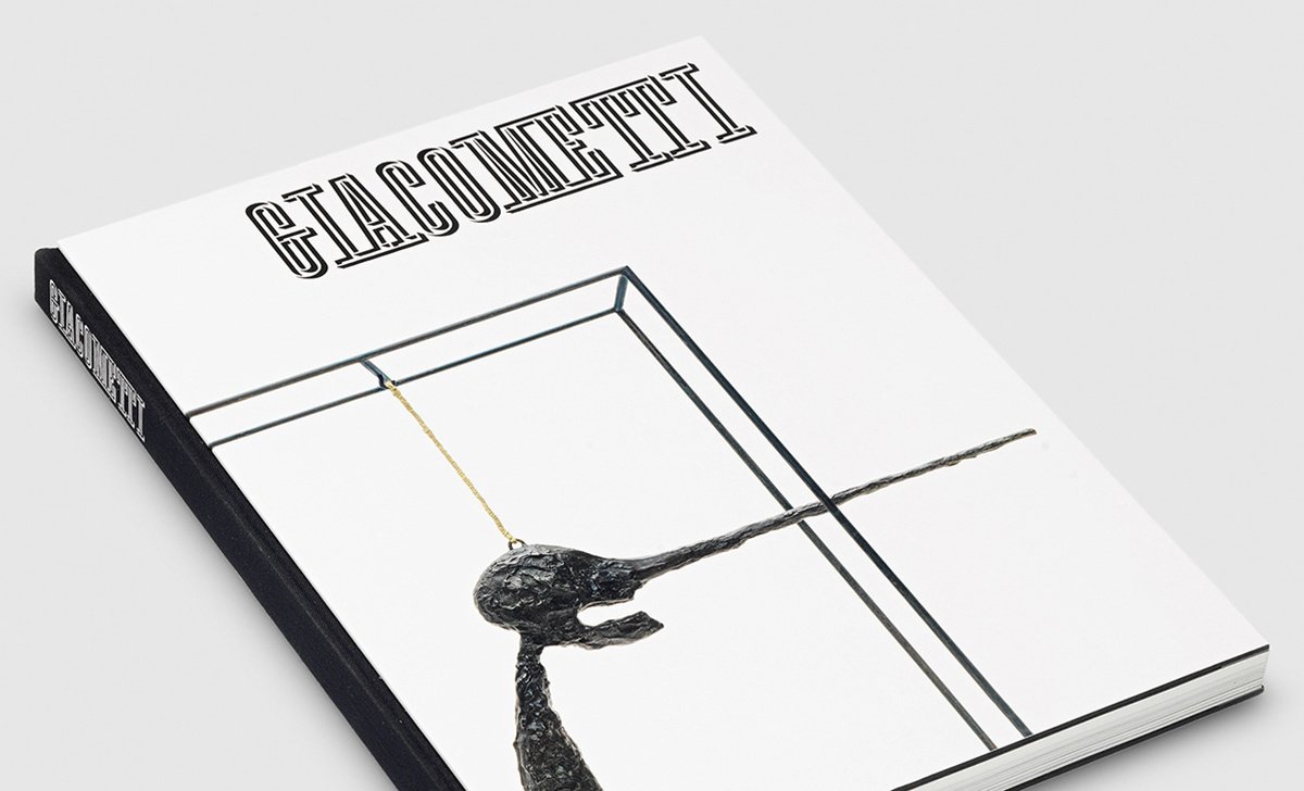
Gavillet strove to highlight Giacometti’s graphic sensibility throughout the book, particularly on the cover, which bears a close-up photograph of Giacometti’s sculpture The Nose. The use of the image was art-directed by Cho to ensure a “very graphic result while keeping the sharp materiality of the sculpture,” says Gavillet. The catalogue also has an unusual binding, with the front and back cover sitting on top of the spine, so that its visible black trim, along with the spine, form a frame for the artworks.
Matter, Gavillet, and Giacometti were all born and raised in Switzerland, each with strong ties to the institutional history of Guggenheim. The resulting catalogue—a mélange of the influences of these three Swiss artists and designers—captures the span and complexity of the seminal artist’s career, within a design that acknowledges the interwoven ties of the Guggenheim and Giacometti.

©2020 The Solomon R. Guggenheim Foundation