With its sophisticated, three-dimensional frame and extremely tight proportions, Modern Matter is a display typeface with a striking character that is distinctly fit for editorial design. An exhaustive set of ligature pairs also make it a playful tool to produce quirky headlines.
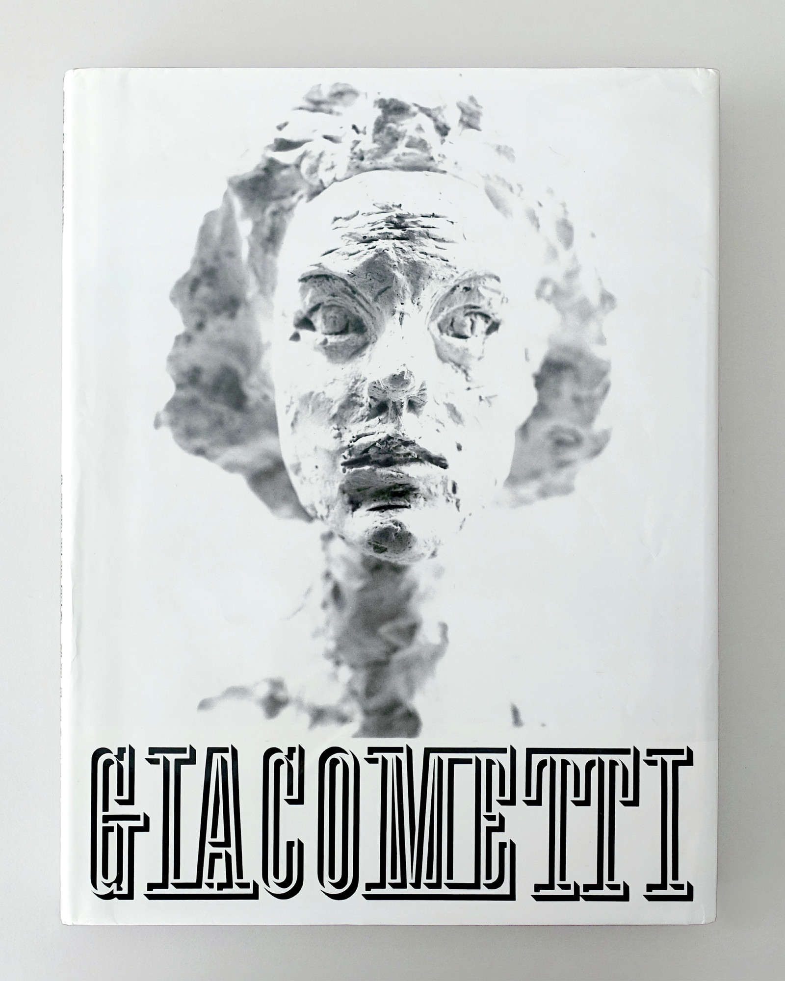
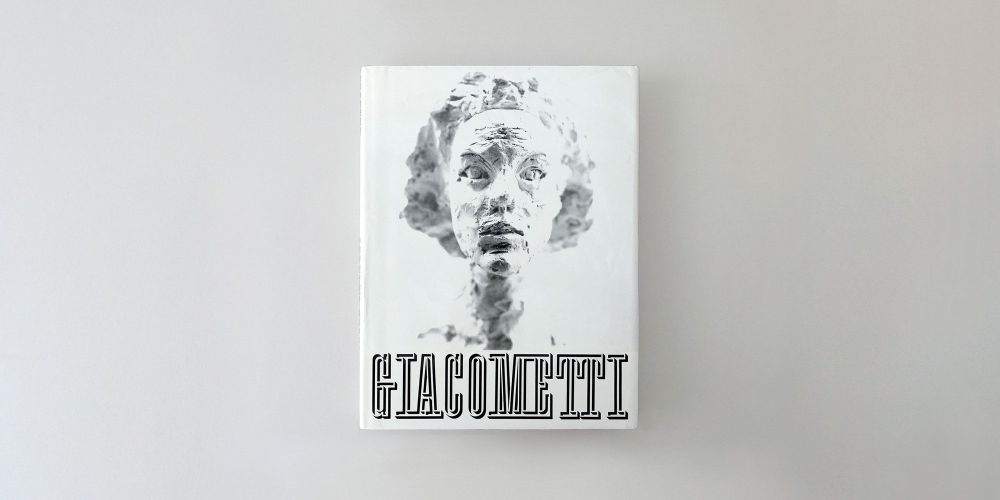
Based on a design by the Swiss Master Herbert Matter, which was notably displayed on the cover of his seminal book, Giacometti in 1987. Modern Matter appears as a synthesis of many aspects of Matter’s graphic language; from his years working for Cassandre to the iconic symbols and logotypes he developed for US corporations.
After François Rappo had filed the project away for many years, he revisited it on the occasion of the 2018 exhibition Giacometti at the Guggenheim Museum in New York City, for which the typeface was used for exhibition signage and the exhibition catalogue. After a reappraisal of the original uppercases, lowercases were also drawn, expanding the collection of glyphs into a complete contemporary character set. Modern Matter celebrates and reintroduces the work of a design icon.
More about the collection >Modern Matter 1 style
Case Sensitive Forms
This function formats the text in uppercase and adjusts spacing between all capital letters. It also applies the ‘Case Sensitive Forms’ feature which replaces certain characters with alternates that are better suited for all capital text, especially related to punctuation.
hi@xyz.ch
@ | ¦ ( ) [ ] { } ¿ ¡ ‹ › « »
- – — ·
← ↖ ↑ ↗ → ↘ ↓ ↙ ↔
HI@XYZ.CH
@ | ¦ ( ) [ ] { } ¿ ¡ ‹ › « »
- – — ·
← ↖ ↑ ↗ → ↘ ↓ ↙ ↔
Contextual Alternates
This feature adapts the position of a glyph after its surrounding context. For instance, a dash placed between two uppercase letters or numbers will be replaced by an uppercase version of the dash, slightly higher. This feature is usually active by default in Adobe applications.
Alternate C E F G L R S T a c f s Æ
Stylistic Set 1 [ss01]
This feature replaces glyph(s) with stylistic alternate(s).
Facsimile
C E F G L R S T a c f s Æ Ǽ Ç Ć Ĉ Č Ċ È É Ê Ę Ě Ë Ē Ĕ Ė Ĝ Ġ Ğ Ģ Ĺ Ľ Ļ Ł Ŀ Œ Ř Ŕ Ŝ Ş Ș Š Ť Ţ Ŧ à á â ã ä ā ă å ǻ ą æ ǽ ć ĉ č ċ ç ś ŝ š ş
Facsimile
C E F G L R S T a c f s Æ Ǽ Ç Ć Ĉ Č Ċ È É Ê Ę Ě Ë Ē Ĕ Ė Ĝ Ġ Ğ Ģ Ĺ Ľ Ļ Ł Ŀ Œ Ř Ŕ Ŝ Ş Ș Š Ť Ţ Ŧ à á â ã ä ā ă å ǻ ą æ ǽ ć ĉ č ċ ç ś ŝ š ş
Fractions
With this feature, any numbers separated by a slash will automatically turn into a fraction. To fit in fraction configuration, numerals have been designed smaller and their weights have been adjusted to suit the typeface.
3/4 3/8 5/8 7/8
3/4 3/8 5/8 7/8
Ordinals
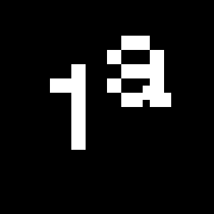
This feature replaces any letter following a numeral with its matching superior letters. French language uses the ordinal indicators such as ‘er’ for 1er premier, while Spanish, Portuguese and Italian require the feminine and masculine ordinals ‘a,’ ‘o’ for 1º, 1ª. Ordinals are designed to match the weight of the typeface.
Slashed Zero
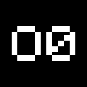
Originally created to avoid the confusion between the ‘0’ and the ‘O’, this feature substitutes all zeros in a selected text by a slashed form of the zero.
Numerators
This feature substitutes glyphs with their matching smaller alternates. The numerators are the same glyphs that are used to create fractions, their vertical position remains within the capital letters height. These glyphs are reduced in size and designed slightly heavier to keep them consistent with the rest of the font.
H0123456789()[]
Habcdefghijklmn
Hopqrstuvwxyz
H0123456789()[]
Habcdefghijklmn
Hopqrstuvwxyz
Denominators
This feature substitutes glyphs with their matching smaller alternates and low position glyphs. The denominators are the same glyphs that are used to create fractions, their vertical position remains within the base line. These glyphs are reduced in size and designed slightly heavier to keep them consistent with the rest of the font.
H0123456789()[]
Habcdefghijklmn
Hopqrstuvwxyz
H0123456789()[]
Habcdefghijklmn
Hopqrstuvwxyz
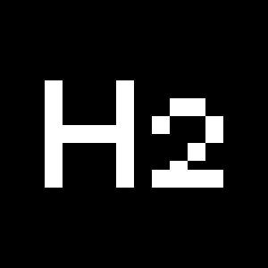
Superscript/Superiors
This feature substitutes glyphs with their matching smaller alternates which are set slightly above the height of the capital letters. These glyphs are reduced in size and designed slightly heavier to keep them consistent with the rest of the font.
Habcdefghijklmn
Hopqrstuvwxyz()[]
Habcdefghijklmn
Hopqrstuvwxyz()[]
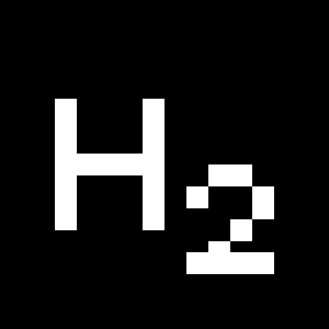
Subscript/Inferiors
This feature substitutes glyphs with their matching smaller alternates which are set slightly below the baseline. These glyphs are reduced in size and designed slightly heavier to keep them consistent with the rest of the font.
Habcdefghijklmno
Hpqrstuvwxyz()[]
Habcdefghijklmno
Hpqrstuvwxyz()[]
Standard Ligatures
Standard ligatures replaces a sequence of characters with a single ligature glyph, they are designed to improve kerning and readability of certain letter pairs.
Extra Ligatures
Standard ligatures replaces a sequence of characters with a single ligature glyph, they are designed to improve kerning and readability of certain letter pairs. Modern Matter is provided with more than 600 ligatures, which is more than the usual standard ligatures.
MODERN MATTER
Fragment future
MODERN MATTER
Fragment future
Discretionary Ligatures
This feature activates discretionary ligatures which are specific to the typeface. It applies all other designed ligatures that are not classified as standard ligatures.
Lowercase math symbols
This feature activates alternate lowercase positioning of mathematical symbols.
up+down
+±×÷−=≈≠¬∞
up+down
+±×÷−=≈≠¬∞
Multiply sign
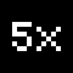
This feature substitutes the letter “x” into the multiplication sign.