Media, A New Typeface for Photo‑composing
Go to Media77 pageThe intention of Bobst Graphic to issue a special text typeface for the new photo-composing system Eurocat established several years ago the contact between our Team’77, Letterform Research & Design, and the manufacturer in Lausanne. As specialists in the field of letterform design, we had been requested to elaborate a project research. The outcome of three years cooperative work is the present type family, Media. The following presentation is our conceptual as well as formal approach in the development os this typeface.

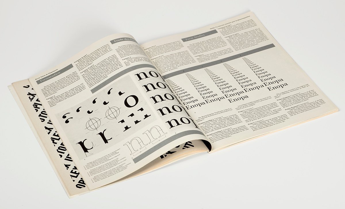
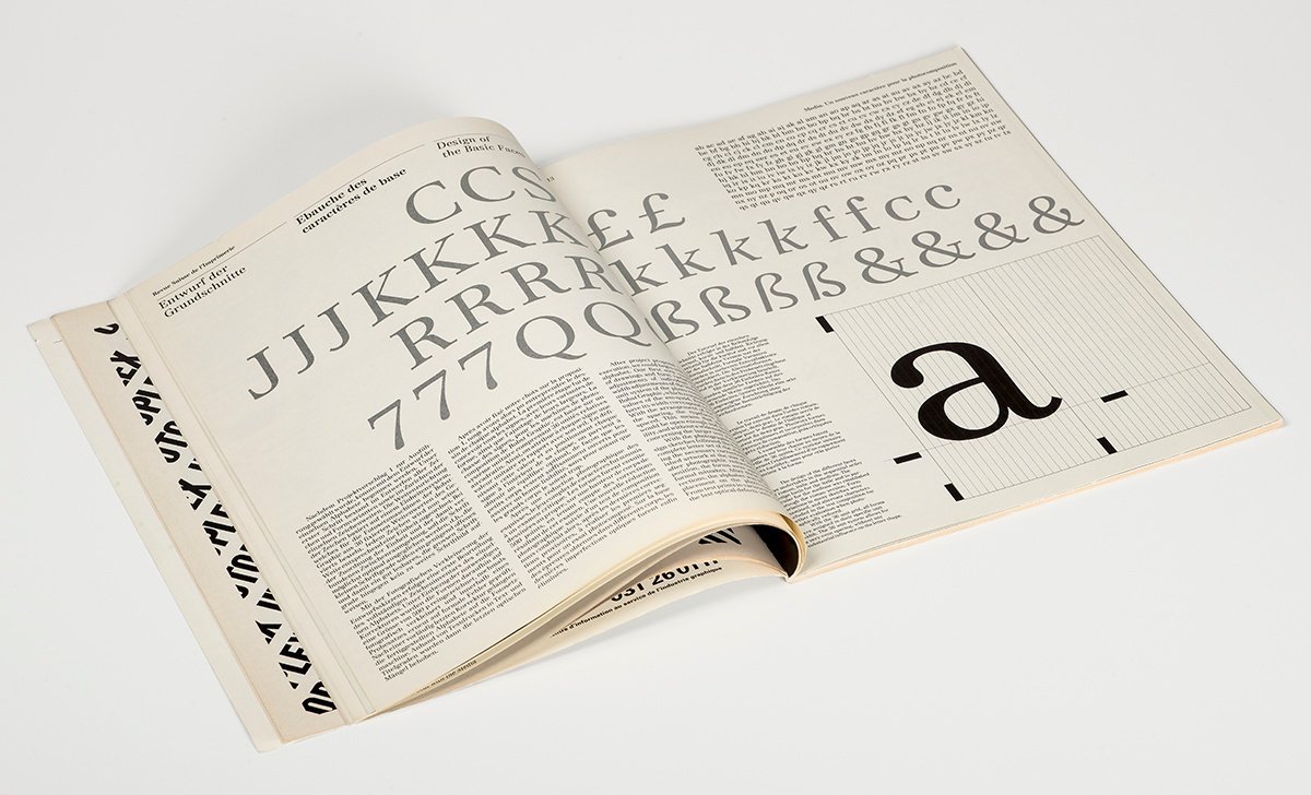
Photo of the article Media, A New Typeface for Photo-typesetting published in the Typografische Monatsblätter, nr. 8/9, 1977.
Problem Statement
Bobst Graphic had entrusted us with the task of designing a new textface as an extension to their existing selection of typefaces. We elaborated as a first step, a study of a possible new form based on the following criteria:
Technical Demands
When designing a typeface exclusively for a photo-composing system, the technical conditions of that particular system should be taken into consideration; not only with regard to the so-called “optical corrections” but also, and especially, to the total conception of the typeface and the formulation of its details from the beginning. The typeface can therefore even attain an individuality and originality.
Scope of Typographical Application
The particular system of our client mainly produces text for various publications such as newspapers, magazines, books, etc. Because of this scope of application, emphasis with regard to the design of the type was placed above all on its legibility as a text face at 8, 9, and 10 point. No formal modifications were made between the various sizes of the type, due to the nature of the reproduction process—all sizes from 6 to 36 point are set from the same basic alphabet. This requires that certain considerations be made while designing the typeface, since the forms that will be reduced to 6 point, will also by used as a display face up to 36 point. The image of the typeface, therefore, in order to maintain legibility in the smaller typesizes, must be sufficiently open and strong, without causing the larger sizes to become broad and heavy.
Style and Form
As a result of both previous criteria, we decided that the style characteristics of the new type should not be determined mainly by factors of historical classification, but by other, more relevant factors; such as the specific technical demands of the composing system, and the present demands of typography for a multifaceted text type. In other words, it was much more important to develop a typeface with the previously stated qualities, that to create more or less a replica of an historical model. In addition to the specified requirements, it was also of importance to us that the new type be innovative and distinguishable from comparable faces presently available on the photo-composing market.
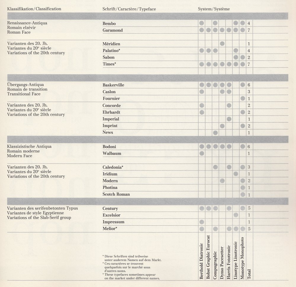
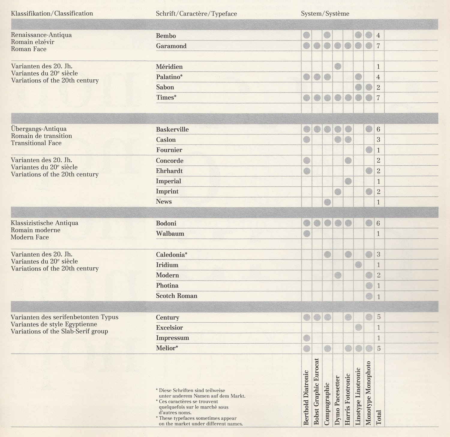
The following list describes a selection of various photo‑composing Roman textfaces. It makes no claim to completeness. Decisive for the selection of specified typefaces were these two alternatives: “Long-established” traditional textfaces which today distinguish themselves still, through their adaptation to photo-composing. Recent textfaces which distinguish themselves either as possible “Bestsellers,” through their quality, or textfaces whose formal conception gives them a certain definite distinction.
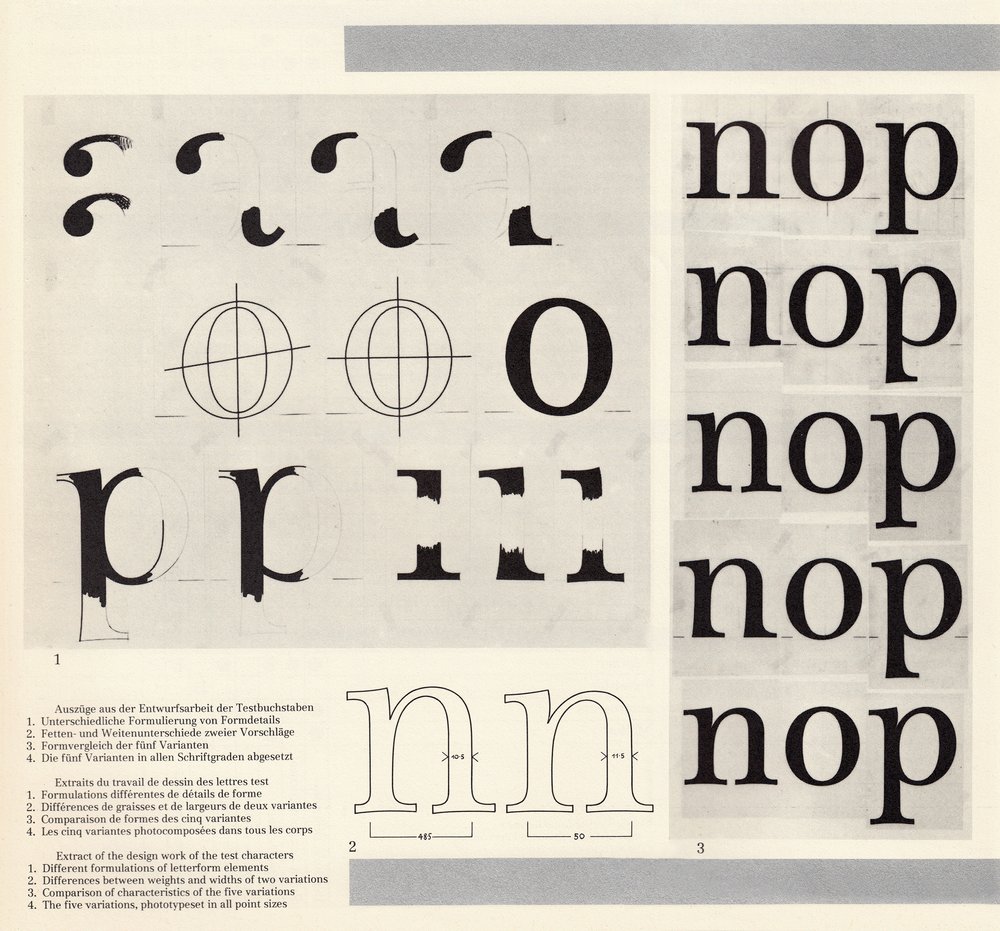
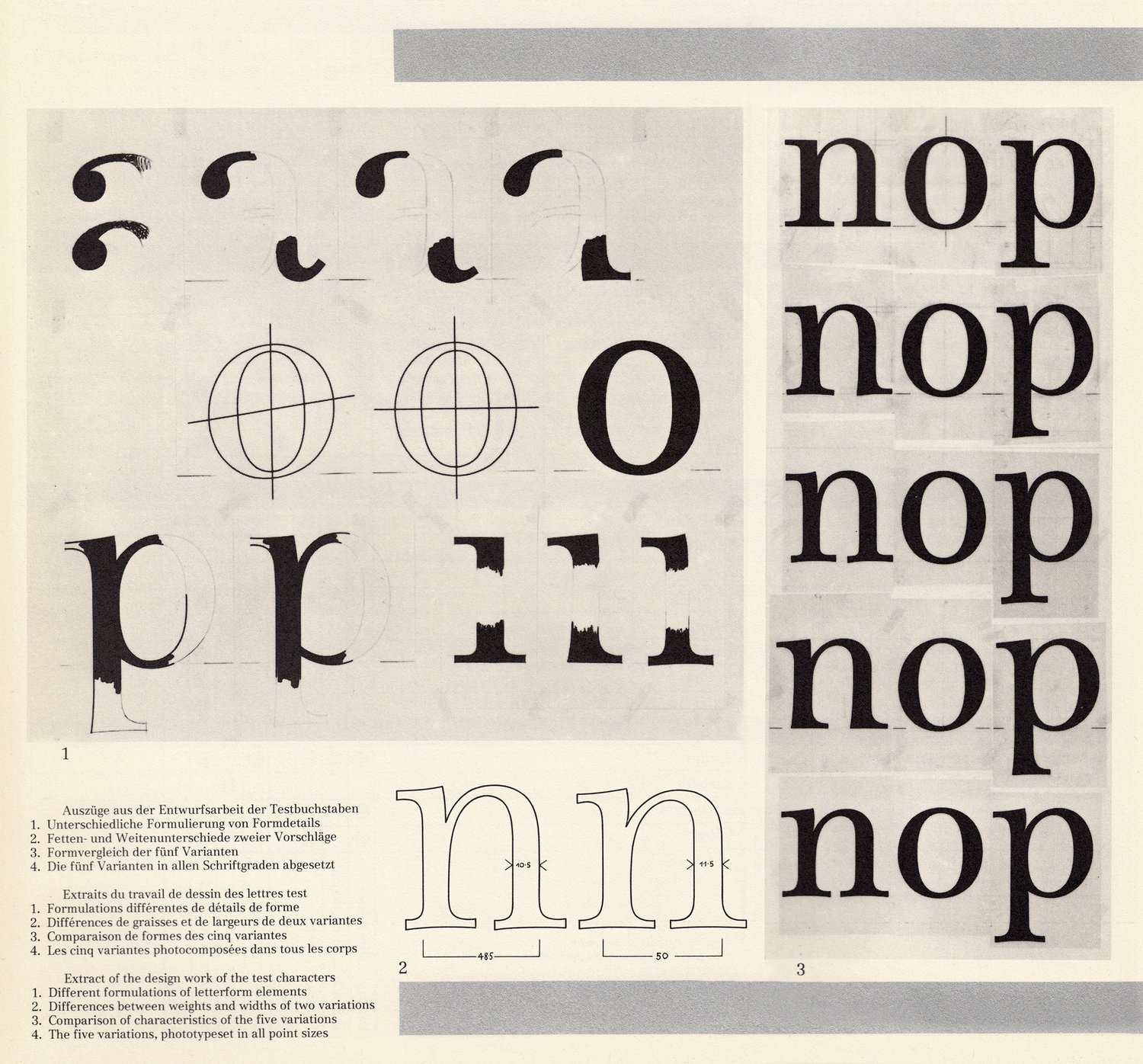
Extract of the design work of the test characters: 1. Different formulations of letterform elements; 2. Differences between weights and widths of two variations; 3. Comparison of characteristics of the five variations.
Form Studies
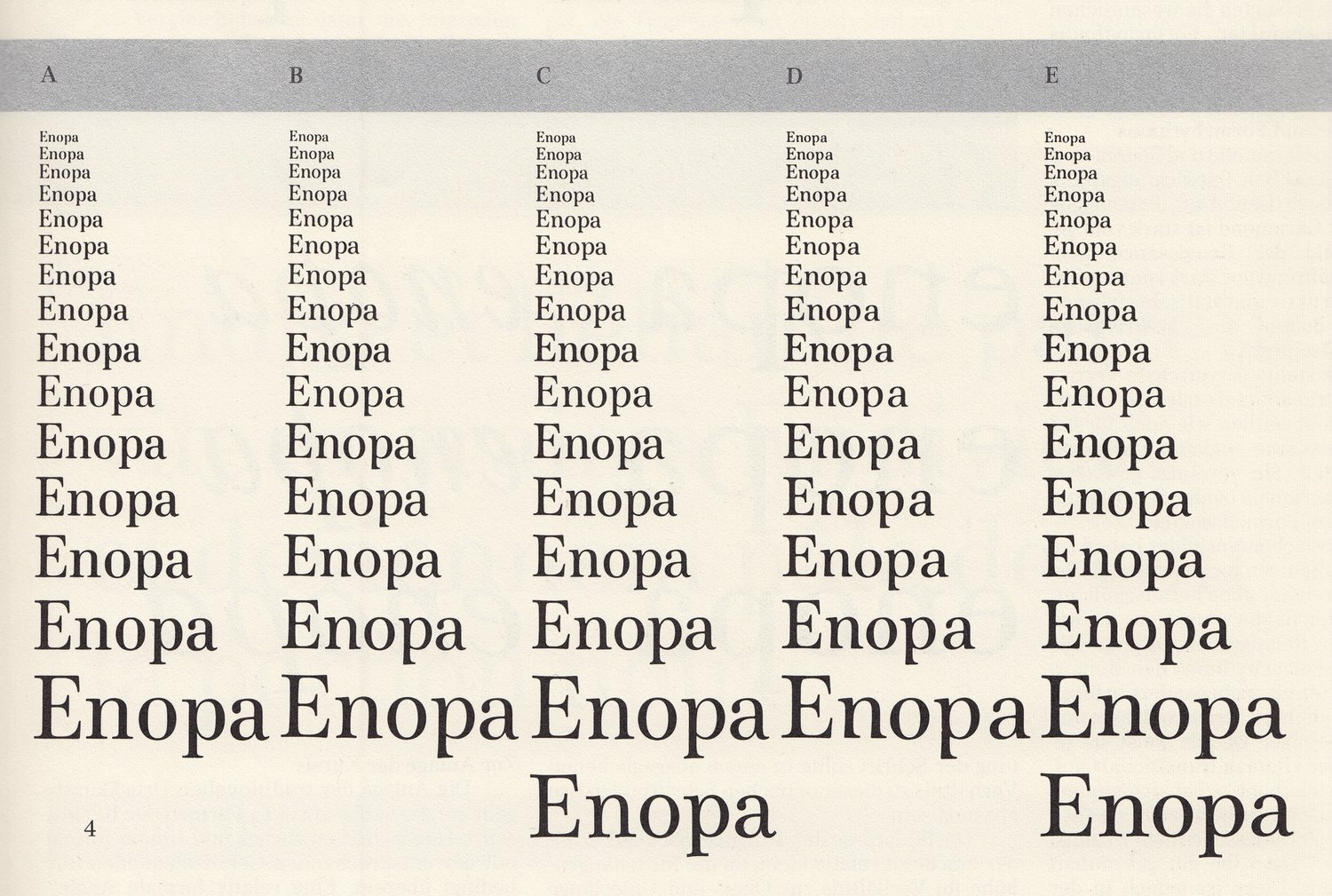
On the basis of past considerations and a previously established stroke thickness probe, we investigated various fundamental form characteristics which for us seemed important towards a definite concept for the new typeface; for instance, the stroke contrast, letter width, or the serif type. With the aid of the test word “Enopa,” we designed five variations, A to E, which the following essential criterion shows:
Variation A: The forms are vertically accentuated, which appears to leave the letter rhythm static and monotonous. This indicated the larger sizes a certain elegance, yet this vertically affected good legibility in the text sizes.
Variations B and C: Both variations are differentiated especially in the bottom serifs. Variation B, through asymmetrically extended serifs in “n” and “p,” is formally determined, although in smaller sizes, looses the value of this serif idea. Variation C was the departure point of our first project proposal.
Variations D and E: Both variations are differentiated also in the design of the bottom serifs. All serifs of Variation D are asymmetrically extended to the right. This consequential serif concept already shown in the test word a certain monotony, which when applied to an entire alphabet, amplified itself. Moreover, this variation indicated a strong calligraphic emphasis. In comparison then, Variation E is more stable, and through the round serif extension in “a,” more differentiated. We selected therefore Variation E as the basis for two project proposals.
The evaluation of probes A through E indicated the following corrections on both proposals
Project Proposal, 1 Variation C: Lightly increasing the thickness of all fine strokes. Less rounded serif transitions in the verticals. Stronger concave rounding off of all serif lengths in “E.” Rounding off of the join of the bottom “p” curve into the vertical and thickening all joins as in Variations D and E.
Project Proposal 2, Variation E: Lightly increasing the thickness of all fine strokes. Strengthening the serif endings which amplify the concave rounding off of serifs. Diagonal thickness displacement of the curves in “o” and “p,” in a more horizontal direction.
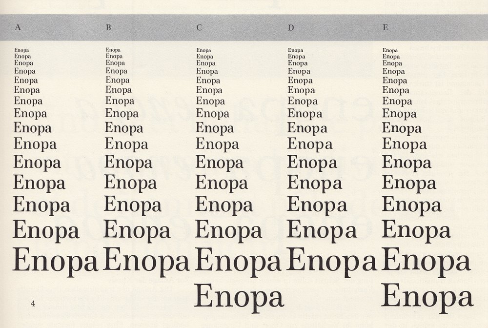
4. The five variations, phototypeset in all point sizes
Comparison of Various Text Faces: Nature of Form Statement and Form Rhythm
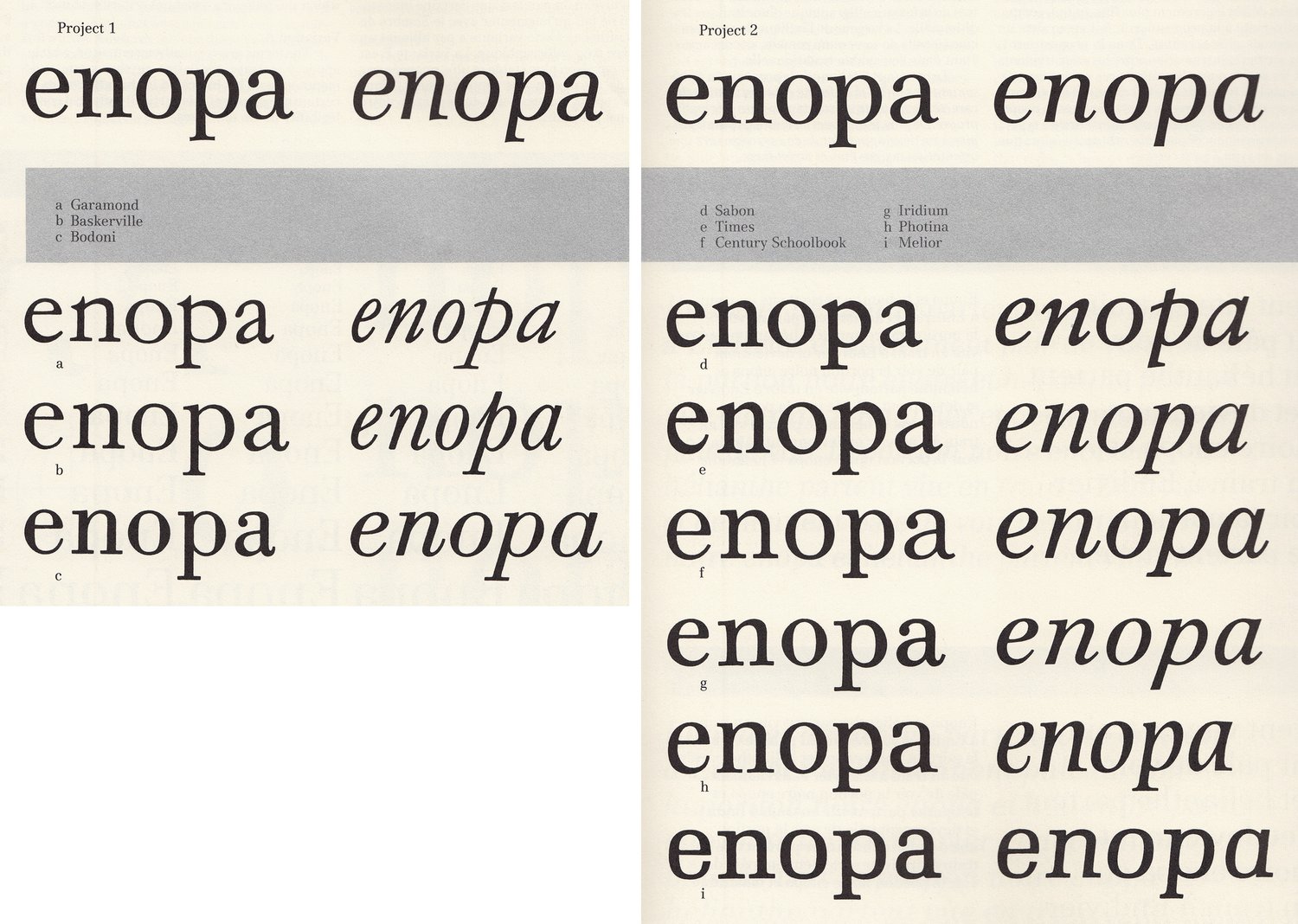
The typefaces Garamond and Bodoni stand as opposites to the continually evolving development of Roman printing faces. The dynamic form rhythm of Garamond is strongly influenced by the written models of Renaissance book faces, whereas, the strongly contrasted and rather constructed, static appearing forms of Bodoni represent the group of Modern faces. Baskerville stands as a typical representative of Transitional faces and is as well, the temporary and formal link between old and modern printing faces. It combines obvious characteristics from both typeface groups into an individual form statement. These three historical models incorporate the essential elements for the later replicas stated above: the formal construction of Sabon conforms in essence with the Roman face. Times, especially in the lowercase, is in its form rhythm, related to Renaissance book-faces. With reference to the stroke contrast and formulation of details, it also indicates however, a tendency towards the Transitional face. Century Schoolbook bases itself clearly on the neoclassical model, although it is rather robustly designed as an outspoken newspaper type. The same is generally valid for Iridium also. It is however, in the serif formulation basically more subtle and modulated than Century. The quite individualistic Photina achieves its Modern face effect through its accentuated stroke contrast. Its form rhythm, and especially its design of the italics, indicates characteristics of Renaissance book faces. Both our project proposals concerning their stroke contrast, generally relate to the Modern face. However, in statement of form and form rhythm, they are differentiated from the traditional Modern face. They are rounder, softer, and more fluid, with the hairlines and stems more modulated and the overall rhythm more dynamic.
Comparison of Various Text Faces: Character Area and Letter Width
The proportion between character height, letter width, and stroke thickness, as well as the proportion between x-height, ascenders, and descenders, defines the optical character area of a typeface. The character width of a typeface should be in an equivalent proportion to the specific area. The x-height area of the three historical models is relatively small, and tight, in proportion to their ascenders and descenders. The relatively thin standard thickness given to Garamond contributes nevertheless to a open overall image, whereby in comparison, Bodoni, due to the heavy weight of its vertical stroke, becomes closed. The x-height of the replicas, as opposed to their historical models in general, is larger and more openly defined. The main justification is that today, in most photo-composing systems, all type sizes are designated from the same and single film image. For the benefit of the small text sizes, the x-height must therefore, if possible, be more largely defined. In our project proposal, we designated the x-height area and the character width of the typeface, so that we could preserve in the small sizes an open enough and hence legible typeface image. However, too high of an x-height appeared to us proportionally detrimental with regard to the ascenders and descenders.
Comparison of Various Text Faces: Design of the Italic
The design of the traditional italic typeface stems back to the calligraphic forms of Renaissance hand-writing, and corresponds formally with the appropriate Roman uprights only with certain reservations. A relatively formal approximation of both versions would only be attempted during the neoclassical age; Bodoni stands here as an example. Most replicas, referring to this point, more or less faithfully follow their historical models. As an exception, perhaps Photina could be brought up once more, while, for a rather modern type, it indicates an individualistic calligraphic formulation of its italic. The differentiated degree of inclination in the illustrated versions indicate as well, the possibilities of the limits of italic design. Our opinion is that an italic design should not be slanted too much in general, because the tendency of optical imbalances in a typeface should be avoided. On this basis, we have chosen for both project proposals a relatively slight italic slant. The italic versions of our proposals are specifically discussed on the following pages.
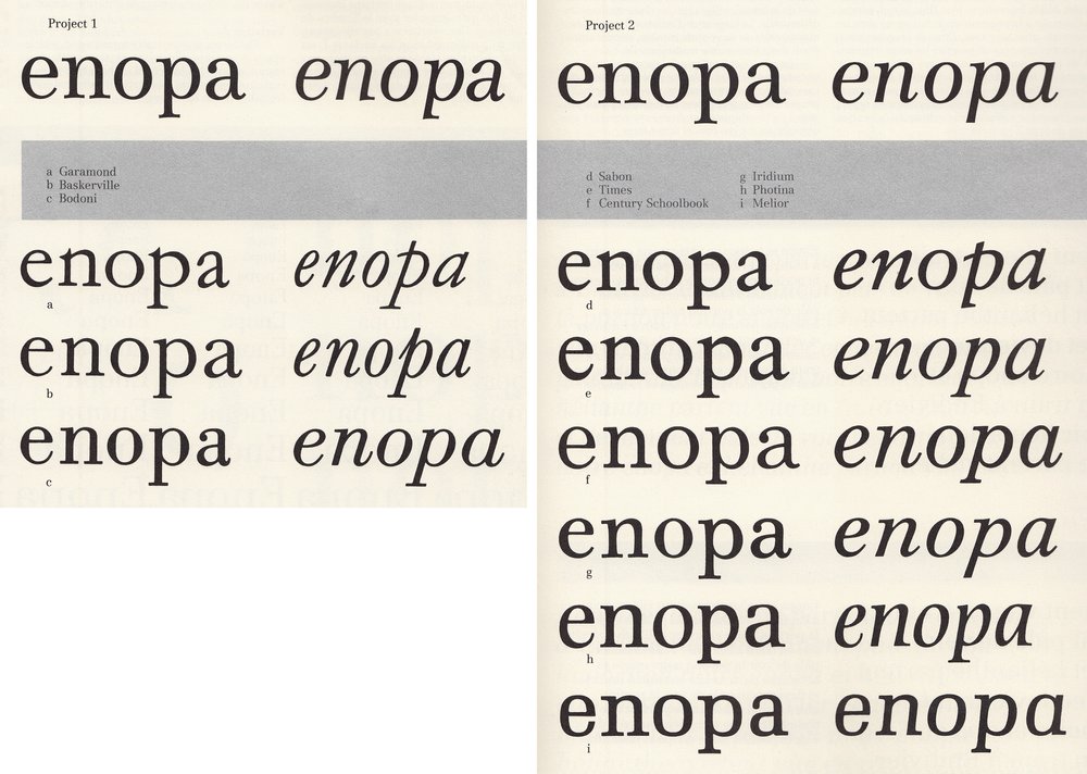
The following nine printing types, representative of the Roman textfaces currently available on the photo‑composing market, serve as the evaluative and comparative context for both project proposals. The examples are divided into two groups: “a” through “c” contain the three historical styles, Roman face-Garamond; Transitional-Baskerville; Modern face-Bodoni. “d” through “i” contains modern replicas of historical styles; Sabon, Times, Century Schoolbook, Iridium, Photina, and Melior. The evaluation involved such essential criteria as form statement, form rhythm, x‑height, character width, as well as the design of the italics.
Comparison of Both Project Proposals
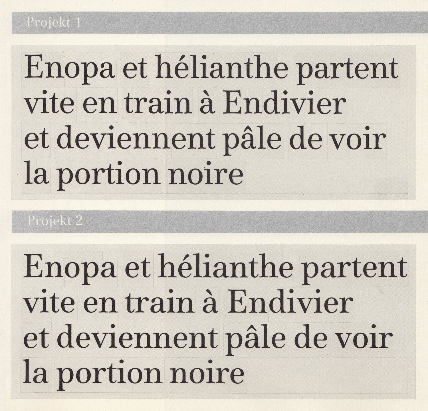
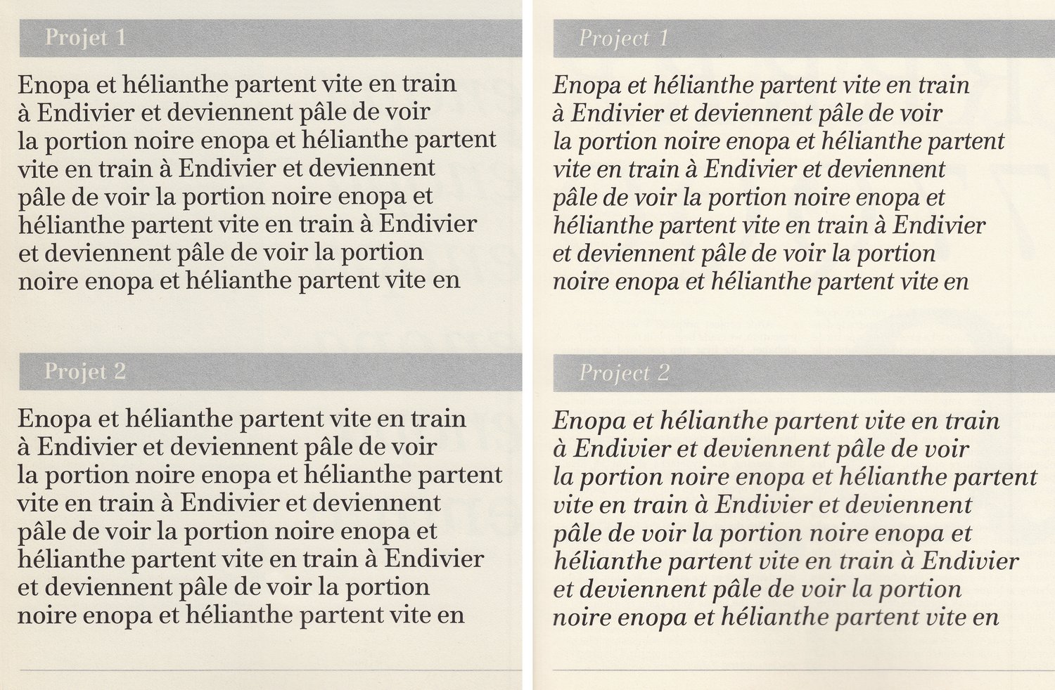
As a final conclusion to our basic study, we had test compositions made for both project proposals in various point sizes. Based upon the offset printing of these text probes, a decisive design for the new printing type was discussed and agreed upon together with the client. Although both proposals comply fundamentally with a pre-established set of technical and design requirements, they differentiate themselves through alternative qualities. Through comparison then, the following considerations formed the working basis for the final decisive design of the typeface for proposal 1:
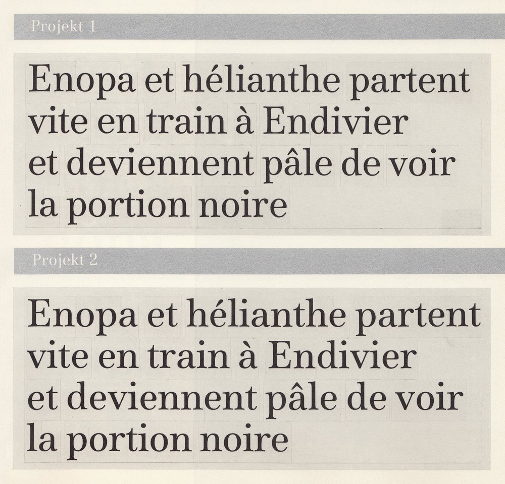
Comparison of x-height and letter width
Comparison of X-height and Letter Width
The first proposal has a narrower letter width and somewhat larger x-height, whereby the overall image, when compared to the second proposal, appears closed and more vertically emphasized. Through a smaller proportionally higher x-height, a more advantageous use of line length was found while maintaining good legibility, as well as, because of a tighter spacing, a more compact letter image in the larger type sizes.
Comparison of Stroke Contrast and Serif Formulation
The proposal 2 has thicker main strokes as well as slightly finer hairlines and they, in comparison to proposal 1, appear to be emphasizing contrast. The transition from serif to main stroke in proposal 1 is angular; the drop serif in “a” and “r” is point-like in comparison to proposal 2. The foot serifs of proposal 1 have been slightly shifted to the right, whereas those of proposal 2 are centered. Stronger hairlines, and a reinforced serif form indicates a generally balanced contrast, and therefore a quieter reading rhythm. Furthermore, a robust formulation of these details assures an equal quality of reproduction for photo-composing and especially with regard to the photographic reproduction process of offset printing.
Comparison of the Italic Design
The design of the italic in proposal 1 has a condensed quality with a relatively steeper incline. The individual characters and their serif forms are directly related to their Roman forms and deviate from the calligraphic forms of traditional italics. The width of italic 2 corresponds to the Roman series and the form is generally more traditional. Both basic series of proposal 1 together comprise a unity of form and in addition establishes an undoubted originality when compared to existent textfaces. It appears to us that the design is suitable for programing the textface in the directions of light-bold, and narrow-broad.
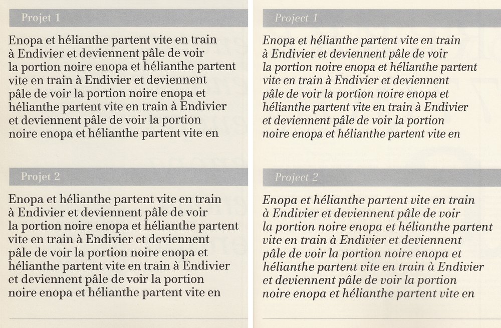
Comparison of stroke contrast and serif formulation; Comparison of the italic design
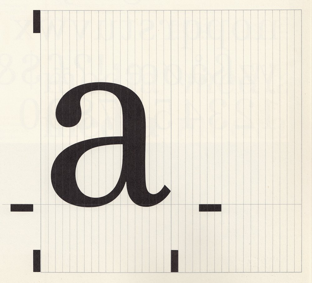
With the 36 unit grid, all forms were assigned to their specific unit width. The 36 unit system allows for a very even spacing, without any substantial influence on the letter shape.
Design of the Basic Faces
After project proposal 1 was selected for execution, we could begin with the design of each alphabet. Our first step consisted of sketches of drawings and form variations, as well as the adjustments of individual letter widths. The width adjustments of the letters was based on the unit system of the photo-composing machines of Bobst Graphic, which remained on 36 fixed width values of the em-quad. Every letter would now have its width correspond to a unit arrangement. With the arrangement of the unit coupled with the spacing, the typefaces should be ideally spaced. This means that the small text sizes would be open enough and thus with good legibility, and without a widened letter image resulting concerning the larger text sizes. With the photographic reduction of the design sketches followed the first evaluation of the complete letter set of the alphabet. After including the necessary corrections, we produced finished artwork at the size of 500 point, and then after photographic reductions and a test composition, the forms were again re-examined for formal mistakes. After these previous final corrections, the alphabet was at last ready for final placement on the photo-composing machine. From test prints in various texts and display sizes, the last optical defects were corrected.
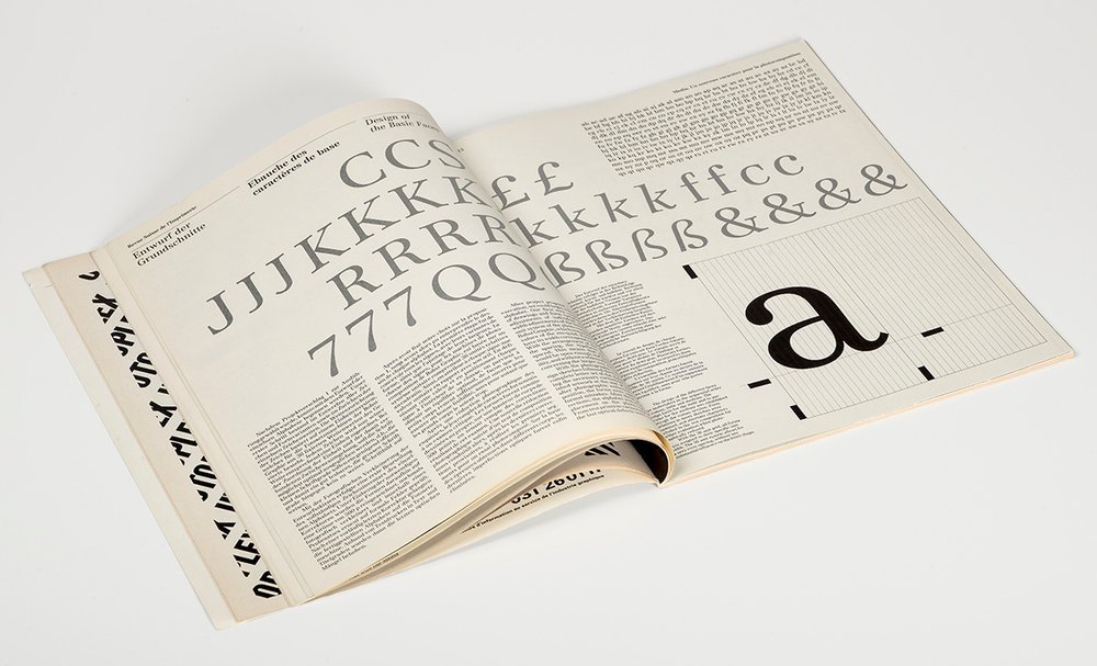
The design of the different faces was undertaken in the sequential order of roman, italic and medium. The design basis for the italic and in particular for the medium was established through the roman version. Form variations in many sketches were examined, and alternate characters included in the test composition for further evaluation when photographically reduced.
The Expansion Program of Media
The multiple tasks within the field of typographic application today, demands a great deal more of a typeface then in terms of its usage as a “body text.” On the one hand, we felt it necessary to provide distinctive variations to the basic face in its text application, while on the other hand, the typeface must also exhibit a wide variety of variations, especially for jobbing and newspaper printing and also, to a certain extent, for headline design. For this reason, especially today, the evaluation of the formal expansion possibilities of a typeface are very important. In connection to this, we believe it is important above all, that feasible and relevant variations of a typeface be planned in advance and together with the conception of the basic face as the final program. Besides investigating typographic suitability in terms of how much and what kind of variations are justified, concerning the, possibilities of applications and implementation, an expansion program is also bound to the formal and stylistic characteristics of the basic face. A serif typeface like Media cannot be varied in the same manner as a non-serif typeface. If in fact, through the technical developments of the digital typesetting method, the basic face of a printing type can be electronically varied, we then are of the alternate opinion that, because of this, the quality of the hand-executed design of variations cannot be replaced. The change in the form of a character is subject to optical and rhythmic rules, which through mere automatic modifications, can be considered to have a non-satisfactory or only a relative quality.
The Basic Program for Media
The normal and italic versions, together with the semi-bold supplementary version, formed the basic program. In addition, a semi-bold italic is also planned. Media semi-bold has its weight designated in such a way so that, on one hand, as a supplementary version, it demonstrates suitable contrast to the basic roman type, while on the other hand, it is open enough and a strong text face for body copy. Media italic is somewhat narrower in its form, and in its stroke thickness somewhat lighter when compared to the basic roman type. The formal design in comparison to a traditional italic typeface, is more uniformly correspondent to the image of its basic roman type.
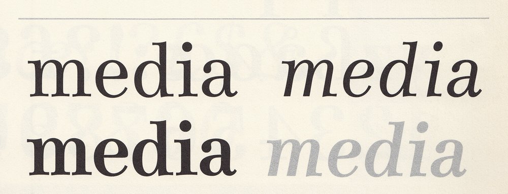
The Basic Program for Media
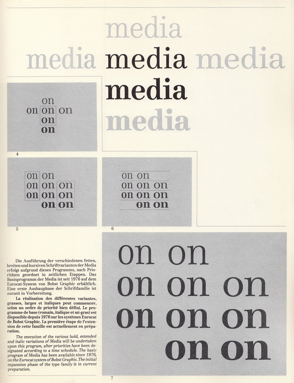
The execution of the various bold, extended and italic variations of Media will be undertaken upon this program, after priorities have been designated according to a time schedule. The basic program of Media has been available since 1976, on the Eurocat system of Bobst Graphic. The initial expansion phase of the type family is in current preparation.
The Extension of the Basic Program
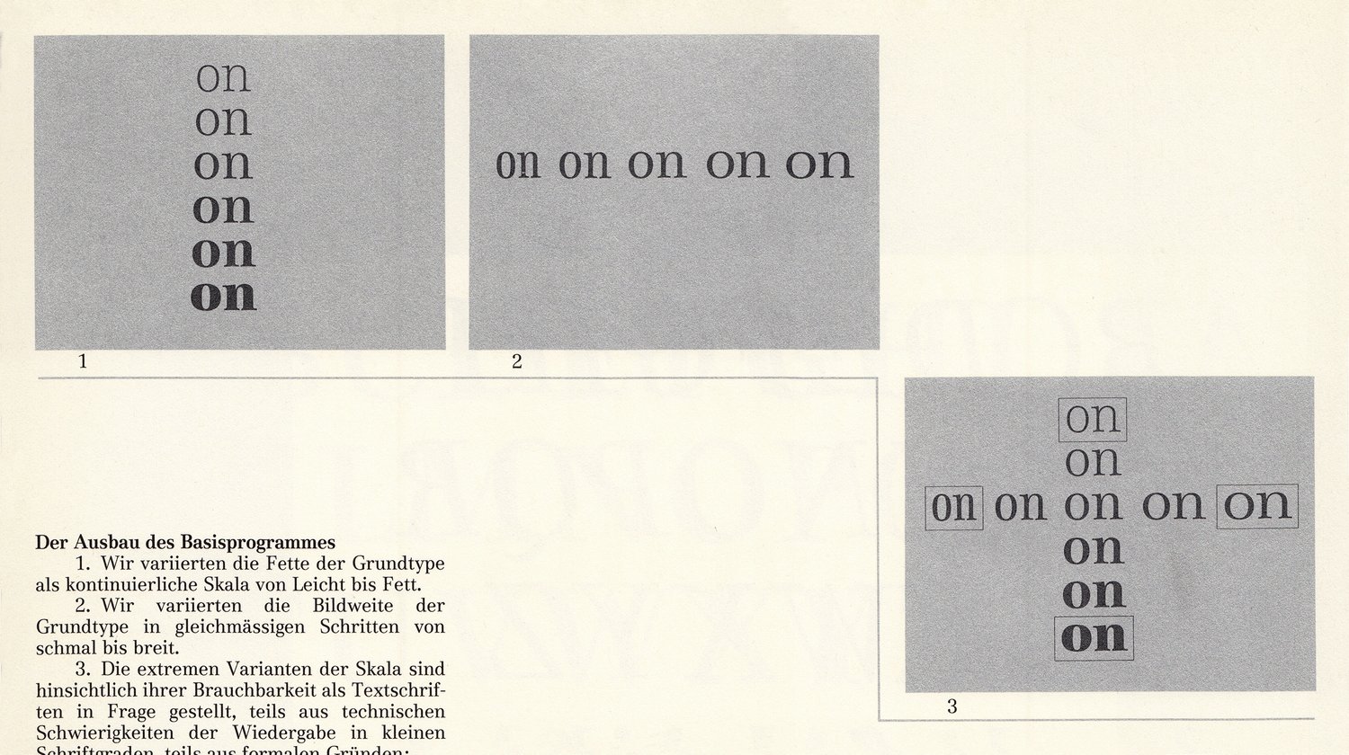
1. We varied the thickness of the basic face in a continuous sequence from light to bold.
2. We varied the widths of the basic face in an equal sequence from narrow to extended.
3. The extreme variations within the sequences were questioned regarding their usefulness as text faces. Partially due to technical difficulties when reproducing in smaller sizes, and partially due to formal considerations: Too light a variation indicated reduced contrast and thus appeared to be out of stylistic context with the basic face; too bold a variation seemed awkward and its strong stroke contrast made the character too active and difficult to read. Too condensed a variation relinquished too much formal activity; too extended a variation fell apart concerning its stroke contrast. Both effects resulted in a poor reading rhythm.
4. The four variations of light, bold, extended and condensed formed the initial expansion phase of the basic program. The graduated differences in the stroke thickness sequence is determined by the differentiating degree between semi-bold and the roman basic type. The graduation between the condensed, normal and extended is in the same optical proportion to the graduation of the stroke thickness sequence.
5. The stroke thickness sequence, as well as in the condensed and extended variations are further additions of the expansion program.
6. The stroke thickness of the condensed and extended variations are in an optical balance with those of the respective normal versions, which means that within the sequence of stroke thicknesses, the stroke weight increases proportionally to the character width.
7. With the extensive program of Media, the conceptual groundwork for expanding the face is established.
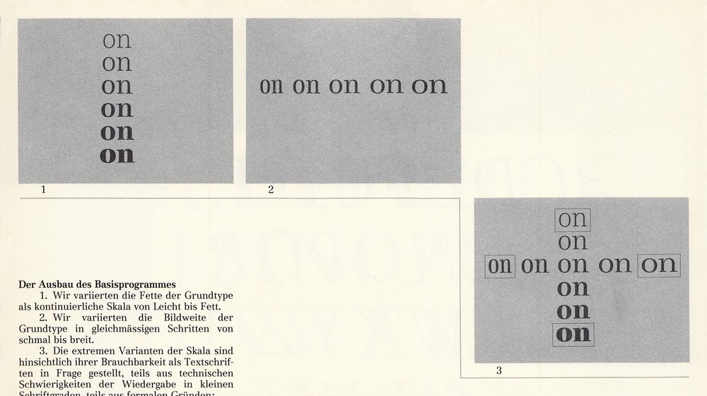
The Extension of the Basic Program
Thoughts on Type Design
The urge for research and discovery, coupled with technological, economic, and cultural needs, creates further changes and innovations in all fields. Just as offset printing brought about a new dimension and influence to the old composing method, so does photo-typesetting and its further developments create new demands influence the creation of new text and display faces, of entire typeface programs, and of non-Latin alphabets, but also our creative impulse. Finally, letterform is also a form a visual expression, and as long as our creative consciousness wants to convey messages in specific form, then we will remain in the search for new formal possibilities in letterform design.
Originally published in: Typografische Monatsblätter, nr. 8/9, 1977.
