Media77
Go to Media77 pageBefore groups like Underware came along, there was Team’77—a Swiss trio producing type designs for the likes of Compugraphic, ITC, and Haas. In the decades since 1980, their work has achieved an almost cultlike following in certain circles. My favorite typeface of 2015 is a revival of their thirty-eight-year-old Media, now named Media77.
Team’77’s best-known work, of course, is Unica. Recently, Unica was almost concurrently rereleased in two separate revivals — one at Monotype, the other at Lineto. Monotype’s Neue Haas Unica was designed by Toshi Omigari, while Lineto’s Unica77 is drawn by Christian Mengelt of Team’77, based on Team’77’s original drawings dating from the 1970s. Unlike the Unicas, Media77 has received almost no attention in the press.
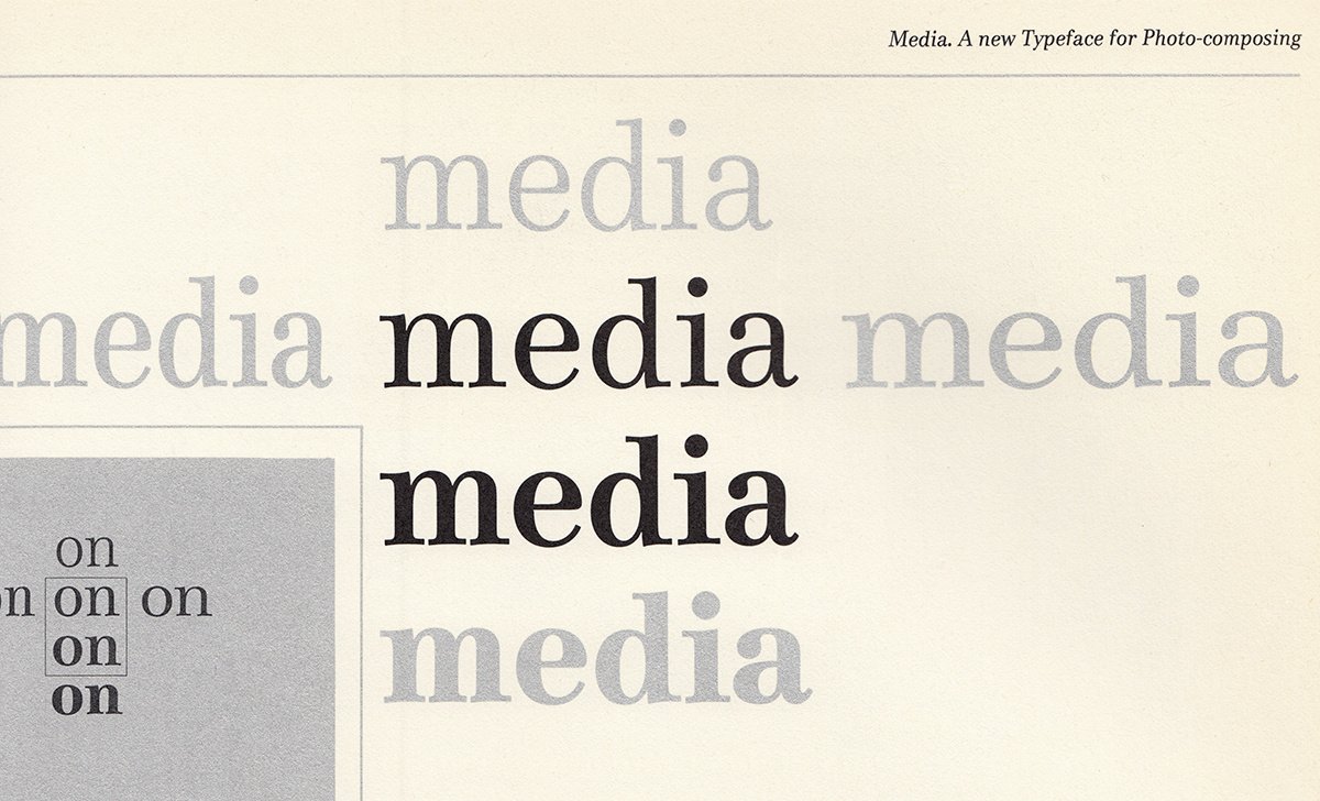
Bobst Graphic released the original Media for its photo-typesetting machines in 1977. The revived Media77 was developed by Team’77 members Christian Mengelt and Erich Gschwind. While no version of Media will ever be as popular as Unica, the original Media incarnation embodies everything noteworthy about Team’77.
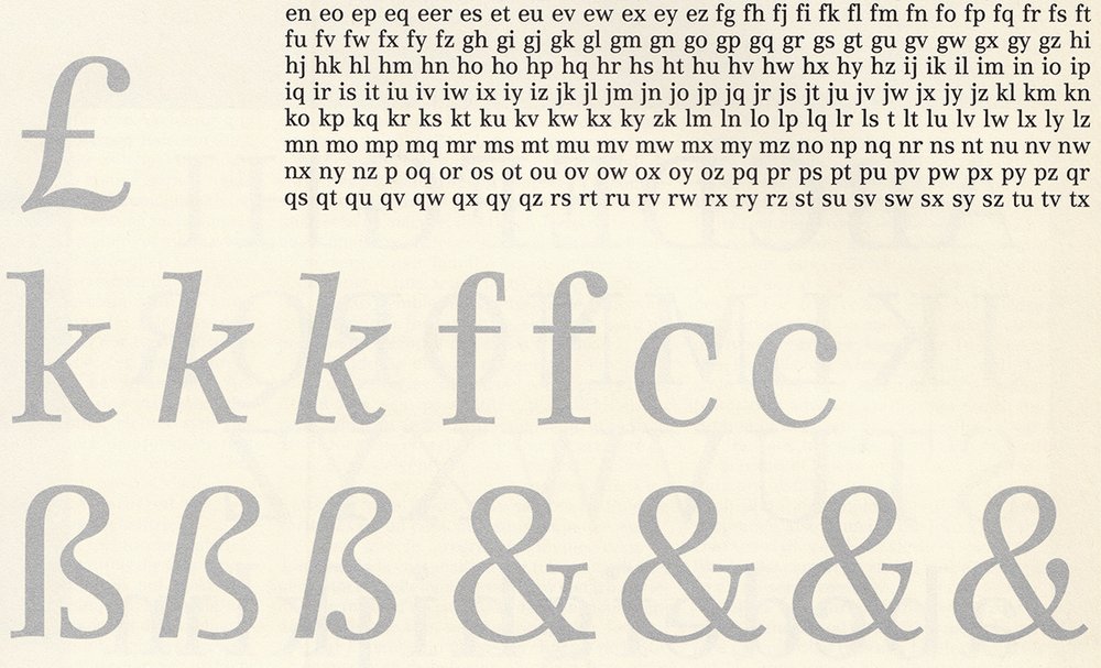
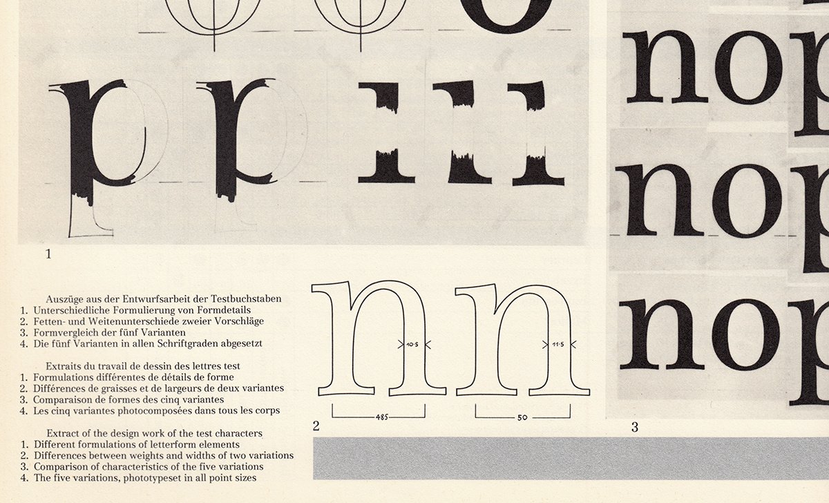
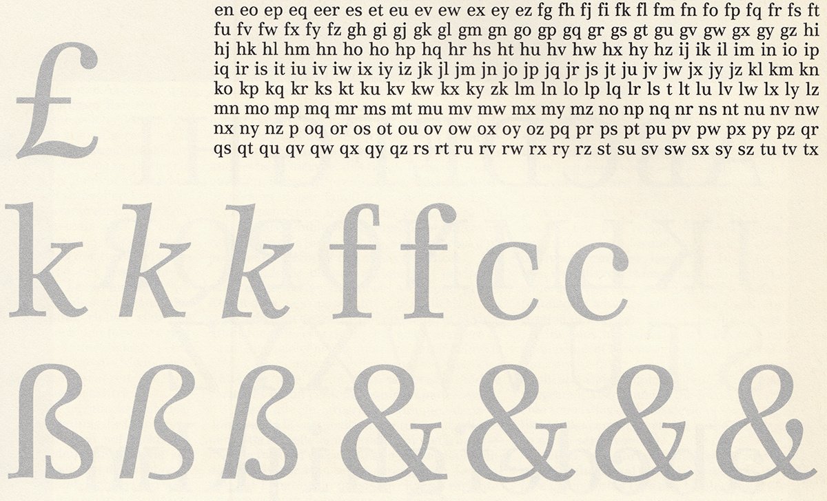
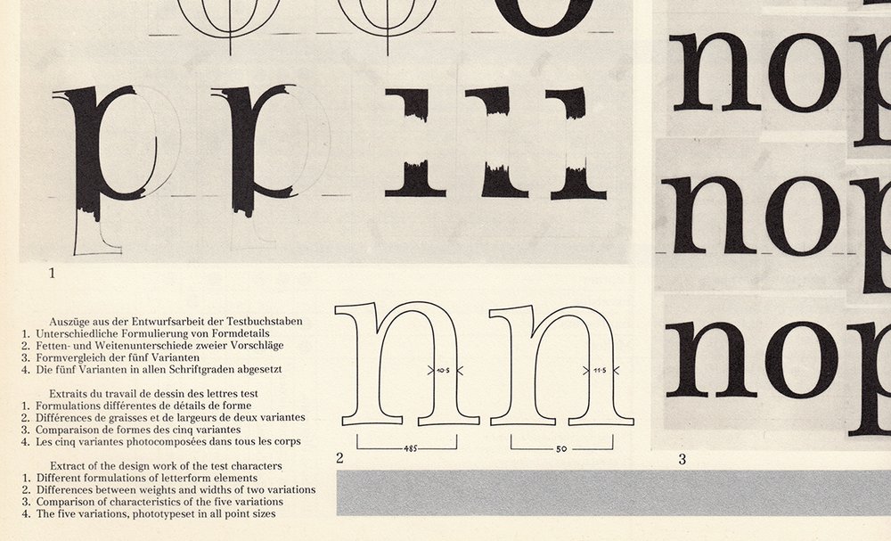
Media’s 1977 debut was accompanied by a trilingual article in Typographische Monatsblätter detailing its design process. Gürtler, Mengelt, and Gschwind examined the most-used serif faces of their time and presented Bobst with various proposals for adoption. Eventually, they agreed upon a sturdy design subtly combining elements from many serif genres. Both Media and Media77 are eminently readable. The italic styles are arguably neither true italics nor obliques, but a unique design solution falling somewhere in between. Something Hrant Papazian would love?
In retrospect, one could argue that—in order to have been better remembered by history—Team’77 should’ve won better clients. Typefaces like Media and Unica were distributed by companies commanding less marketing power than their larger phototype-era competitors; the fonts didn’t gain a foothold during the early PostScript-era, either. However, it isn’t difficult to imagine a parallel universe in which, instead of regularly specifying Century Expanded and Helvetica, Massimo Vignelli might have favored Media and Unica. I don’t predict that Media77 will be popular with today’s graphic designers. Nevertheless, dear reader, I commend you to go forth to Optimo’s website and look at Media77 immediately!
Proving that good work is often not forgotten in the end, André Gürtler, Christian Mengelt, and Erich Gschwind collectively received the Swiss Grand Award for Design last year. And why shouldn’t they have? Team’77 represents the most significant collaborative type design group Switzerland has produced. Their working methods were groundbreaking in the 1970s, and remain a model for today’s type designers to study. If that isn’t enough of an argument for “best typeface of the year,” I’ve got nothing else for you.

Originally published on Typographica
