Without Method There’s No Success
Go to Metodo page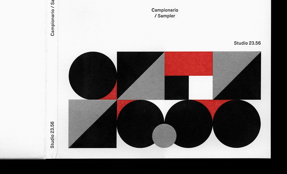
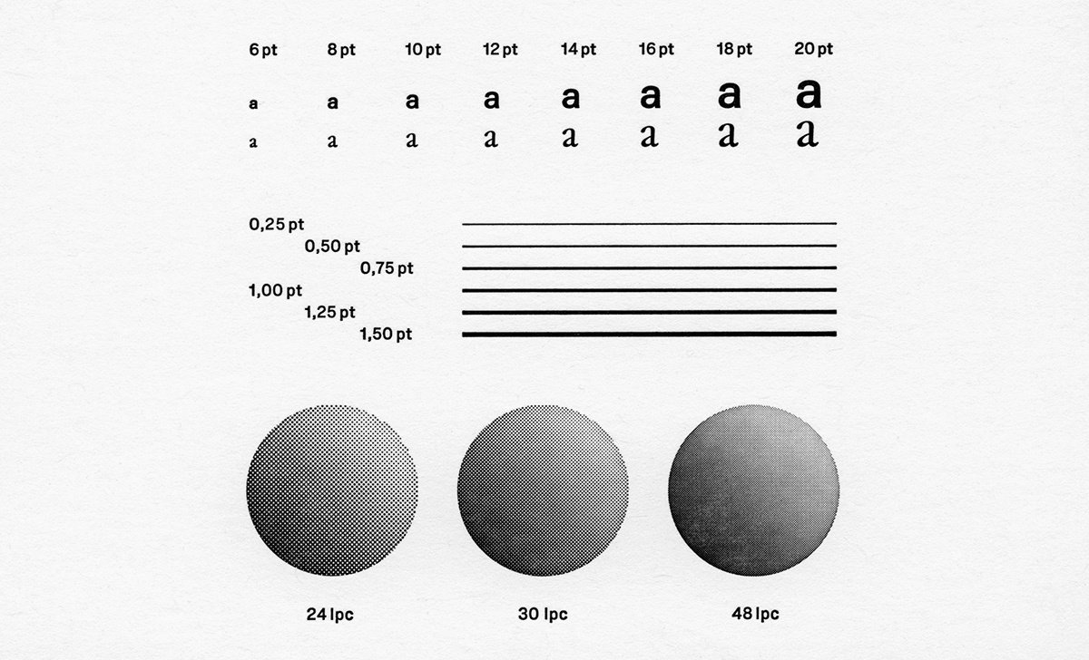
Detail of Campionario / Sampler designed by Studio 23.56 and using Metodo typeface for Archivio Tipografico.
Without method there’s no success.[]
Catalyzed by his studies at École cantonale d’art de Lausanne (ÉCAL) and his appreciation for a German grotesque typeface with an intricate history, Davide Tomatis’ Metodo appears as a substantive evolution in a lineage featuring Aurora-Grotesk and Normal-Grotesk before being taken up by Tomatis.
Tomatis first started working on Metodo while completing his master’s degree in type design at ÉCAL in 2019. Through his studies, he developed an interest in a 1908 German typeface from the Leipzig punchcutting firm Wagner & Schmidt, which became his main inspiration for Metodo.[, ] The story of the typeface is an obscure one, as it traveled through a number of European foundries under different names. In fact, a large part of the history of German sans serifs—from its origins to its early development—remains relatively unknown, in large part due to a lack of archival practices and naming conventions. To add to the confusion, that foundries would frequently copy the typefaces of others at the time adds a further level of complexity for historians attempting to uncover the histories of particular typefaces. []Despite these difficulties, researchers such as Dan Reynolds and Indra Kupferschmid have recently managed to shed some light on the general context in which these typefaces were developed.[, ]

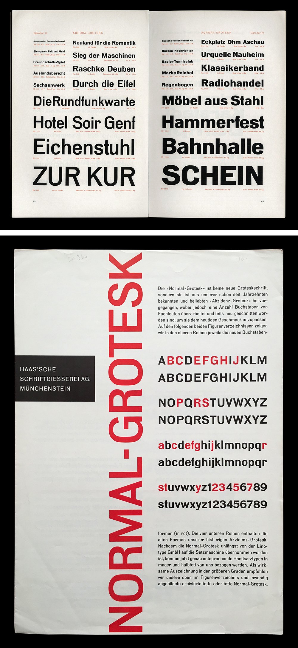
On top, Aurora-Grotesk specimen by the German foundry Weber (photographed at the collection of Archivio Tipografico). Below, Normal-Grotesk specimen by the Swiss foundry Haas (photographed by François Rappo at the Museum für Gestaltung in Zürich). In red are the letters that were changed from Akzidenz Grotesk (their version of Neue Moderne Grotesk) to give the typeface a more “contemporary” look.
According to Kupferschmid, who investigated the lineage of typefaces with which Tomatis was interested, it seems that Wagner & Schmidt designed the original matrices in four regular weights from which Ludwig Wagner’s foundry cast and released the typeface under the name of Neue Moderne Grotesk—with additional terms used to denote the different weights and widths. While the typeface’s designer has not yet been uncovered, based on Wagner & Schmidt’s documentation, it is known that the firm worked with renowned schriftkünstler (lettering artists) and collaborated with other type foundries on type designs. Focusing on punchcutting and engraving, Wagner & Schmidt licensed its matrices to European foundries, who would then cast and sell typefaces under a name of their own choosing. At the time, creating type was a lengthy and expensive enterprise—factors that encouraged foundries to commonly acquire and trade matrices and designs from and with one another. Through her research, Kupferschmid has identified more than twenty known versions of Wagner & Schmidt’s Grotesk, which were each distributed by different German and European foundries under a variety of names. Among the most well-known versions of the typeface are Aurora-Grotesk by the German foundry Weber, Cairoli by the Italian foundry Nebiolo, and Accidenz-Grotesk (later styled as Akzidenz-Grotesk) by the Swiss foundry Haas. Modifications of various degrees would occasionally be made by the publishing foundries, such as Haas’ reworking of the design and expansion of the family in the 1950s which was released under the name Normal-Grotesk.[6] It was in relation to this development by Haas that Tomatis’ typeface is positioned—as a next evolutionary step from Aurora-Grotesk to Normal-Grotesk (which were his reference models).
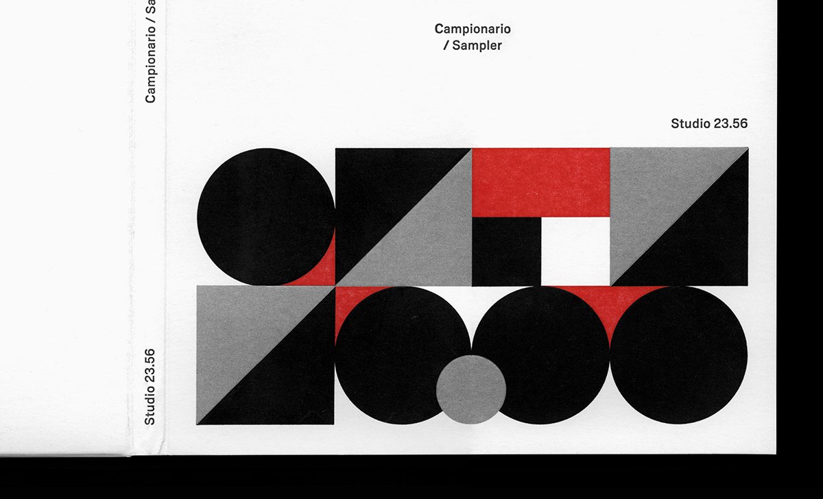
Detail of Campionario / Sampler designed by Studio 23.56 and using Metodo typeface for Archivio Tipografico.

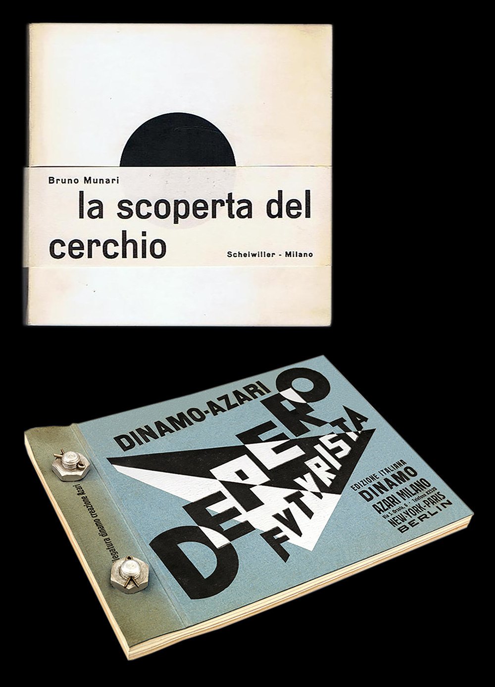
The typeface Cairoli by the Italian foundry Nebiolo was used in both of these publications: La Scoperta del Cerchio (1964) from Bruno Munari and Depero Futurista, Dinamo-Azari (1927) from Fortunato Depero. Source: https://www.maremagnum.com Libreria Menabò/Mare Magnum, 2016. License: All Rights Reserved. Source: https://www.kickstarter.com © 2016 Artists Rights Society (ARS), New York / SIAE Rome. License: All Rights Reserved.
Though remaining somewhat obscure, the typeface (and all its variants) were widely used across Europe through most of the twentieth century, in applications that varied from technical manuals to advertising copy. Right from the outset, the typeface was used in avant-garde and modern contexts. For example, Dada artists used Aurora-Grotesk in some of their avant-garde publications—notably on the third and fourth issues of the journal Dada. However, the most remarkable use of Aurora-Grotesk was certainly by Jan Tschichold, for the first edition of Die Neue Typographie, which was published in 1928. In the book, Tschichold writes, “the so-called ‘grotesque’ sans serif […] is the only one in spiritual accordance with our time.” He went on to add that “the newest designs such as Erbar and Kabel, are inferior to the old anonymous sans serifs, and have modifications which place them basically in line with the rest of the ‘art’ faces.”[7] With these statements Tschichold not only justified his choice of typeface for the book but set the trajectory that modernist typography would take in the years following. Even though Tschichold was limited to selecting the book’s typeface from the printer’s library, he found it preferable to all the available roman typefaces. Though he may have initially been apprehensive to use Aurora-Grotesk, the designers went on to use the typeface in a number of other applications—he even chose it for his own wedding announcement in 1926.[8] Later on in the typeface’s timeline, in the 1950s and 1960s, another version of it, Cairoli from Nebiolo, was used in some Pirelli advertisments designed by modernists such as Armando Testa and Laura Lamm. In 1964, the typeface again made a notable appearance in the modernist canon when it was used by Bruno Munari in the first edition of La scoperta del cerchio. With Metodo, Tomatis captures the qualities of innovative modernist design and spirit—while still giving the typeface a contemporary feel.

Detail of Campionario / Sampler designed by Studio 23.56 and using Metodo typeface for Archivio Tipografico.
Tomatis’ fascination with this typeface was mainly due to its very sophisticated design. Its distinctive curves and the unique tension found in its rounded shapes immediately caught the designer’s attention. The typeface’s particular tension is, in fact, created by manipulating slightly condensed ovals to form boxy shapes—a feature that is especially noticeable in the “e” and “o”. The varying angles at which its terminals finish combined with its high horizontal crossbars—apparent in the “R” and “E”—characterize the typeface and reveal its era of provenance. A certain warmth and vivacity emanate from its slightly irregular shapes—a common characteristic of early grotesques when compared to the refined and systematized neo-grotesque of the 1950s.
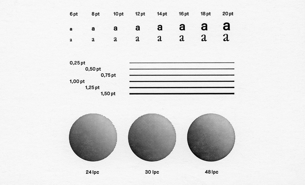
Tomatis decided to initially focus his study on Aurora-Grotesk because of the high quality and availability of its samples—ranging from original specimens and catalogues. Thanks to Archivio Tipografico in Turin, a collaborative space for the preservation, the study, and the practice of typographic arts, Tomatis had the chance to consult many of the specimens and movable types in person. He was able to discern that Wagner & Schmidt’s matrices seemed to have been produced with a high level of precision and care and came to understand that Aurora-Grotesk was surely cast with considerable attention to detail. Great technological and manual knowledge and experience were brought together in an artisanal process that resulted in an extremely well-built metal typeface. As part of his exploration, Tomatis analyzed the letter “e” and compared its cuts in 6 points, 14 points, 20 points, and 36 points. He noticed the wide range and specificity of shapes, proportions, and spacing visible in each cut: the smaller the point size, the wider and more widely spaced the typeface becomes.
Tomatis’ typeface was developed under the guidance of François Rappo, his mentor at ÉCAL. Upon graduating from ÉCAL, he continued the work on his project and widened his investigation to also study other versions of the typeface, giving especially close attention to Normal-Grotesk. From his study, he envisioned Metodo to be the next development in the lineage of this typeface. Rather than wanting to faithfully reproduce the minute details of any of the versions of the typeface, Tomatis’ project aimed to capture a more general feeling. He discarded all of the distinguishing features of the source typeface—even those which were seemingly essential. For Tomatis, the identity of the typeface was in the tension of the curves and in the texture and the grade of gray that the typeface produced in text compositions.
One of the main challenges of designing the typefaces was to bring a set of curves and shapes not easily interpretable by Bézier curves into a digital environment. The digital design experience was, therefore, a process of translation from one design environment into another. The resulting design is of a very high quality and the peculiar feeling produced by the physicality of the original metal typeface were successfully echoed. With Metodo, Tomatis manages to bring distinctly early twentieth century attributes to a contemporary typeface and, in doing so, creating a sophisticated design with a timeless character.

Detail of Campionario / Sampler designed by Studio 23.56 and using Metodo typeface for Archivio Tipografico.
1 The name Metodo derived from a quote by Italian publisher and anti-fascist Carlo Frassinelli: “Without method there’s no success.”
2 “Normal-Grotesk and Neue moderne Grotesk,” Forgotten Shapes.
3 Paul McNeil, The Visual History of Type (London: Laurence King Publishing Ltd, 2017),. 199.
4 Dr. Dan Reynolds, “Database of sans serifs sold in 19th-century Germany,” TypeOff.
5 Indra Kupferschmid, “Live Type Research in Berlin,” Kupferschrift.
6 “Normal-Grotesk and Neue moderne Grotesk,” Forgotten Shapes.
7 Jan Tschichold, The New Typography (London: University of California Press Ltd, 2006) 73, 75.
8 Chrispopher Burke, Active literature. Jan Tschichold and New Typography (London: Hyphen Press, 2007), 53.
- 1
The name Metodo derived from a quote by Italian publisher and anti-fascist Carlo Frassinelli: “Without method there’s no success.”
- 2
“Normal-Grotesk and Neue moderne Grotesk,” Forgotten Shapes.
- 3
Paul McNeil, The Visual History of Type (London: Laurence King Publishing Ltd, 2017),. 199.
- 4
Dr. Dan Reynolds, “Database of sans serifs sold in 19th-century Germany,” TypeOff.
- 5
Indra Kupferschmid, “Live Type Research in Berlin,” Kupferschrift.
Detail of Campionario / Sampler designed by Studio 23.56 and using Metodo typeface for Archivio Tipografico.
Detail of Campionario / Sampler designed by Studio 23.56 and using Metodo typeface for Archivio Tipografico.
Detail of Campionario / Sampler designed by Studio 23.56 and using Metodo typeface for Archivio Tipografico.
Detail of Campionario / Sampler designed by Studio 23.56 and using Metodo typeface for Archivio Tipografico.
