Stanley
Go to Stanley page
So much of type design and mythology relates to the long history of the Times Roman and Times New Roman typefaces, from its references to its numerous successors to the incredible stories that surround the design of it. Before World War II, a lot of people and companies were involved in the design of the typeface, including Stanley Morison, Victor Larden, Eric Gill, William Starling Burgess, Frank Hinman Pierpont, Robert Granjon, Monotype, Linotype, The Times of London, and so on. More recently—again, between all versions, revivals, and copies—it’s impossible to list all the individuals and companies involved.
Times New Roman was the default font for years, from newspaper production to any kind of project during the phototypesetting era. It was also part of the PostScript printer’s first set of resident fonts and the default typeface for a majority of applications, from QuarkXpress to Microsoft Office. This ubiquity gave the typeface its reputation for banality—so much so, that to be considered a professional by his peers, a graphic designer learns to never use it. As a default, Times became a sort of symbolic, transparent typeface, the representation of something that had yet to be designed.
New versions emerged over the years. Times Europa created by Walter Tracy in 1972 for the Times was clearly a different typeface. Times Millennium an attempt to revise it. In my early career, Times was also a common target for typeface designers, (like Helvetica was for Erik Spiekermann when he designed FF Meta). I tried, without clear success, when I designed Le Monde Journal. (It’s normal for today’s eyes to be disappointed with old projects). A few years later, my good friend Dave Farey designed a polished version of the original Times. Perhaps it was too perfect? Is that why Research Studios was asked to make Times Modern?
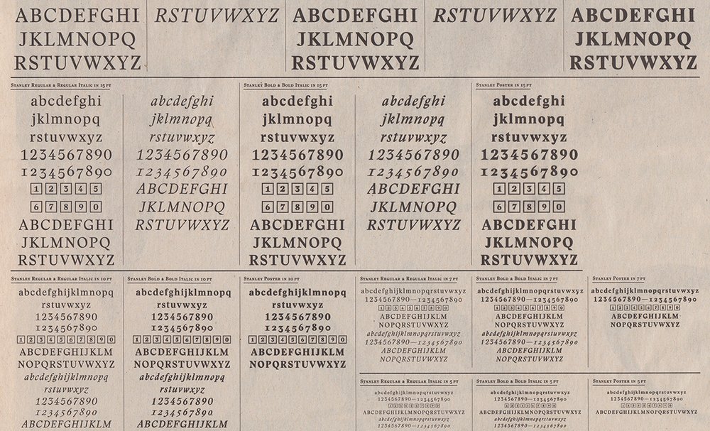
Stanley wasn’t given that name by chance; it’s a clear reference to Stanley Morison. But its design has as much to do with its designer as it does Times. Ludovic Balland studied under Wolfgang Weingart, among others, so his background is in ’70s Swiss typography: Helvetica, asymmetric layouts, exercises in deconstruction, and high black and white contrasts. One of Balland’s typefaces, created for the Warsaw Museum of Modern Art, was based on vernacular signs and mixed with images, patterns, fragments. So one might assume irregular letters appeal to him. His position regarding typefaces—“A font is there not only to be read, but to keep visual memory of things”—seems to confirm that assumption. And we can see connections between the typeface he designed for the Theater Basel and Stanley; there is a brutal quirkiness in both cases.
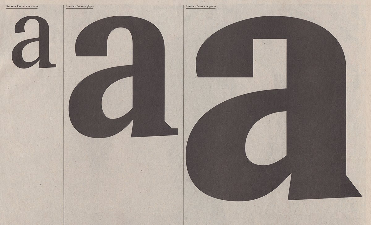
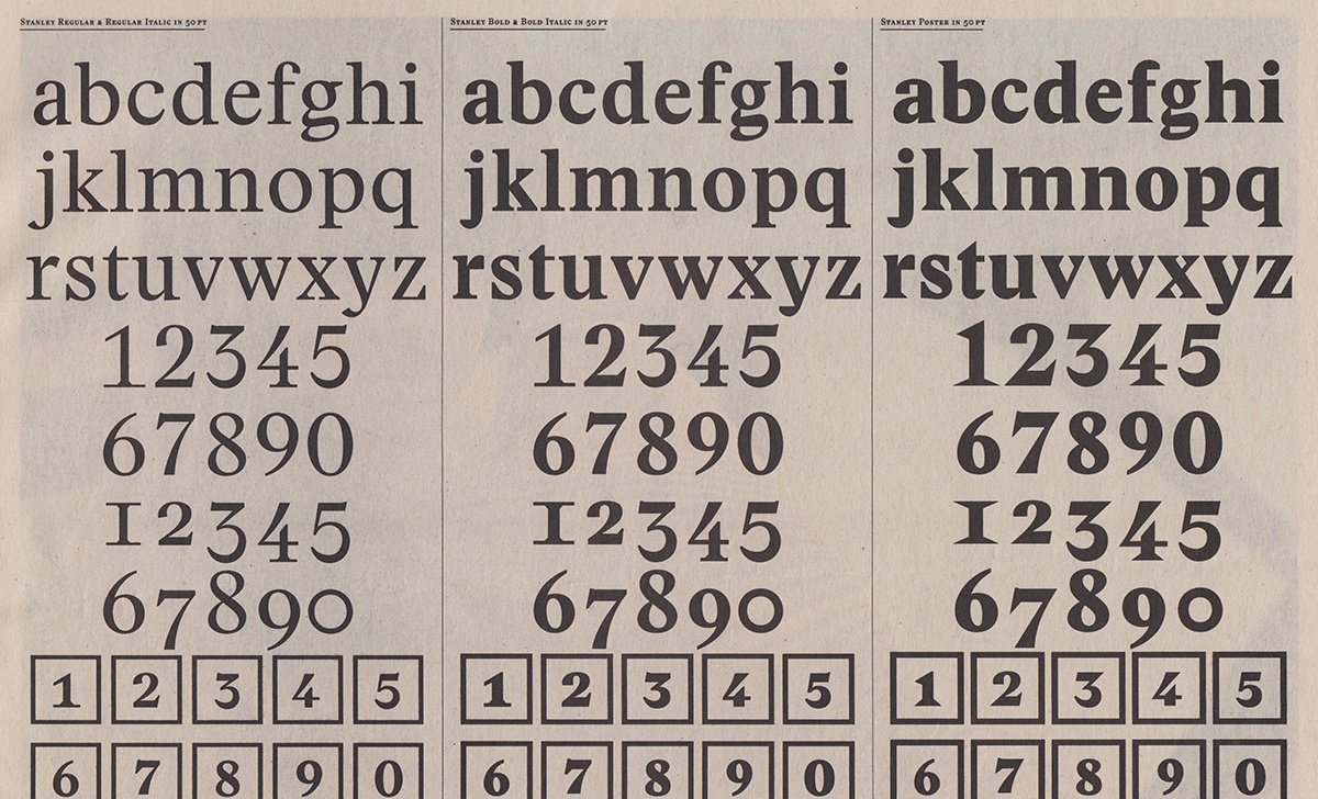
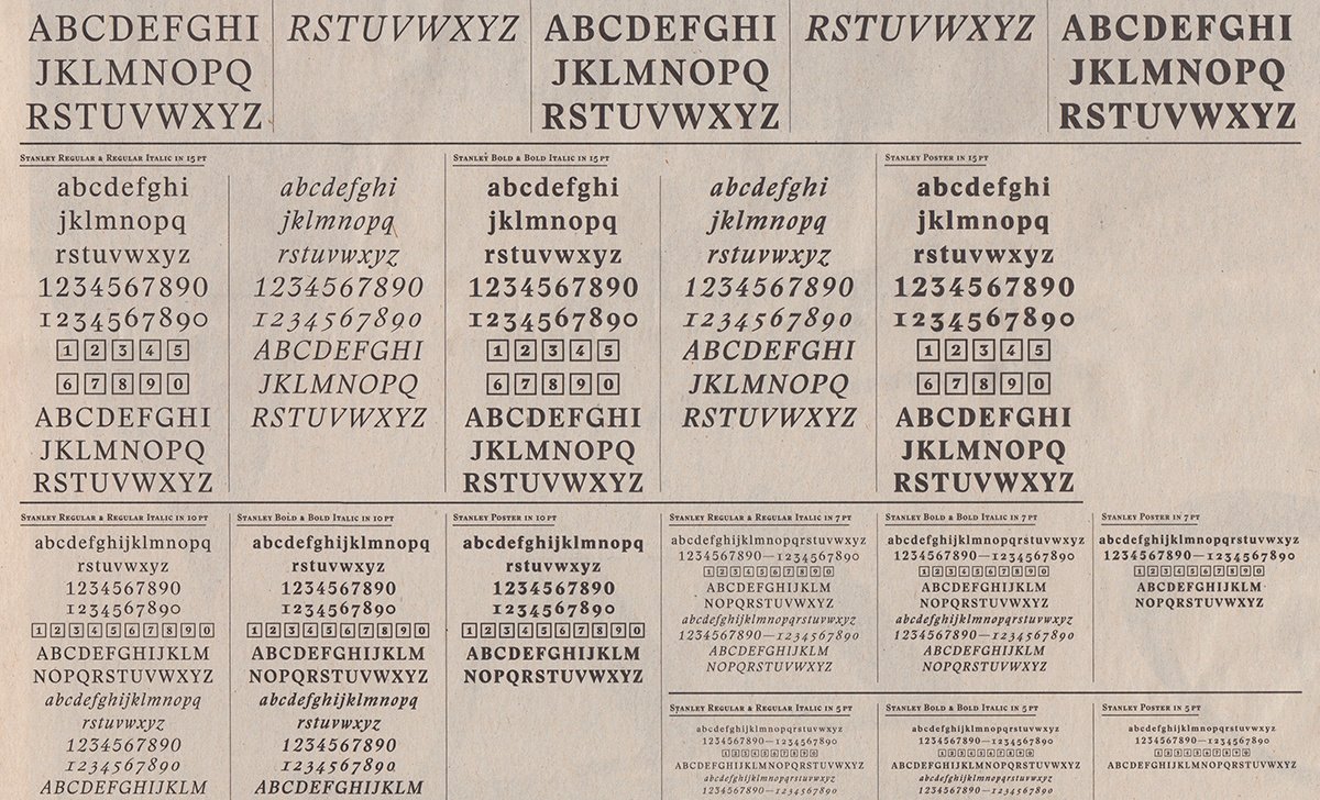
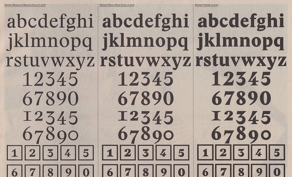
Stanley shares the contrast and feeling of Times, but the serifs are built with straight lines, like Charter, yet with a finish à la Didot. The visual result on the printed page is more upright than Times with its almost oblique axis. Stanley is more static and stable.
Comparing the typefaces of young Swiss designers, we see similar goals, they look to influence each other. The big difference is Stanley is a much more mature typeface. Any details are included with a certain consciousness. They produce a lively typeface, despite being rough and strong and brutal.
Its qualities are also the biggest problems in the eyes of typeface designers. (On the roman, weights are not clearly balanced. The terminal of the ‘a’, for example, looks quite heavy compared to the ‘c’. The lowercase ‘g’ is odd in roman, but much more successful in heavier weights. But we are not here to list all details that only obsessive typefaces designers see.) The uppercase ‘G’s are reminiscent of the Grasset typeface. Eugène Grasset (born in Lausanne, Switzerland) was perhaps an influence, and Émile Javal’s work looks to be present the heavy weights with its squared counters. What is really interesting are the dynamic, lively italics.
So, unlike Times, this typeface isn’t invisible at all—to challenge what the Swiss typographic tradition means to many. It’s a delicate punk rock typeface, under control. Its a Times New Roman with three days’ stubble.
Originally published on Typographica