Theinhardt Compact
Go to Theinhardt page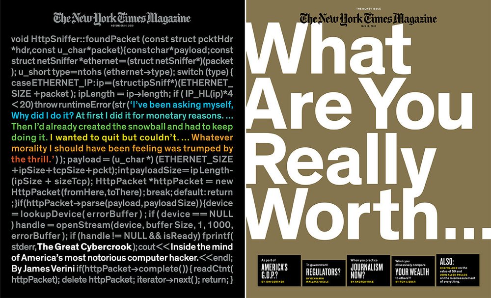
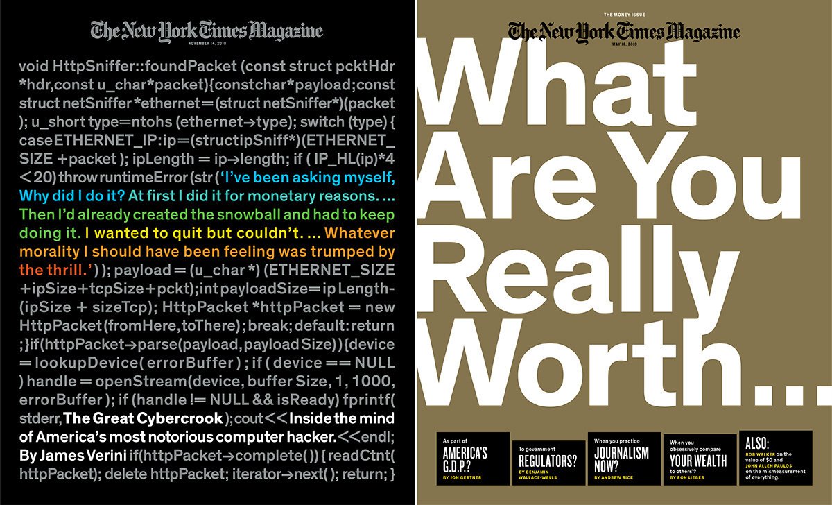
Theinhardt in use on The New York Times Magazine’s covers, issues of November 14, 2010, and May 16, 2010.
Keen on using Theinhardt but in need of a typeface with a more compact width, The New York Times Magazine commissioned Optimo to create a customized version of Theinhardt intended for display and headline purposes.
In addition to its editorial reputation, The New York Times Magazine’s design sensibility is also highly regarded, primarily for its award-winning cover designs (since 2018, the magazine has even been producing a video series documenting the process of creating each of the covers). This Sunday supplement to The New York Times features longer form journalism than that found in the newspaper and has boasts a roster notable contributors—from writers to photographers to illustrators. The magazine’s creative team articulates and presents outstanding content through brilliant layouts and impactful concepts. The typefaces are an integral component of the magazine’s design and are chosen accordingly.

Detail of Theinhardt Compact in use on The New York Times Magazine online issue of December 19, 2010.
In 2010, Optimo was approached by Arem Duplessis, then the magazine’s Design Director (now Group Creative Director for Apple’s Worldwide Marketing Department), who intended to use Theinhardt, which had just been released at the time. A milestone in the development of grotesque type design, Theinhardt was designed by François Rappo, after studying the origins of sans-serif typefaces emerging from the late nineteenth and the early twentieth centuries. Theinhardt combines the best historical features of early grotesque typefaces and adapts them for extensive modern usage. In other words, the typeface mixes a certain warmth—which stems from its roots in variegated early-grotesque drawing—and a more calculated modern feeling. Overall, Theinhardt is sturdy, solid, and restrained in spirit; it is a versatile typeface suitable for a wide range of tasks.
While these qualities of Theinhardt allowed it to fulfill The New York Times Magazine’s requirements, the magazine became interested in using a more compact width for titling and headlines, as a means to fit more content in a tighter space all while having a strong impact. François Rappo developed a custom compact version of Theinhardt by increasing the x-height and reducing the counter space of the typeface. These moves generated a new and impactful family with strong vertical lines that stand out in word compositions and give the typeface an extremely graphic quality. This new width was successfully employed by the magazine in online features.
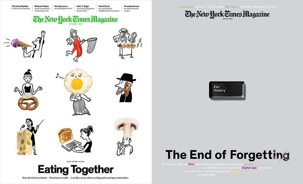
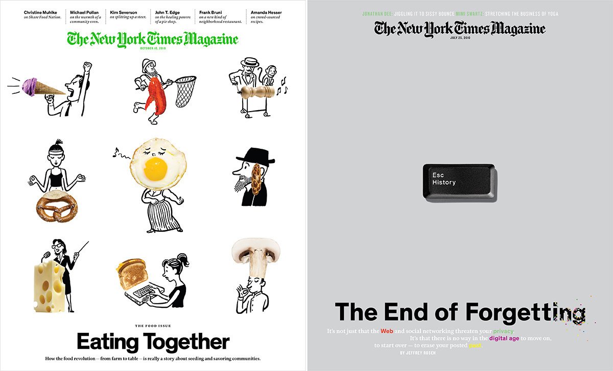
Theinhardt in use on The New York Times Magazine’s covers, issues of October 10, 2010, and July 25, 2010.
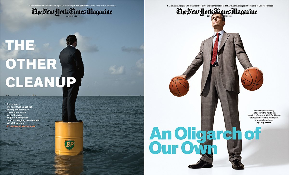
The magazine’s team—including Gail Bichler, then Art Director, now Design Director of The New York Times Magazine, and Hilary Greenbaum, then Designer, now Director of Graphic Design at the Whitney Museum of American Art—made numerous issues using Theinhardt, which now include some of The New York Times Magazine’s most canonic designs.
The development of this compact version of Theinhardt led Optimo to extend Theinhardt into a collection including multiple widths. The character set was preliminarily extended to support languages that use Cyrillic and Greek alphabets with the release of Theinhardt Pan in 2018. It was followed by the 2019 addition of two larger width families: Theinhardt SemiExtended and Theinhardt Extended. And, to conclude, in 2020, Theinhardt Compact, Theinhardt Condensed, and Theinhardt SemiCondensed were incorporated into the collection. Furthermore, a Monospace version of the typeface was also added that same year. Theinhardt is now Optimo’s largest collection and can addresses any challenges in contemporary uses—from super-sized printed banners to lengthy digital texts.
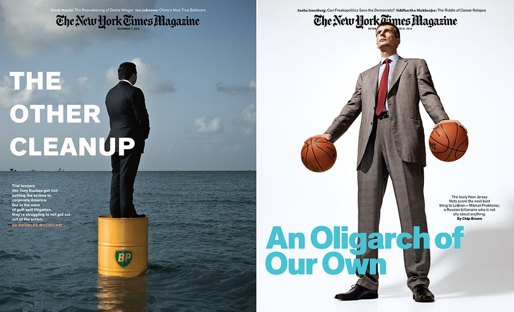
Theinhardt in use on The New York Times Magazine’s covers, issues of November 7, 2010, and October 31, 2010.
