Theinhardt
Theinhardt SemiExtended
Theinhardt Extended
Theinhardt SemiCondensed
Theinhardt Condensed
Theinhardt Compact
Theinhardt Mono
OpenType Features
«Optimo»
@|¦()[]{}¿¡‹›«»-–—·
«OPTIMO»
@|¦()[]{}¿¡‹›«»-–—·
egjpqy
èéêěëēĕėęæǽĝğġģijĵȷỳýŷÿ
egjpqy
èéêěëēĕėęæǽĝğġģijĵȷỳýŷÿ
s
s
0
0
0
0
0123456789
0123456789
3/4 3/8 5/8 7/8
3/4 3/8 5/8 7/8
up+down
+±×÷−=≈≠¬∞
up+down
+±×÷−=≈≠¬∞
H0123456789()[]
Habcdefghijklmn
Hopqrstuvwxyz
H0123456789()[]
Habcdefghijklmn
Hopqrstuvwxyz
H0123456789()[]
Habcdefghijklmn
Hopqrstuvwxyz
H0123456789()[]
Habcdefghijklmn
Hopqrstuvwxyz
Habcdefghijklmn
Hopqrstuvwxyz()[]
Habcdefghijklmn
Hopqrstuvwxyz()[]
Habcdefghijklmno
Hpqrstuvwxyz()[]
Habcdefghijklmno
Hpqrstuvwxyz()[]
fi ffi fl ffl ff
fi ffi fl ffl ff
-> <-
-> <-
Character Map
Uppercases
Lowercases
Accented Uppercases
Accented Lowercases
Standard Ligatures
Stylistic Alternates
Punctuation
Lining Figures
Oldstyle Figures
Slashed Zero
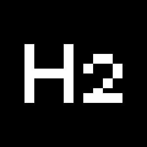
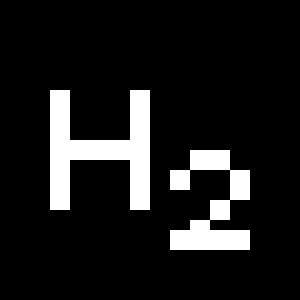
Numerators
Denominators
Superscripts/Superiors
Subscripts/Inferiors
Prebuilt Fractions
Symbols
Mathematical Symbols
Currencies
Arrows
Ordinals
About
A milestone in the development of grotesque type design, Theinhardt was designed by François Rappo, after studying the origins of sans-serif typefaces emerging from the late nineteenth and the early twentieth centuries. The typeface is named after Ferdinand Theinhardt, whose visionary approach significantly shaped modern typography as he opened a new range of possibilities for the grotesque genre—scholars are continuing to uncover details about this fascinating typographic saga. Theinhardt was released nearly fifty years after the revolutionary arrival of neo-grotesque typefaces, which thrived in the Swiss-style context. Looking at this fantastic line of descent, François Rappo meticulously created a new typeface, valorizing the quality and heritage of its sans-serif ancestors.
Theinhardt is composed of nine complementary weights, each masterfully drawn with their corresponding italics and offering a wide range of possibilities. A solid and well-proven typeface Theinhardt combines the best historical features of early grotesque typefaces in a contemporary adaptation fit for extensive modern usage. It is “the original grotesque” par excellence.
More about the collection >

