Considered by some as an entire genre of type design, Clarendon has been revisited many times since its first appearance in 1845, resulting in the release of several adaptations and revivals—one of the most noted is Hermann Eidenbenz’s adaptation in the 1950s. Drawn by François Rappo, Clarendon Graphic is a remarkably innovative take on the style, bringing a new graphic identity to it and fulfilling its modernist potential.
Clarendon Graphic is a fluid, dynamic, and highly graphic typeface. Its lusty frame features a moderate stroke contrast, crowned by ball terminals and upturned tails. Lighter than earlier Egyptian type styles, Clarendon Graphic’s serifs are still prominent and characterized by their bracketed rectangular shape. Being the only Clarendon offering light styles, Clarendon Graphic works beautifully at both large and small sizes, as it has been specifically optimized for text. And, for the first time for a modern Clarendon, this typeface has two complete sets of italics: a slanted Roman and a true cursive italic.
Clarendon Graphic 20 styles
Clarendon Graphic Stencil 6 styles
Case Sensitive Forms
All Caps [cpsp]
This function formats the text in uppercase and adjusts spacing between all capital letters. It also applies the ‘Case Sensitive Forms’ feature which replaces certain characters with alternates that are better suited for all capital text, especially related to punctuation.
«Optimo»
(4−7+8)
(){}‹›«»-–—
+±÷−=≠¬
«Optimo»
(4−7+8)
(){}‹›«»-–—
+±÷−=≠¬
Contextual Alternates
This feature adapts the position of a glyph after its surrounding context. For instance, a dash placed between two uppercase letters or numbers will be replaced by an uppercase version of the dash, slightly higher. This feature is usually active by default in Adobe applications.
Contextual Alternates
This feature adapts the position of a glyph after its surrounding context. This feature is usually active by default in Adobe applications.
Tabular Lining Figures
Tabular Lining Figures [tnum–lnum]
Based on the proportions of the capitals, lining figures have an invariable height. With the combination of the tabular spacing format, the width of each numeral is uniformized. This feature is useful when numerals need to all lined up. It facilitates the reading of numbers set within columns or tables. As some applications don’t have access to this feature, proportional figures are set as the default choice.
0123456789
0123456789
Proportional Oldstyle Figures
Based on the design of the lowercase, oldstyle figures have varying ascenders and descenders. Like most of the letters, each number has an appropriate width based on its shape. The combination of oldstyle figures with proportional setting generate numerals perfectly adapted for text.
Tabular Oldstyle Figures
Based on the design of the lowercase, oldstyle figures have varying ascenders and descenders. With the combination of the tabular spacing format, the width of each numeral is uniformized. This feature is useful when numerals need to all lined up. It facilitates the reading of numbers set within columns or tables.
Fractions
With this feature, any numbers separated by a slash will automatically turn into a fraction. To fit in fraction configuration, numerals have been designed smaller and their weights have been adjusted to suit the typeface.
3/4 3/8 5/8 7/8
3/4 3/8 5/8 7/8
Ordinals
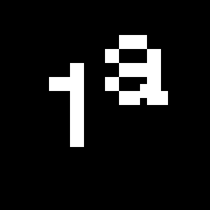
This feature replaces any letter following a numeral with its matching superior letters. Spanish, Portuguese and Italian language uses the feminine and masculine ordinal indicators such as ‘a’ for for 1º, 1ª. Ordinals are designed to match the weight of the typeface.
Numerators
This feature substitutes glyphs with their matching smaller alternates. The numerators are the same glyphs that are used to create fractions, their vertical position remains within the capital letters height. These glyphs are reduced in size and designed slightly heavier to keep them consistent with the rest of the font.
Denominators
This feature substitutes glyphs with their matching smaller alternates and low position glyphs. The denominators are the same glyphs that are used to create fractions, their vertical position remains within the base line. These glyphs are reduced in size and designed slightly heavier to keep them consistent with the rest of the font.
Superscript/Superiors
This feature substitutes glyphs with their matching smaller alternates which are set slightly above the height of the capital letters. These glyphs are reduced in size and designed slightly heavier to keep them consistent with the rest of the font.
Habcdefghijklm
Hnopqrstuvwxyz
Habcdefghijklm
Hnopqrstuvwxyz
Standard Ligatures
Standard ligatures replaces a sequence of characters with a single ligature glyph, they are designed to improve kerning and readability of certain letter pairs.