NEXT Mono
NEXT
OpenType Features
hi@xyz.ch
@|¦()[]{}¿¡‹›«»-–—·
↖↑↗↘↓↙↔
HI@XYZ.CH
@|¦()[]{}¿¡‹›«»-–—·
↖↑↗↘↓↙↔
visionaries
aáăâäàāąåǻãæǽ
visionaries
aáăâäàāąåǻãæǽ
RÉTROSPECTIVE
GESPRÄCH MIÑO
ÀÁÂÃÄĀĂÅǺĄǼĆĈČ
ĊÇĆĈČĊÇĎÈÉÊĚËĒĔ
ĖĘĜĞĠĢĜĞĠĢĤÌÍÎĨÏĪ
ĬİĮĴĶĹĻŃŇÑŅÒÓÔÕ
ÖŌŎŐǾŔŘŖŔŘŖŚŜŠ
ŞȘŤŢÙÚÛŨÜŪŬŮŰŲ
ẀẂŴẄỲÝŶŸŹŽŻ
RÉTROSPECTIVE
GESPRÄCH MIÑO
ÀÁÂÃÄĀĂÅǺĄǼĆĈČ
ĊÇĆĈČĊÇĎÈÉÊĚËĒĔ
ĖĘĜĞĠĢĜĞĠĢĤÌÍÎĨÏĪ
ĬİĮĴĶĹĻŃŇÑŅÒÓÔÕ
ÖŌŎŐǾŔŘŖŔŘŖŚŜŠ
ŞȘŤŢÙÚÛŨÜŪŬŮŰŲ
ẀẂŴẄỲÝŶŸŹŽŻ
0123456789
0123456789
3/4 3/8 5/8 7/8
3/4 3/8 5/8 7/8
up+down
+±×÷−=≈≠¬∞
up+down
+±×÷−=≈≠¬∞
Habcdefghijklmn
Hopqrstuvwxyz()[]
Habcdefghijklmn
Hopqrstuvwxyz()[]
Habcdefghijklmno
Hpqrstuvwxyz()[]
Habcdefghijklmno
Hpqrstuvwxyz()[]
fi ffi fl ffl ff
fi ffi fl ffl ff
-> <-
The
-> <-
The
Character Map
Uppercases
Lowercases
Accented Uppercases
Accented Lowercases
Standard Ligatures
Stylistic Alternates
Punctuation
Lining Figures
Numerators
Denominators
Superscripts/Superiors
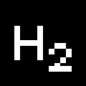
Subscripts/Inferiors
Prebuilt Fractions
Symbols
Mathematical Symbols
Currencies
Arrows
Ordinals
About
Designed at the intersection of two typographic archetypes: constructivism and humanism, NEXT challenges the two genres and offers a visionary aesthetic. NEXT was initiated in 2007, when Ludovic Balland was commissioned to create a new visual identity for the Museum of Modern Art in Warsaw. The typeface was inspired in part by Marek Sigmund’s design for the Ministry of Transportation in Poland. For the ten years following his being commissioned, Balland pursued research and development for this font project. NEXT’s mix of geometrical architecture with calligraphic strokes results in a multifunctional tool adapted both for screen and paper. At smaller sizes, the large counters offer an appreciable reading comfort, while this feature becomes very graphic and powerful on display sizes.
NEXT was conceived of as having a binary program. Each weight comes in two different variants: Book and Poster. The Book versions provide linear flows while the Poster versions offer dynamic visual rhythms resulting from a combination of narrow and wider letters.
More about the collection >


