Signa77
OpenType Features
«Optimo»
@|¦()[]{}¿¡‹›«»-–—·
«OPTIMO»
@|¦()[]{}¿¡‹›«»-–—·
bdgpq ďđĝğġþ
big
bdgpq ďđĝğġþ
big
gĝğġgg
big
gĝğġgg
big
0123456789
0123456789
Habcdefghijklmn
Hopqrstuvwxyz()[].,
Habcdefghijklmn
Hopqrstuvwxyz()[].,
Habcdefghijklmn
Hopqrstuvwxyz()[].,
Habcdefghijklmn
Hopqrstuvwxyz()[].,
Habcdefghijklmn
Hopqrstuvwxyz()[].,
Habcdefghijklmn
Hopqrstuvwxyz()[].,
Habcdefghijklmno
Hpqrstuvwxyz()[].,
Habcdefghijklmno
Hpqrstuvwxyz()[].,
up+down
+±×÷−=≈≠¬∞
up+down
+±×÷−=≈≠¬∞
Character Map
Uppercases
Accented Uppercases
Accented Lowercases
Lowercases
Stylistic Alternates
Standard Ligatures
Punctuation
Lining Figures
Slashed Zero
Numerators
Denominators
Superscripts/Superiors
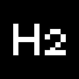
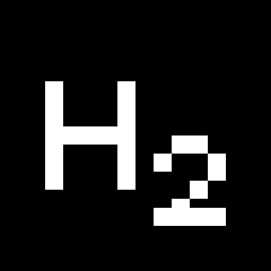
Subscripts/Inferiors
Prebuilt Fractions
Symbols
Mathematical Symbols
Currencies
Arrows
Ordinals
About
The result of continuous practice in pursuit of perfection, Team’77 presents Signa in a digitalized version. With a unique warmth and finesse, Signa77 can be seen as an evolution of modernist typography with organic inflections.
Placing first in the Bobst Graphic’s Lettre d’Or 1978 competition, Signa was originally developed for phototypesetting technology by the legendary Team’77 (André Gürtler, Christian Mengelt, and Erich Gschwind). As Team’77 had witnessed the transition from metal type to its dematerialization first-hand, they knew how to leverage the technology effectively. Signa was created in perfect accordance with the technology of the time and has, now, been skillfully revitalized and adapted for contemporary typesetting.
A transition from mid-century archetype to the 1970s, Signa77 is a typeface with a substantial rigor yet is infused with a certain fluidity in its ductus. Reminiscent of calligraphy, Signa77 has subtle flares at the end of its strokes, a characteristic that gives the typeface a certain charm. The design gestures that are brought together in Signa77 make it perfectly suited for elegant headlines and for embellishing compositions, while also being highly effective for extended text layouts, as Signa77’s family comprises four weights and its accompanying italics.
More about the collection >


