Bringing the neo-grotesque program into the realm of variable fonts, Artex is an innovative typeface designed by Valentin Brustaux. With its simplified forms tempering strict geometry, Artex proposes a distinctive graphic language in which modern efficiency meets contemporary technology.
Eager to design a typographic tool that would equally perform as static text blocks and motion graphics, Brustaux researched thoughtful, rational shapes that could optimize the quality of transitions between the extreme widths and weights of the program. Within its overarching modern architecture, Artex incorporates modular and symmetrical forms. These specific attributes improve sharpness in static uses and streamlines transitions as a dynamic font. Consequently, Artex develops a distinctive aesthetic that effortlessly attracts attention and makes for easy retention.
An extensible program—masterfully engineered in a variable format and 72 static fonts—Artex offers a full expansion of widths (from compressed to extended) and weights (from hairline to black). Each style includes 29 alternate glyphs, which provide a versatility in visual vocabulary and add dimension to any project.
Artex 12 styles and Variable
Artex SemiExtended 12 styles and Variable
Artex Extended 12 styles and Variable
Artex SemiCondensed 12 styles and Variable
Artex Condensed 12 styles and Variable
Artex Compressed 12 styles and Variable
Case Sensitive Forms
All Caps [cpsp]
Case Sensitive Forms [case]
This function formats the text in uppercase and adjusts spacing between all capital letters. It also applies the ‘Case Sensitive Forms’ feature which replaces certain characters with alternates that are better suited for all capital text, especially related to punctuation.
«Optimo»
@|¦()[]{}¿¡‹›«»-–—·
«OPTIMO»
@|¦()[]{}¿¡‹›«»-–—·
Contextual Alternates
This feature adapts the position of a glyph after its surrounding context. For instance, a dash placed between two uppercase letters or numbers will be replaced by an uppercase version of the dash, slightly higher. This feature is usually active by default in Adobe applications.
Standard letters and figures
Stylistic Set 1 [ss01]
This feature replaces glyph(s) with stylistic alternate(s).
abdghmnpqru
BDEFGMNPQR
145&@
abdghmnpqru
BDEFGMNPQR
145&@
Serif a
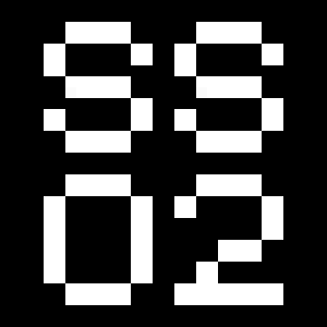
Stylistic Set 1 [ss01] and Stylistic Set 2 [ss02]
The activation of both features replaces glyph(s) with stylistic alternate(s).
a àáâãäāăåǻąæǽ
a àáâãäāăåǻąæǽ
Single-storey a
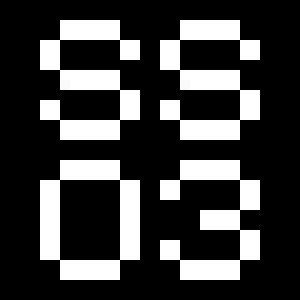
Stylistic Set 1 [ss01] and Stylistic Set 3 [ss03]
The activation of both features replaces glyph(s) with stylistic alternate(s).
a àáâãäāăåǻąæǽ
a àáâãäāăåǻąæǽ
Standard g b d p q
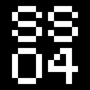
Stylistic Set 4 [ss04]
This feature replaces glyph(s) with stylistic alternate(s).
gbdpq
ĝğġģďđþ
gbdpq
ĝğġģďđþ
Standard h m n r u
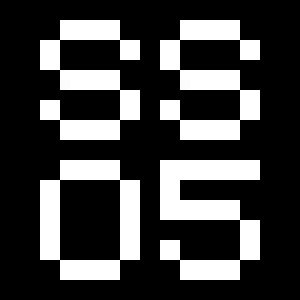
Stylistic Set 5 [ss05]
This feature replaces glyph(s) with stylistic alternate(s).
hmnru
ĥńňñņŋŕřŗù
úûũüūŭůűų
hmnru
ĥńňñņŋŕřŗù
úûũüūŭůűų
Standard capitals
Stylistic Set 7 [ss07]
This feature replaces glyph(s) with stylistic alternate(s).
BDEFGMNPQR
ĎĐÈÉÊĚËĒĔĖĘĜĞ
ĠĢŃŇÑŅŊŔŘŖ
BDEFGMNPQR
ĎĐÈÉÊĚËĒĔĖĘĜĞ
ĠĢŃŇÑŅŊŔŘŖ
Standard G
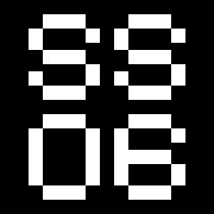
Stylistic Set 9 [ss09]
This feature replaces glyph(s) with stylistic alternate(s).
G ĜĞĠĢ
G ĜĞĠĢ
Alternate G
Stylistic Set 10 [ss10]
This feature replaces glyph(s) with stylistic alternate(s).
G ĜĞĠĢ
G ĜĞĠĢ
Standard Q
Stylistic Set 11 [ss11]
This feature replaces glyph(s) with stylistic alternate(s).
Q
Q
Tabular Lining Figures
Tabular Lining Figures [tnum–lnum]
Based on the proportions of the capitals, lining figures have an invariable height. With the combination of the tabular spacing format, the width of each numeral is uniformized. This feature is useful when numerals need to all lined up. It facilitates the reading of numbers set within columns or tables. As some applications don’t have access to this feature, proportional figures are set as the default choice.
0123456789
0123456789
Proportional Oldstyle Figures
Based on the design of the lowercase, oldstyle figures have varying ascenders and descenders. Like most of the letters, each number has an appropriate width based on its shape. The combination of oldstyle figures with proportional setting generate numerals perfectly adapted for text.
Tabular Oldstyle Figures
Based on the design of the lowercase, oldstyle figures have varying ascenders and descenders. With the combination of the tabular spacing format, the width of each numeral is uniformized. This feature is useful when numerals need to all lined up. It facilitates the reading of numbers set within columns or tables.
Fractions
With this feature, any numbers separated by a slash will automatically turn into a fraction. To fit in fraction configuration, numerals have been designed smaller and their weights have been adjusted to suit the typeface.
3/4 3/8 5/8 7/8
3/4 3/8 5/8 7/8
Ordinals
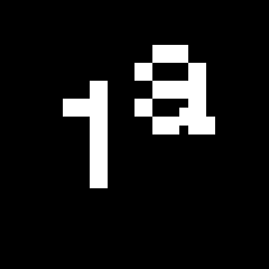
This feature replaces any letter following a numeral with its matching superior letters. French language uses the ordinal indicators such as ‘er’ for 1er premier, while Spanish, Portuguese and Italian require the feminine and masculine ordinals ‘a,’ ‘o’ for 1º, 1ª. Ordinals are designed to match the weight of the typeface.
Slashed Zero
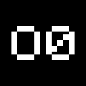
Originally created to avoid the confusion between the ‘0’ and the ‘O’, this feature substitutes all zeros in a selected text by a slashed form of the zero.
Slashed Zero Oldstyle
Originally created to avoid the confusion between the ‘0’ and the ‘O’, this feature substitutes all zeros in a selected text by a slashed form of the zero.
Tabular figures are all of equal width. They are only needed when the figures must all line up from one line to the next, as in a table. Proportional figures have varying widths, just like most letters; each number has a width appropriate to its design. Lining figures are all the same height, usually similar to that of capital letters. They are needed for use with all-capital settings.
Standard figures
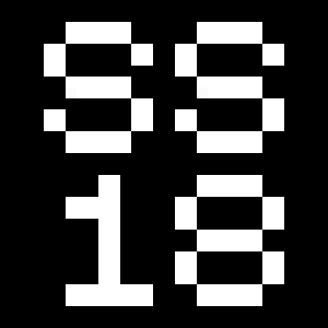
Stylistic Set 8 [ss08]
This feature replaces glyph(s) with stylistic alternate(s).
145
145
Numerators
This feature substitutes glyphs with their matching smaller alternates. The numerators are the same glyphs that are used to create fractions, their vertical position remains within the capital letters height. These glyphs are reduced in size and designed slightly heavier to keep them consistent with the rest of the font.
Habcdefghijklmn
Hopqrstuvwxyz()[].,
Habcdefghijklmn
Hopqrstuvwxyz()[].,
Denominators
This feature substitutes glyphs with their matching smaller alternates and low position glyphs. The denominators are the same glyphs that are used to create fractions, their vertical position remains within the base line. These glyphs are reduced in size and designed slightly heavier to keep them consistent with the rest of the font.
Habcdefghijklmn
Hopqrstuvwxyz()[].,
Habcdefghijklmn
Hopqrstuvwxyz()[].,
Superscript/Superiors
This feature substitutes glyphs with their matching smaller alternates which are set slightly above the height of the capital letters. These glyphs are reduced in size and designed slightly heavier to keep them consistent with the rest of the font.
Habcdefghijklmn
Hopqrstuvwxyz()[].,
Habcdefghijklmn
Hopqrstuvwxyz()[].,
Subscript/Inferiors
This feature substitutes glyphs with their matching smaller alternates which are set slightly below the baseline. These glyphs are reduced in size and designed slightly heavier to keep them consistent with the rest of the font.
Habcdefghijklmno
Hpqrstuvwxyz()[].,
Habcdefghijklmno
Hpqrstuvwxyz()[].,
Standard Ligatures
Standard ligatures replaces a sequence of characters with a single ligature glyph, they are designed to improve kerning and readability of certain letter pairs.
Discretionary Ligatures
Discretionary Ligatures [dlig]
This feature activates discretionary ligatures which are specific to the typeface. It applies all other designed ligatures that are not classified as standard ligatures.
-><-
ru ri rf rt rv rw ry
-><-
ru ri rf rt rv rw ry
Lowercase math symbols
This feature activates alternate lowercase positioning of mathematical symbols.
up+down
+±×÷−=≈≠¬∞
up+down
+±×÷−=≈≠¬∞
Small symbols © ® ℗
Stylistic Set 18 [ss18]
This feature replaces glyph(s) with stylistic alternate(s).
©®℗
©®℗
Small arrows
Stylistic Set 19 [ss19]
This feature replaces glyph(s) with stylistic alternate(s).
←→↑↓↖↗↘↙
←→↑↓↖↗↘↙
Multiply sign
This feature substitutes the letter “x” into the multiplication sign.